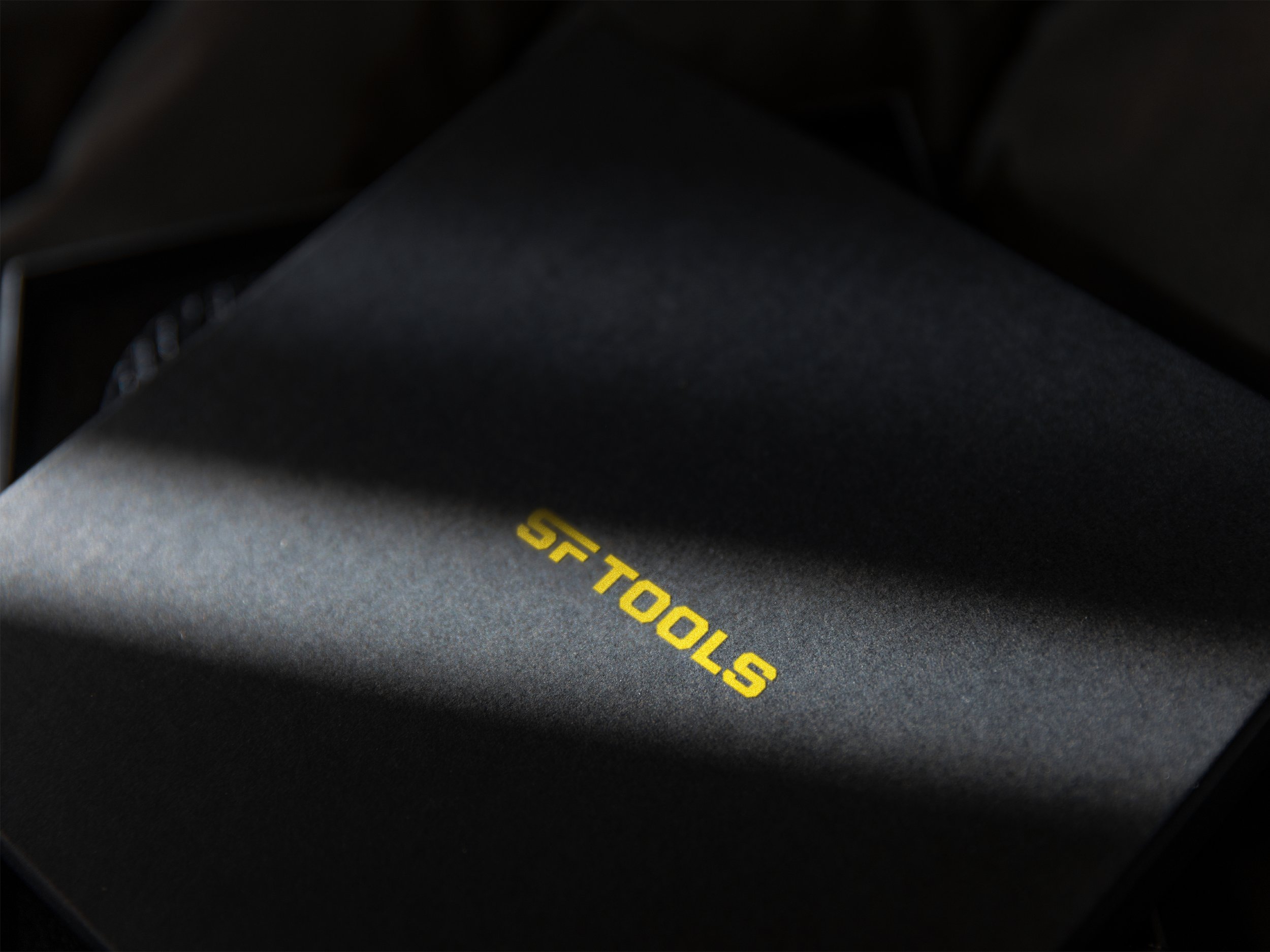
SF TOOLS
SF Tools is the world-leading manufacturer of some of the safest, most powerful industrial-scale direct heat tools.
Previously known as Shrinkfast, the company had grown exponentially thanks to its reputation as an innovator in the field. If they were going to continue to grow, their future needed to be bigger than “shrink,” to appeal to new audiences and industries.
As they stepped into this exciting new chapter, the iconic tool brand needed a new name – one that spoke to their storied history yet gave them room to grow – and a fresh, modern brand identity to go with it. EightySeven was more than happy to partner with them to design a refreshed brand that would truly turn the heat up on their competition.
Our Services
Brand Focus
Brand Strategy
Brand & Product Naming
Brand Identity
Brand Voice
Brand Visuals
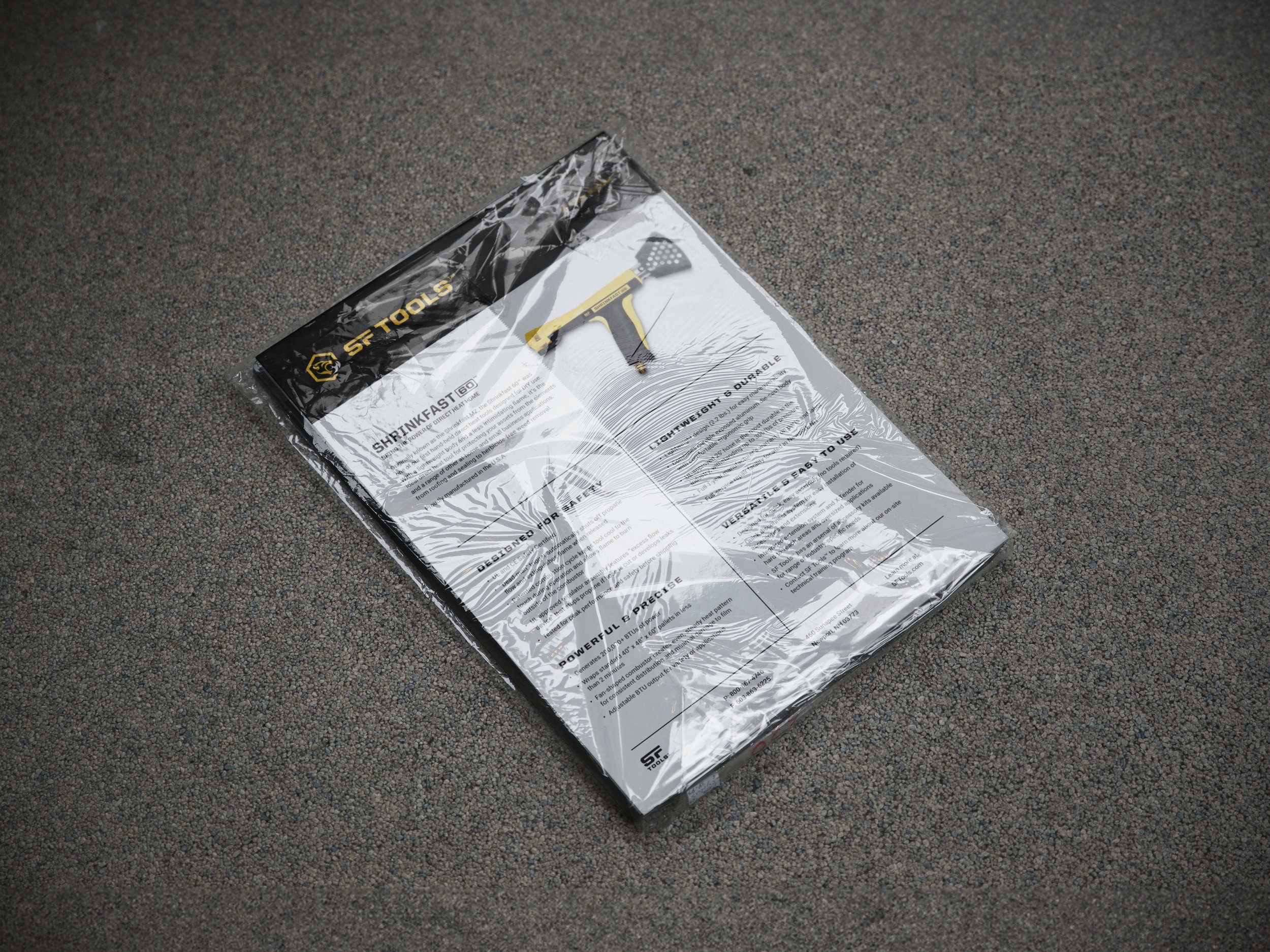
Packaging
Social
Website
Marketing Materials
Sales Collateral
Prior Logo
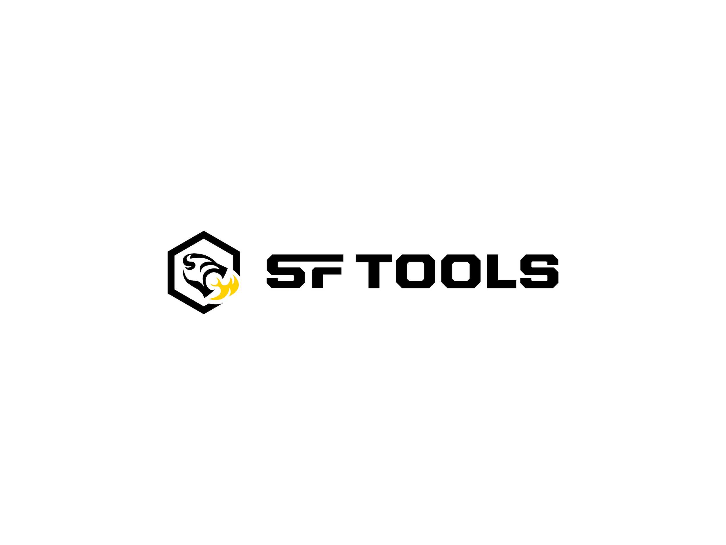
Updated Logo

Branding a future that’s bigger than “shrink.”
Industrial shrink wrapping is distinct from the cheaper and less durable “stretch wrapping” it’s often confused for. It has so many applications across industries, from winterizing boats and outdoor furniture to securing large and oddly shaped items for shipping. But whenever you’re working with an open flame, safety and precision has to be prioritized.
In a market where safety is so often secondary, Shrinkfast’s safe, reliable, and precise tools are far and away the best. The issue was their price point was significantly higher compared to the other tools available.
Shrinkfast needed a name, story, brand identity, and design system that felt premium enough to justify the price point and rugged enough to appeal to the tradesmen who used them if they were going to get more customers – and industries – on board.
Brand Focus
87BrandFocus Workshop
Brand Core & Audit
Vision & Values
Audience & Personality
Brand Focus
Essential Brand Statements
Brand Action Items
Designing a naming system to honor an icon.
Shrinkfast needed a new name that would allow them to grow beyond shrink wrapping, but the Shrinkfast name also had strong equity and a loyal consumer base that the client didn’t want to lose. This inspired a solution that retained that hard-earned equity with a simple brand name evolution that let us dial up the creativity and emotion at the product level.
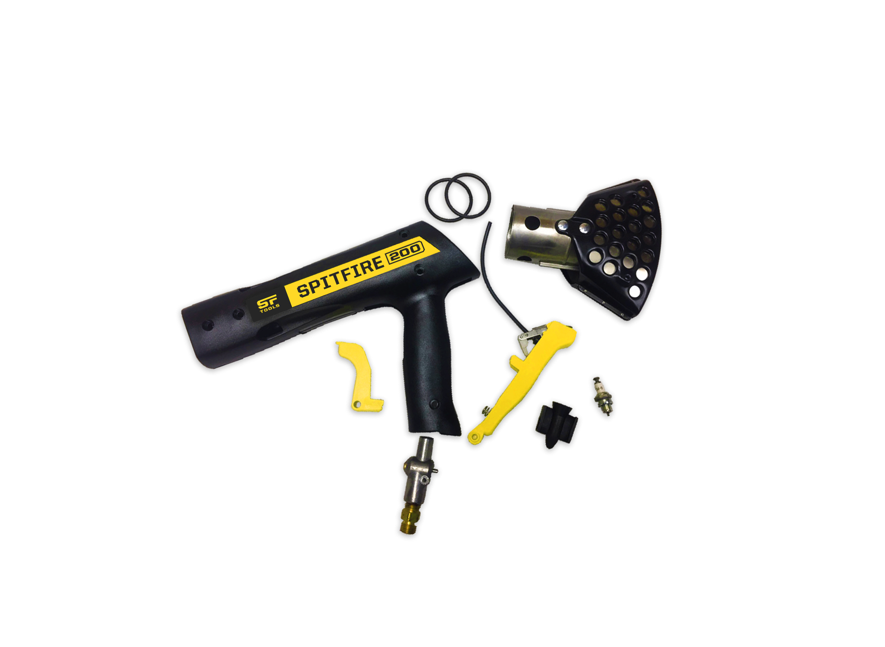
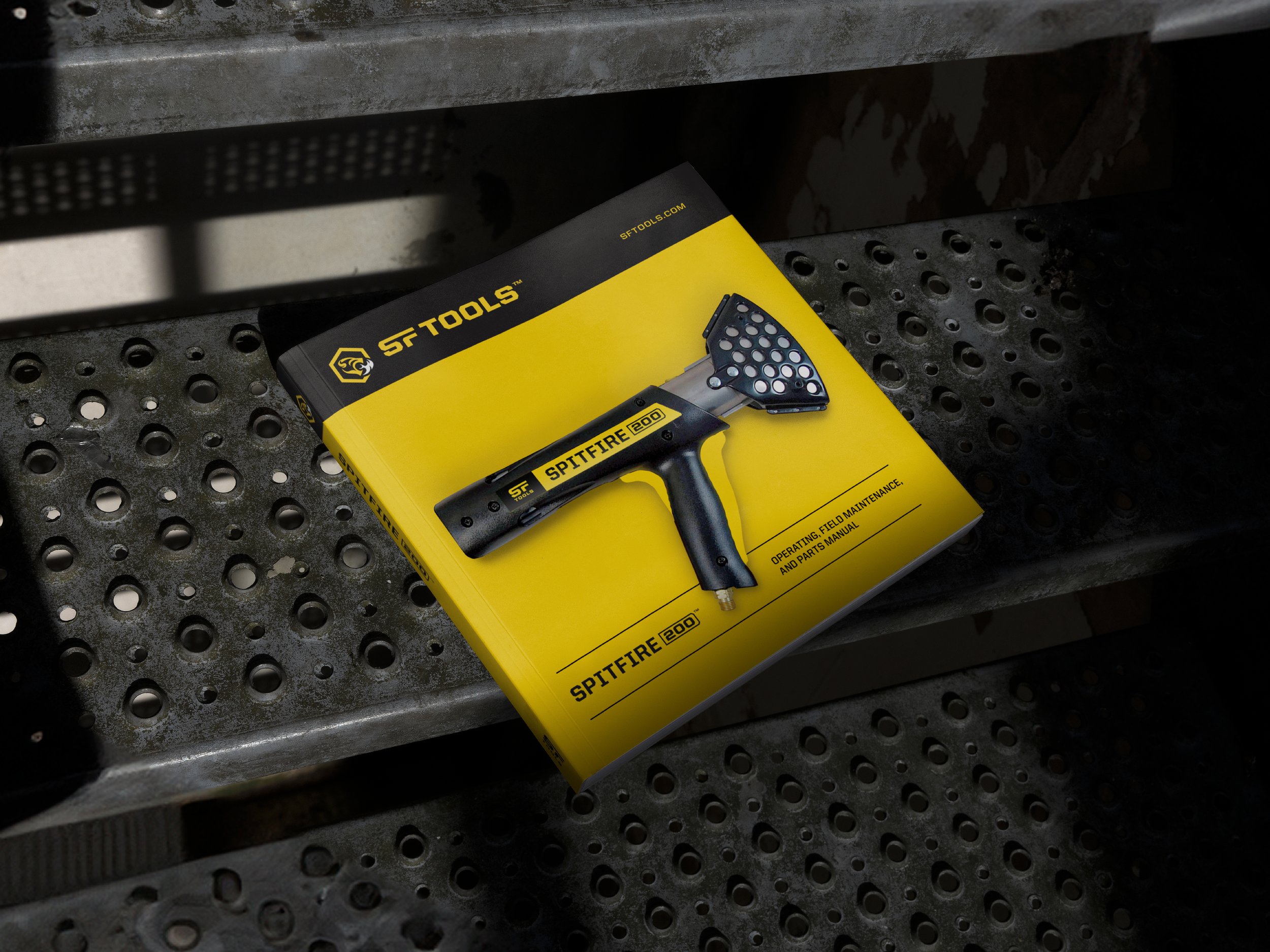
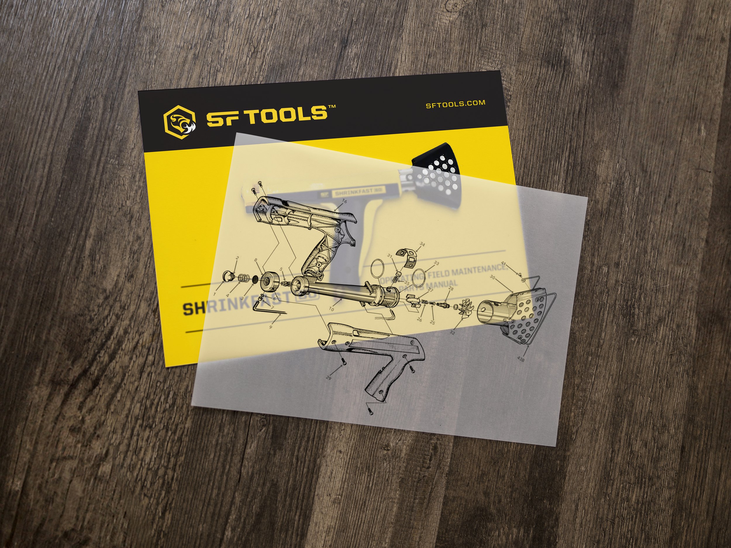
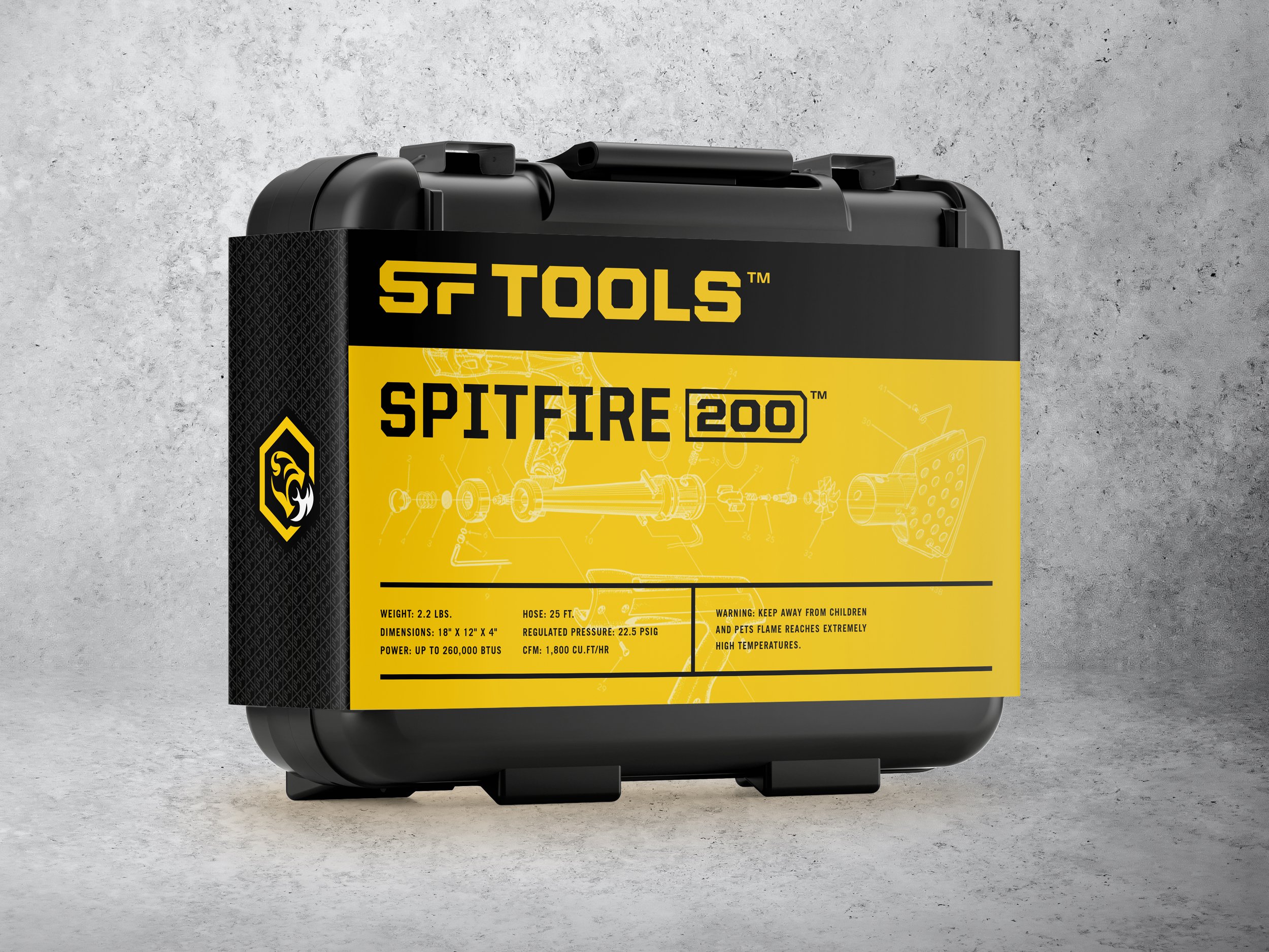
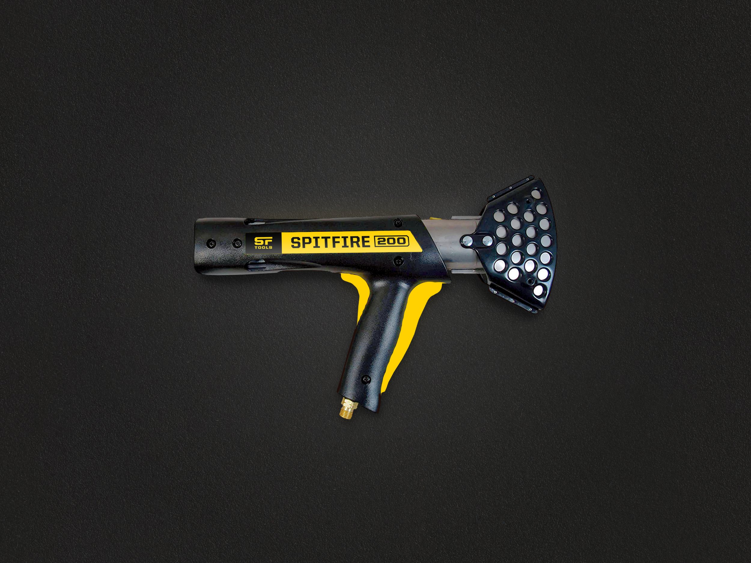
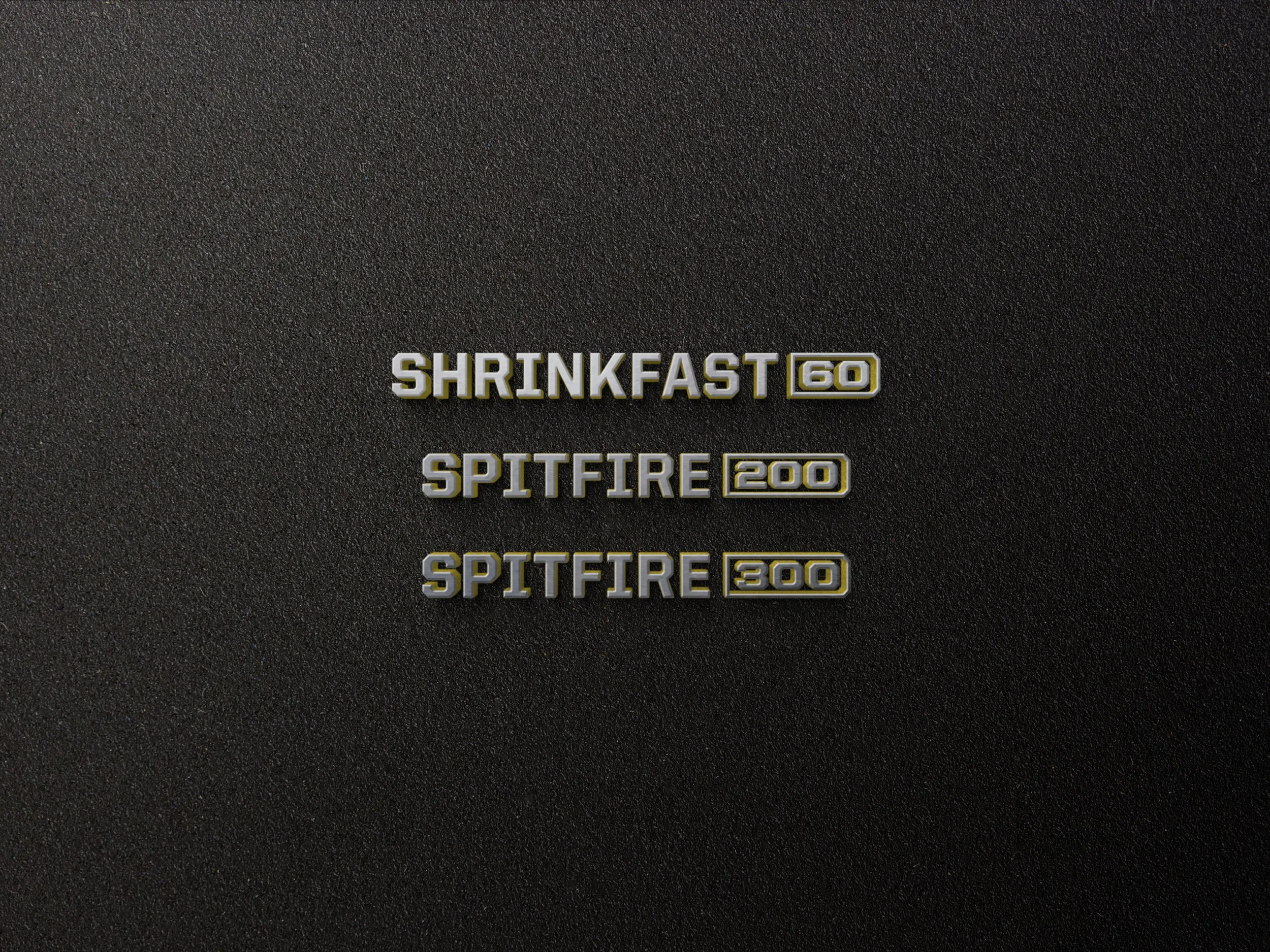
The solution was SF Tools. “SF” paid homage to “ShrinkFast,” allowing them to continue marketing their shrink wrap specific products under the Shrinkfast name. This also created new opportunities to introduce additional products that would take on more emotive “SF” names, like SpitFire. These names were then paired with a number representing the power level, or BTUs, of each tool, making it easier for users to navigate and understand the SF Tools portfolio.
Brand Name
Naming Workshop
Brand Naming
Product Naming
Naming Systems

Firing up the brand’s personality.
Next, we set out to establish the SF Tools voice. The client wanted something that was tough and rugged, but also sophisticated and intelligent. Some of their tools were designed by rocket scientists, after all.
The refreshed brand voice leverages witty headlines that are packed with attitude and speak to the unique needs of various target audiences and industries. This allowed us to draw various audiences in by playing up the brand’s personality before getting direct with the more technical copy. The result was a brand voice designed to celebrate and connect with the rugged personalities and professions these tools were made for.
Brand Voice
Brand Story
Brand Voice Guidelines
Key Messaging Toolkit
Web Copy
Packaging Copy
Sales Collateral

Testimonial
“I really enjoyed working with EightySeven throughout our rebranding project. My company offers a unique set of benefits, but their team quickly picked up on the industry and turned out a fantastic brand evolution that we will proudly release to our customers. I highly recommend their services for any type of branding project.”
Chuck Milliken, President, SF Tools

Turning up the heat with a new look.
With the name and voice in place, it was time to bring the brand to life visually. The challenge was to find a balance between the new and familiar. We modernized their color palette and typefaces, introduced a new wordmark and mascot, and developed patterns and systems inspired by Shrinkfast’s commitment to design and the science of direct heat.
-
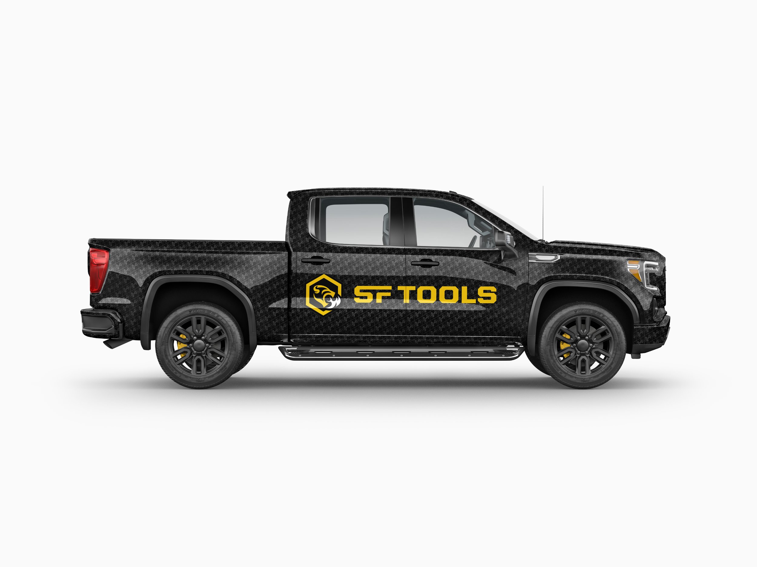
We presented the leadership team with storyboards featuring distinct looks, typefaces, and logos that had been inspired by the insights we gathered during our Focus Workshop. These helped the client visualize how their future brand would come together by illustrating how each of the looks might be applied to their tools, packaging, uniforms, and even their company truck. Once a favorite territory was chosen, we were off to the races.
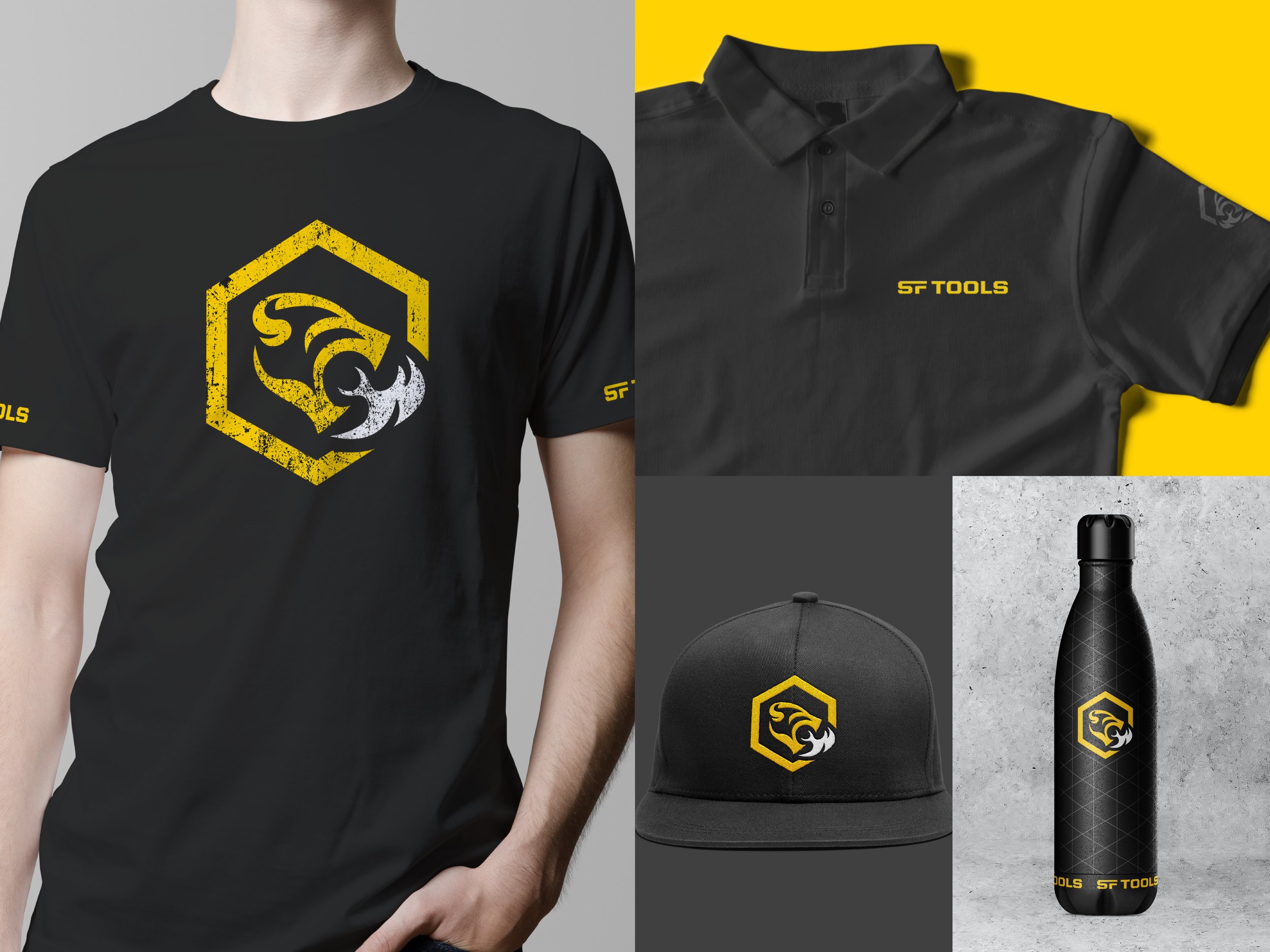
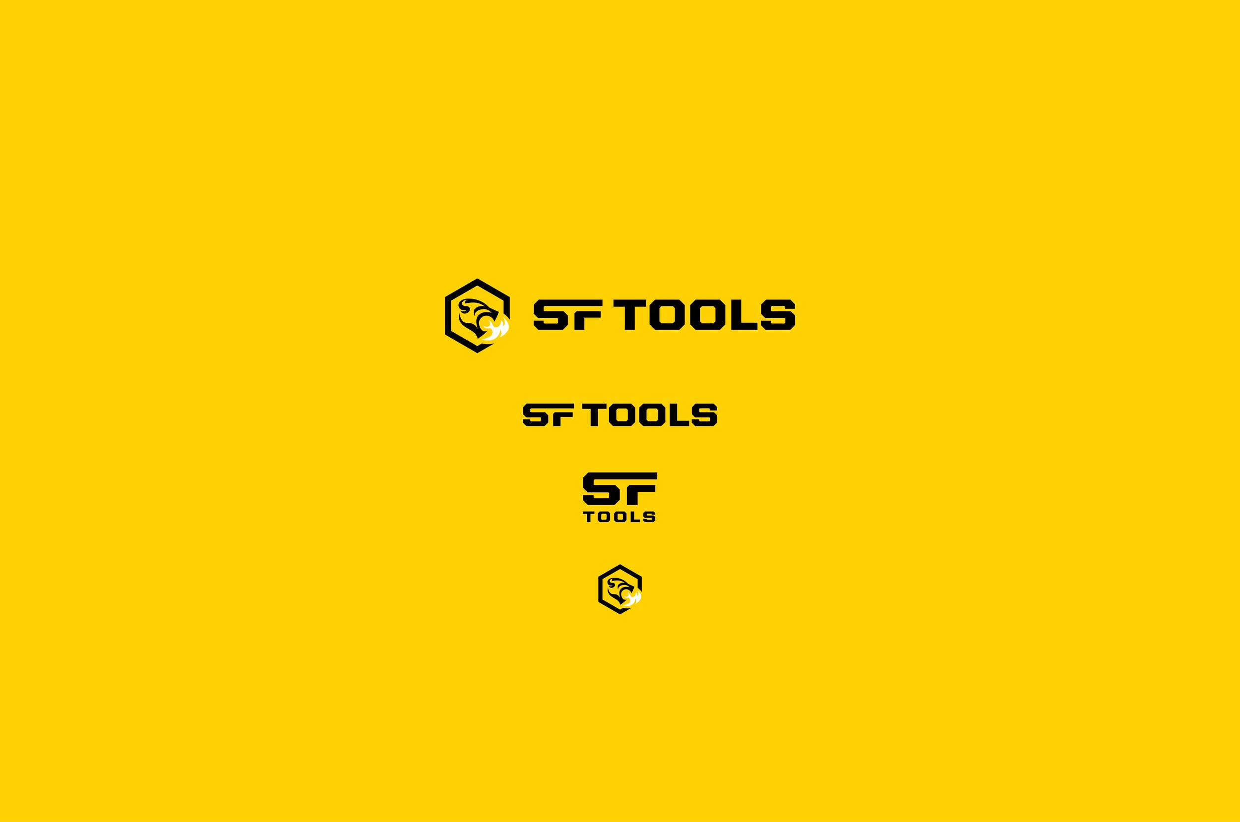
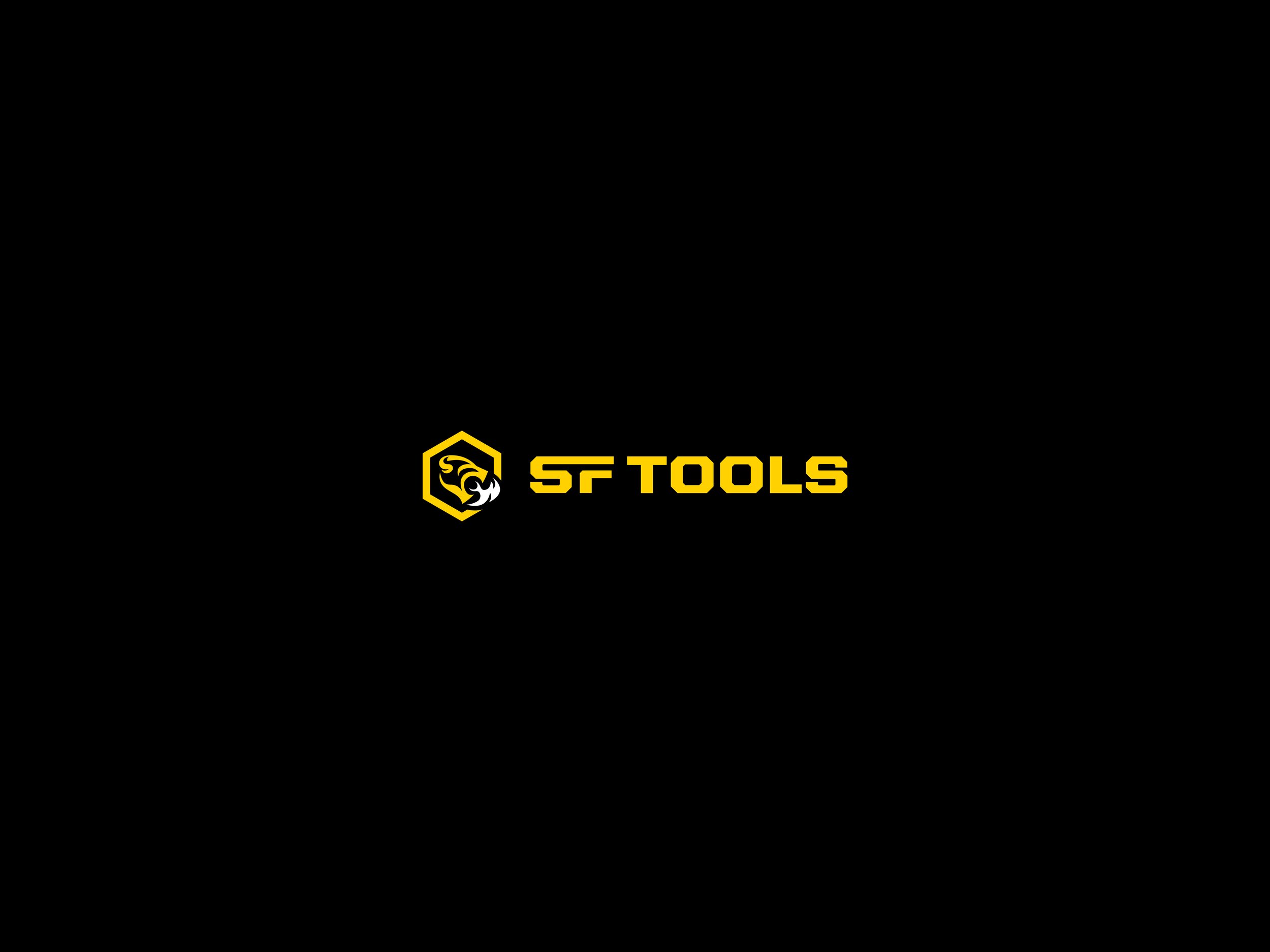
We lovingly refer to the updated logo as the “Demon,” a fire-breathing hellcat that represents the power and ferocity of the tools themselves. Its hexagonal container was inspired by the hex nuts that are found on most job sites and allowed us to integrate the logo into a kevlar-inspired pattern that could be leveraged as an additional design element. If you take a close look at the wordmark that accompanies the Demon, you might also notice that the shape of SF was inspired by the tools themselves.
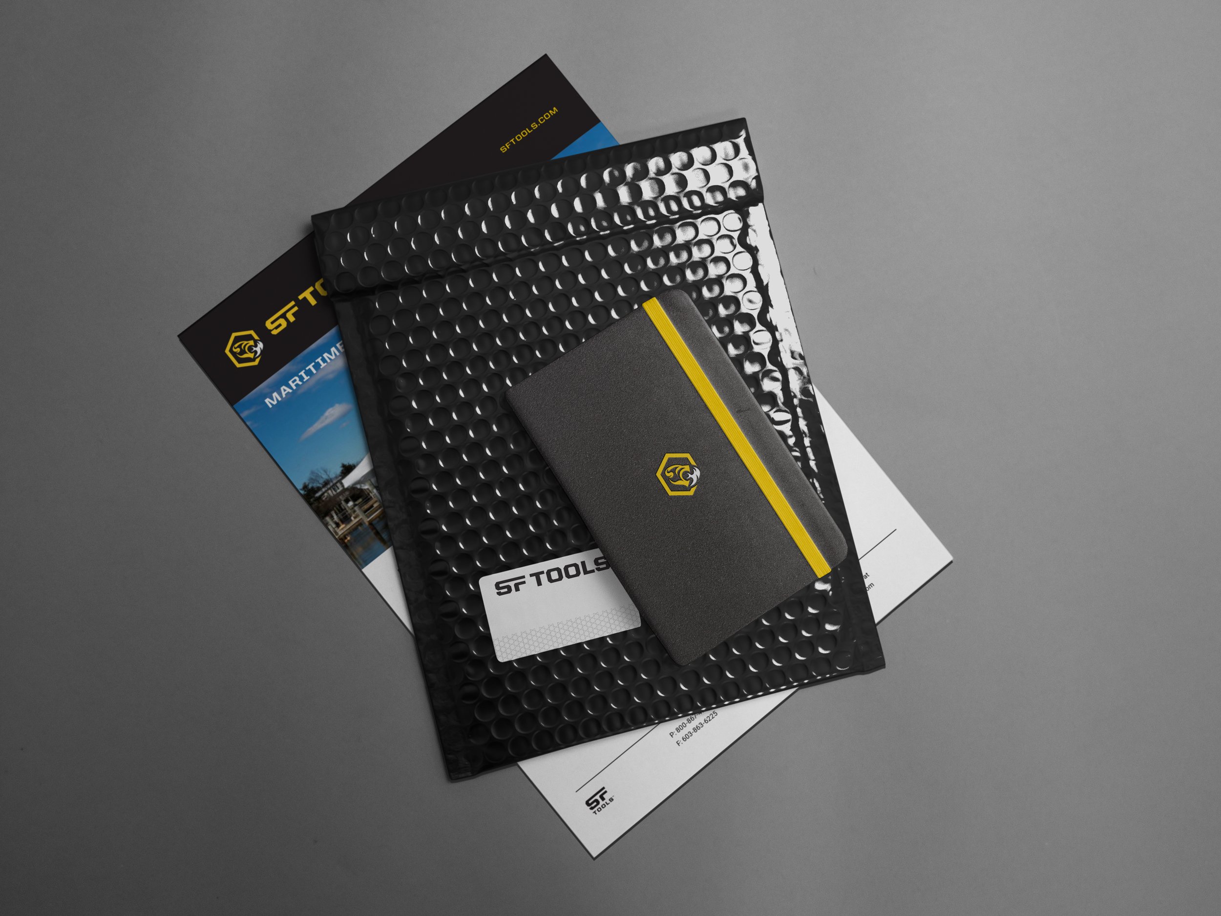
We created an entire design system for SF Tools that would ensure brand consistency across a variety of applications. We also took great care in making it as easy as possible for them to replicate the look and move the brand forward, even with limited marketing resources. We then applied that system across their brand essentials, from business cards, email signatures, and uniforms to product stickers, packaging, and their new and improved web experience.
The result was a tough, intelligent, and undeniably badass brand that did justice to its ferociously powerful tools, honored the tough guys they were made for, and opened new doors for a deserving industry leader.
Brand Visuals
Visual Identity
Logo Redesign
Logo Systems
Typography
Patterns & Iconography
Tool Decals
Packaging & Manuals
Staff Uniforms
Web Design
Photography Style
Sales Collateral