FONDA DE PAULA
Fonda de Paula is bringing the flavor of 1960s Mexico City to the suburbs.
-
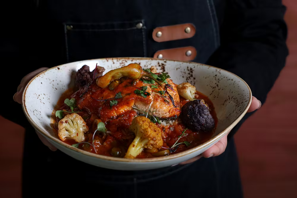
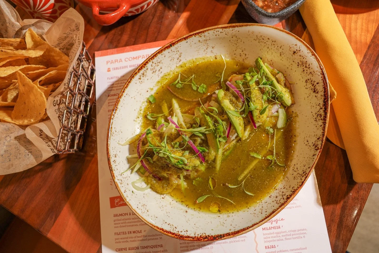
There are plenty of “Mexican” restaurants out there, but far too many rely on the tired, Americanized staples of tacos and tequila. Inspired by the recipes of Chef Juan’s grandmother served at her eatery in 1960s Mexico City, Fonda de Paula is an all-day eatery that shifts the narrative by bringing friends and families together to experience the flavors of Mexico more authentically.
Foodworks Hospitality Group selected EightySeven based on their experience in the space to craft a comprehensive brand identity that could honor Paula’s legacy and entice diners to spice things up with a more fun, traditional, and flavor-forward all-day Mexican experience.
Our Services
(87)BrandFusion
Brand Focus
Brand Strategy
Verbal Identity
Visual Identity
Photography by: Two Top Creative
Design support: Atla Design


(01) Brand Focus
Great brands start with great ingredients.
-
With Fonda de Paula, the main ingredient was the authentic brand story that inspired it. Chef Juan is an icon of the Foodworks Hospitality Group. His menus have launched and sustained several incredibly successful restaurant concepts, most notably the Mago Grill chain.
Chef Juan and the Foodworks team had their eyes (and stomachs) set on a concept that honored the woman who had inspired Juan to get into cooking in the first place, his grandmother, Doña Paula.
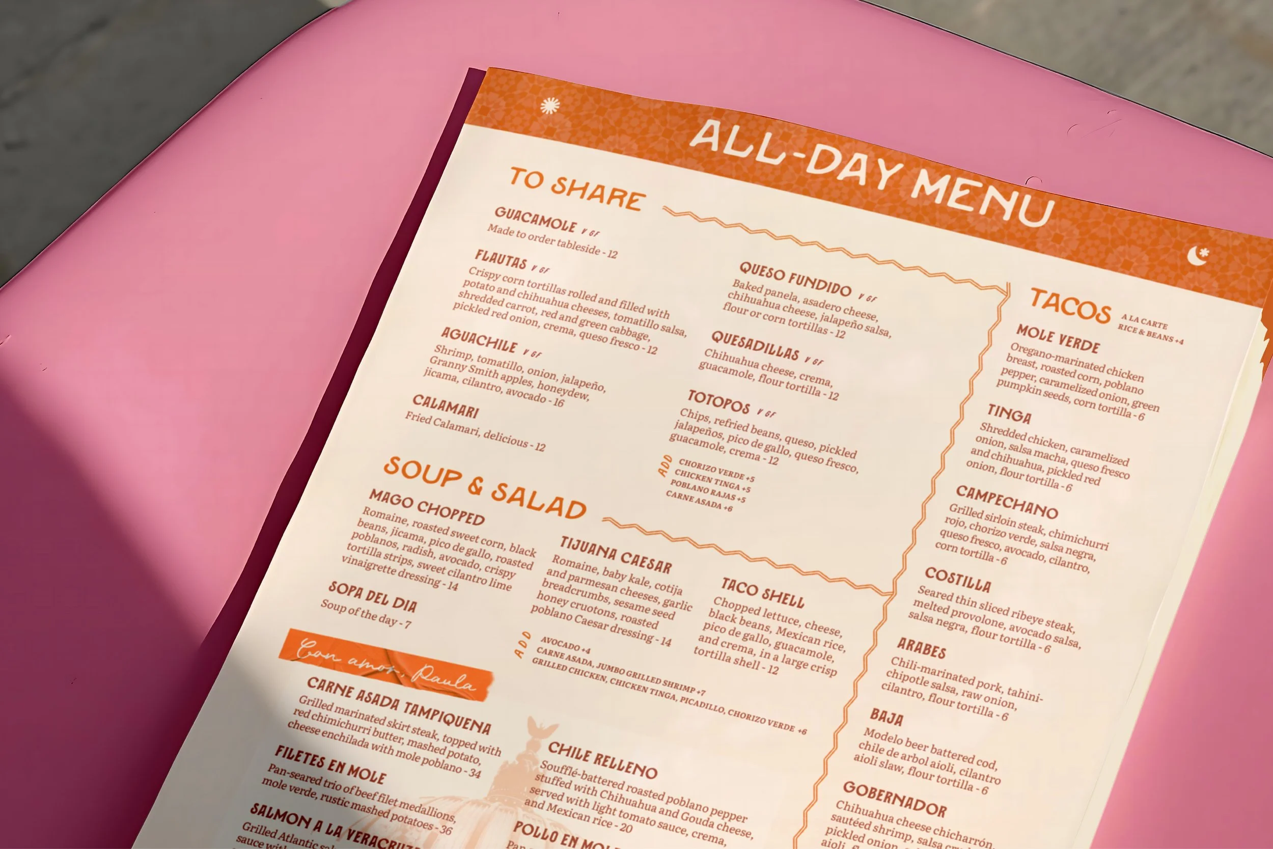
Paula fed her neighborhood at her all-day eatery in the heart of Mexico City during the 1960s and 1970s. Her Fonda (”eatery”) was more than tacos and tequila, and it wasn’t limited to lunch or dinner. It was a place where friends and family could come together for all-Mexican flavor all day long, whether it was breakfast, lunch, or dinner. This all-day concept was central to the story we wanted the restaurant to tell.
During our Brand Focus workshop, we delved into the details of her story, gaining insight into who she was and what she was known for, so we could infuse the essence of Paula and her Fonda into the soul of the restaurant.
Most importantly, we wanted to ensure the concept and offering aligned with the needs of the surrounding community and customer base. Connecting the pastry and coffee program with commuters and reinforcing the all-day concept to attract a breakfast customer to dinner and vice versa.
BrandFocus Workshop
Brand Core & Audit
Vision, Mission, & Values
Audience & Personality
87BrandSpark
Brand Action Items
Photography by: Two Top Creative
(02) Brand Design → Visuals
A look that brings a lot to the table.
-
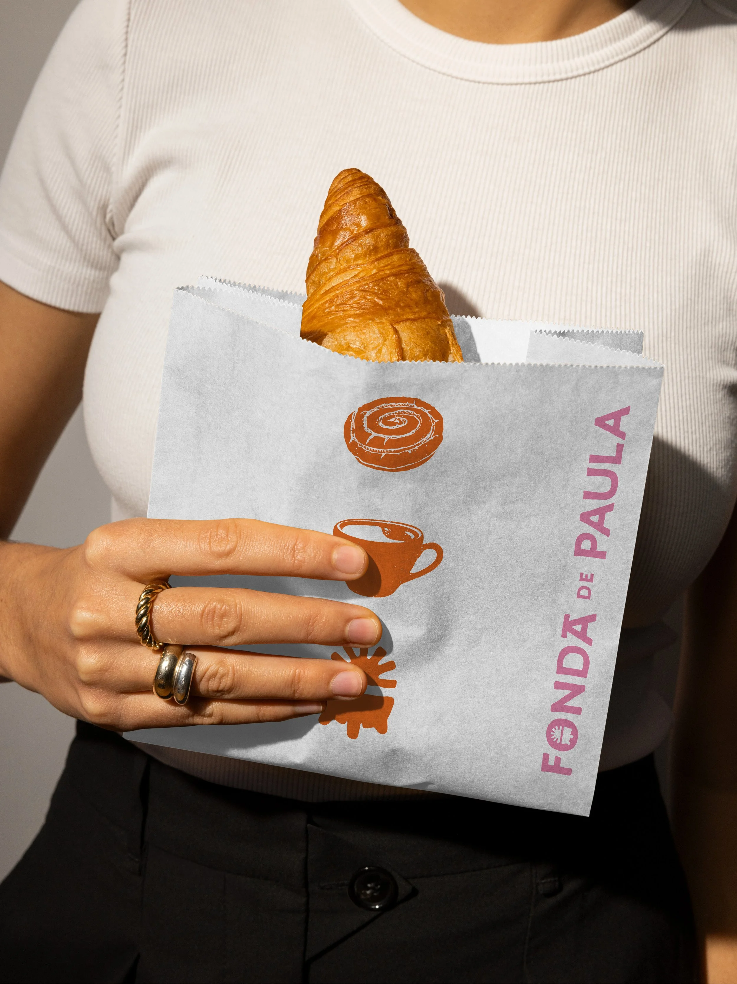
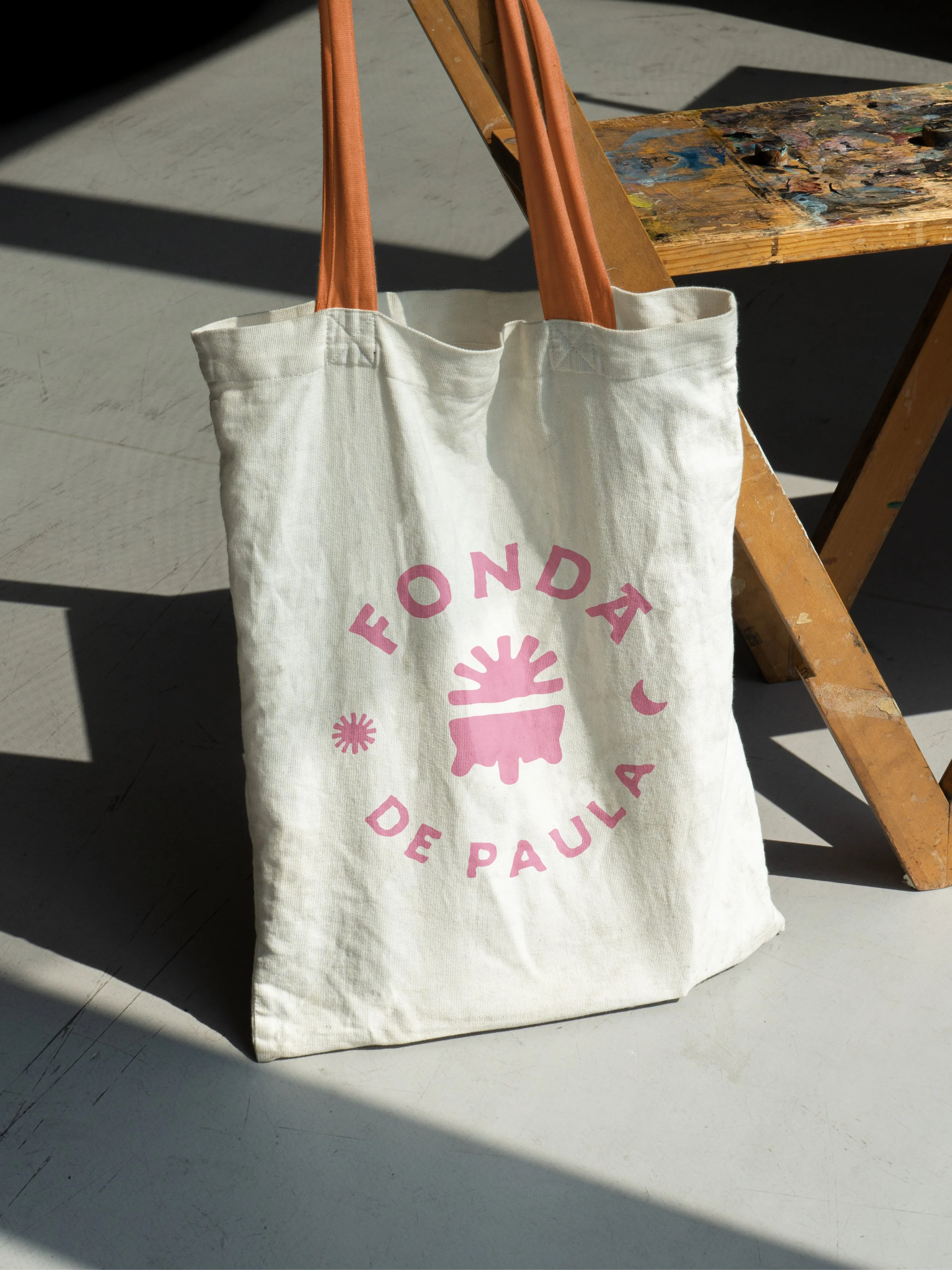
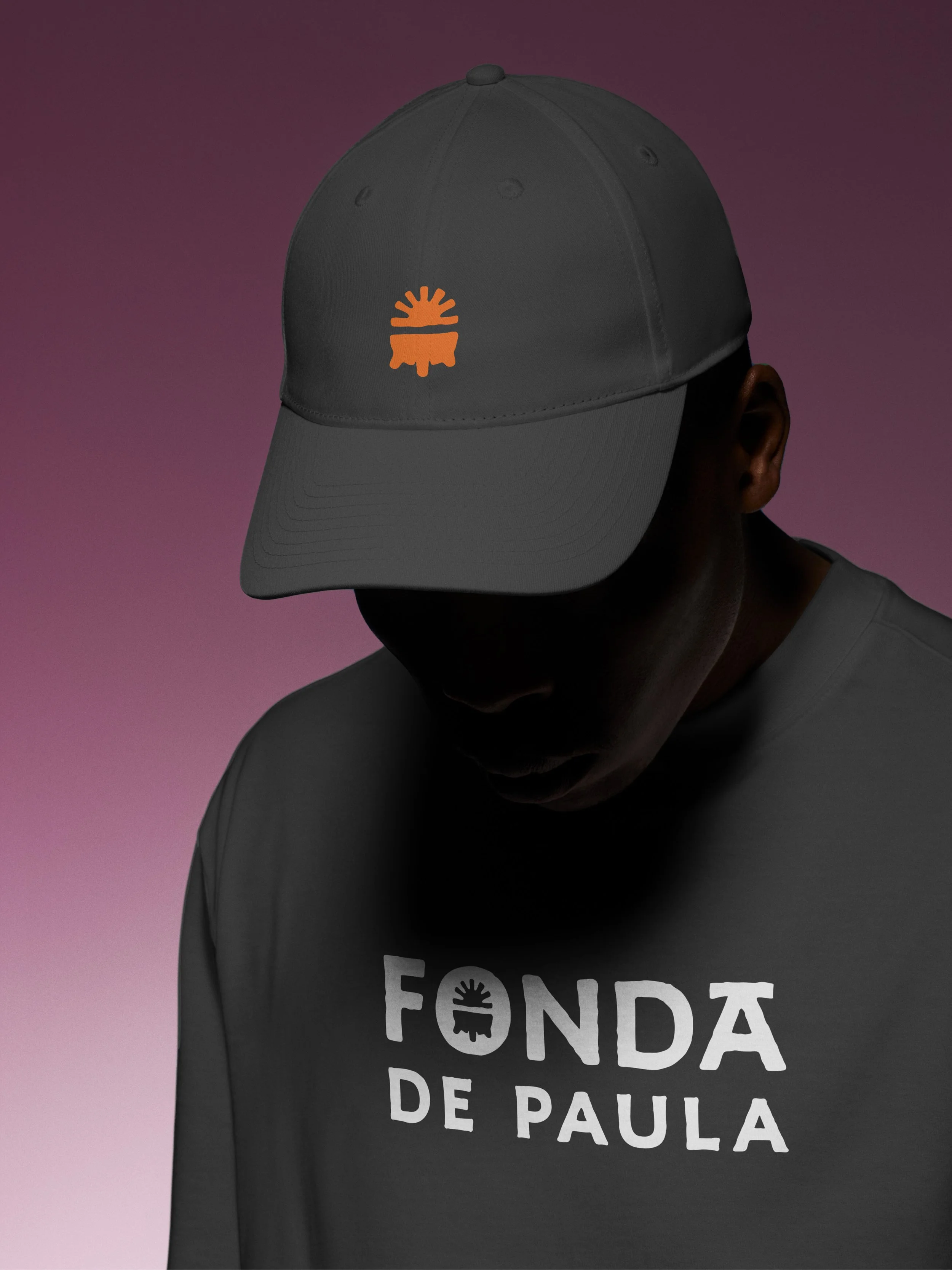
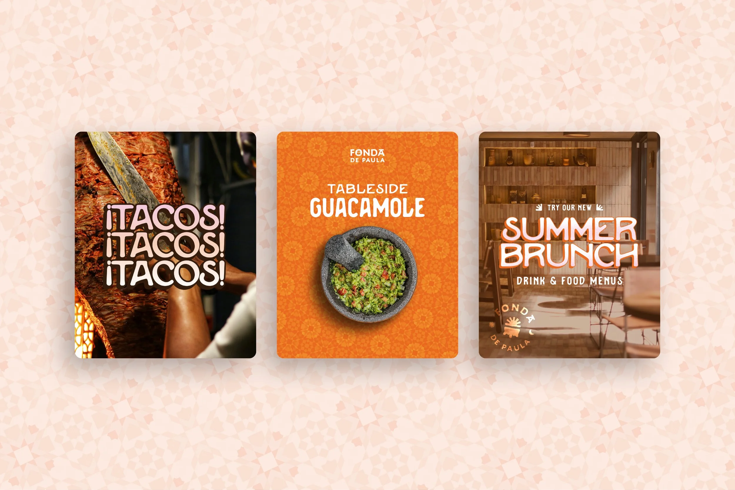
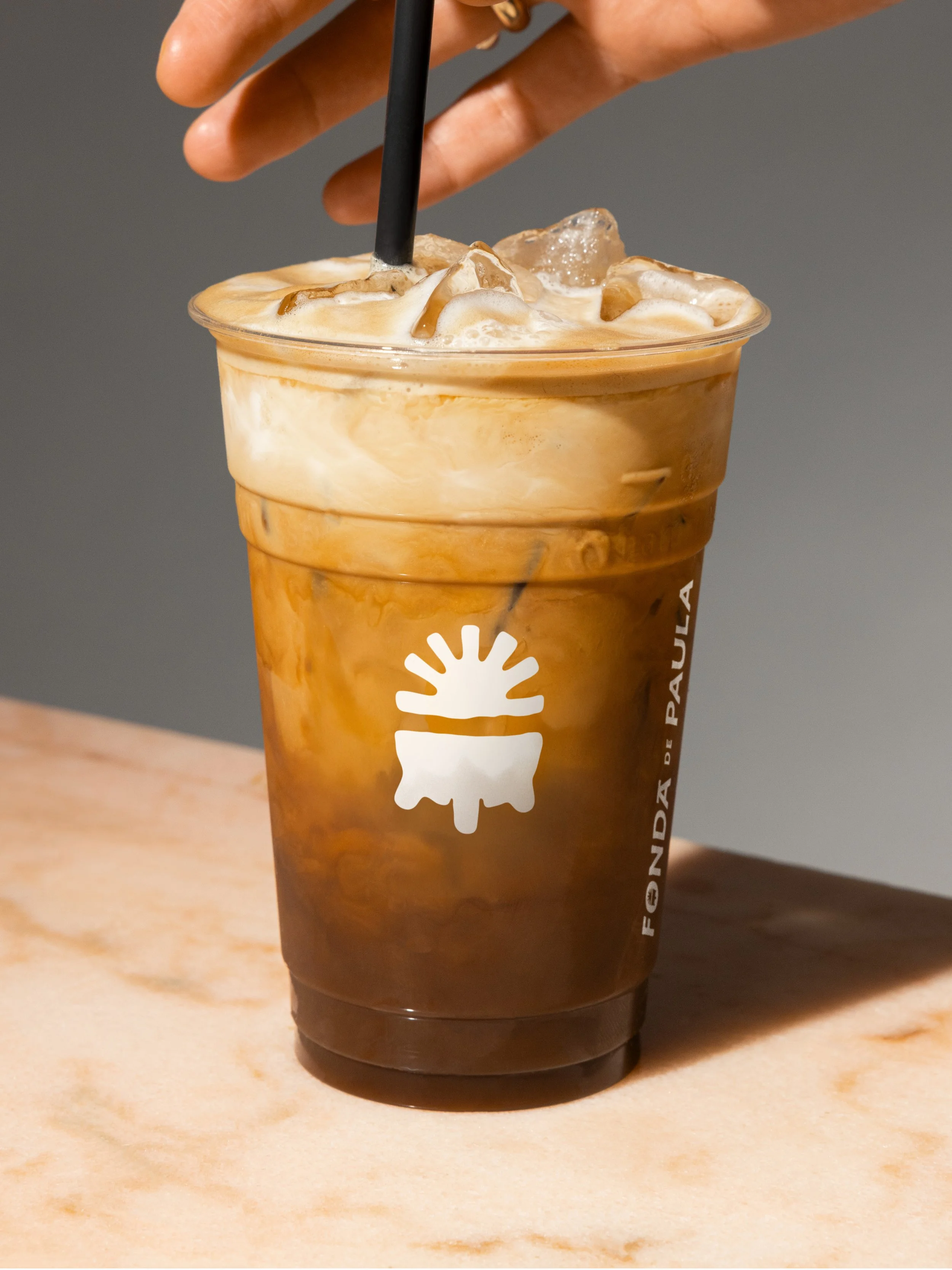
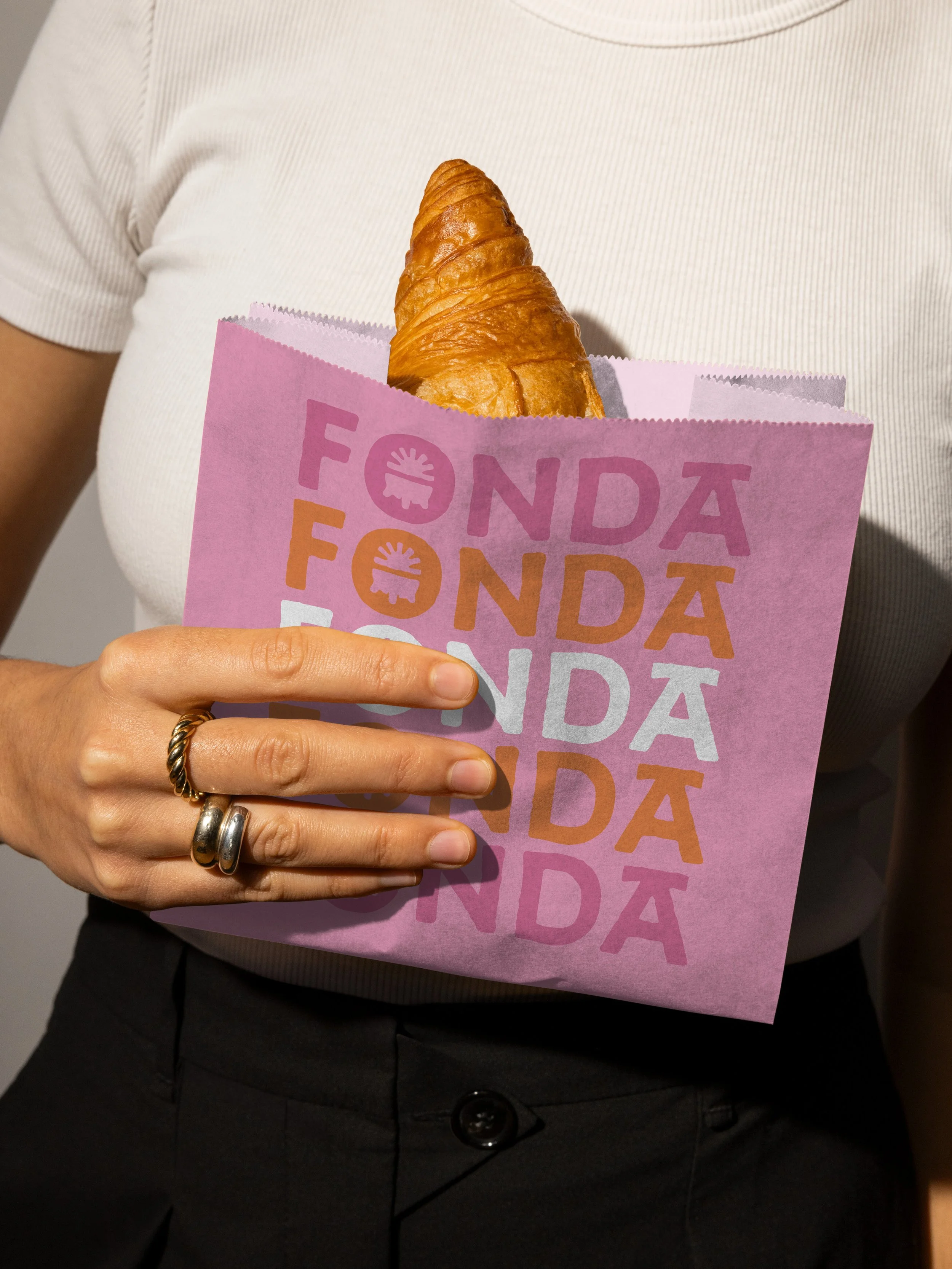
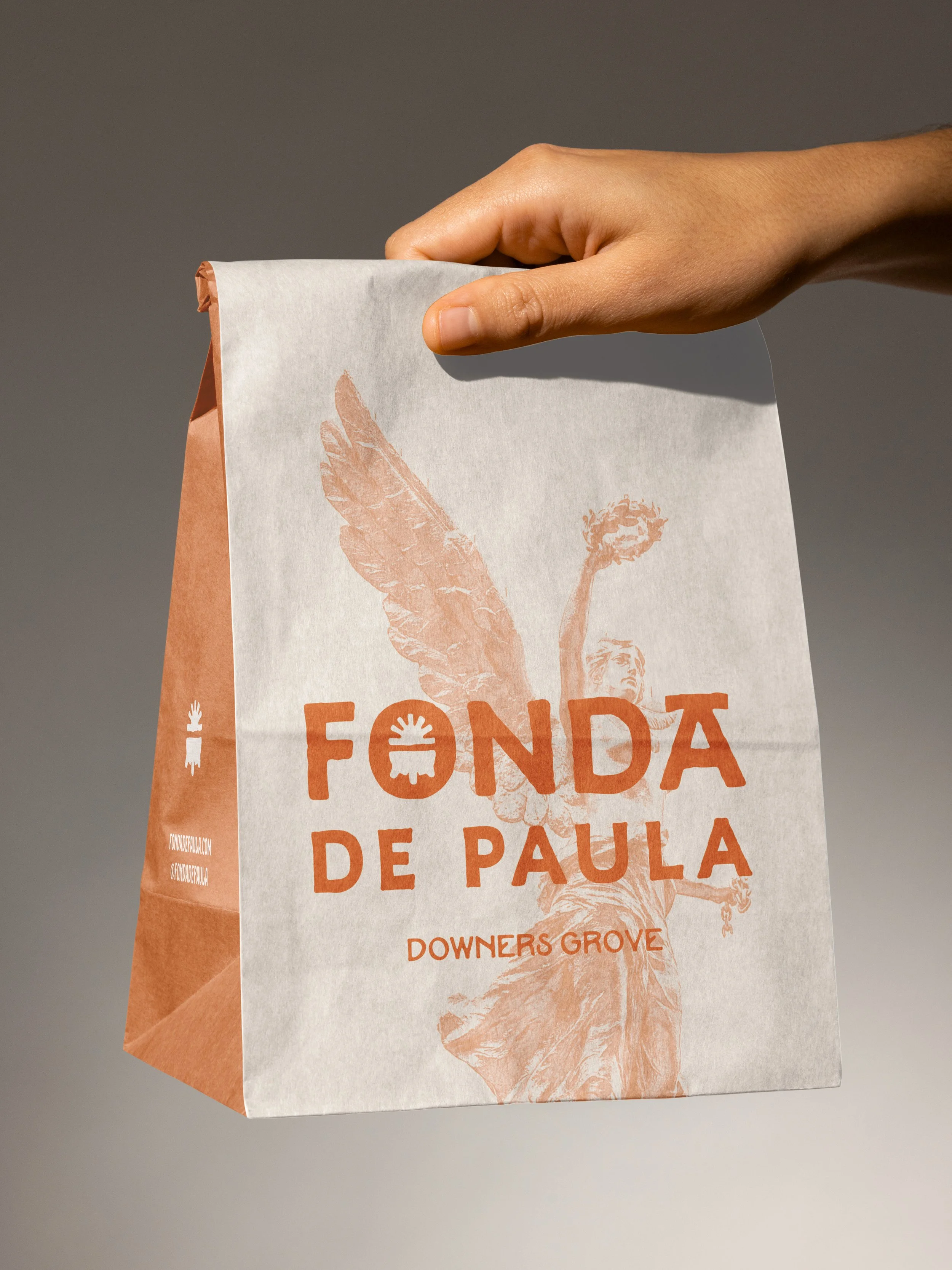
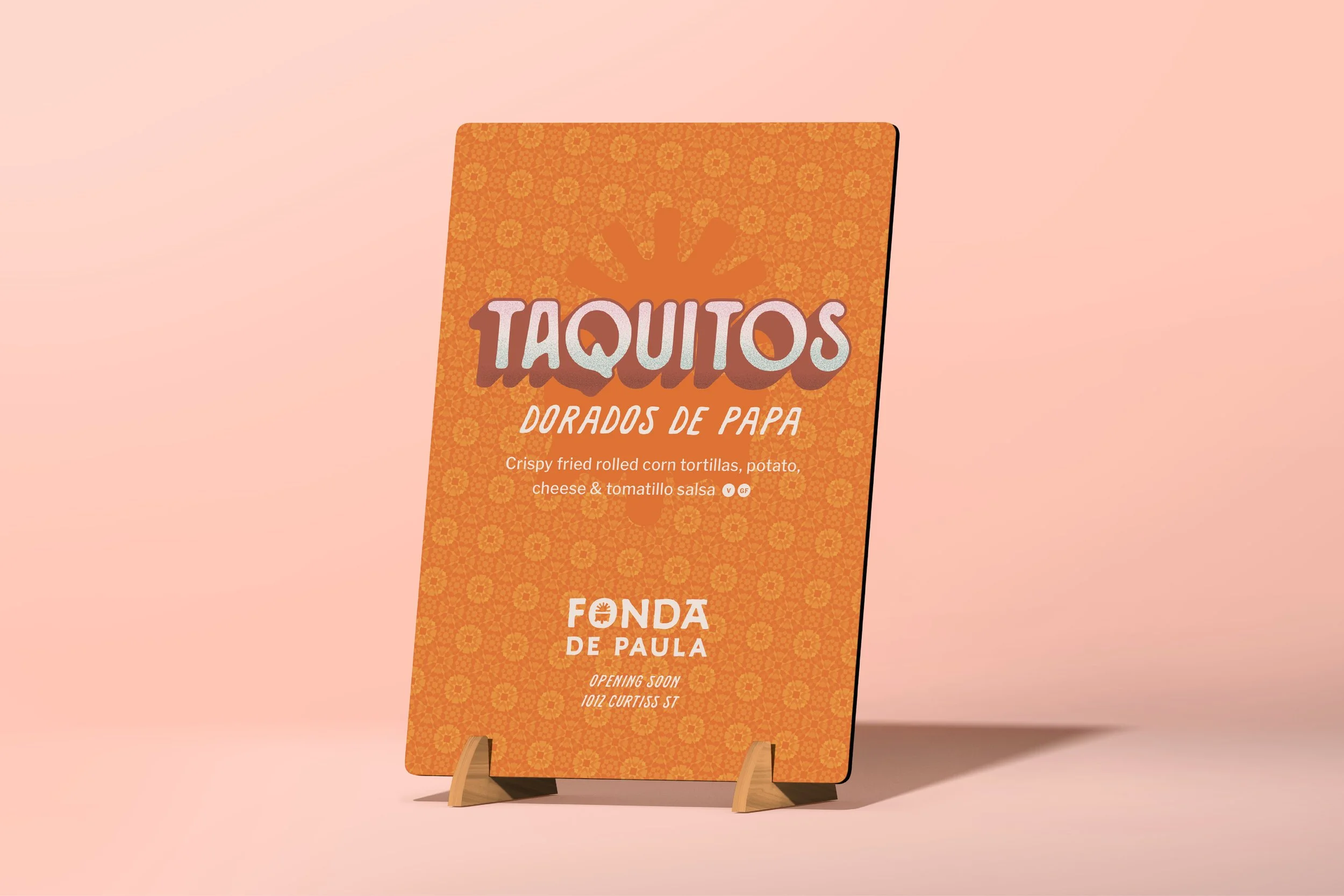
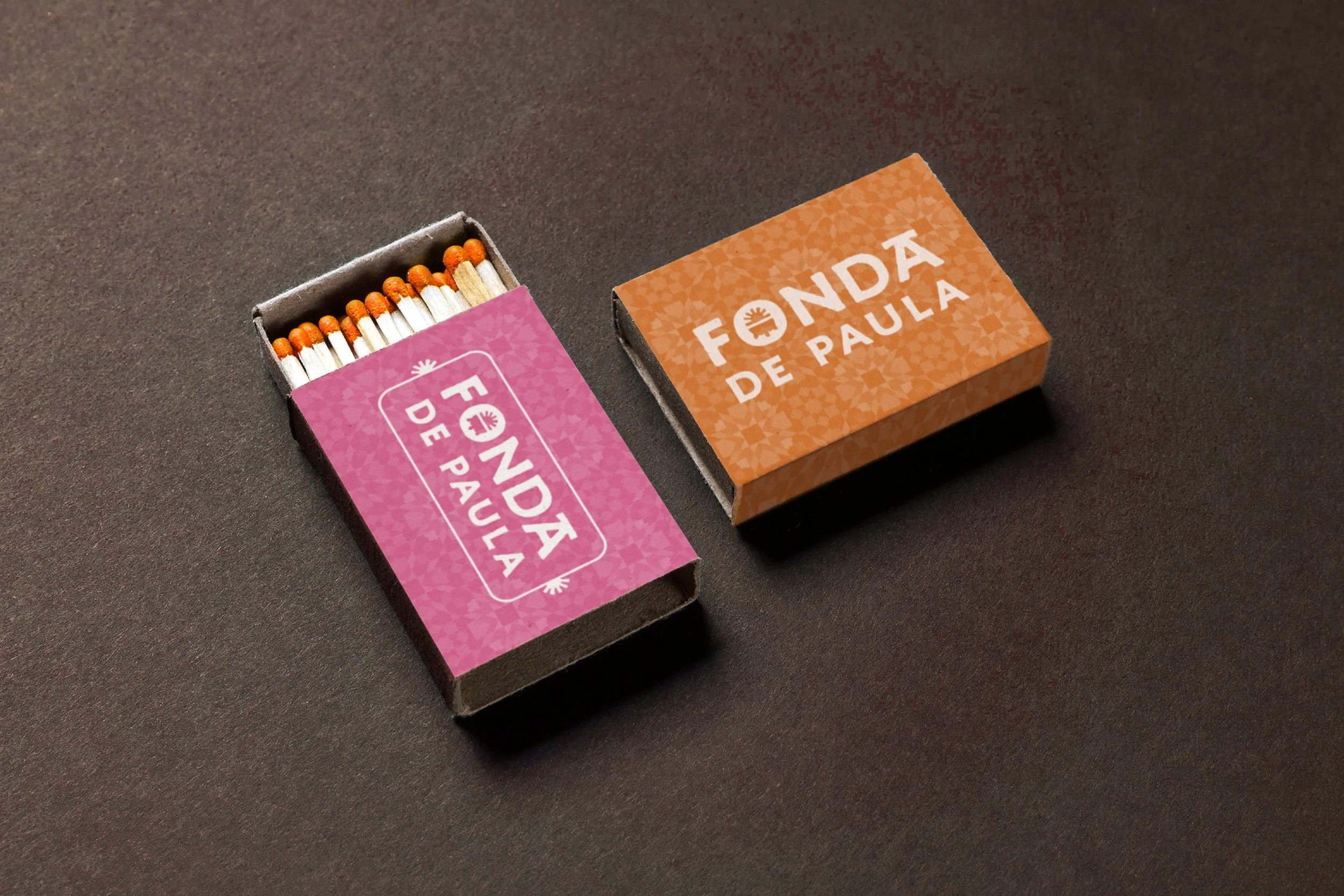
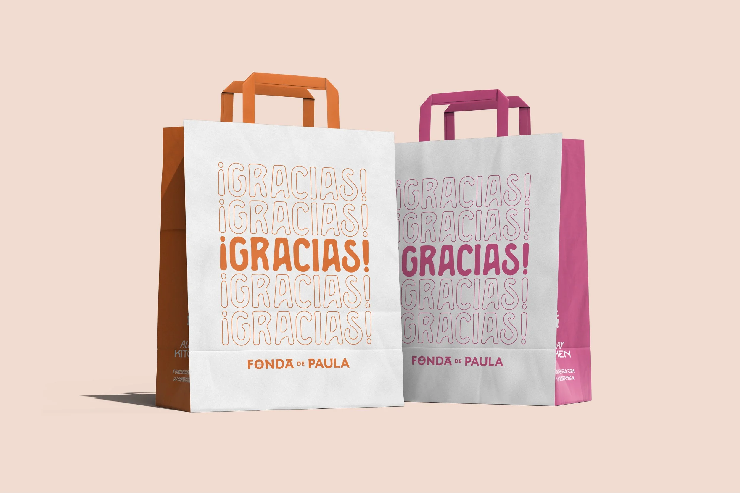
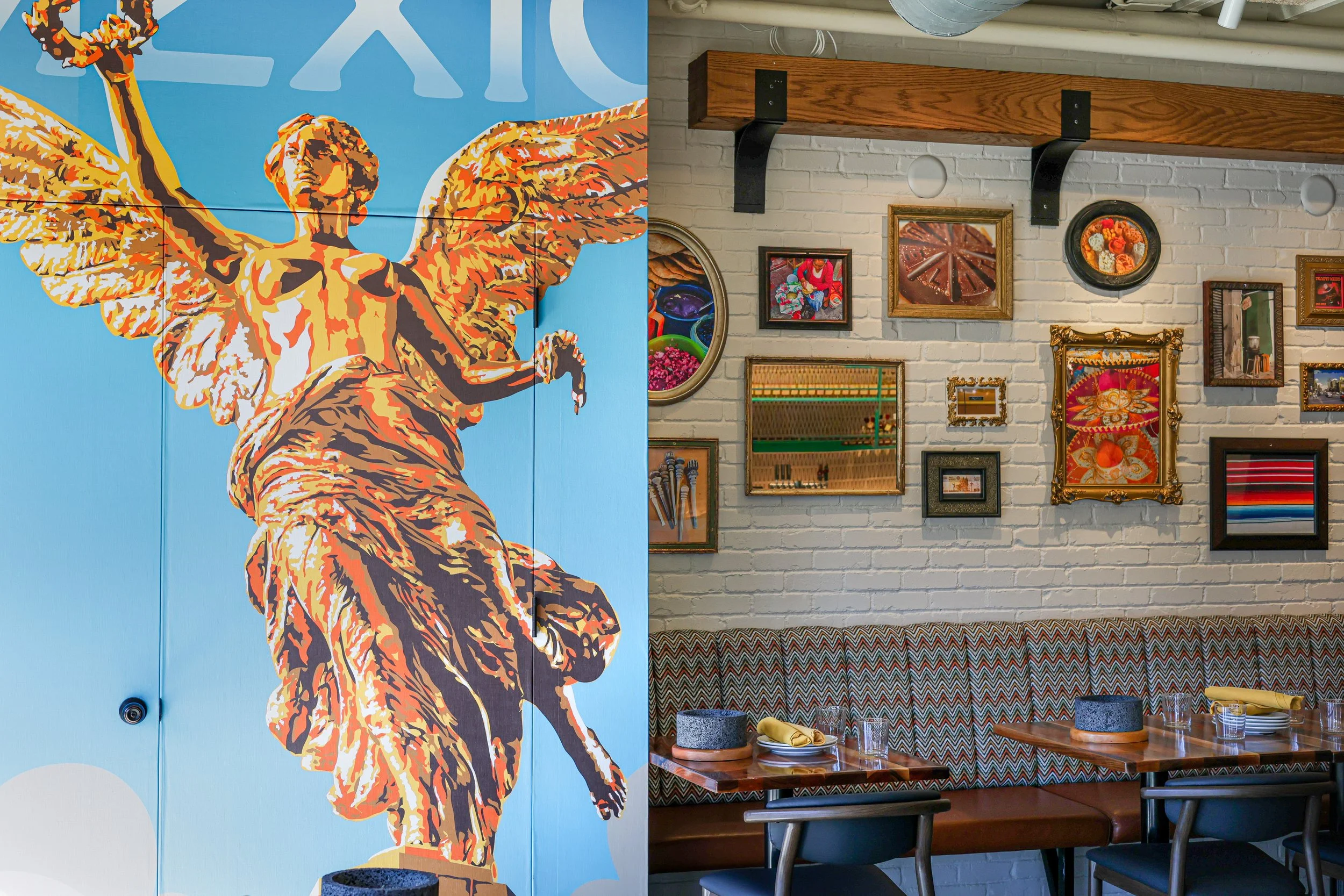
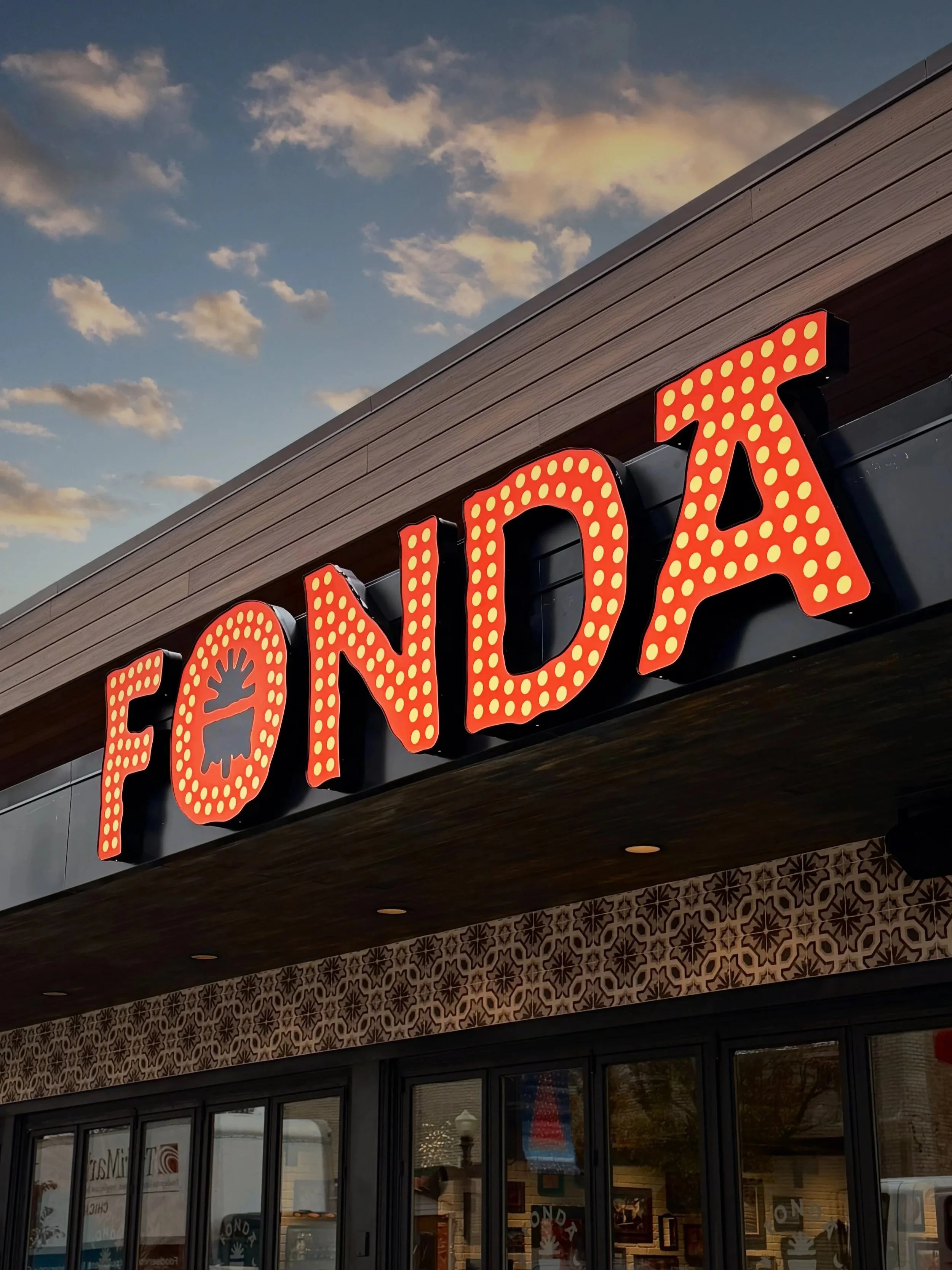
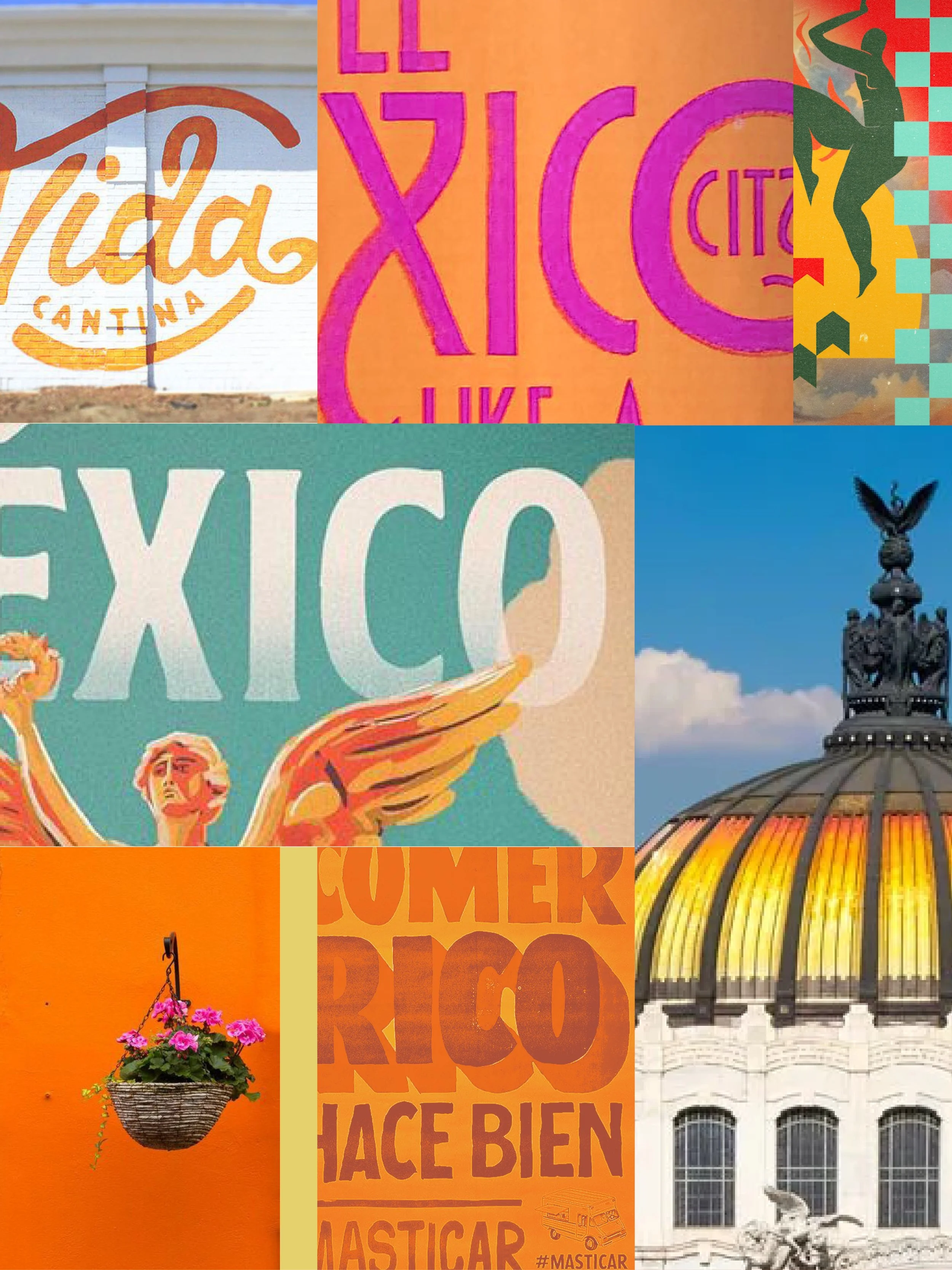
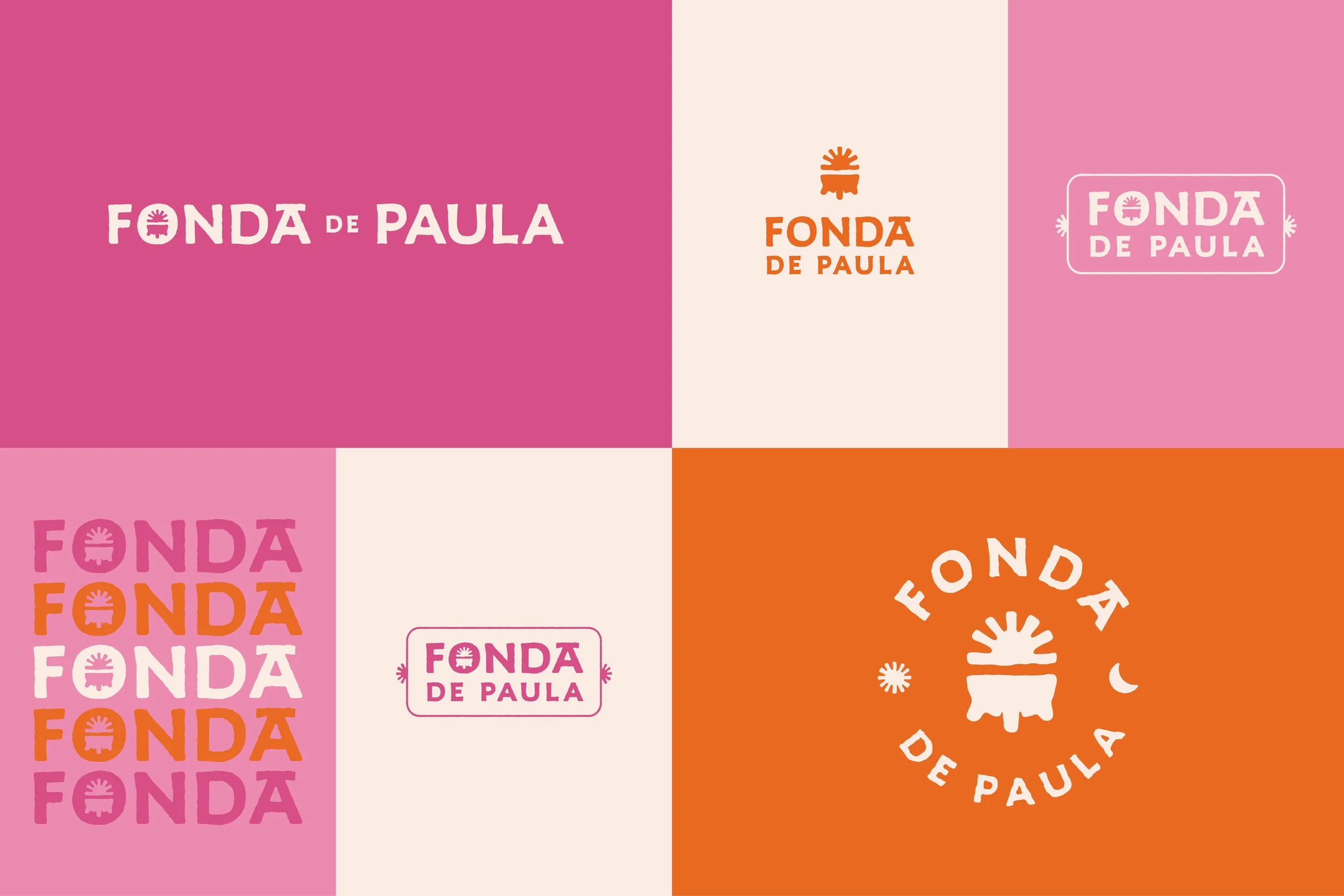
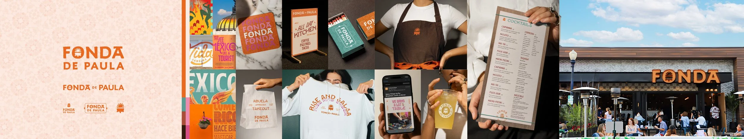
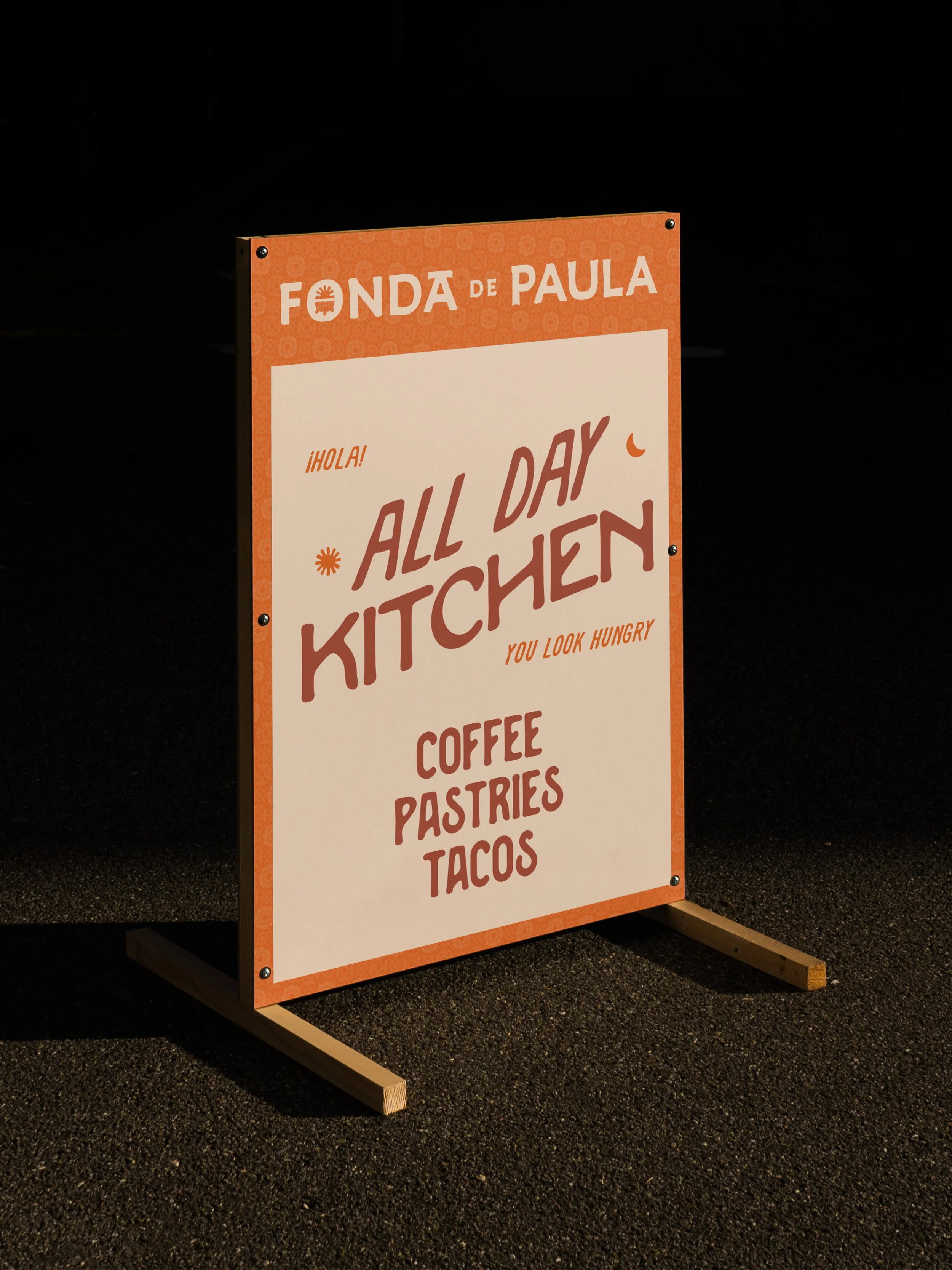
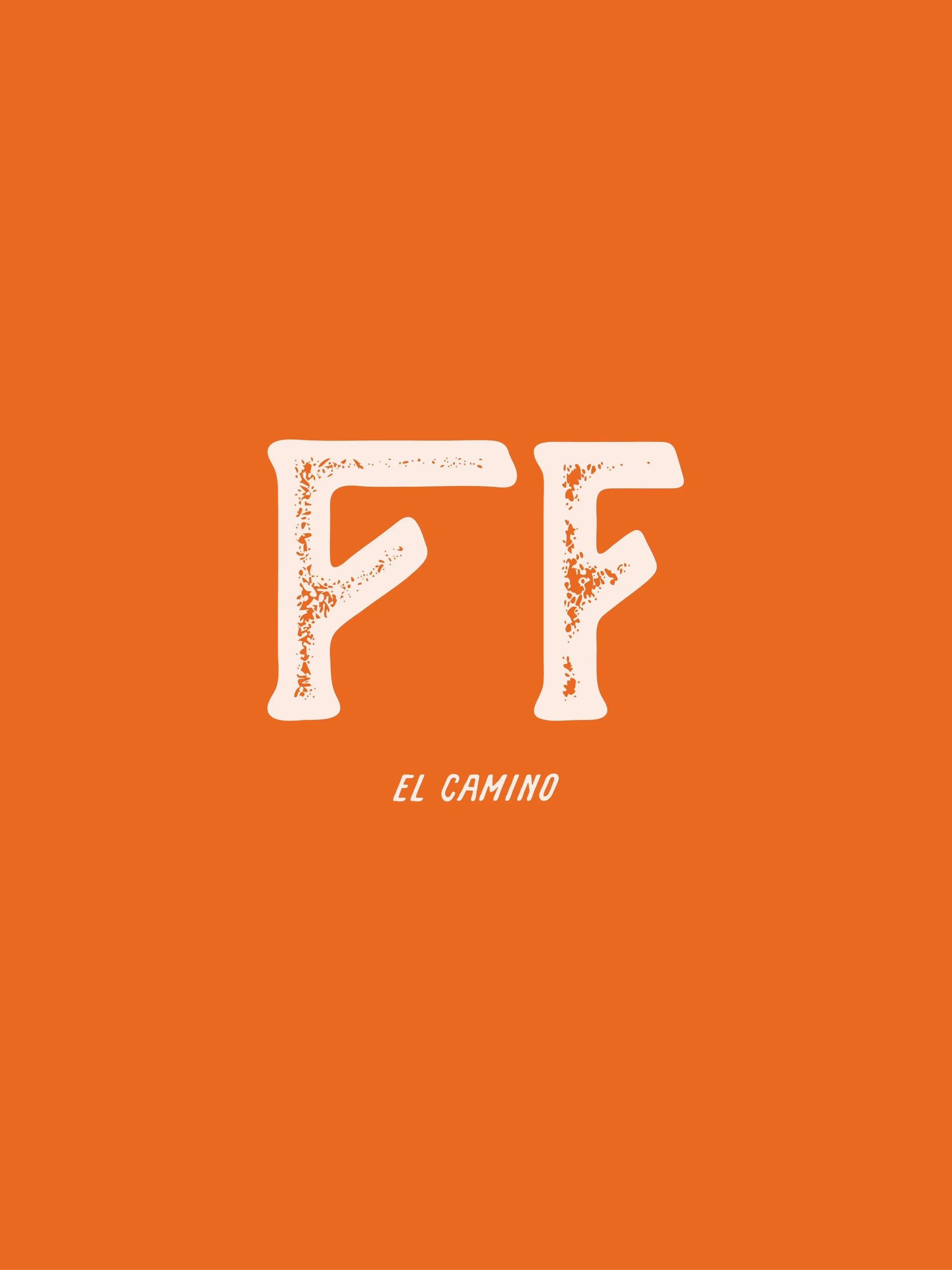
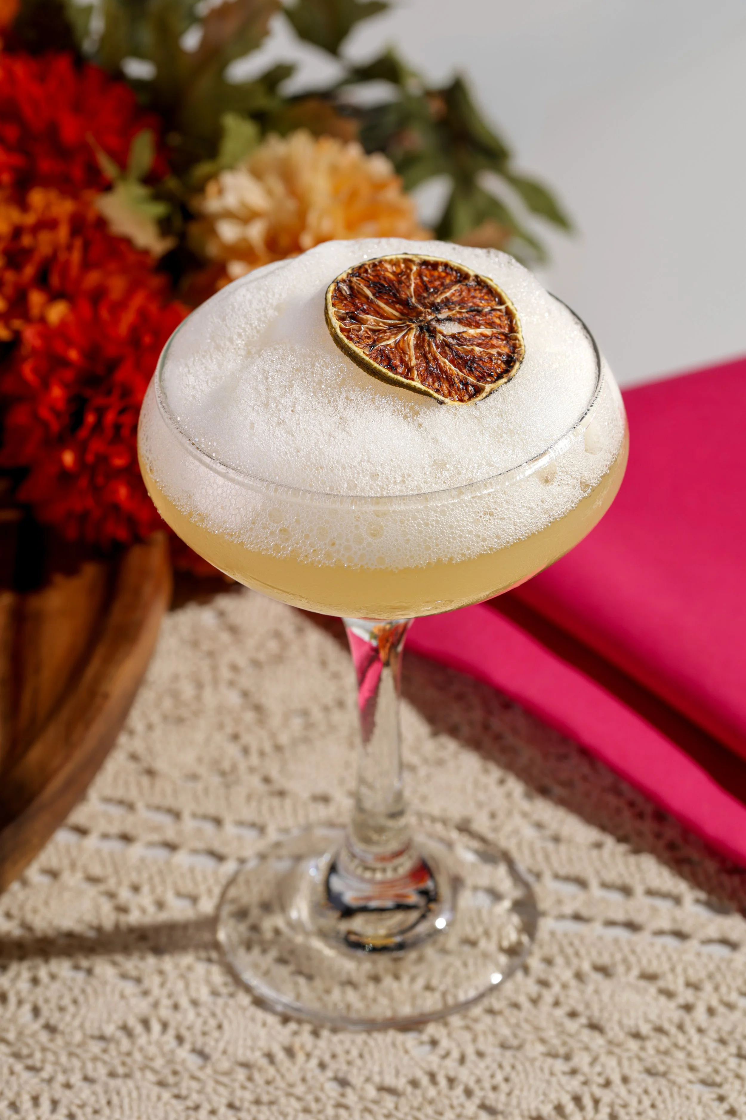
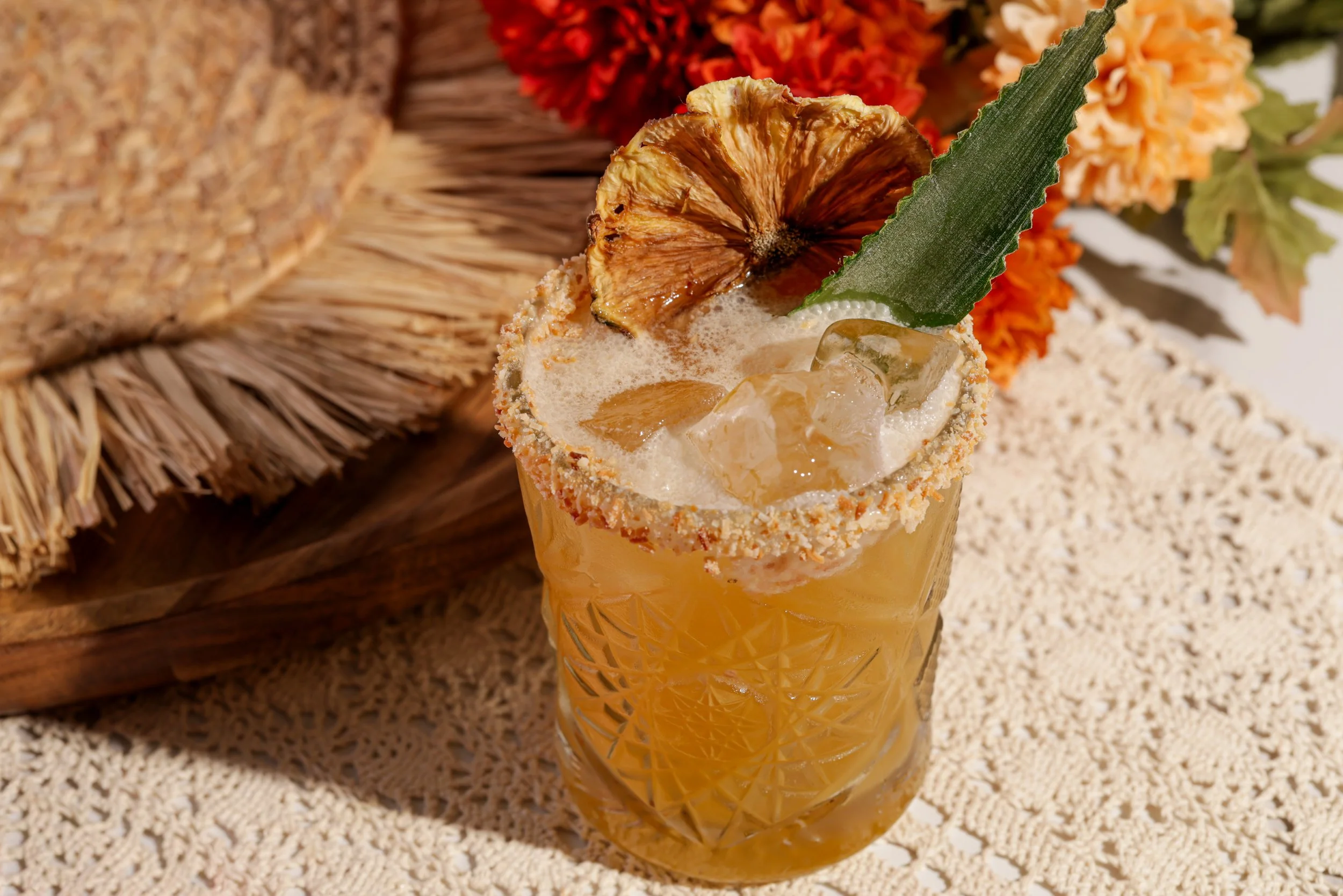
Like the restaurant itself, the visual identity caters to a variety of needs. One of the specialties of Fonda de Paula is the handmade guacamole, prepared right at the table. We carried this idea into the brand’s logo suite, featuring a traditional Mexican molcajete with a sun that symbolized the all-day nature of the restaurant’s offerings.
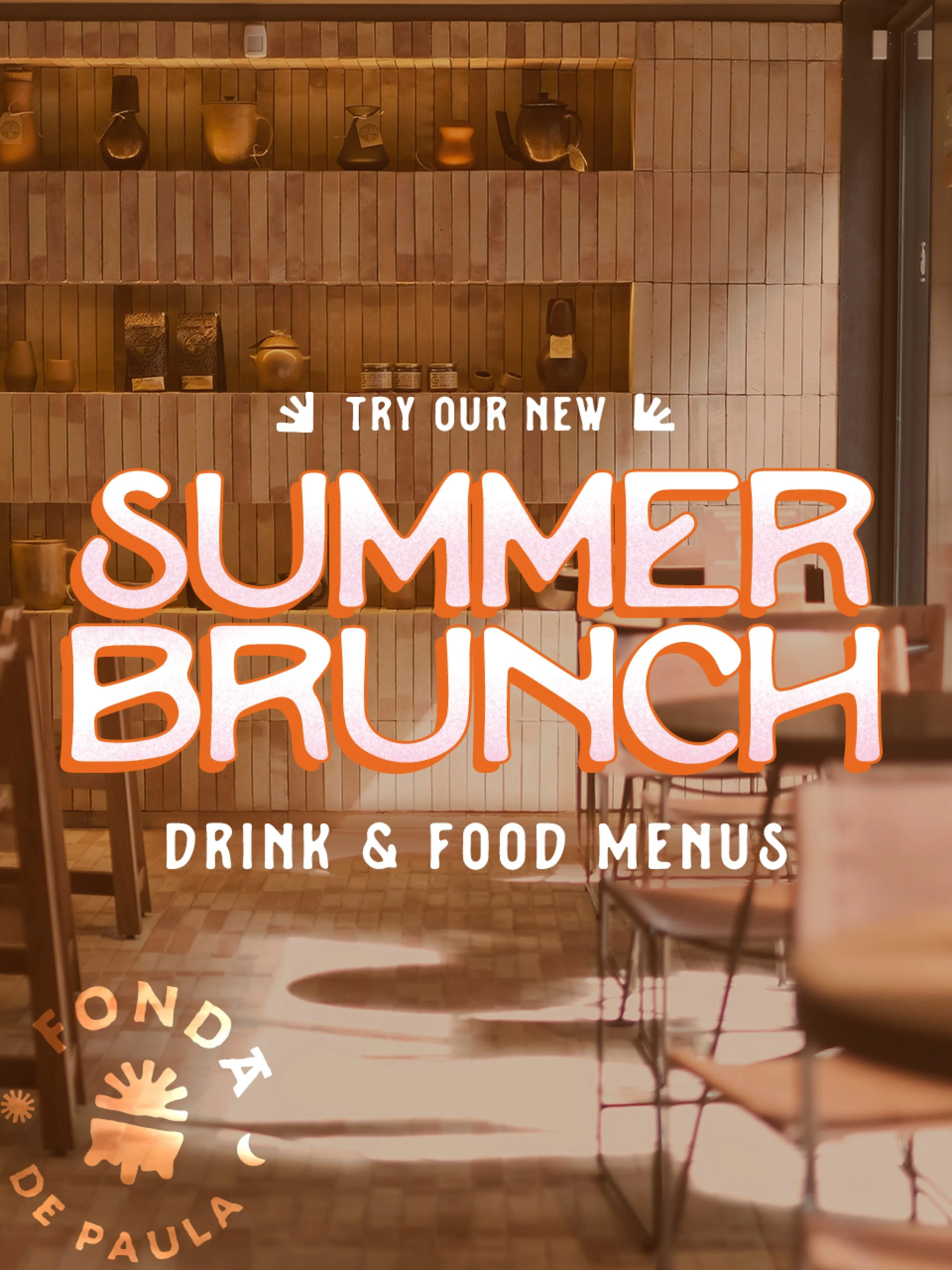
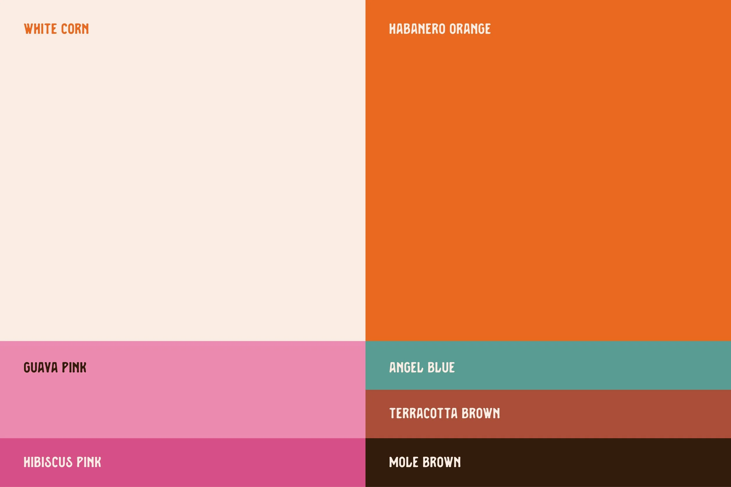
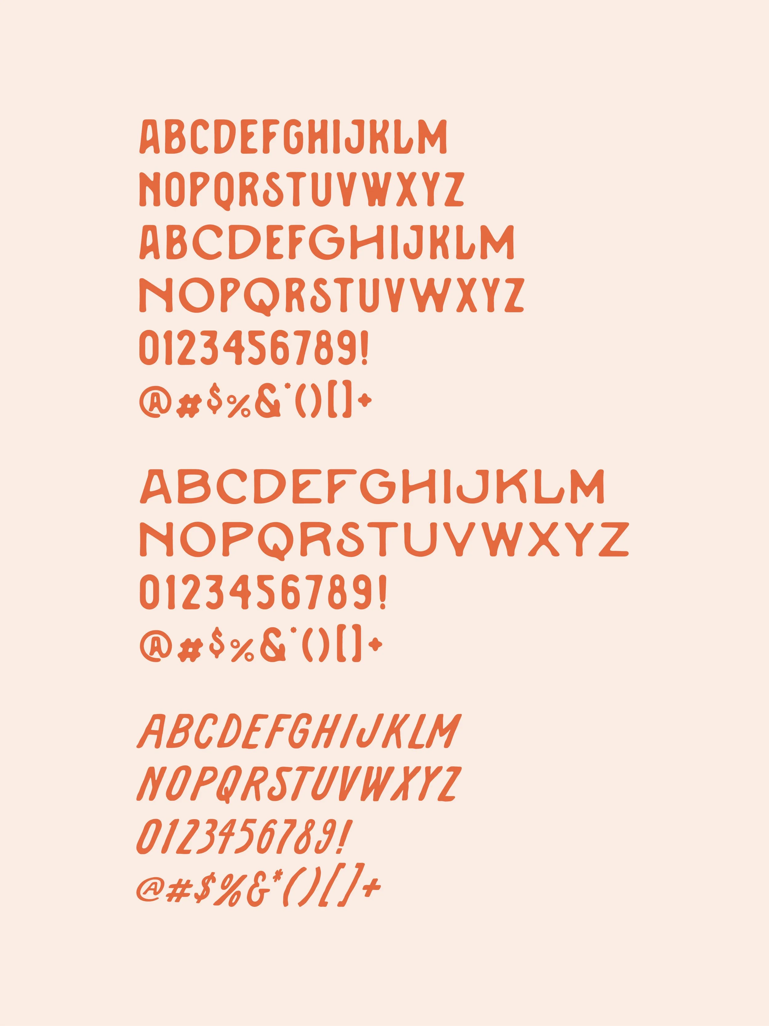
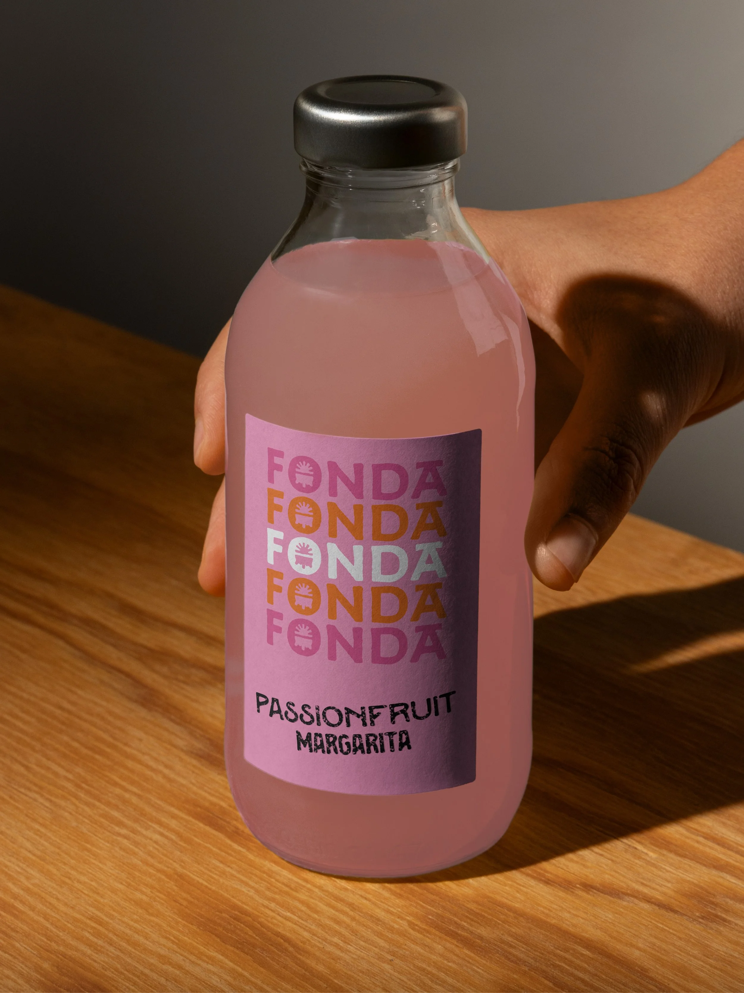
To provide a sense of consistency and flexibility, we developed a responsive logo system allowing the brand marks to scale up and down in size, depending on the context in which they’re used, from large-format signage to smaller applications on cups and napkins. And when it came to the larger visual identity, we leaned heavily into the spirit of 1960s Mexico City, from the warm, vibrant pink and orange colors to the tiled textures, vintage photography, and typography with a handmade touch.
Brand Storyboards
Visual Identity
Art Direction
Motion
Graphic Elements & Iconography
Typography
Photography Style
Brand Guidelines
“Working with the EightySeven team brought structure and clarity to our branding work, guiding us through each phase with a balance of strategy and design focus. Their process helped capture our vision and express it consistently across brand elements.”
Daniela Carrera, Marketing Director, Foodworks Hospitality Group


(02) Brand Design → Voice
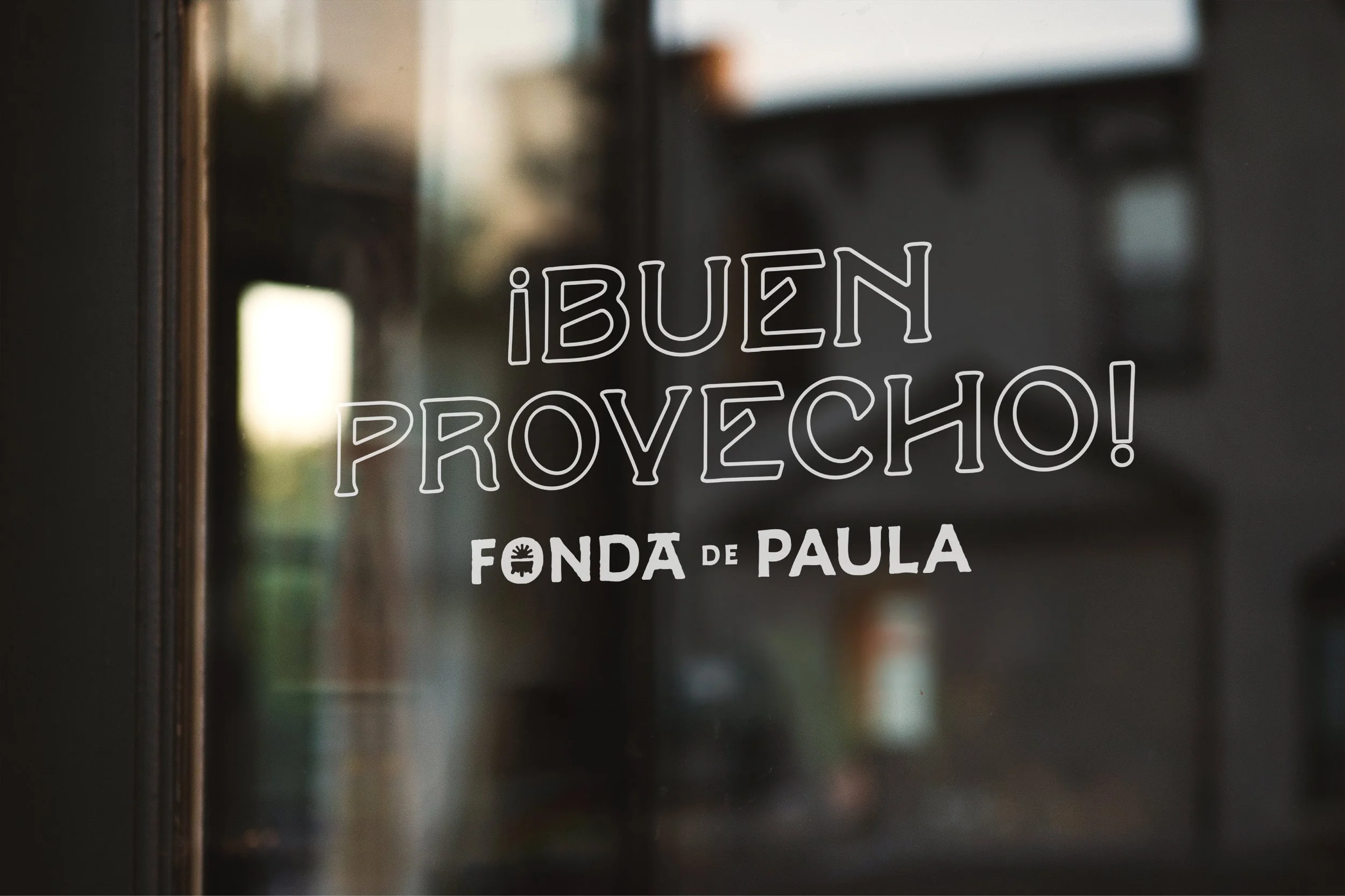
France has bistros, Italy has trattorias, America has diners, México has fondas.
-
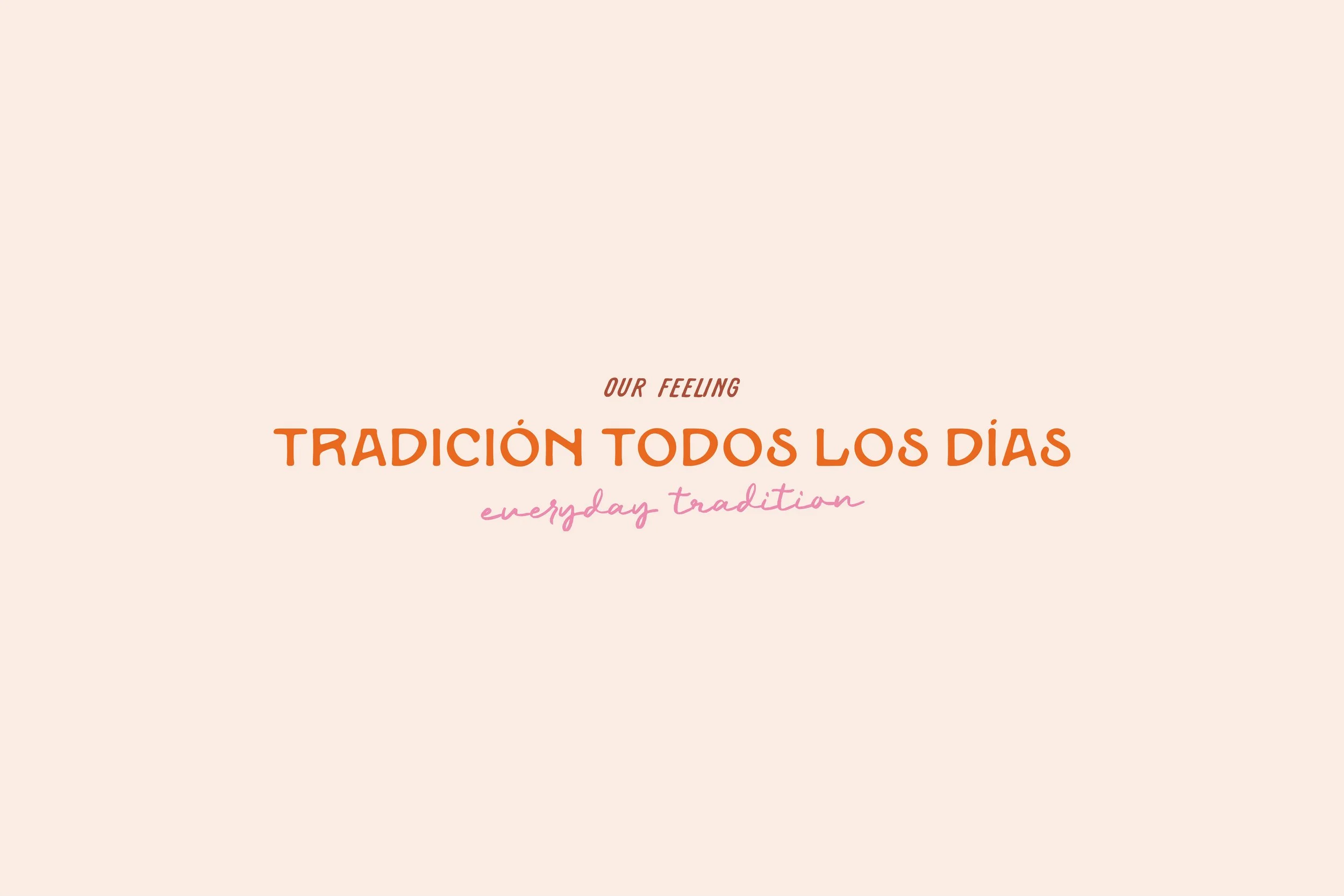
Several factors contributed to the creation of Fonda de Paula's personality. The voice was part Pati Jinich. Proud, but not patronizing, with a strong, welcoming sense of heritage, with the vibrance and energy of a Mexican market and the warmth and textural nostalgia of Abuela’s apron. Overall, we wanted the voice to convey a sense of fun and pride, with the warmth and comfort of a family kitchen.
We helped the team distill their story into its simplest form and provided a host of fun, playful lines for various applications. As Fonda de Paula is a restaurant, we aimed to keep the language brief yet evocative, so it could work in harmony and whet appetites alongside the visual design.
Name Consulting
Brand Voice Guidelines
Brand Language Toolkit
Brand Story


(03) Brand Activation
From the heart of CDMX to DG.
-
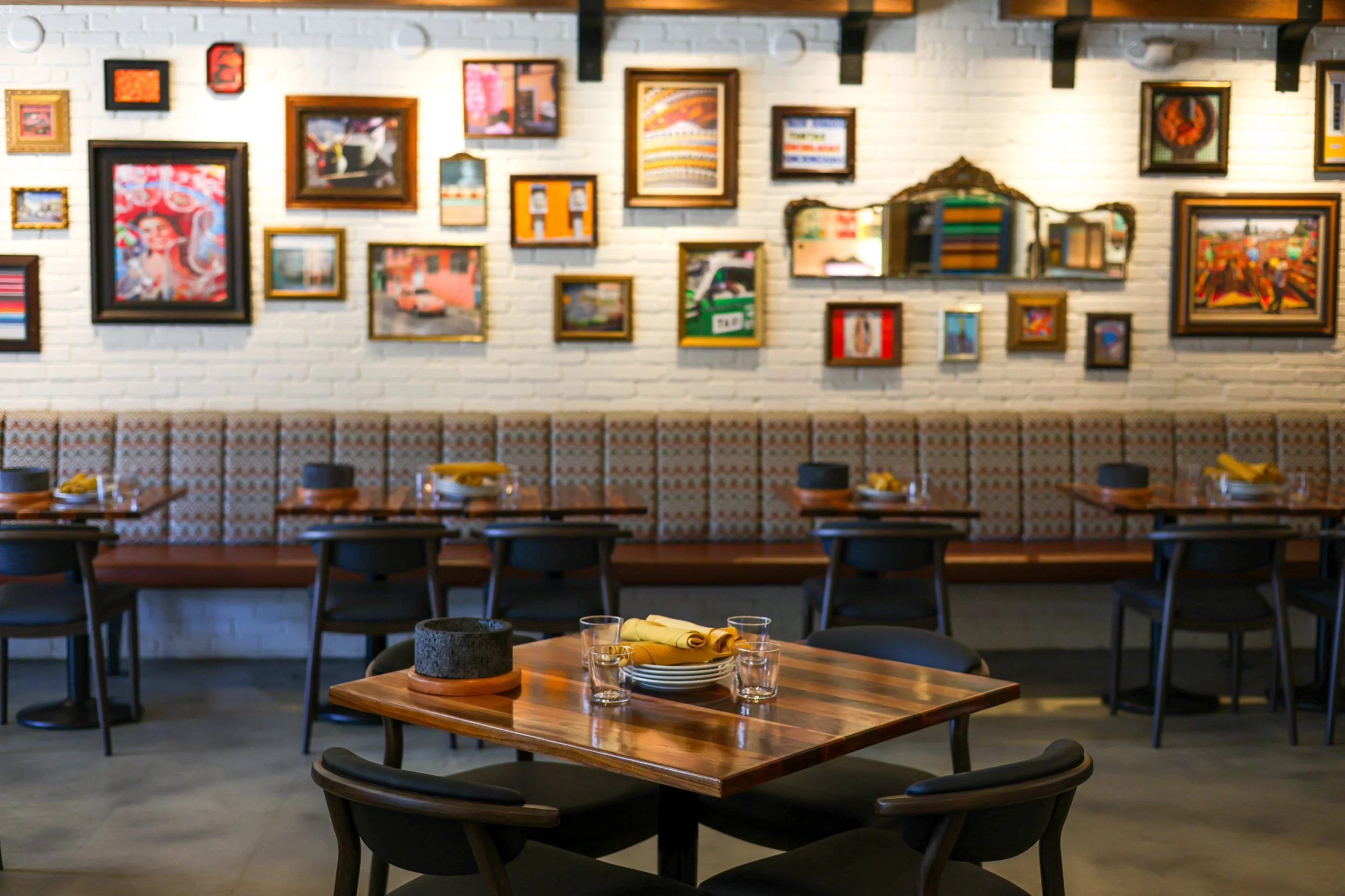
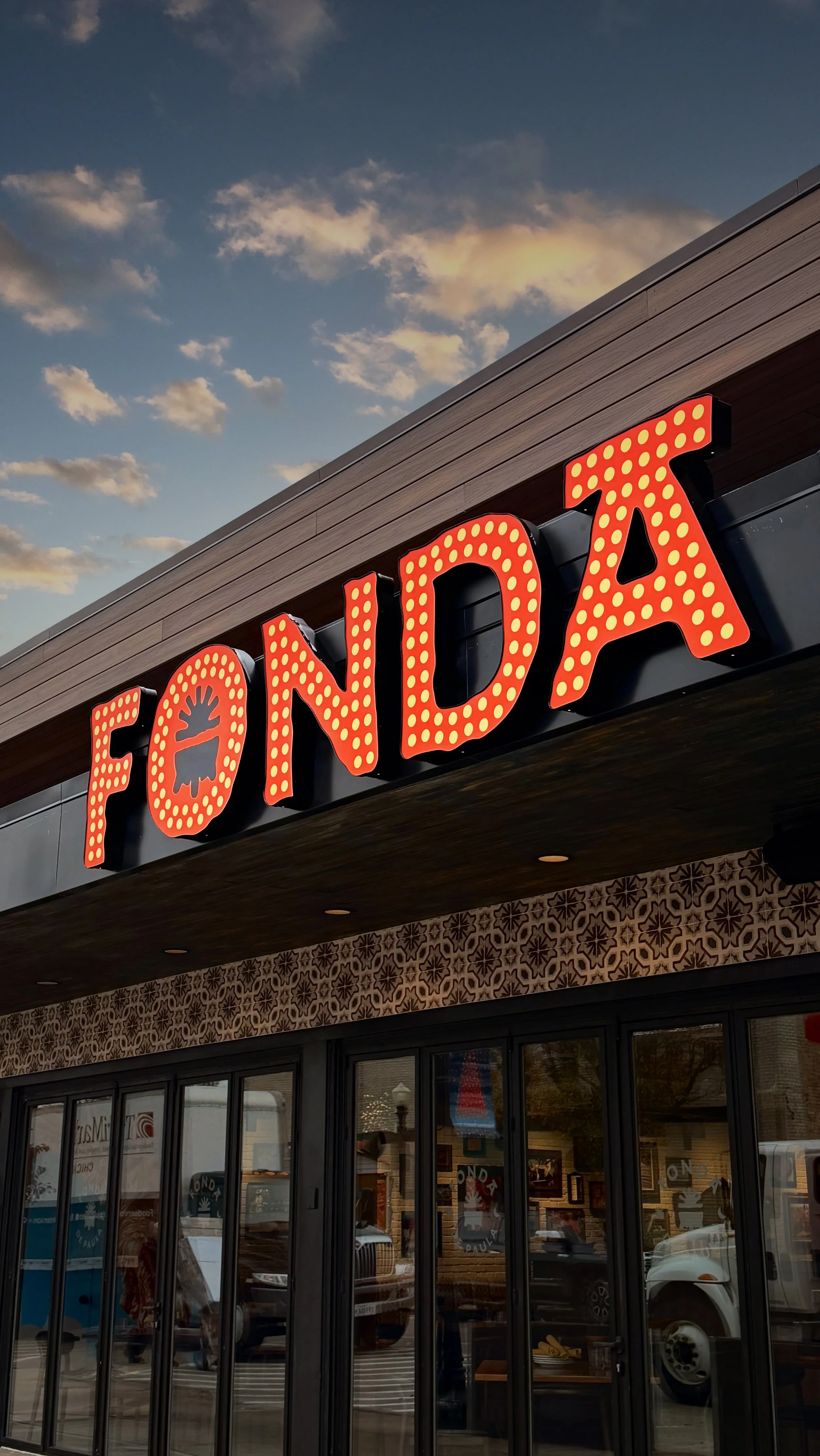
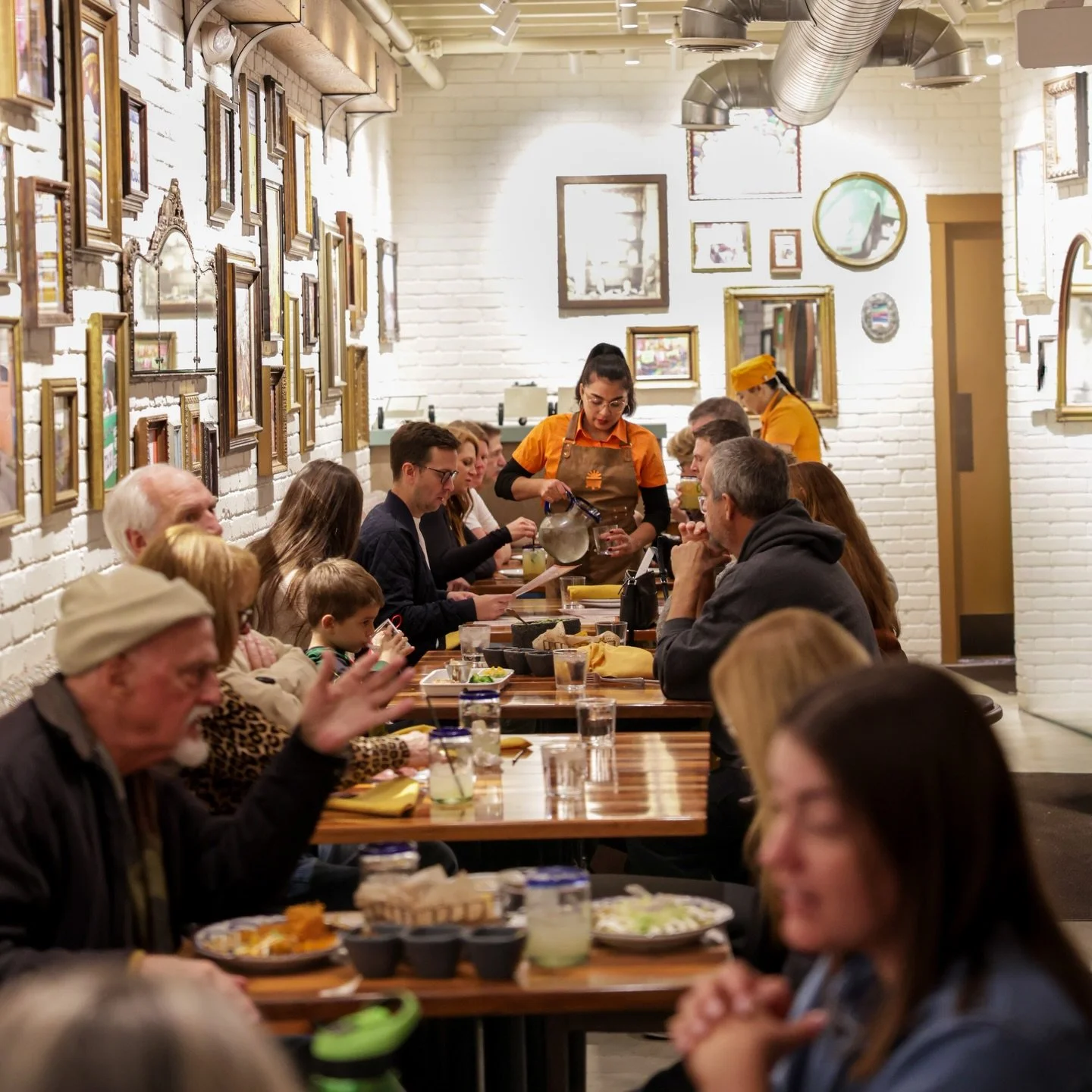
To bring this brand from the screen to reality involved a close collaboration with the Foodworks team to align all the brand experiences. Starting with the interior design and diner touchpoints, we worked closely with their team to develop a cohesive story and theme across screens, walls, and menus.
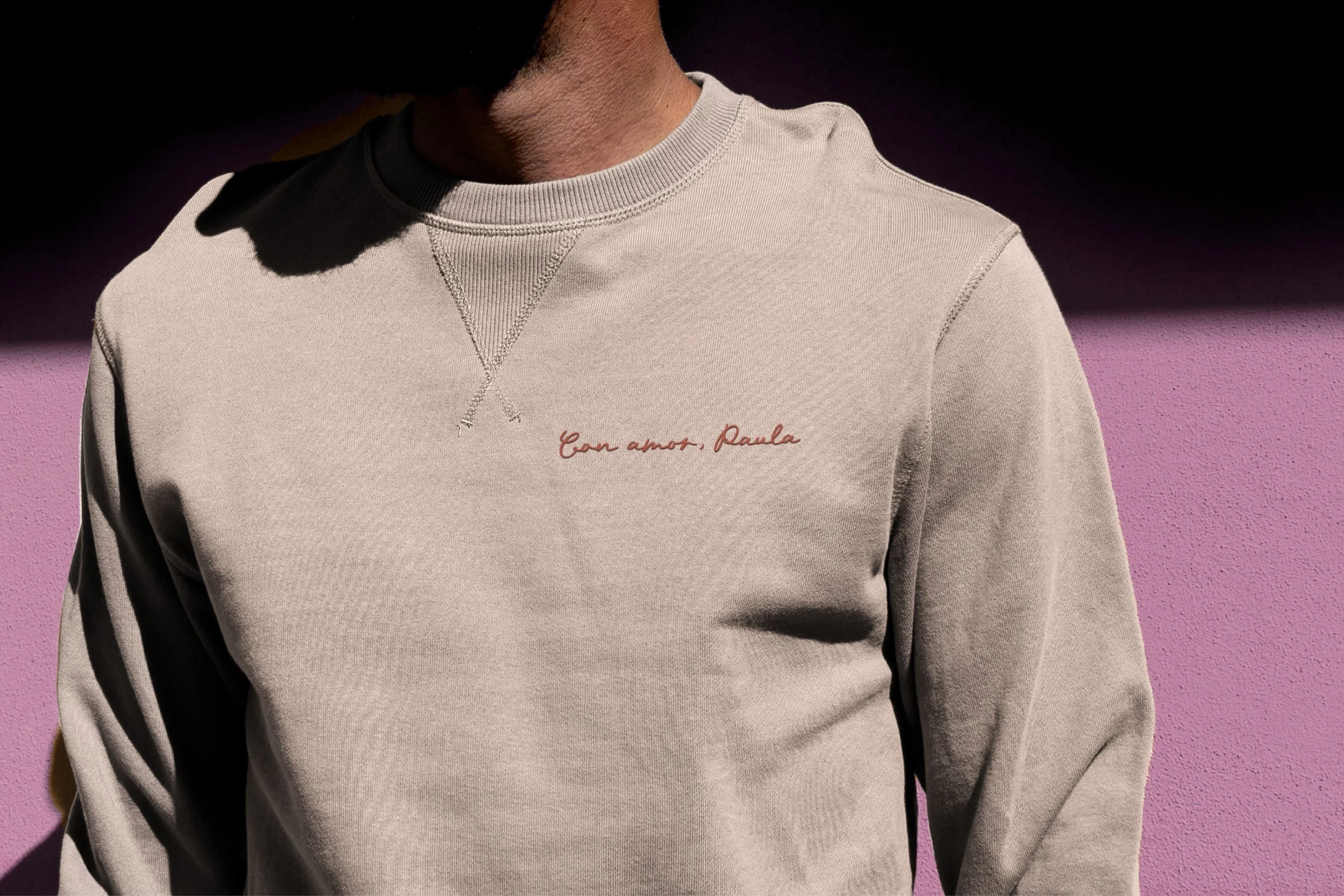
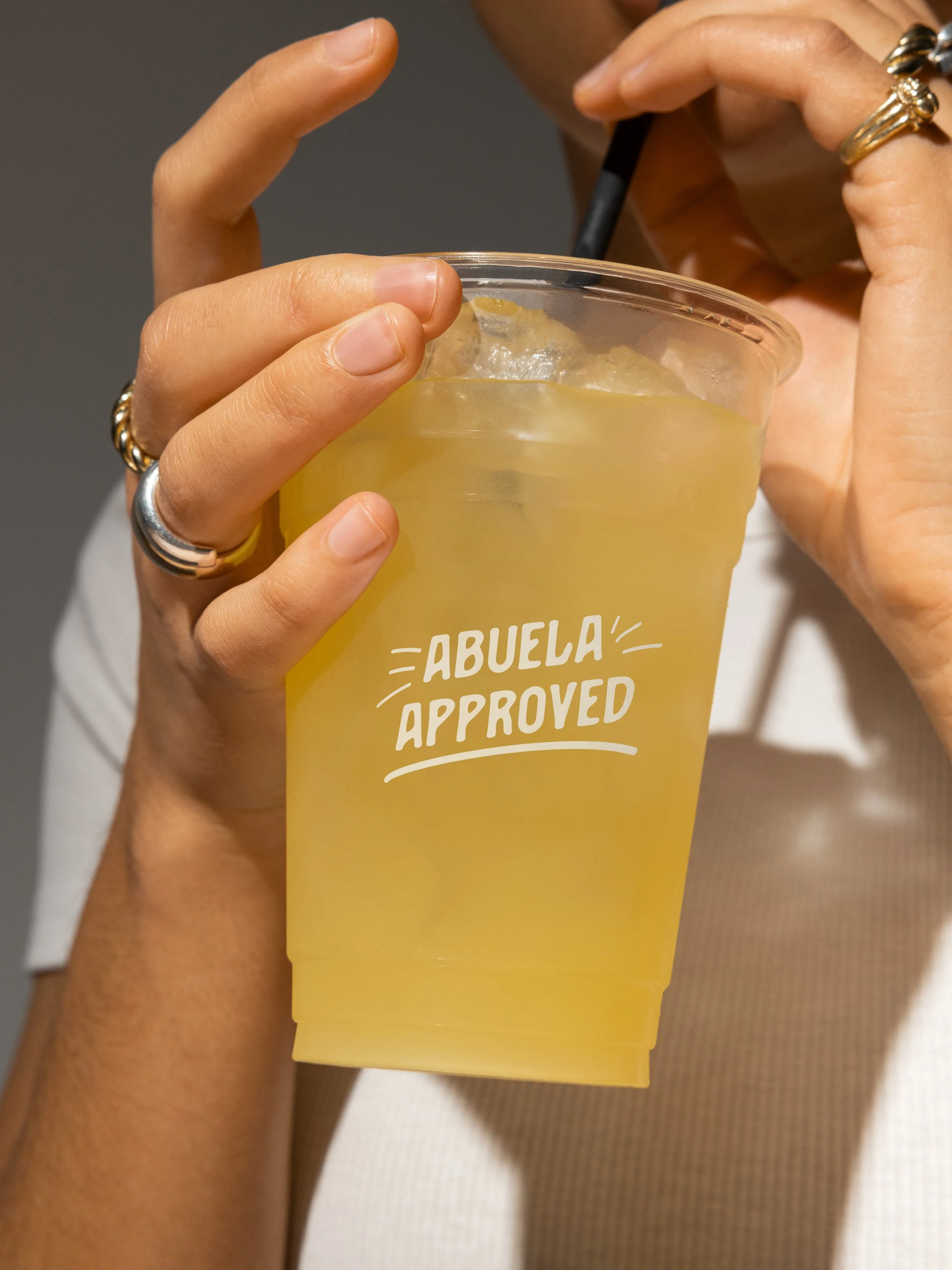
We provided concepts for uniforms and swag, created key lines for their takeout cups and packaging, designed signage and menus, and even collaborated with their interior design team to ensure continuity between the environment and branding.
Opened in late 2025, it’s generating significant buzz throughout the Downers Grove community. Next time and any time you’re in the barrio (neighborhood), stop by Fonda de Paula for an authentic taste of “Abuela-approved” Mexican cuisine.
Logo Suite
Brand Guidelines
Environmental
Uniforms & Swag
Signage
Menu Design
Website
Business Cards