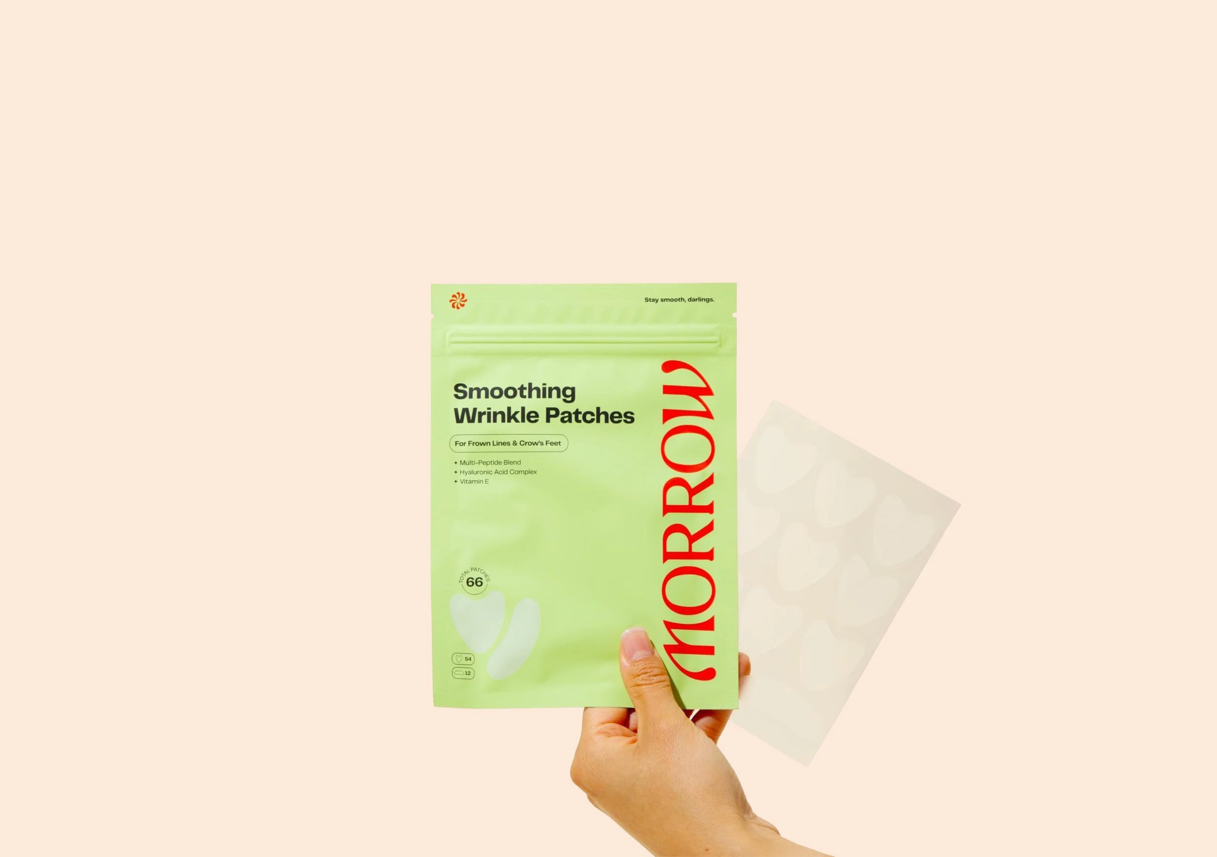
Morrow Beauty
Morrow is the easiest way to stay smooth and fight fine lines and wrinkles like there’s no tomorrow.
-
Serial beauty entrepreneur and co-founder of Peach & Lily, Cindy Kim, understands the power of Korean skincare. For her latest venture, she had an idea for a natural, needle-free treatment that could make smoothing fine lines and wrinkles so easy you could do it in your sleep. She had her proprietary formula, supply chain, and business model all figured out, she just needed a name and brand identity to bring her vision to life.
We partnered with Cindy to create a fun, vibrant brand that stood out against a landscape of muted, clinical competitors on Amazon and invited millennials to experience beauty sleep in a whole new way.
Our Services
(87)BrandLaunch
Brand Focus
Brand Strategy
Brand Name
Verbal Identity
Visual Identity
(01) Brand Focus
Smoothing out the strategy, getting into the fine details behind fine lines.
-
Before diving into design, we needed to build a strong strategic foundation for Cindy’s brand to grow from. We began with a one-day Brand Focus workshop, where we delved into the details of her new innovation, as well as her goals, target audience, and competitive landscape.
Cindy wanted to become the go-to for fine line and wrinkle care. After exploring the beauty landscape, we noticed that so many beauty brands and influencers were encouraging people to prevent wrinkles by laughing, frowning, and squinting as little as possible, but what’s the fun in that?
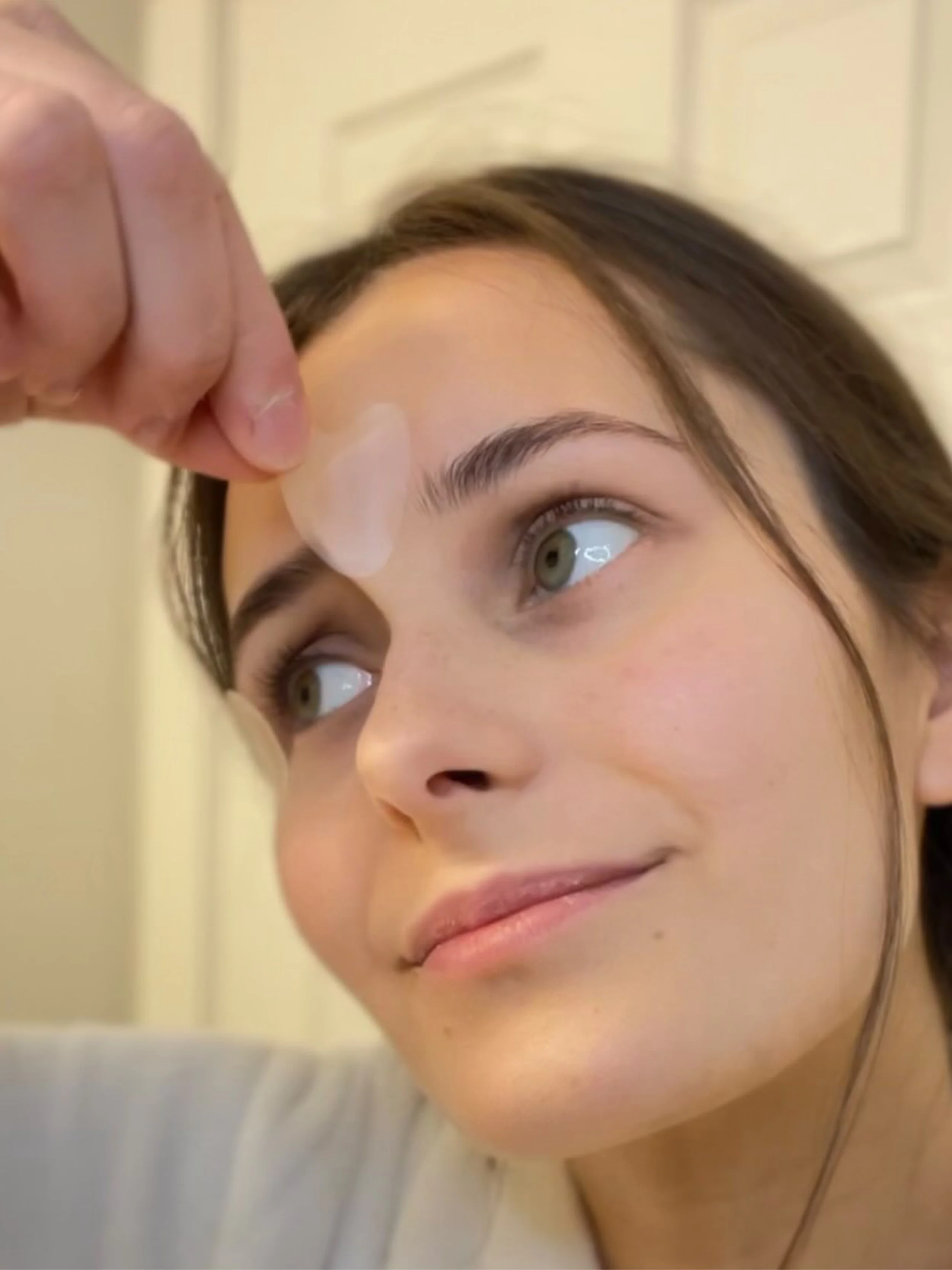
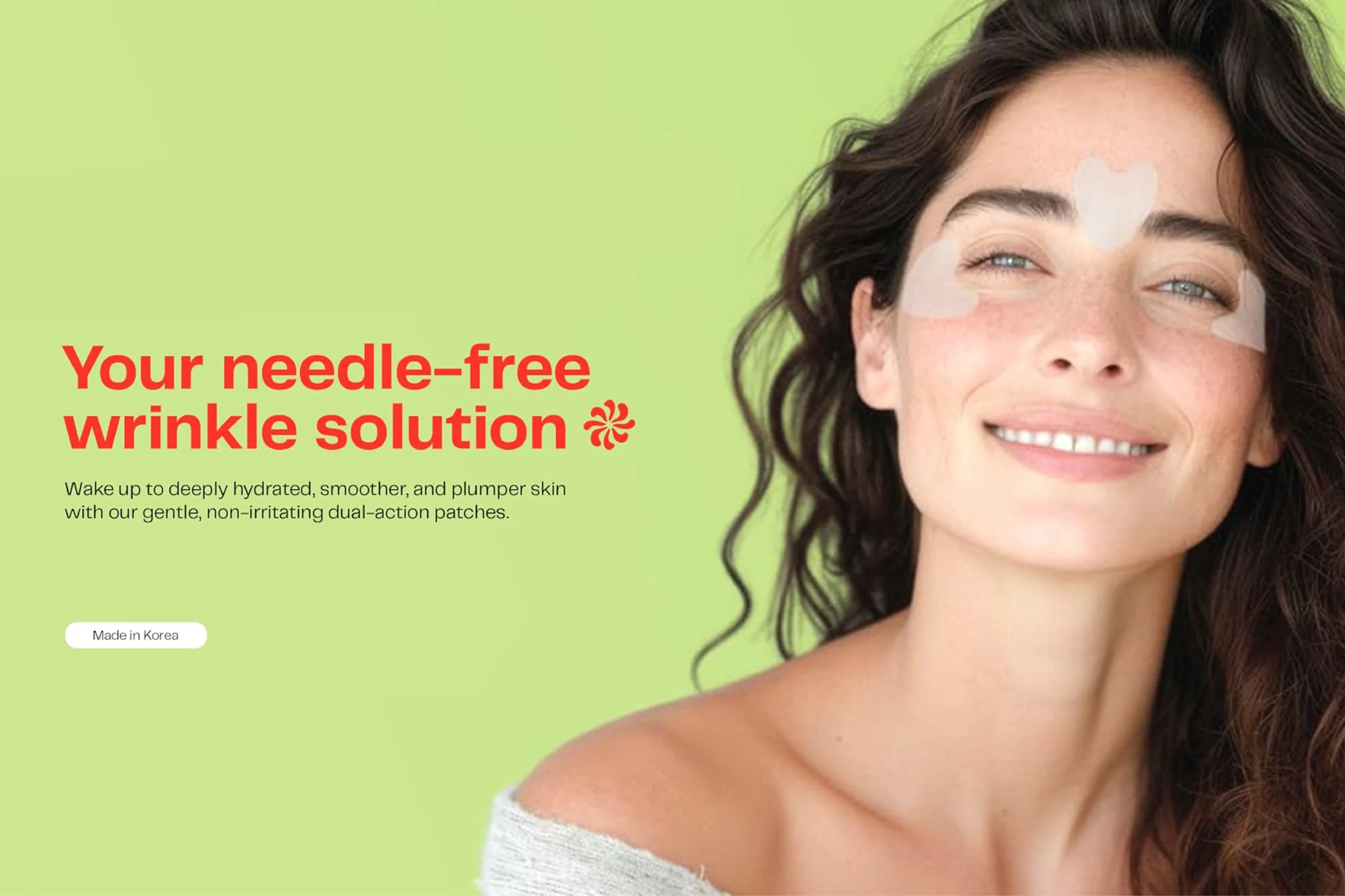
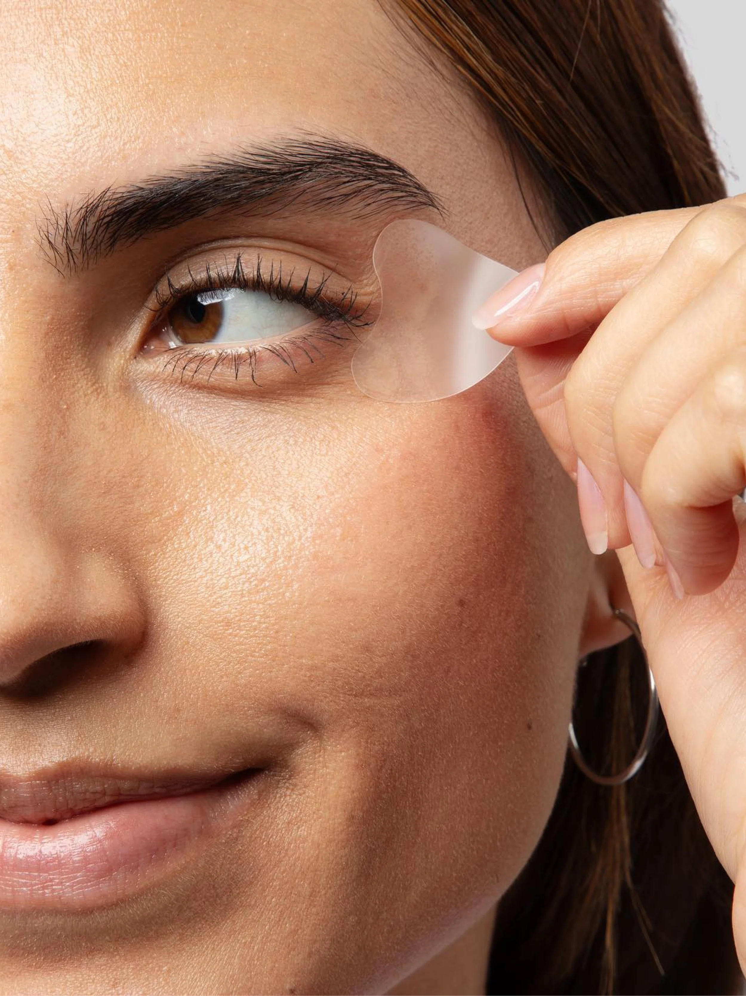
Wrinkles are something you can’t outrun, but with Morrow wrinkle patches, you could still wake up and face the day feeling your best — with skin that feels smooth, hydrated, supple, and youthful. Cindy had an opportunity to carve out a niche by offering people a way to embrace aging while still living life to the fullest.
87BrandFocus Workshop
Brand Core & Audit
Vision, Mission, & Values
Audience & Personality
87BrandSpark

(02) Brand Design → Brand Name
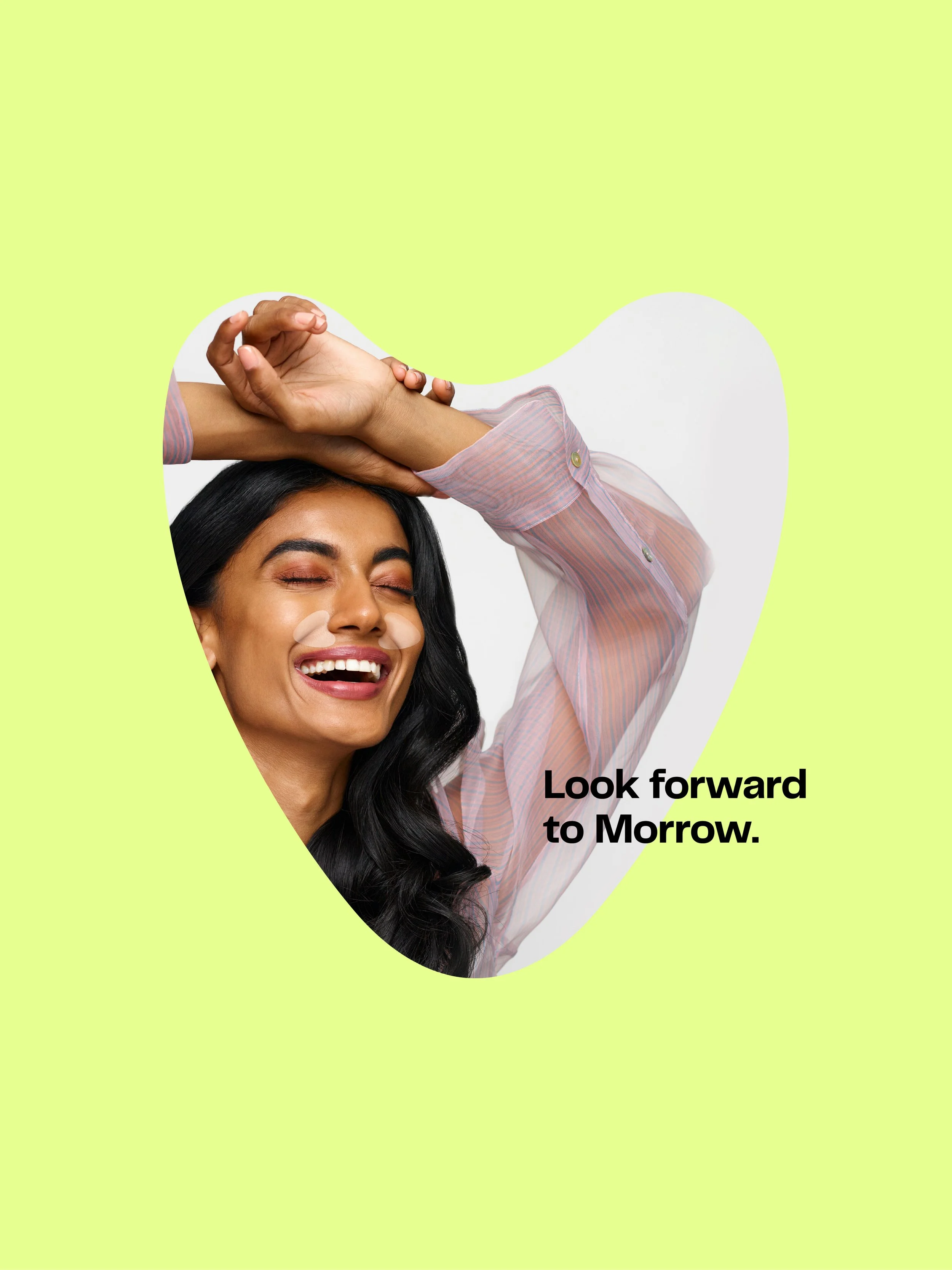
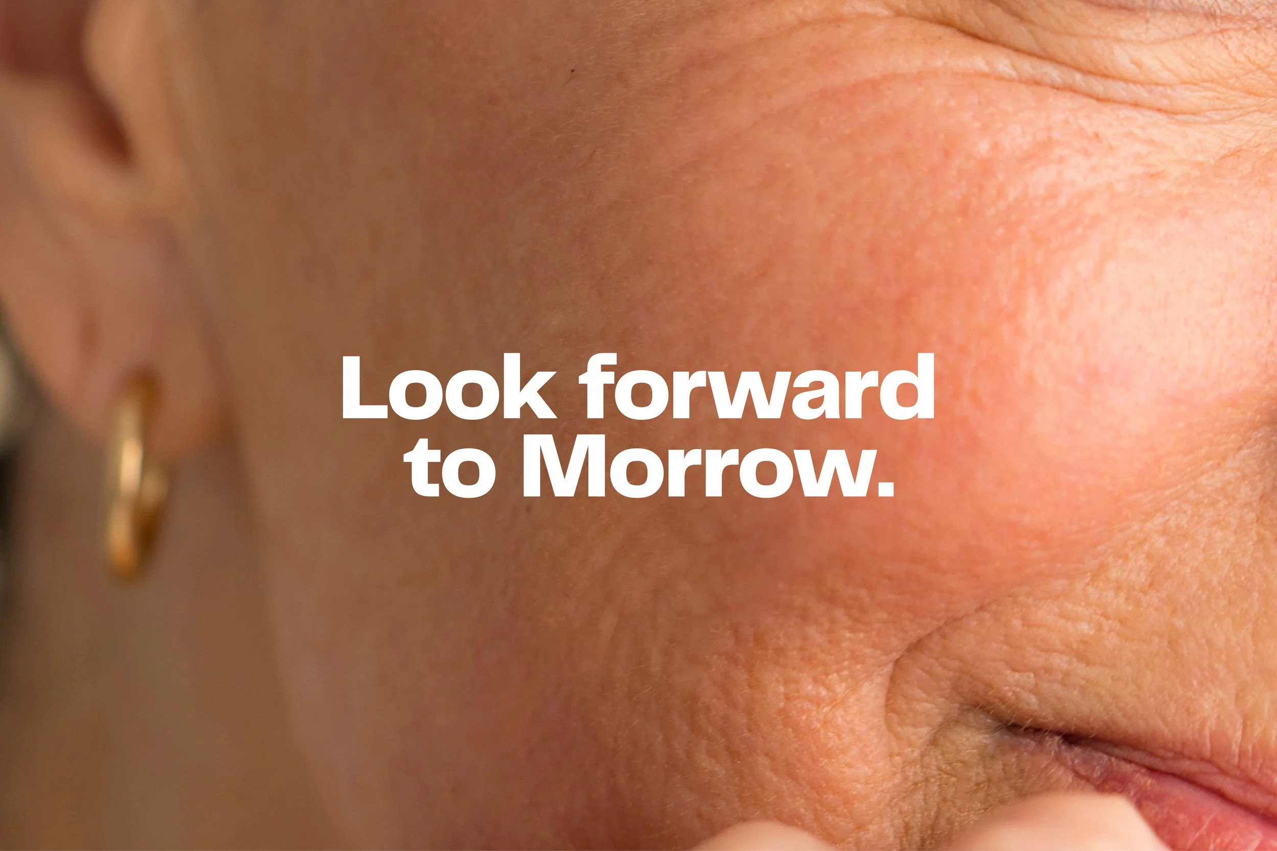
Look forward to living life, look forward to Morrow.
-
Our first challenge when it came to the verbal identity was coming up with a name that fit our strategy and stood out against the competition. We found that the competition really fell into two camps name-wise — they either felt super clinical, like SilkDermis or Nurive, or overly juvenile, like Frownies or Wrinkles Schminkles. We saw an opportunity to create a fun name, but also had some gravitas and maturity — one that balanced sophistication with play.
Morrow checked those boxes. Inspired by the word meaning “the near future,” it leans into the story that life and aging are something to embrace. We wanted to inspire people to look forward to living their lives to the fullest — and look forward to Morrow.
Brand Story
Naming Workshop
Trademark Screening
Brand Name Story
Product Naming Construct
Domain & Social Handles
(02) Brand Design
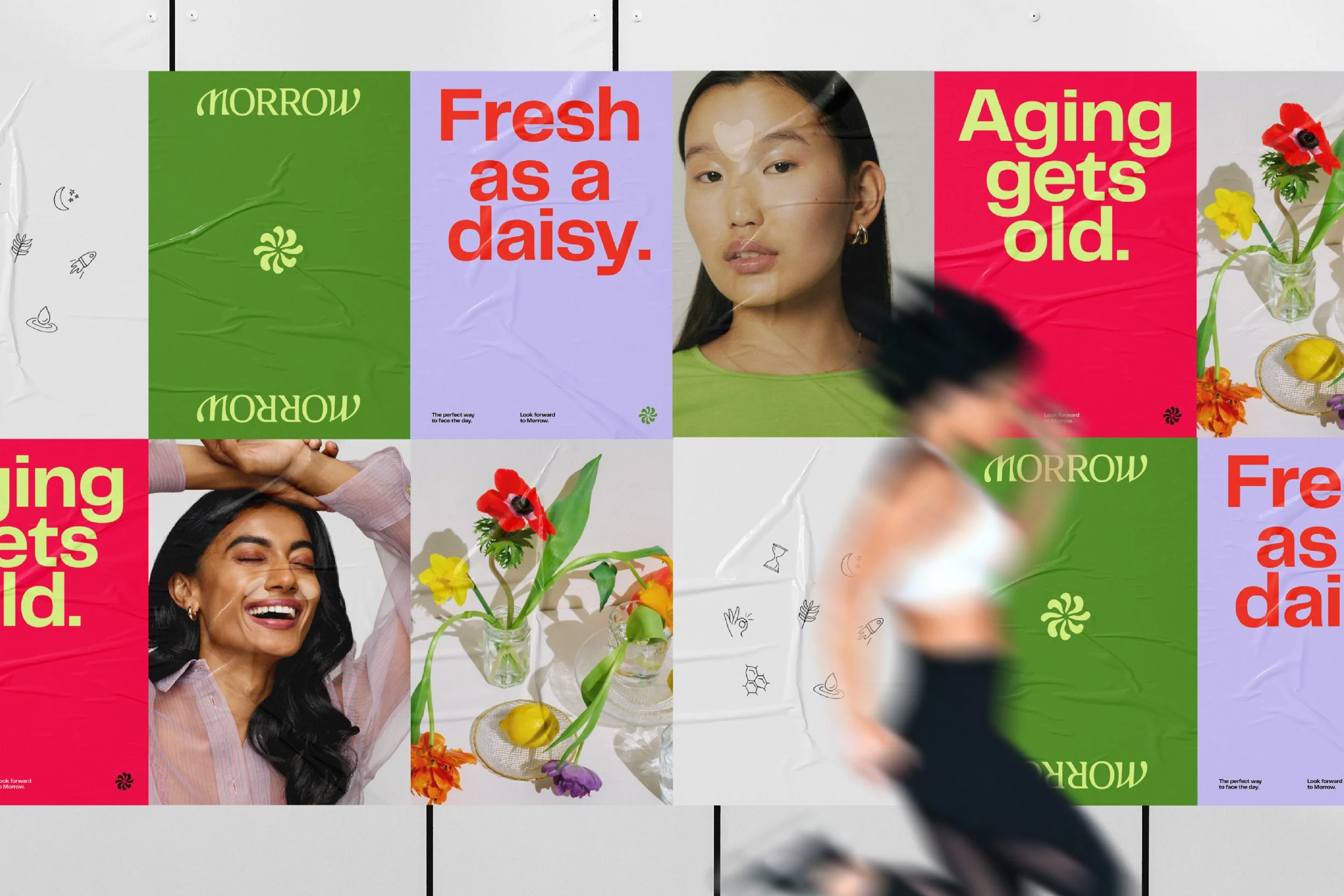
A look made to dial up that “Cool Aunt” energy
-
A balance of sophistication and play was built into every level of the brand, voice included. We worked with Cindy to develop a framework to help her tell her story and frame Morrow in the contexts most relevant to her audience. When it came to personality, we thought of some of the most important figures in our lives, “the cool aunts” we always looked up to—the women who are stylish, sophisticated, witty, and utterly unafraid of being themselves.
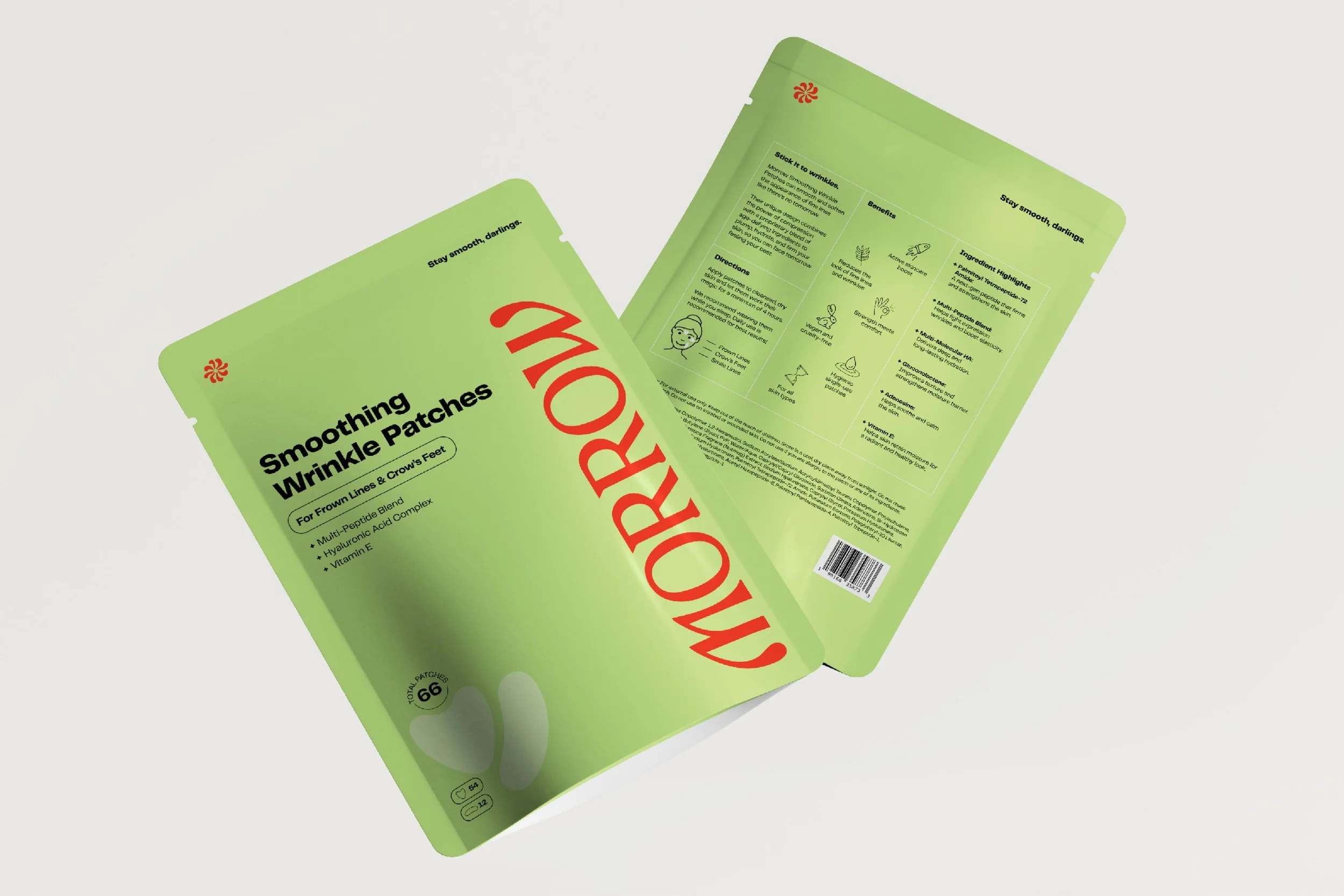
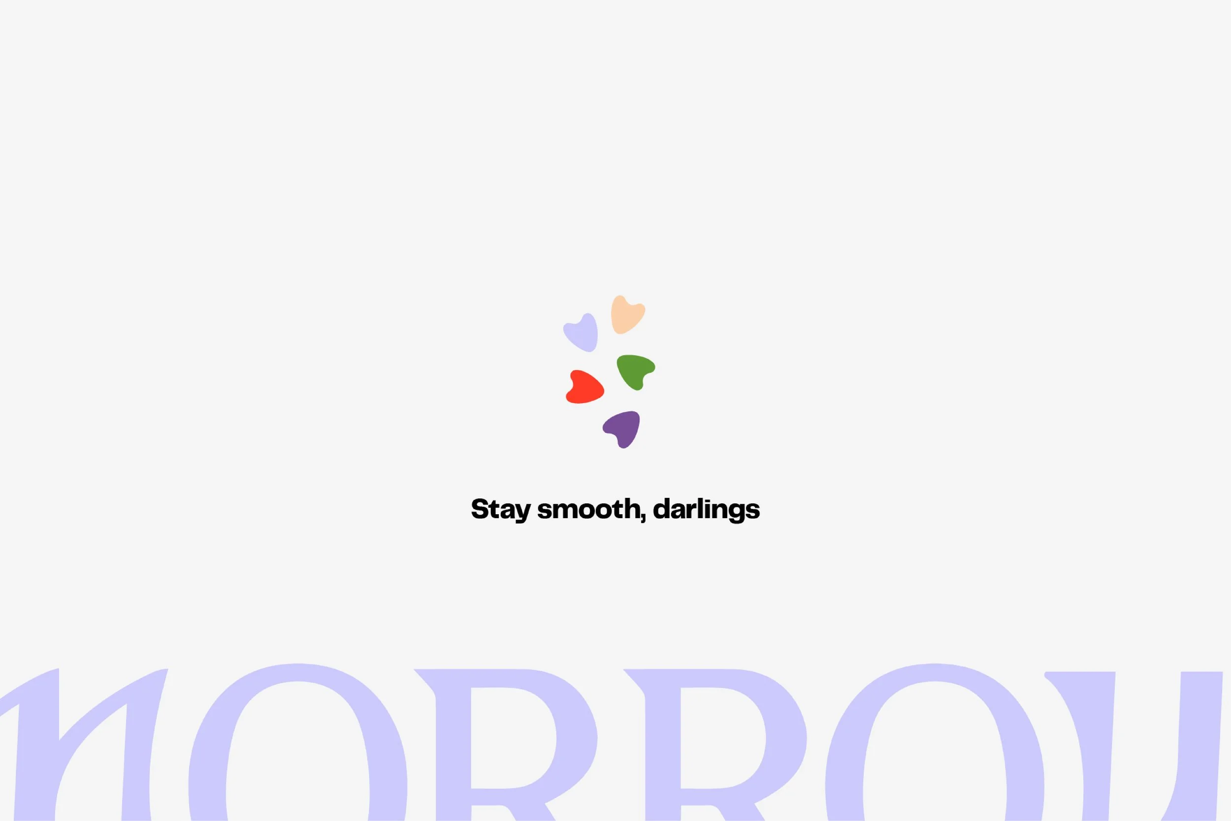
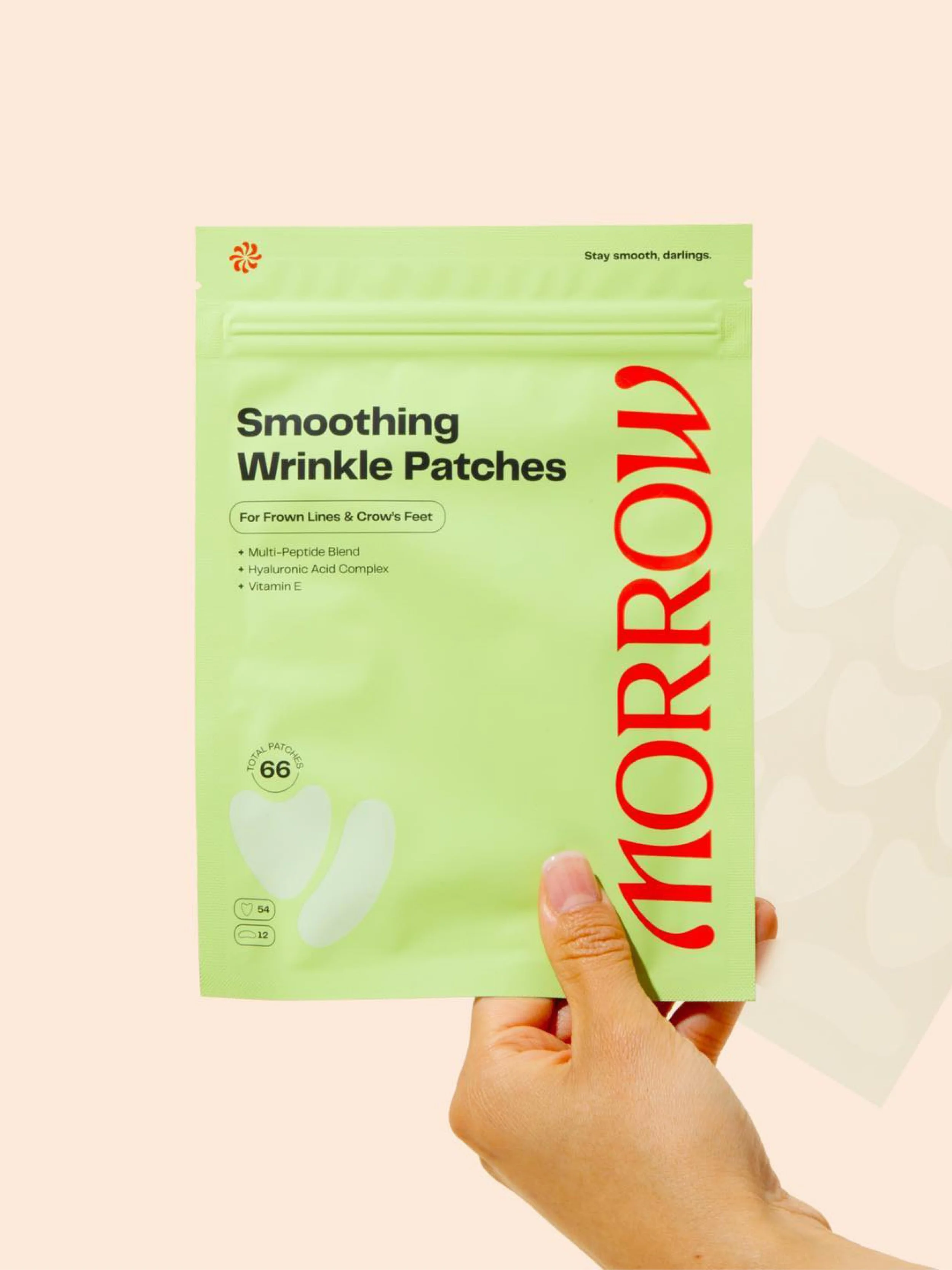
With fun lines like “stay smooth, darlings,” and “stick it to wrinkles,” we spoke to the utility of the product while putting a smile on our audience’s faces. We applied that voice throughout the brand experience, from the brand website and Amazon pages to packaging, dialing the voice’s playfulness up or down depending on the context in which it appeared.
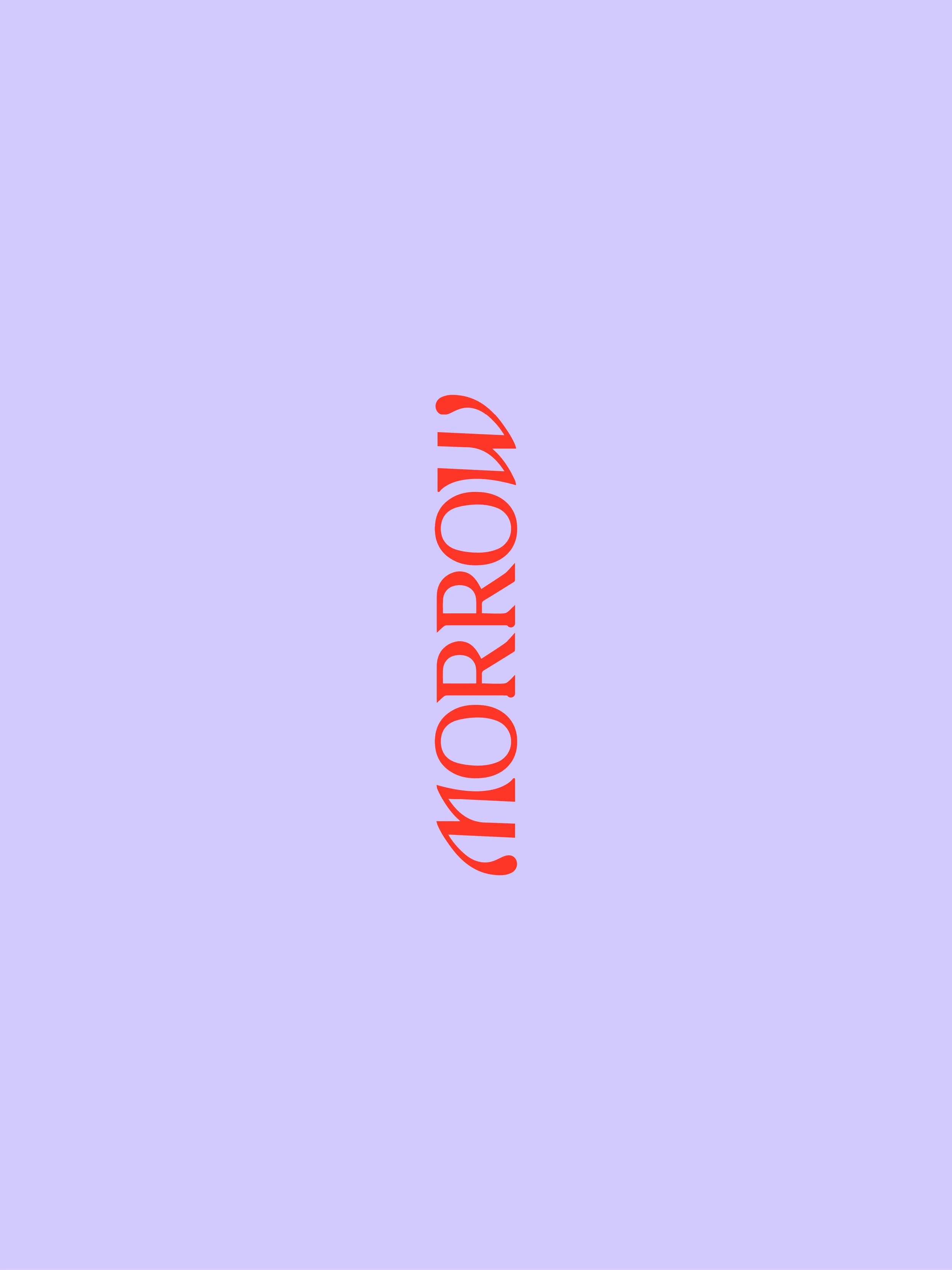
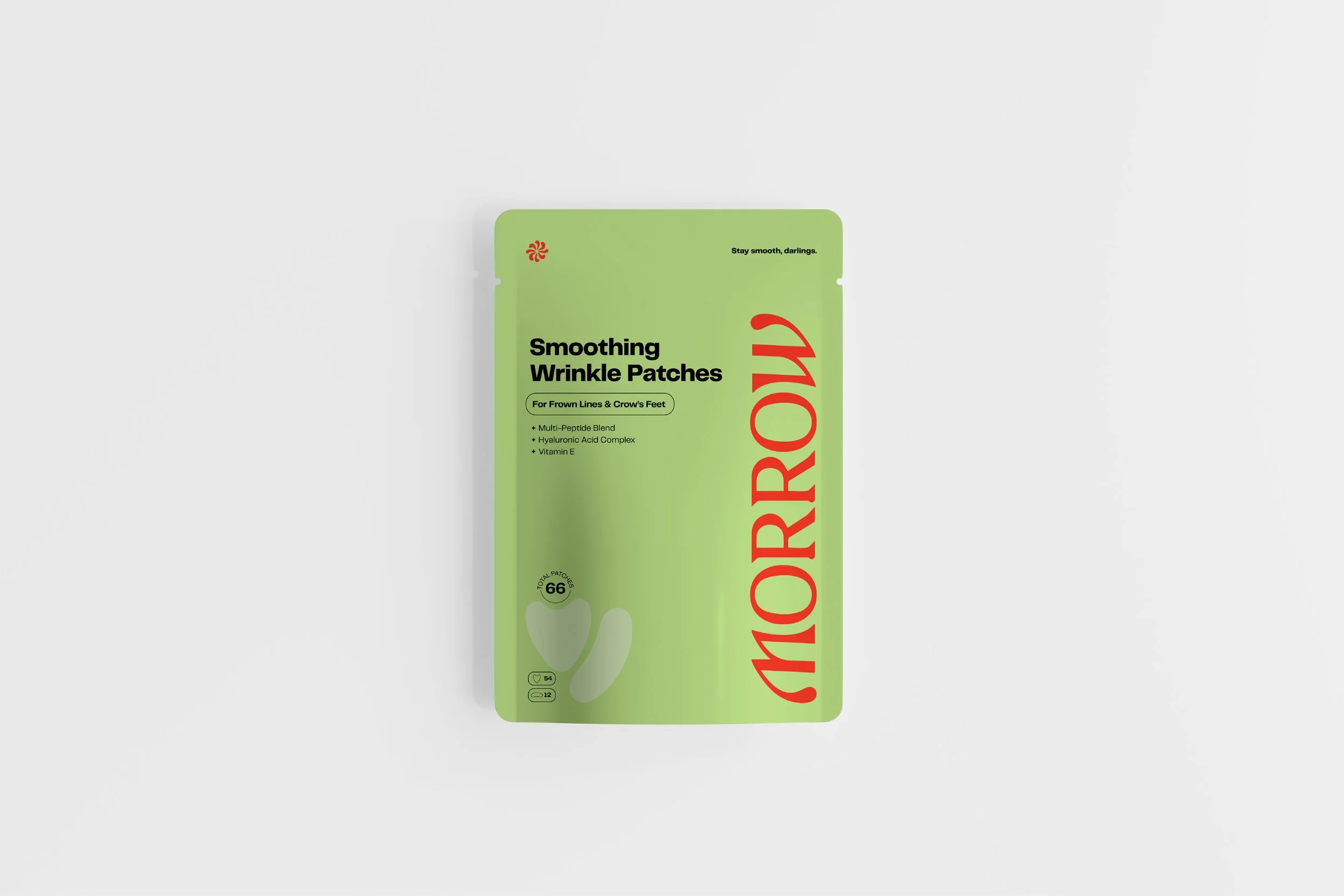
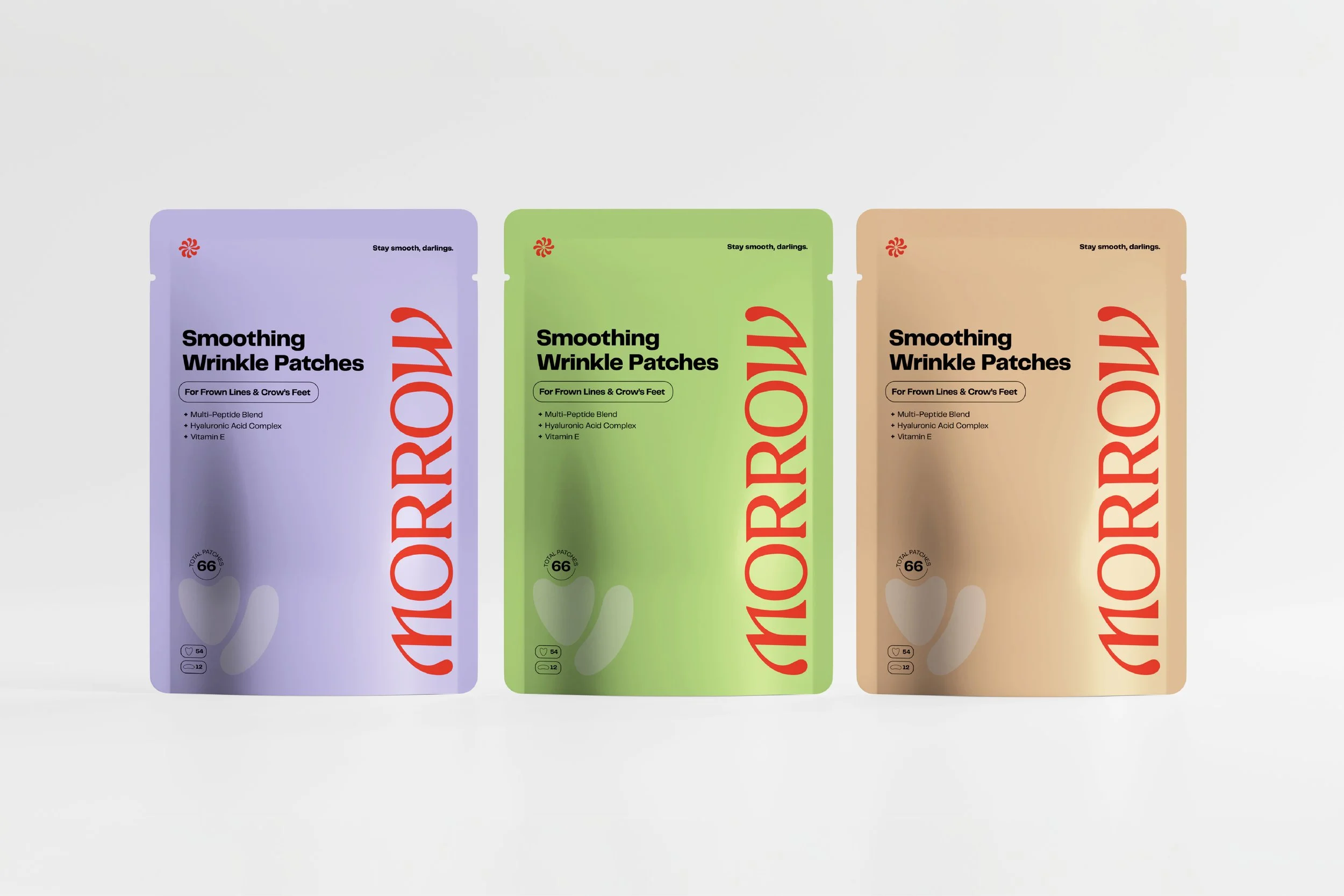
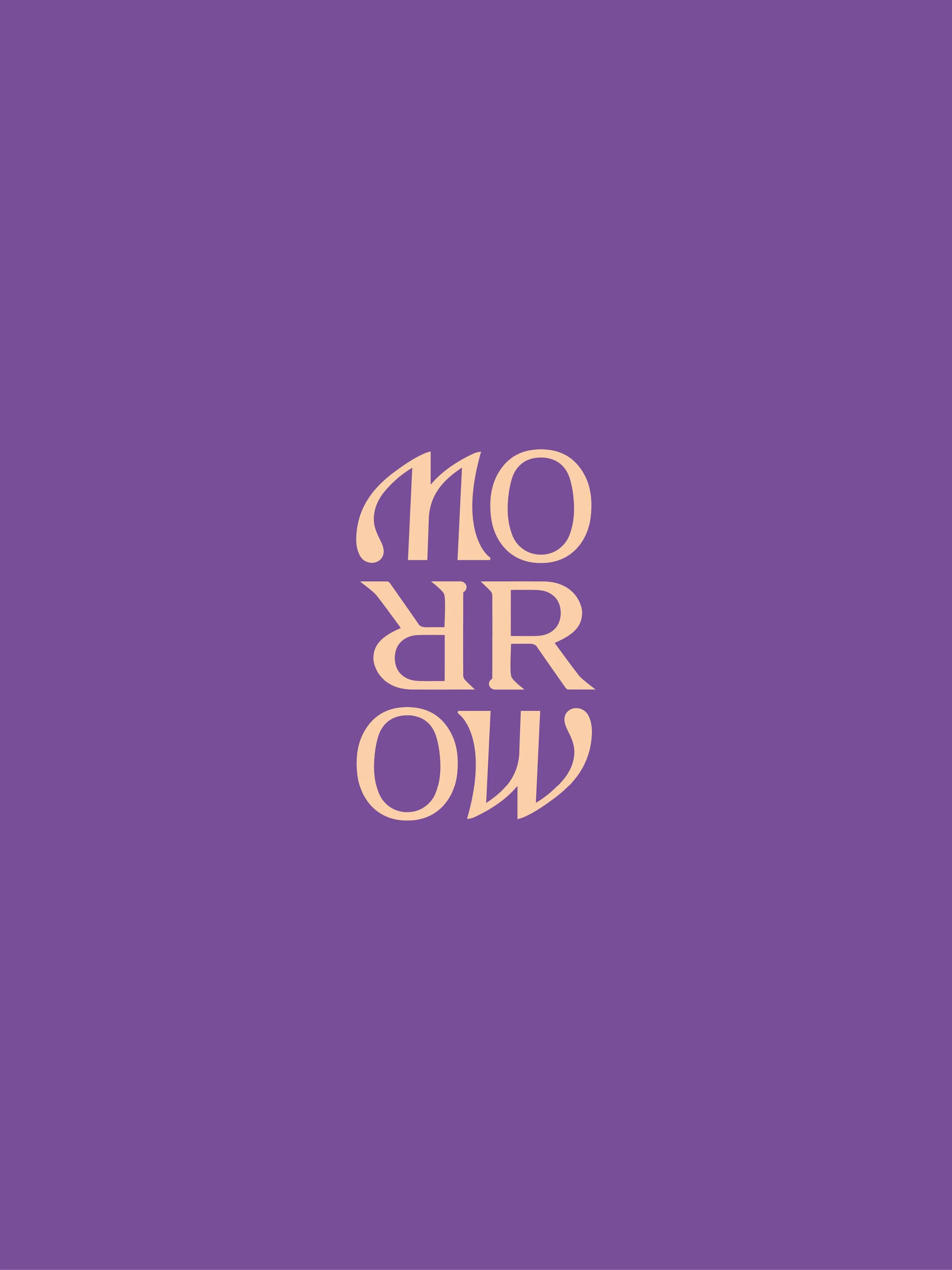
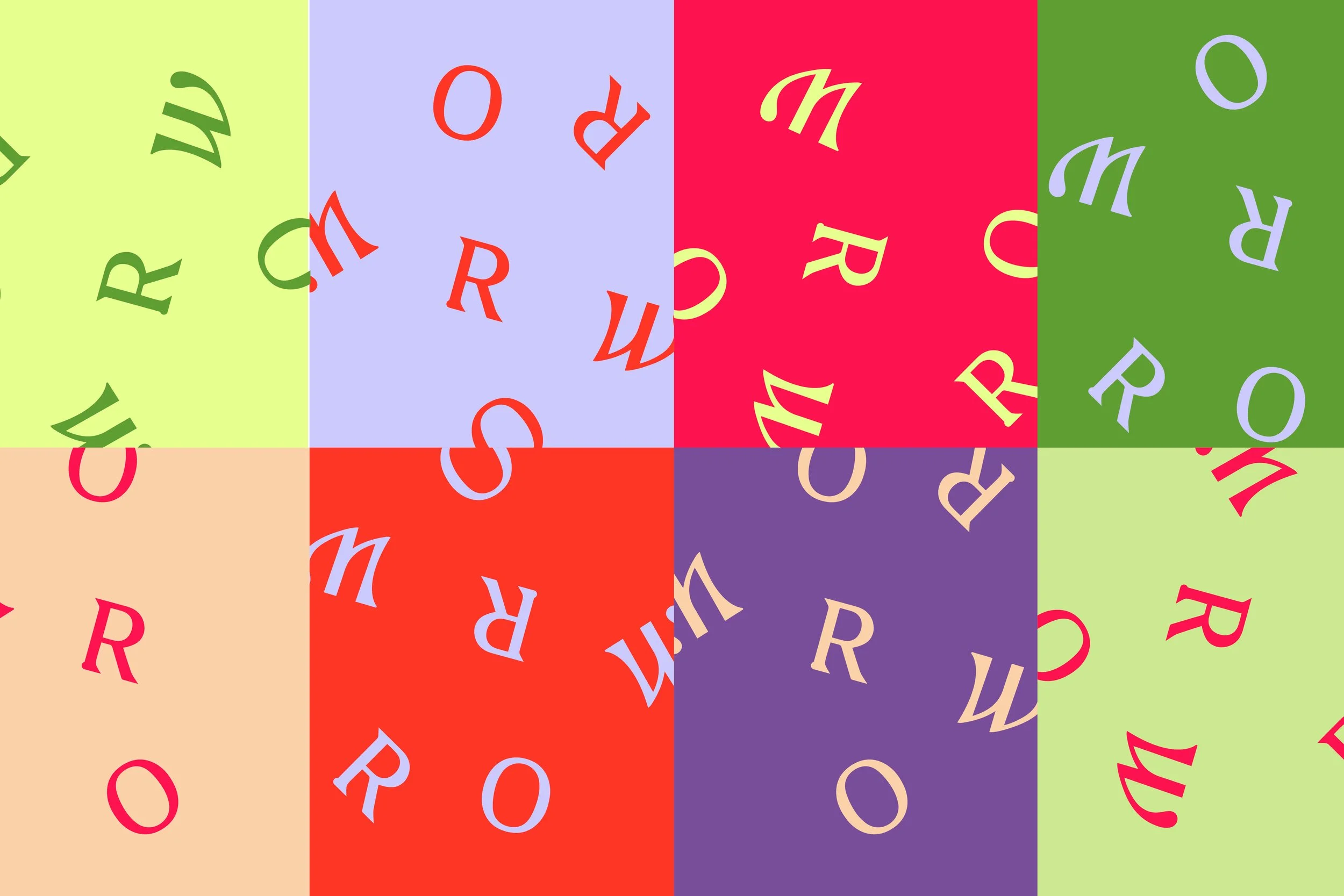
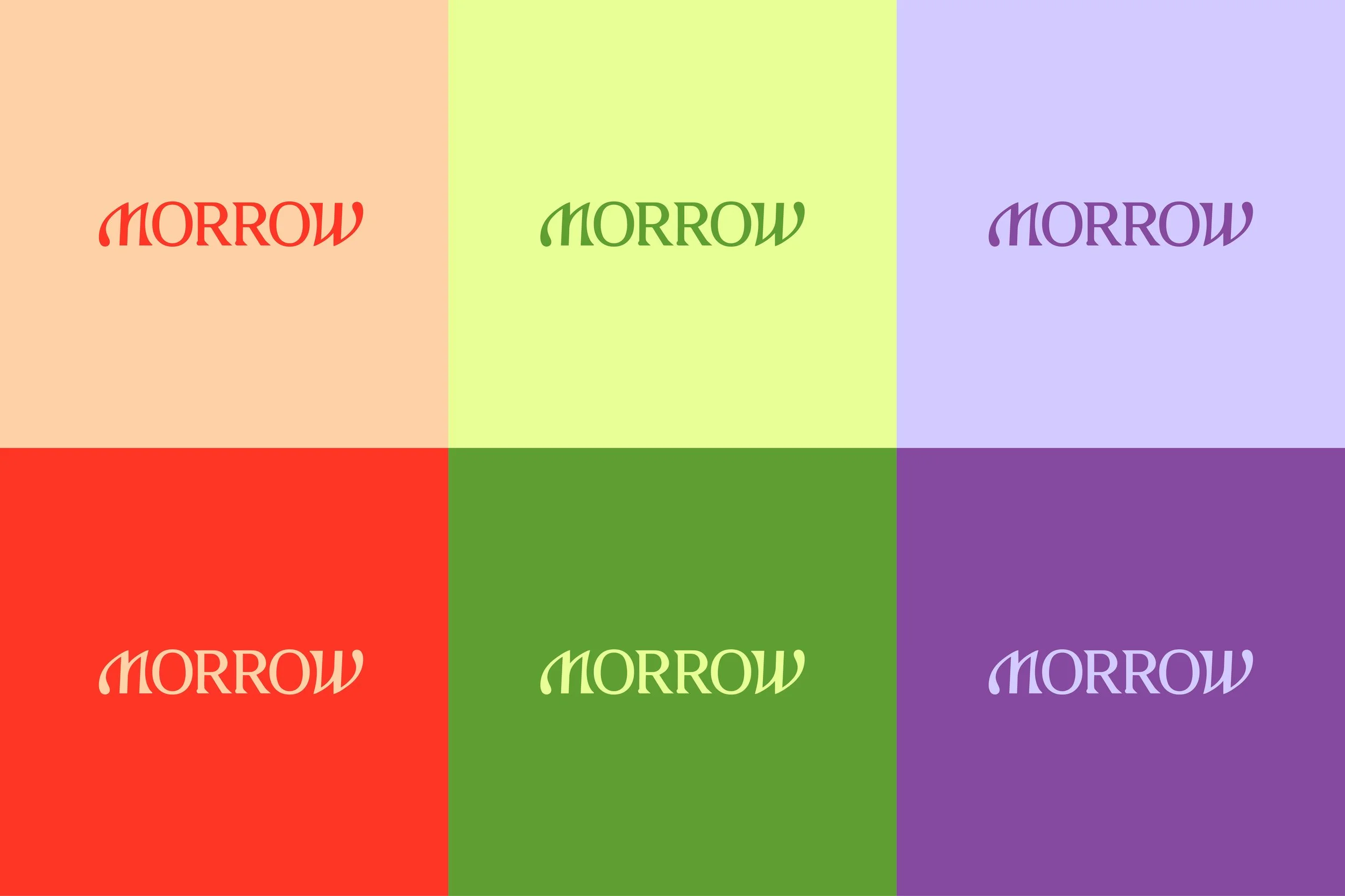
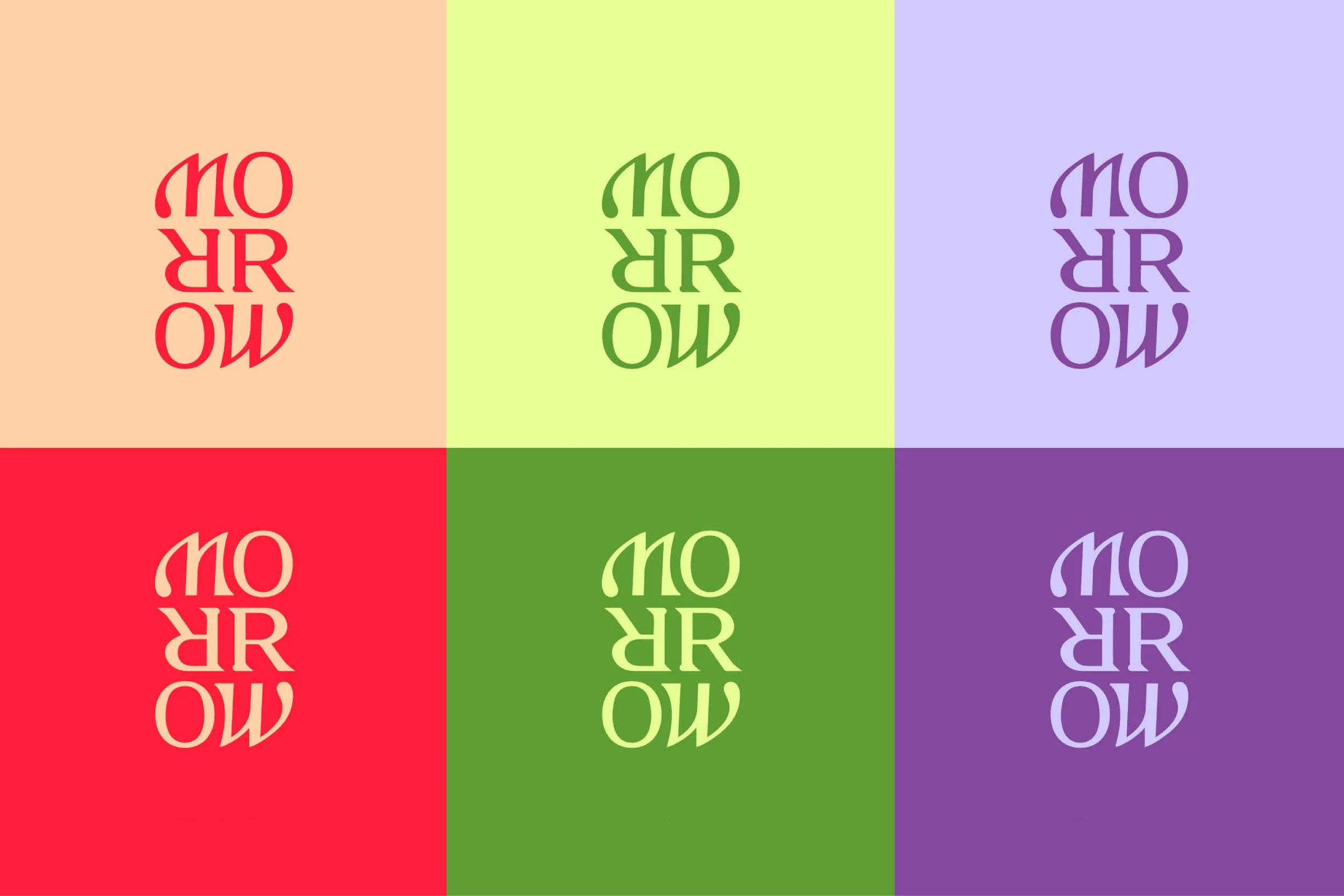
As with the name and voice, the visual identity blended sophistication and play. “Morrow” isn’t a perfect palindrome, but it’s close. It’s balanced and symmetrical, evoking the idea of looking in a mirror. It’s about the importance of self-love and self-reflection, looking backward and forward in one’s life.
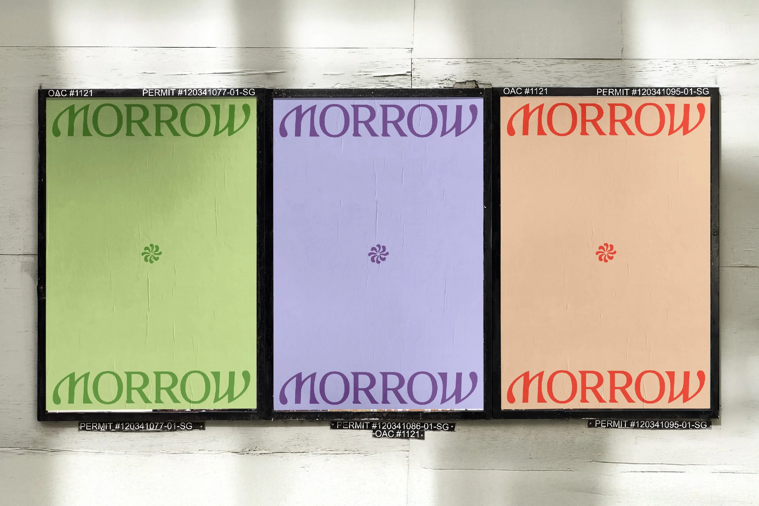
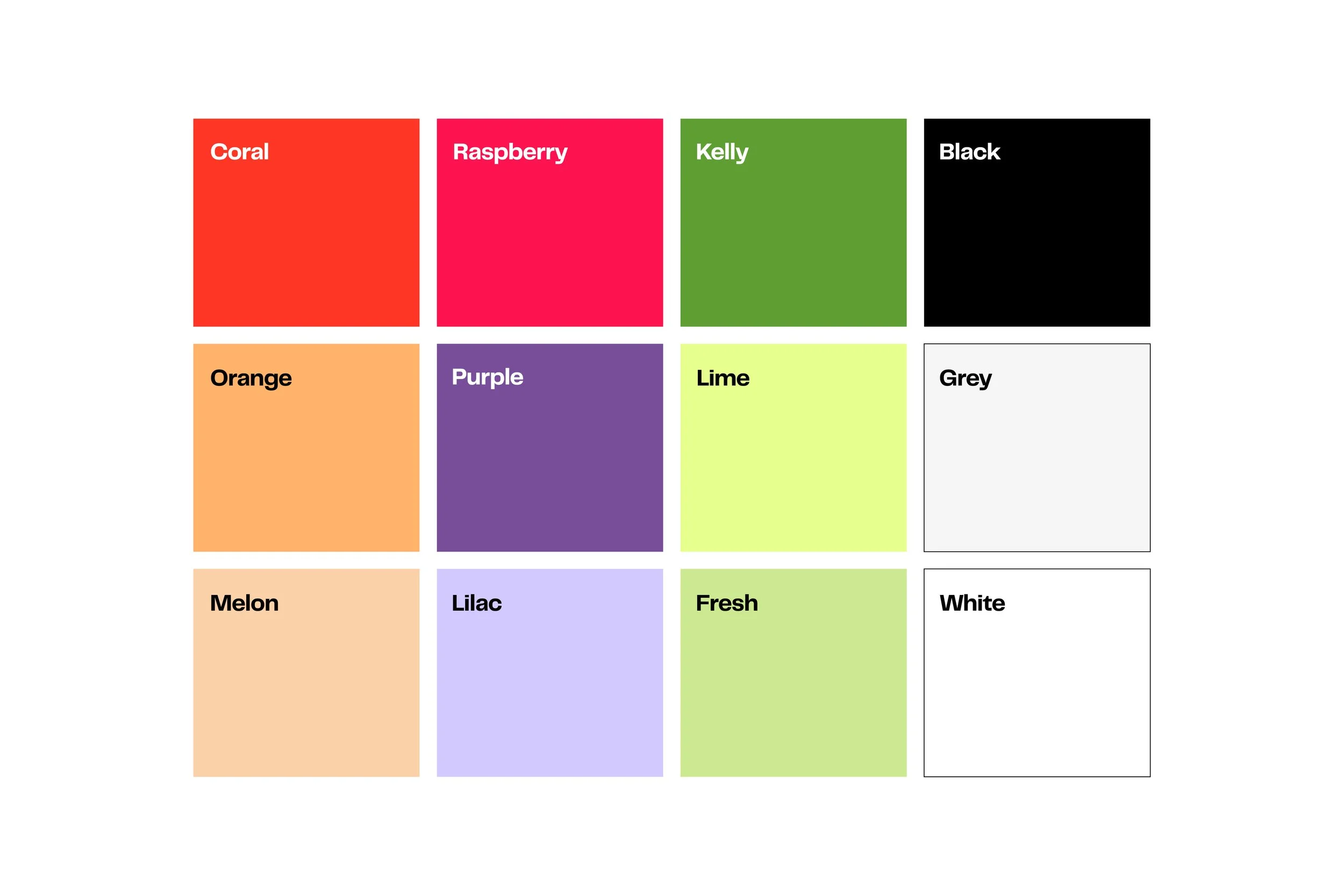
The color palette is intentionally unexpected. It was designed to stand out with elegance and play in an otherwise muted and clinical category. It’s a look that’s as bold and beautiful as the people it’s made for.
Brand Storyboards
Visual Identity
Art Direction
Photography Style
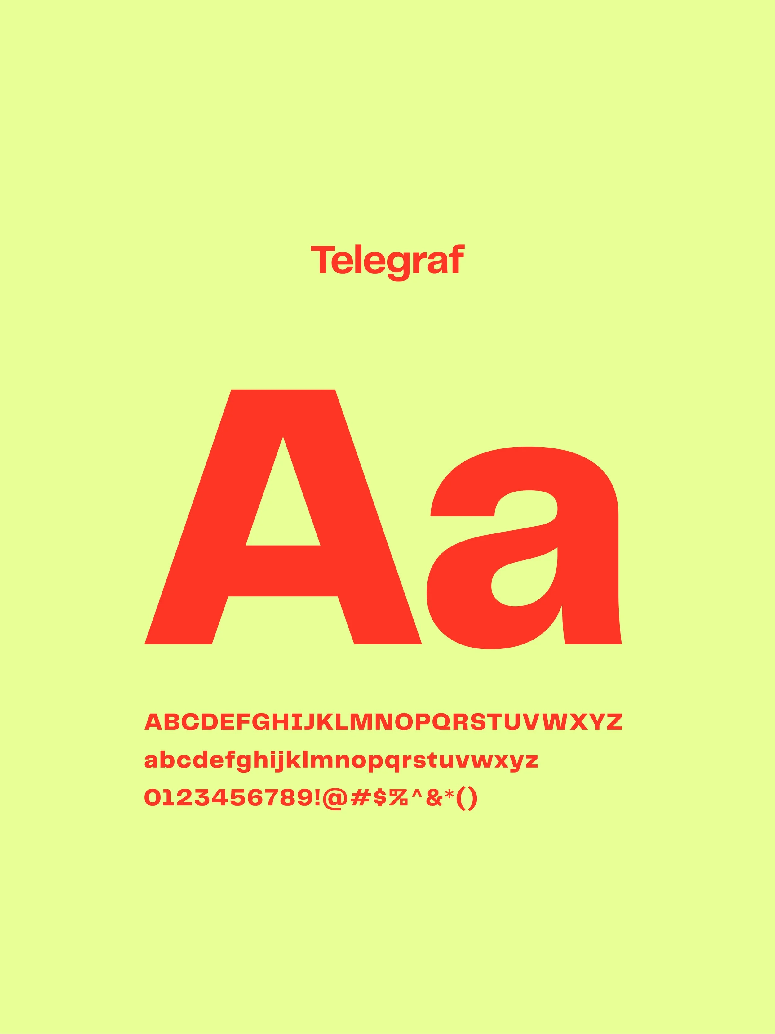
Typography
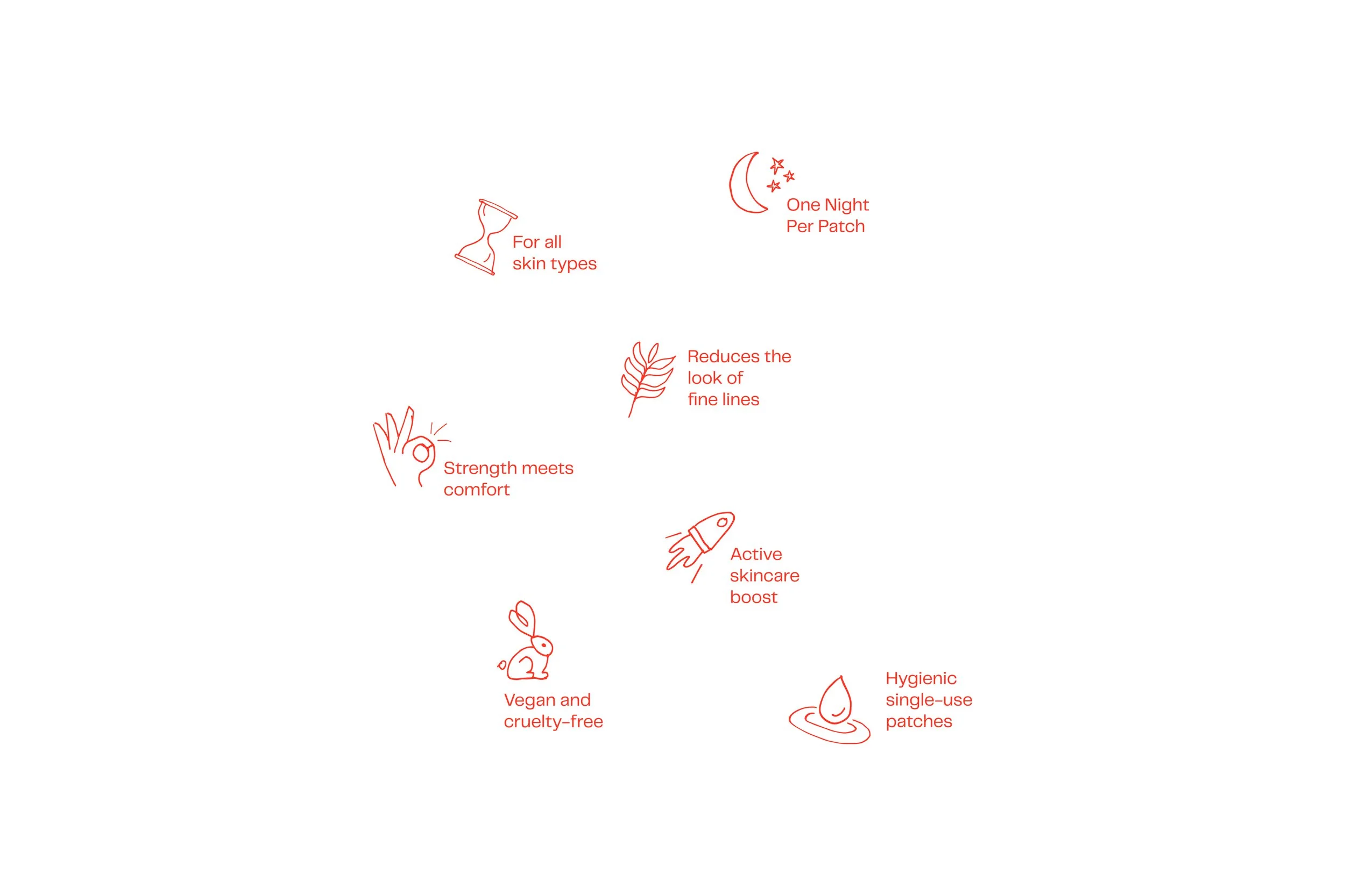
Graphic Elements & Illustrations
Brand Guidelines


(03) Brand Activation
Facilitating a wrinkle-free rollout.
-
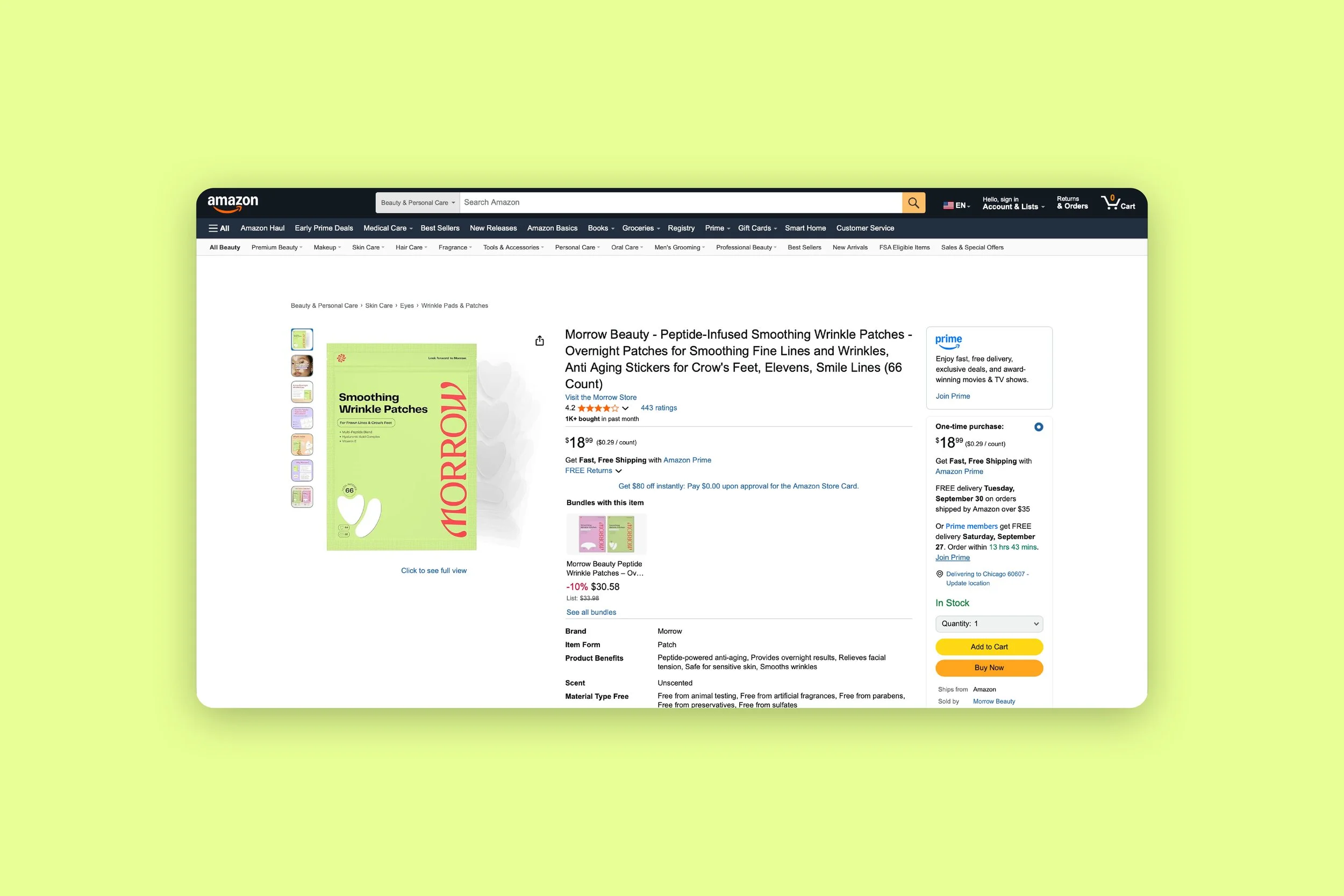
With this being a BrandLaunch project, we needed to deliver the essentials to help Cindy tell her story and launch her new brand. The plan was for Morrow to begin as a D2C brand to be sold via Amazon, and later rolled out across retail outlets, so we focused primarily on packaging and digital assets.
Thus far, Morrow has been an enormous success, selling thousands of units per month on Amazon and making waves across the beauty community. It's safe to say this innovative beauty brand has a bright future to look forward to.
Logo Suite
Packaging
Essential Website
Social Launch Assets
Email Template
Amazon Essentials
Brand Guide One-Sheeter