PURÉE JUICE BAR
They loved it as customers, then they bought it to continue the vision.
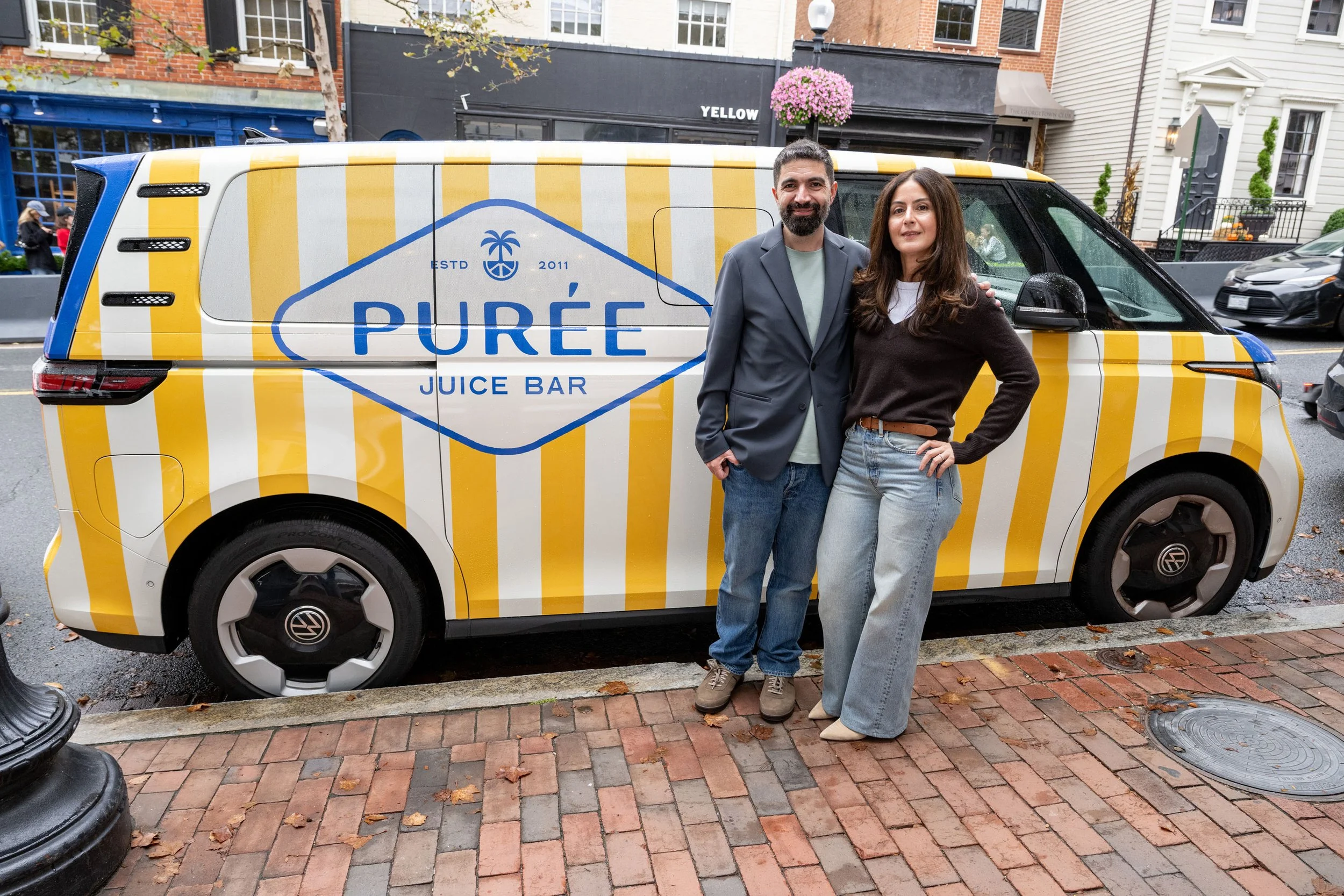
Co-Founders Dyala Madani & Kaveh Shirazi
(87)BrandLift • Identity, voice, packaging, retail, web · New locations in Washington, DC, Virginia, and Maryland.
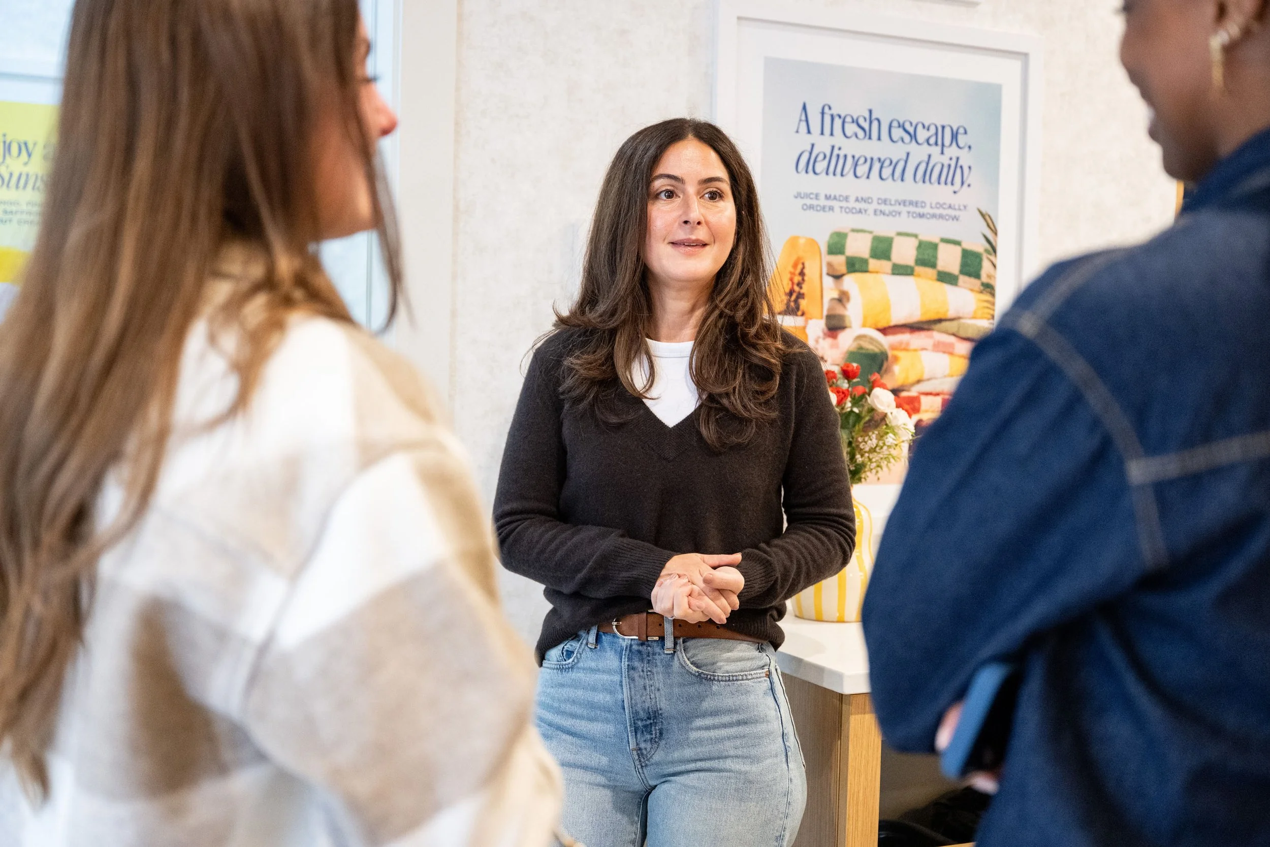
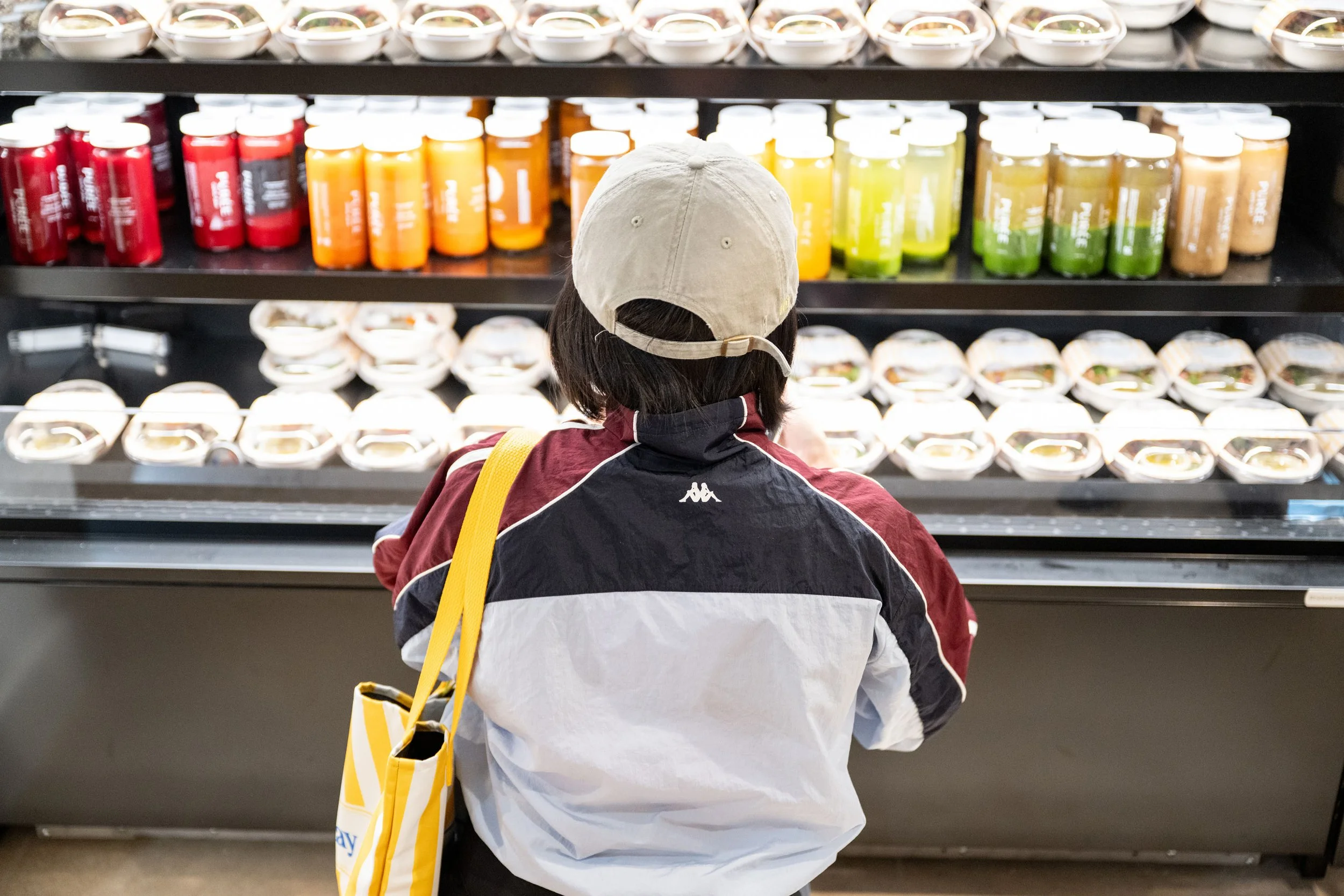
Dyala and Kaveh were Purée regulars long before they were owners. In 2025, they took over a D.C. favorite that had been pressing organic juice into glass bottles since 2011.
The product was already great. The brand hadn't kept up. And with new locations on the way, they had to figure out what to protect and what to change before growing it.
We started with Focus workshops to put words to what made Purée special. Then we refreshed the identity, voice, packaging, and stores, so it could grow into new neighborhoods without losing the feeling regulars came back for.
“The workshops… felt less like a branding exercise and more like therapy for our business.”
Dyala Madani, Co-Owner & CEO
-
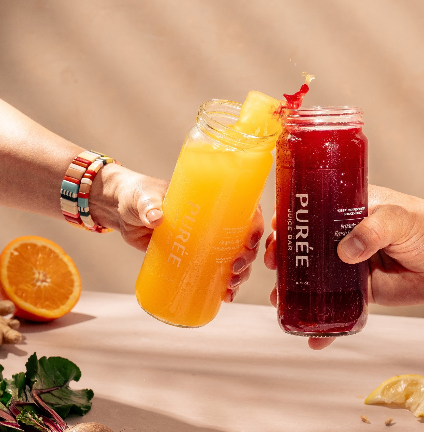
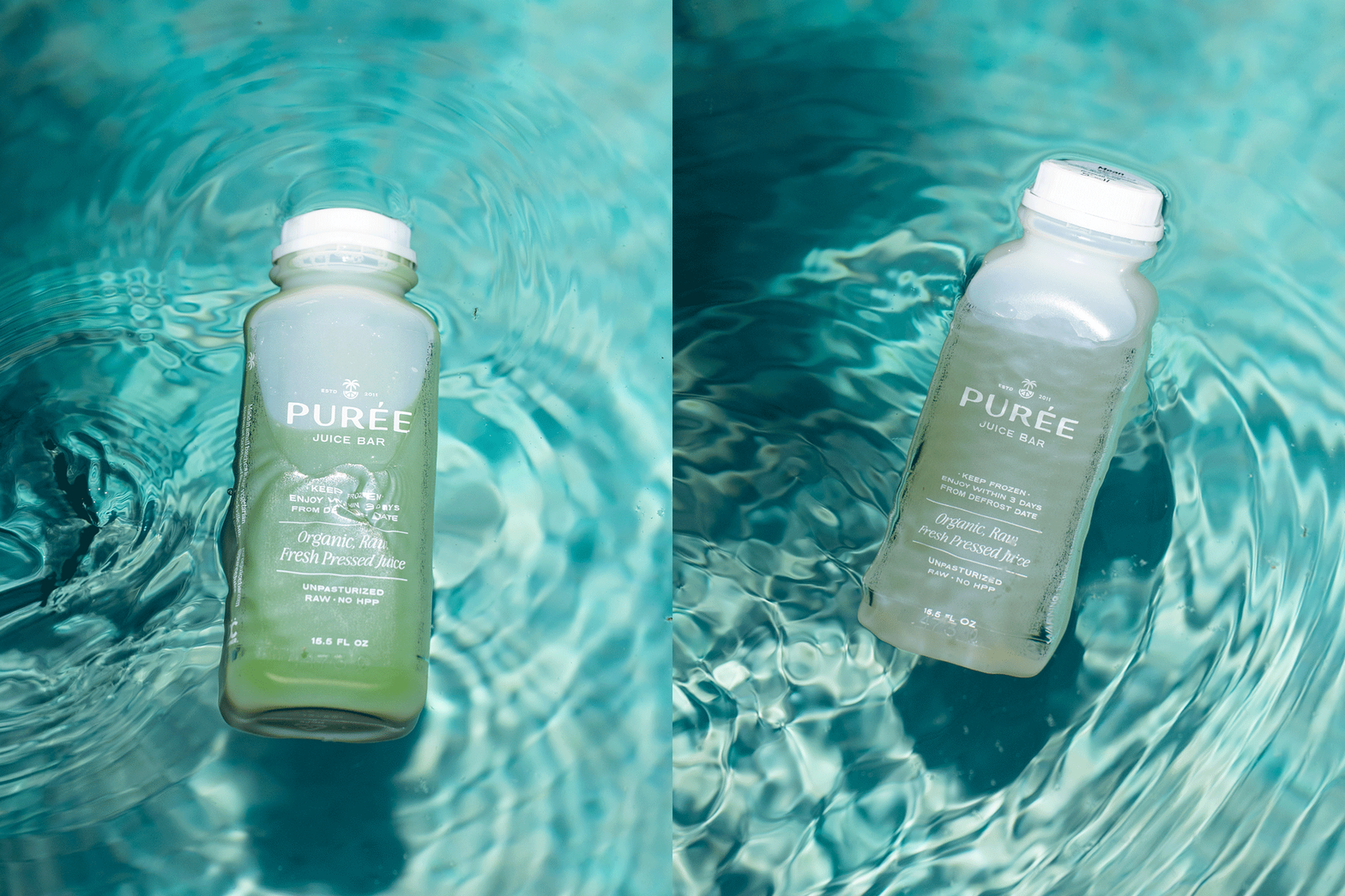
Pureé Juice Bar had already built a loyal following. Known for raw, organic, unpasteurized juices served in glass, the product quality was exceptional. But as the business grew, the brand presentation had not kept pace with the experience customers felt inside the space. What made Pureé special was clear to regulars, but harder to articulate to new audiences and future locations.
The team came to EightySeven at a pivotal moment. They were preparing for expansion and needed a brand that could scale without losing its soul. Not a reinvention, but a refinement that clarified what Pureé had always stood for and elevated it into a distinctive, ownable position in the wellness space.
Our role was to help translate Pureé’s care, standards, and hospitality into a brand system that felt confident, joyful, and unmistakably premium, without becoming precious or unapproachable.
—
Photos by Birch Photography and Chris Ferenzi
Brand Support by Erika Park

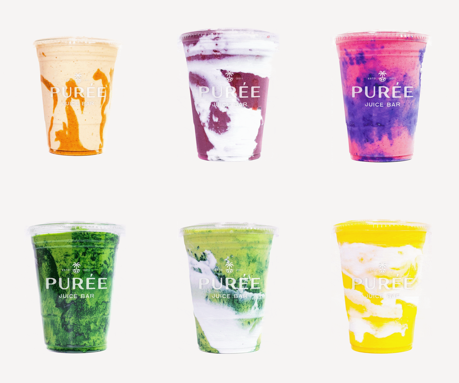
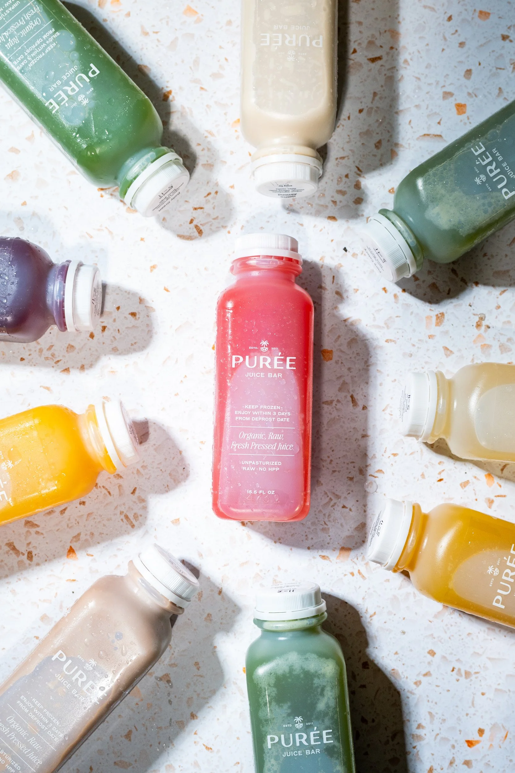
(01) Brand Focus
Clarifying the ingredients that make Purée exceptional.
-
During our Focus phase, we worked closely with the Purée team to unpack not only what they make but also why people return. The insight was not about ingredients alone. It was about how Purée makes wellness feel.
Unlike most juice brands that emphasize discipline, restriction, or performance, Purée had quietly built something warmer. Customers described it as a pause in their day. A ritual. A place where nourishment felt joyful, not transactional.
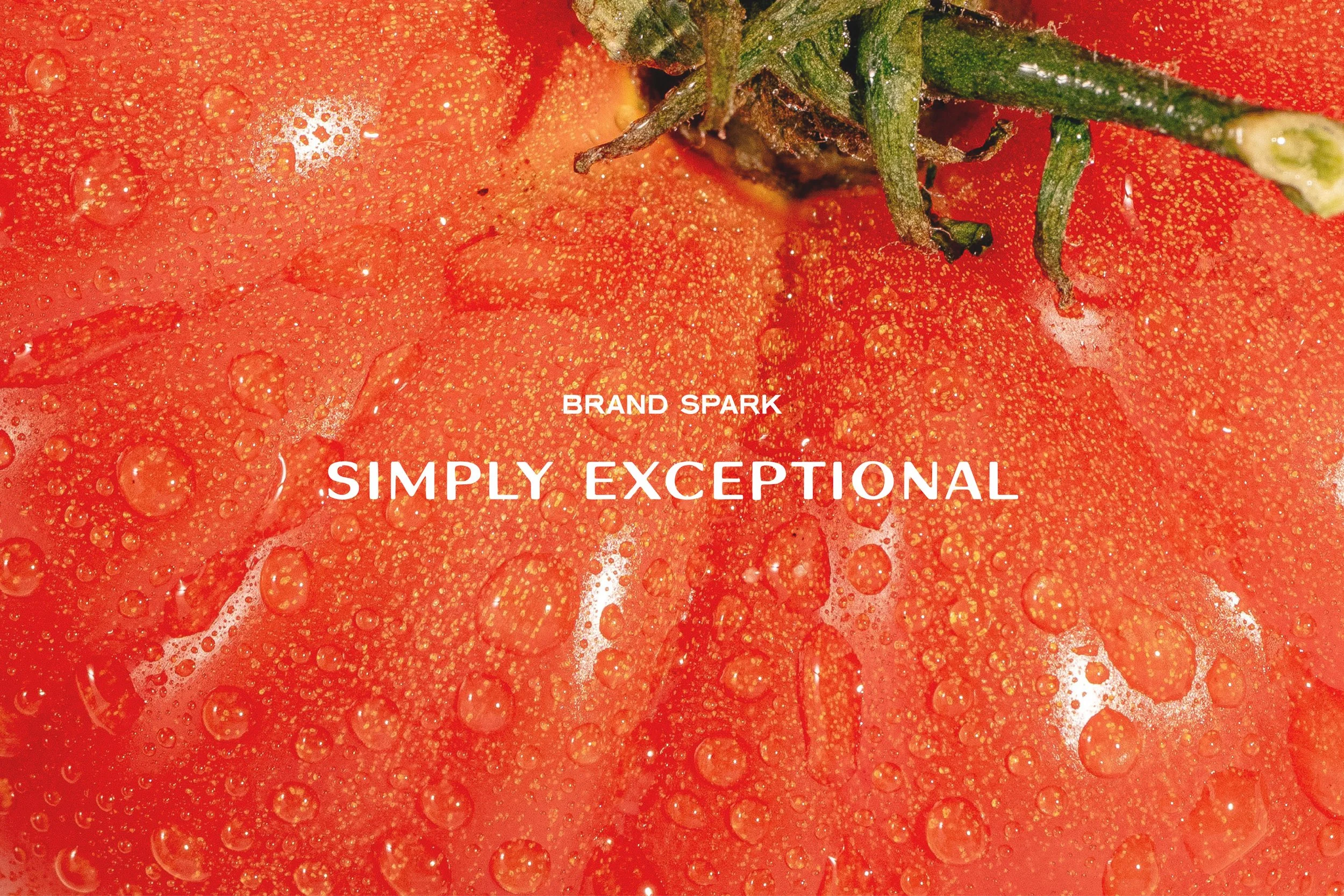
This led to a clear reframing. Purée is not just a juice bar. It is a hospitality-led wellness brand. One that treats food with the same care, detail, and intention you would expect from a great hotel or restaurant. That clarity became the foundation for every decision that followed. From positioning to tone to visual direction, the brand needed to feel simply exceptional, without trying too hard to prove it.
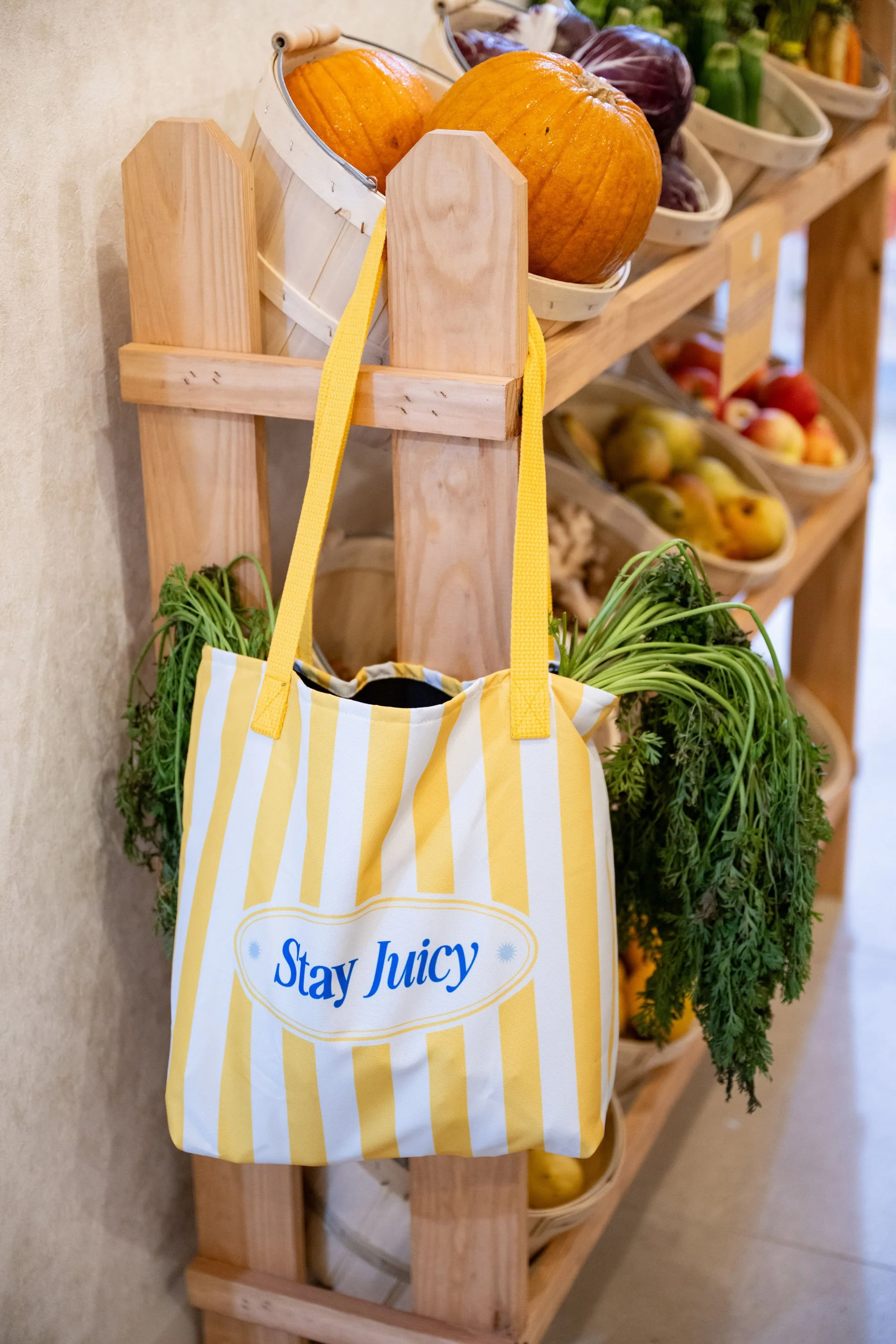
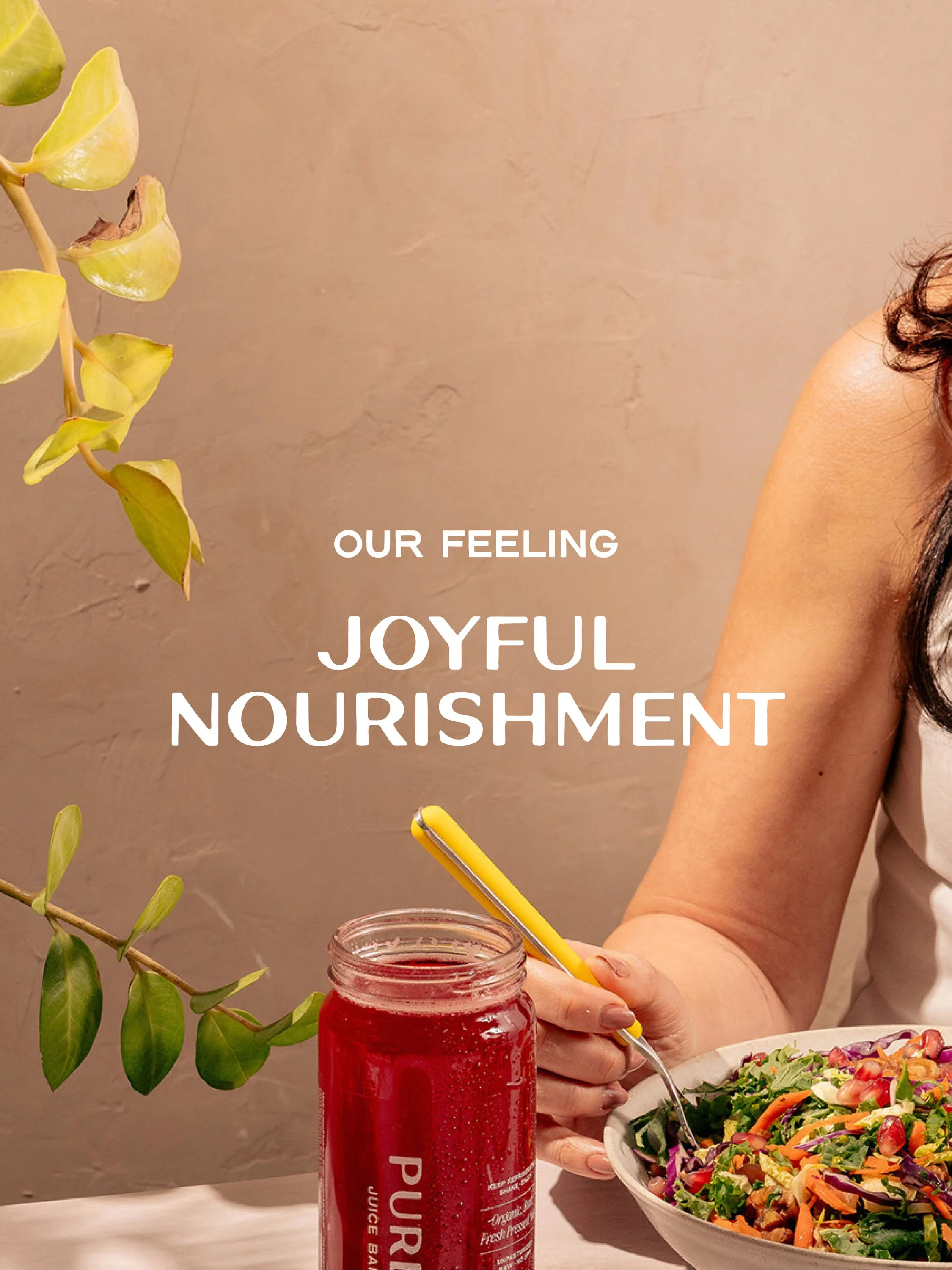
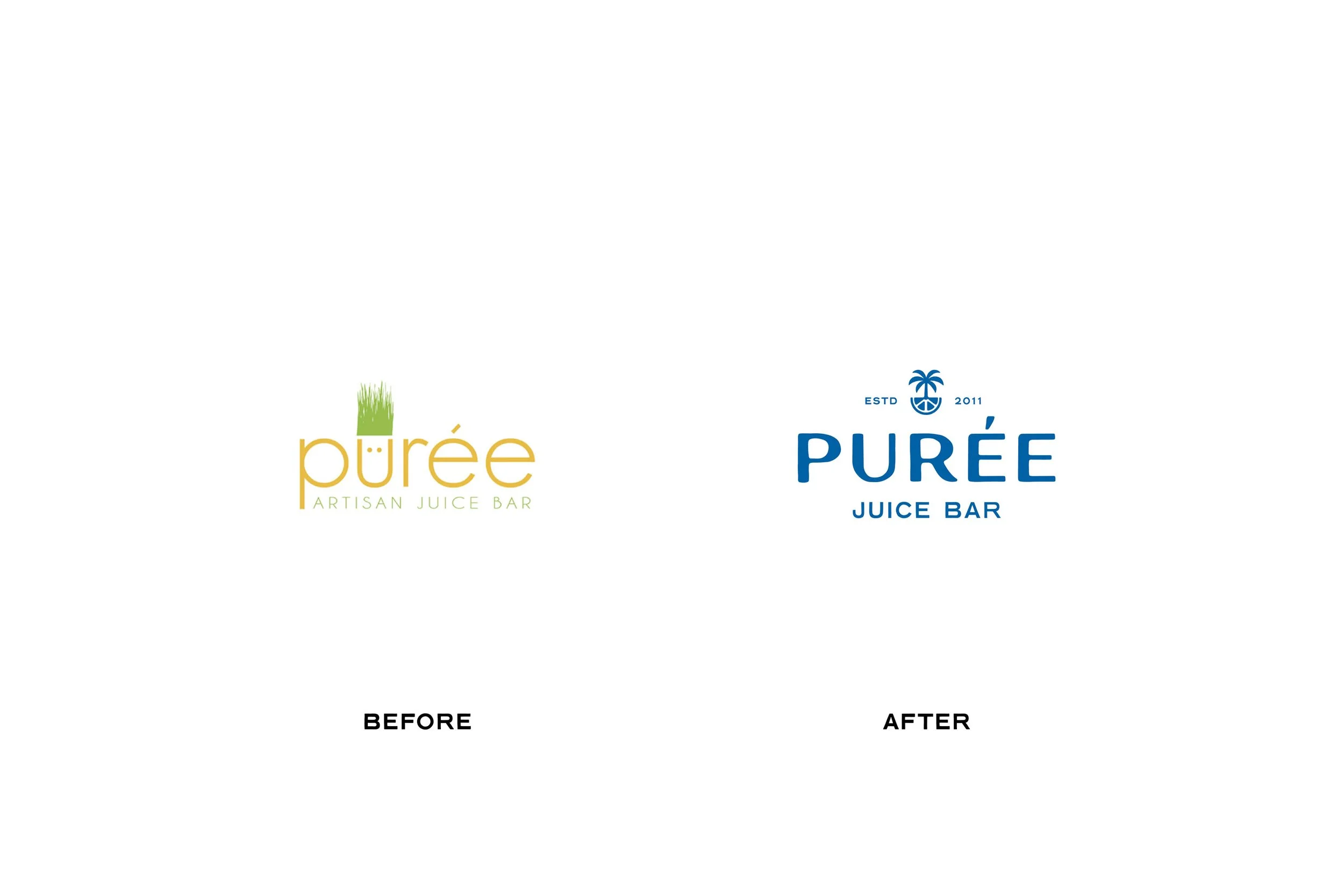
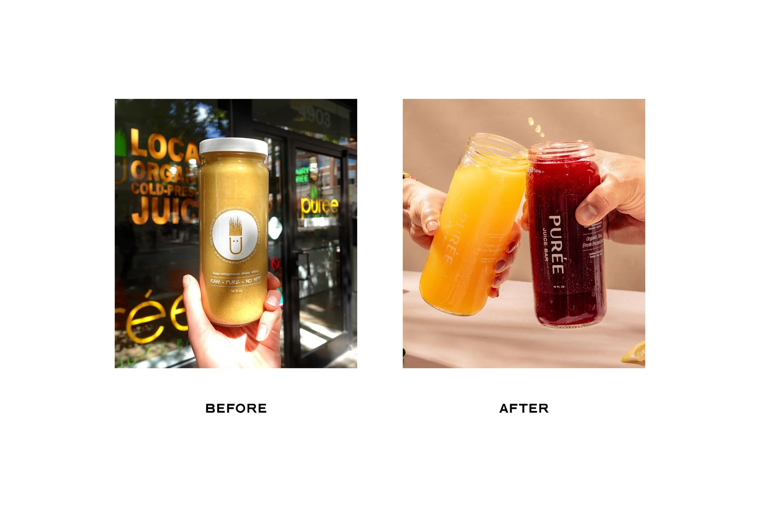
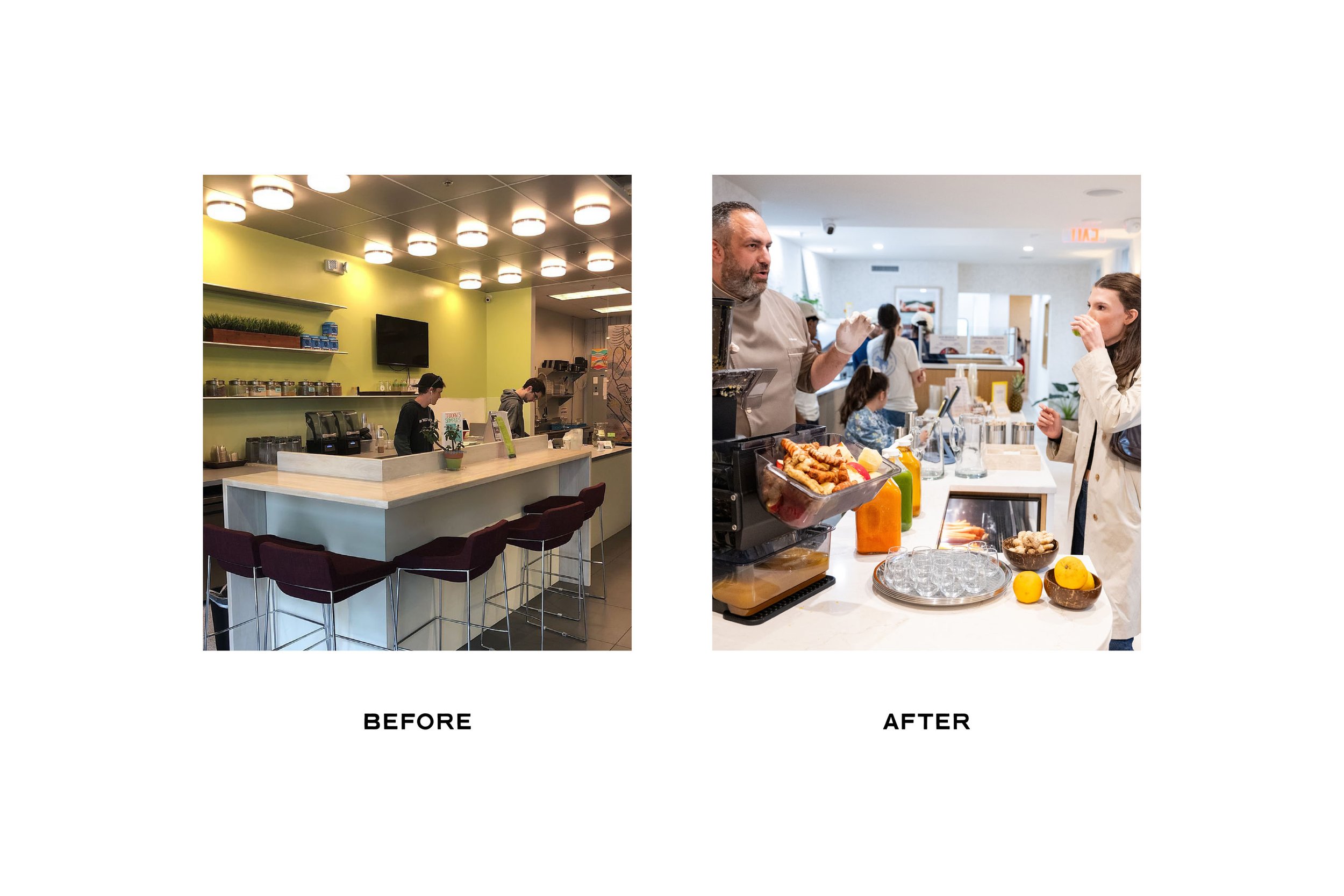


(02) Brand Design → Visual Identity
A sunny expression of joy and care.
-
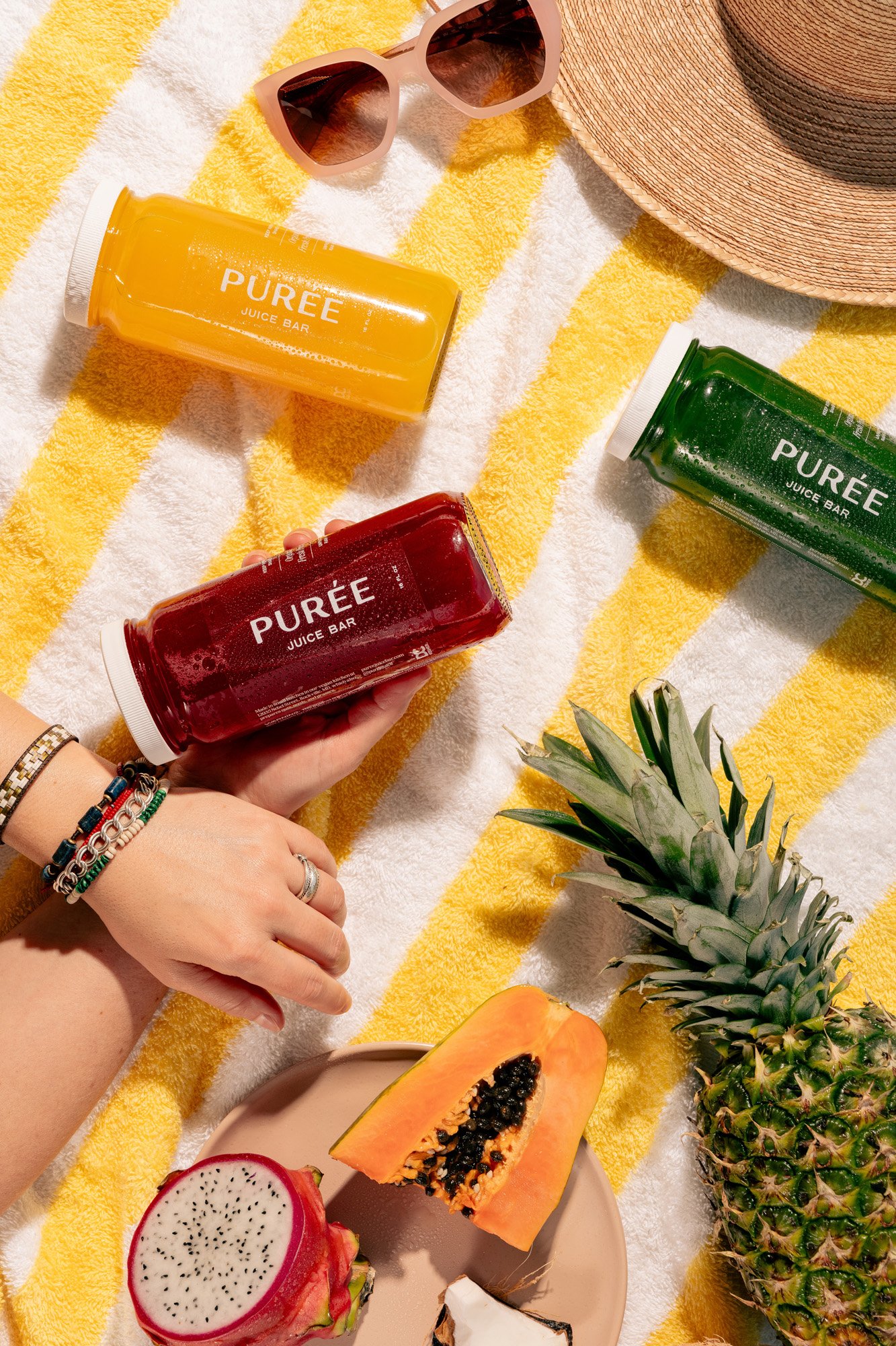
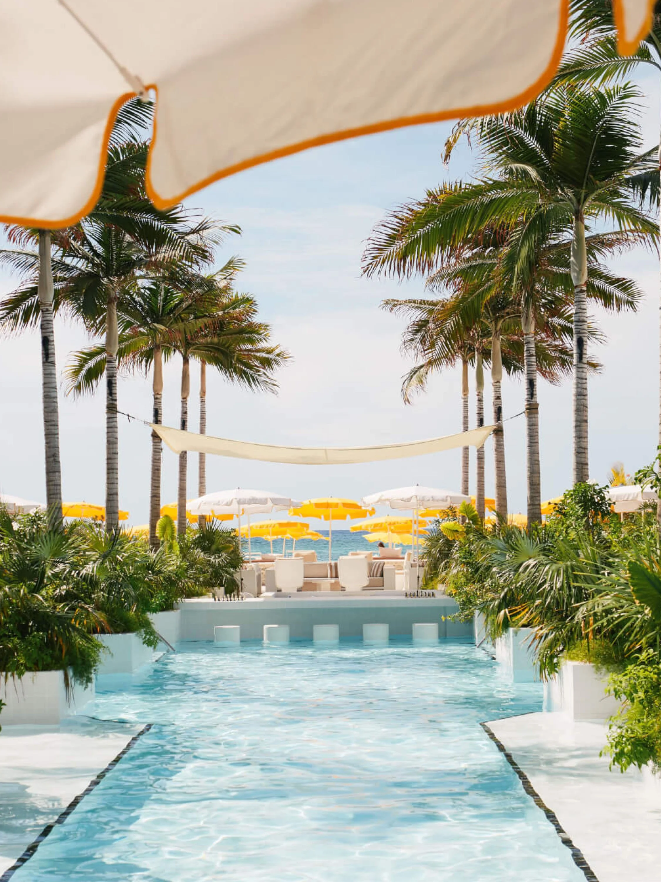
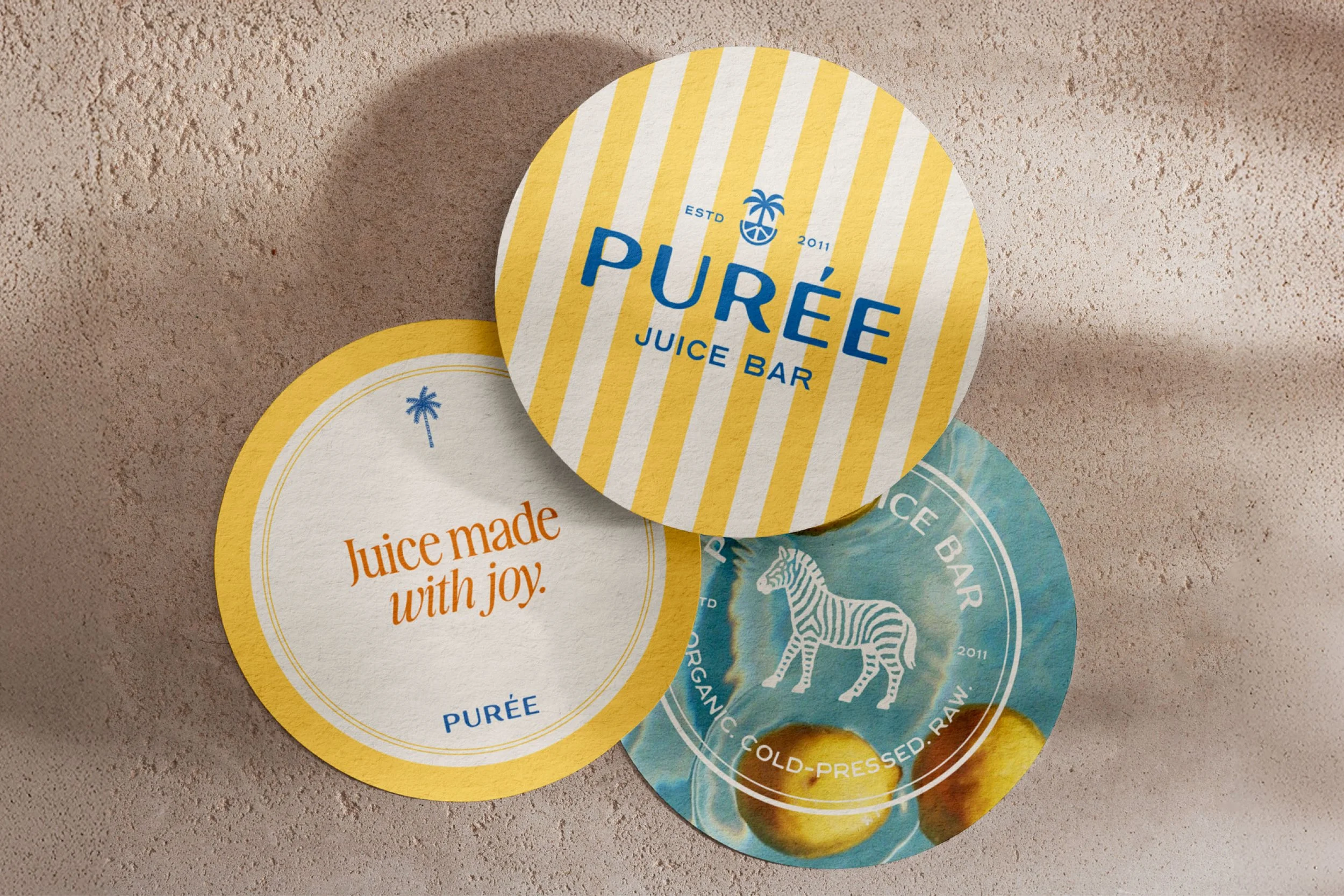
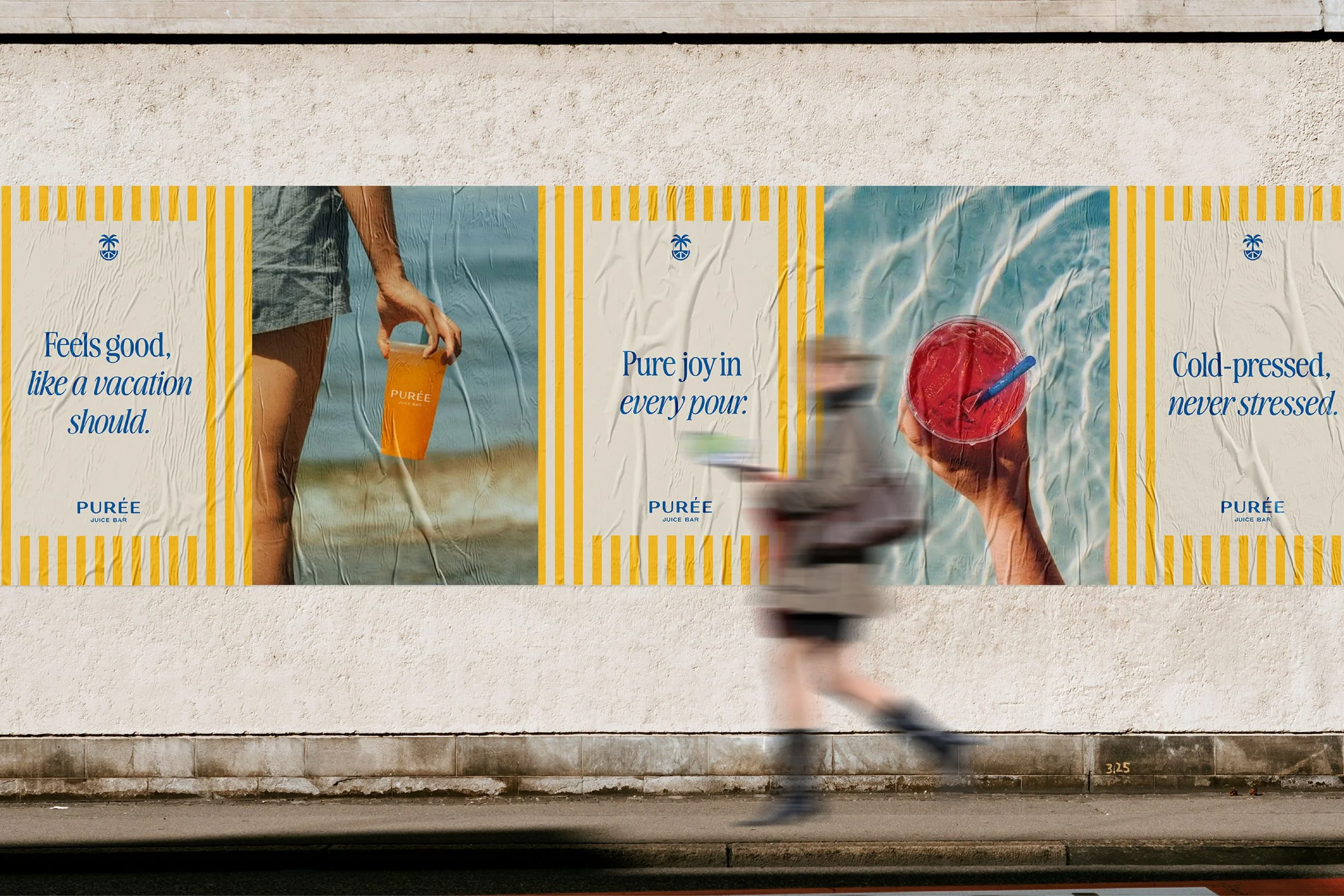
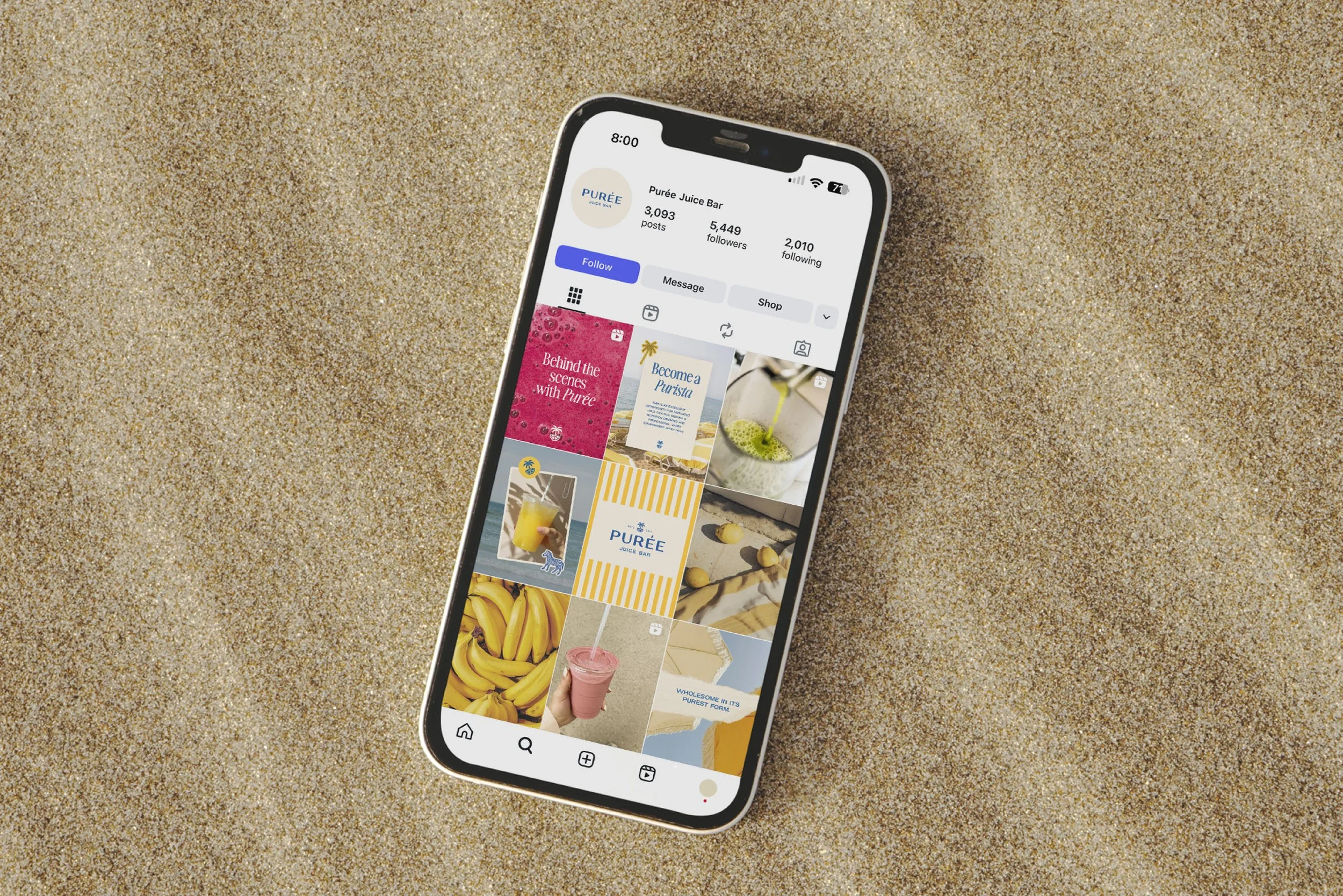
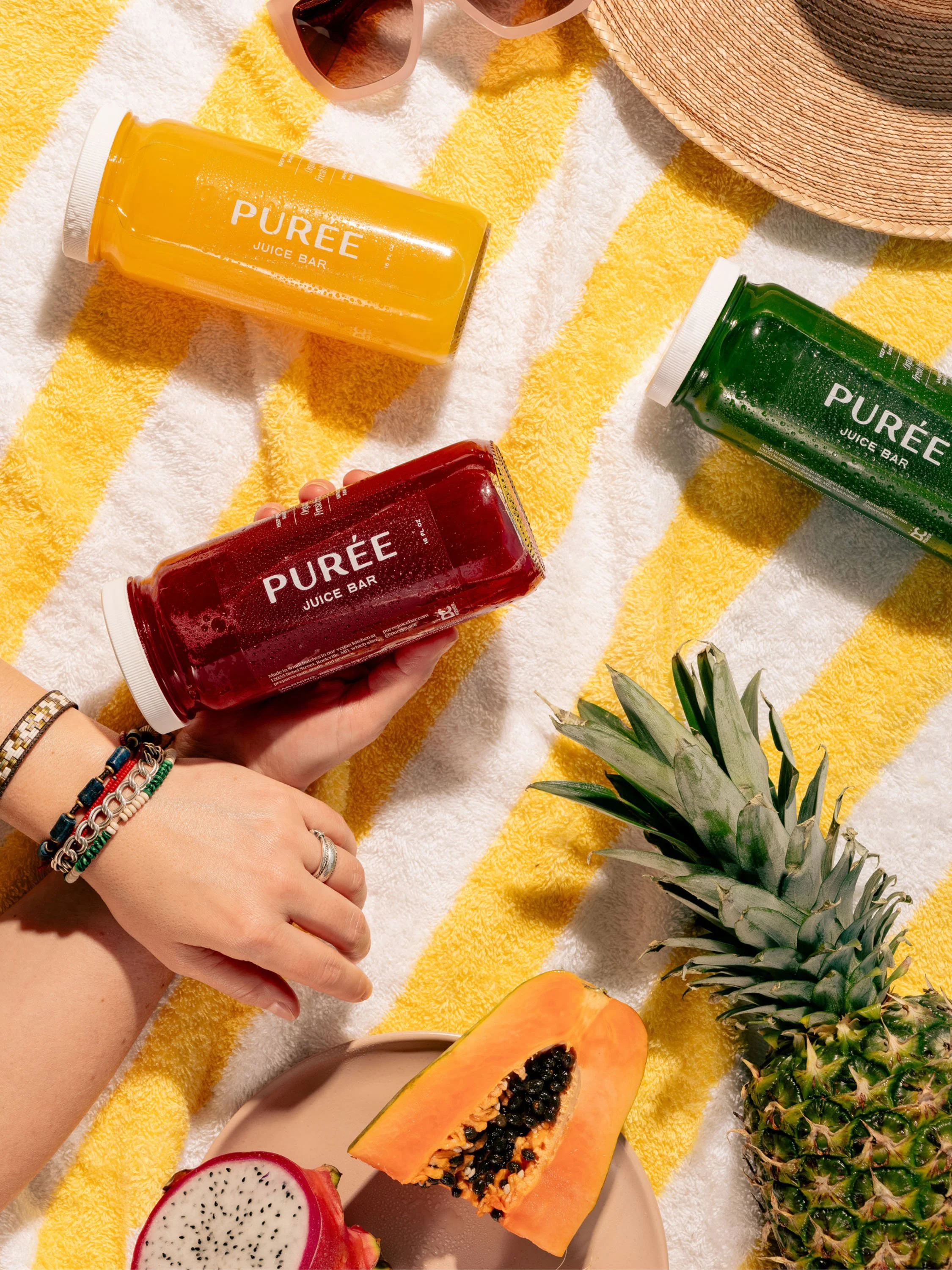
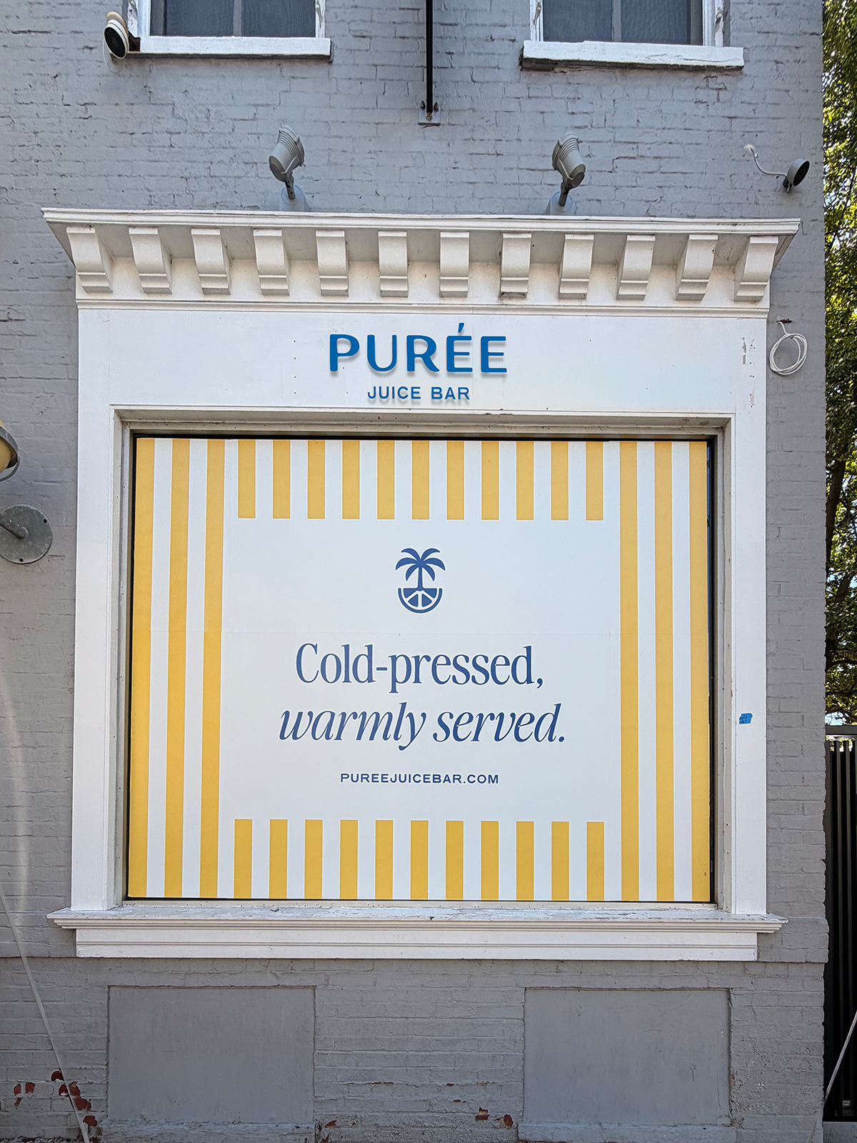
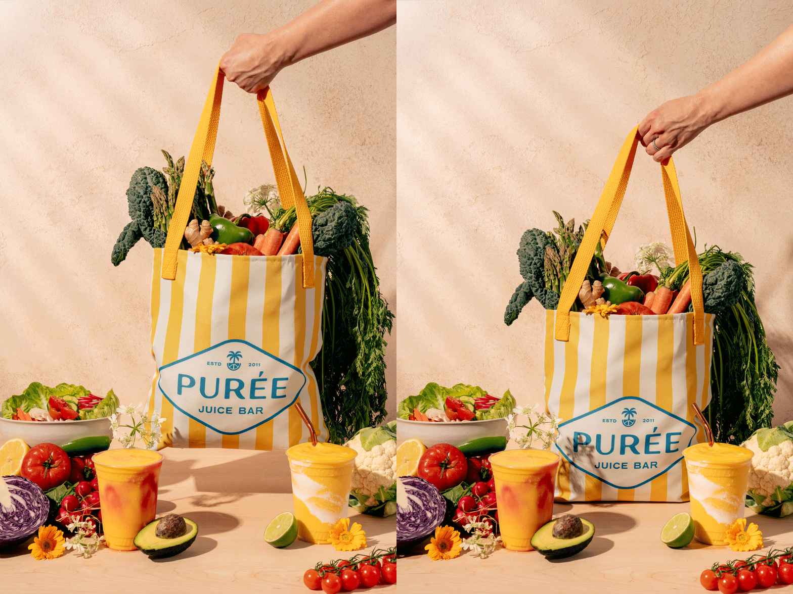
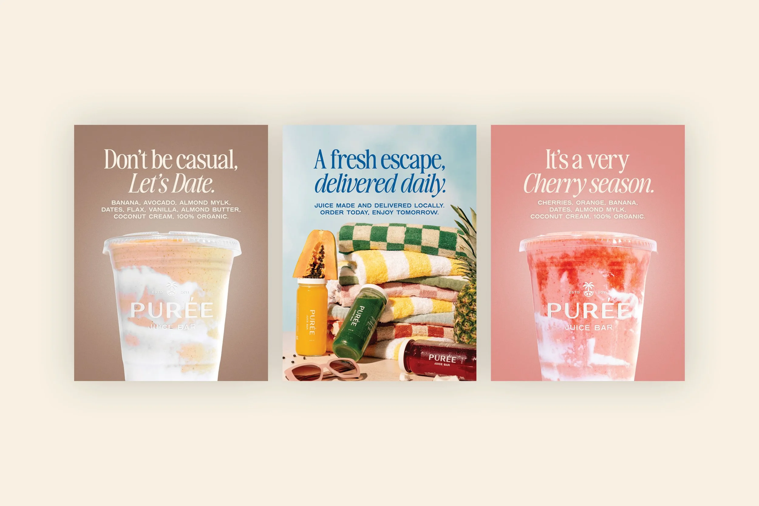
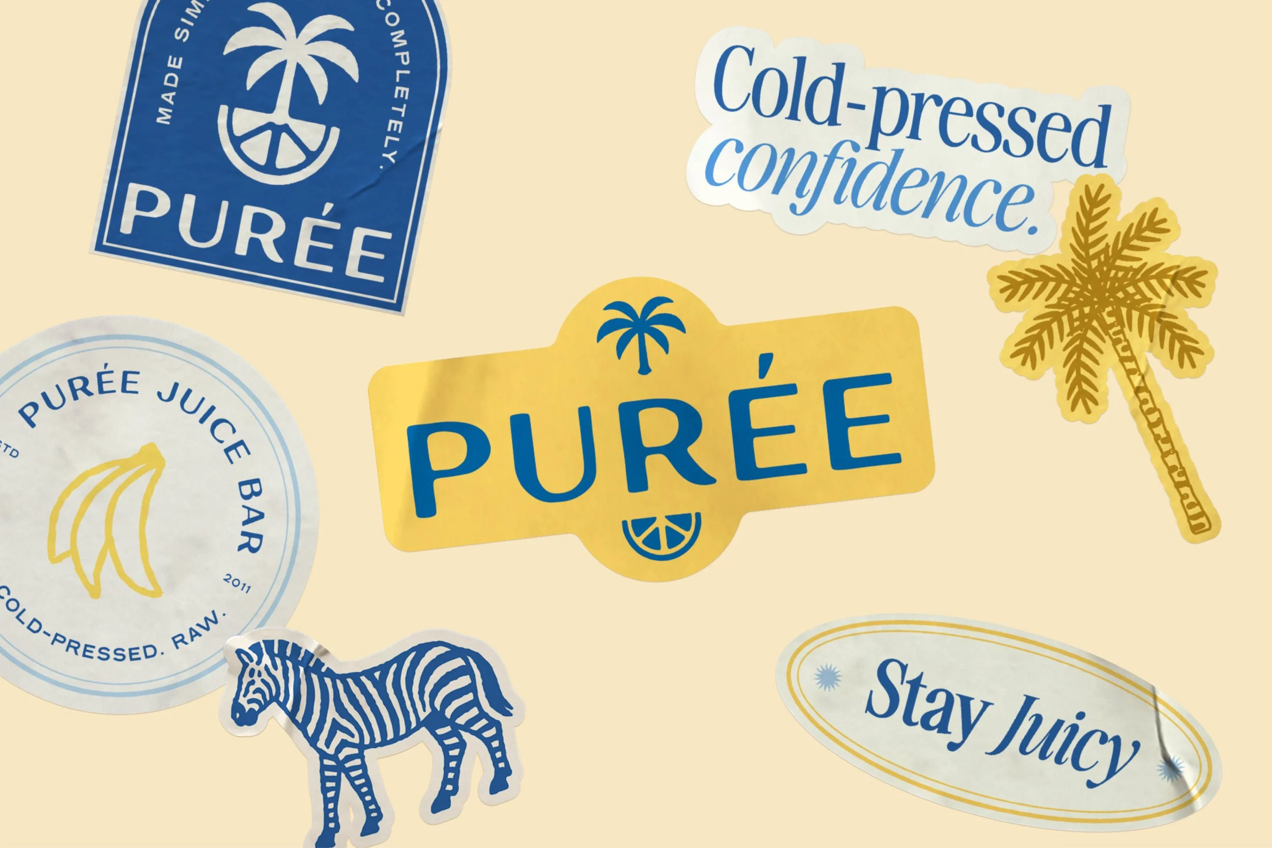
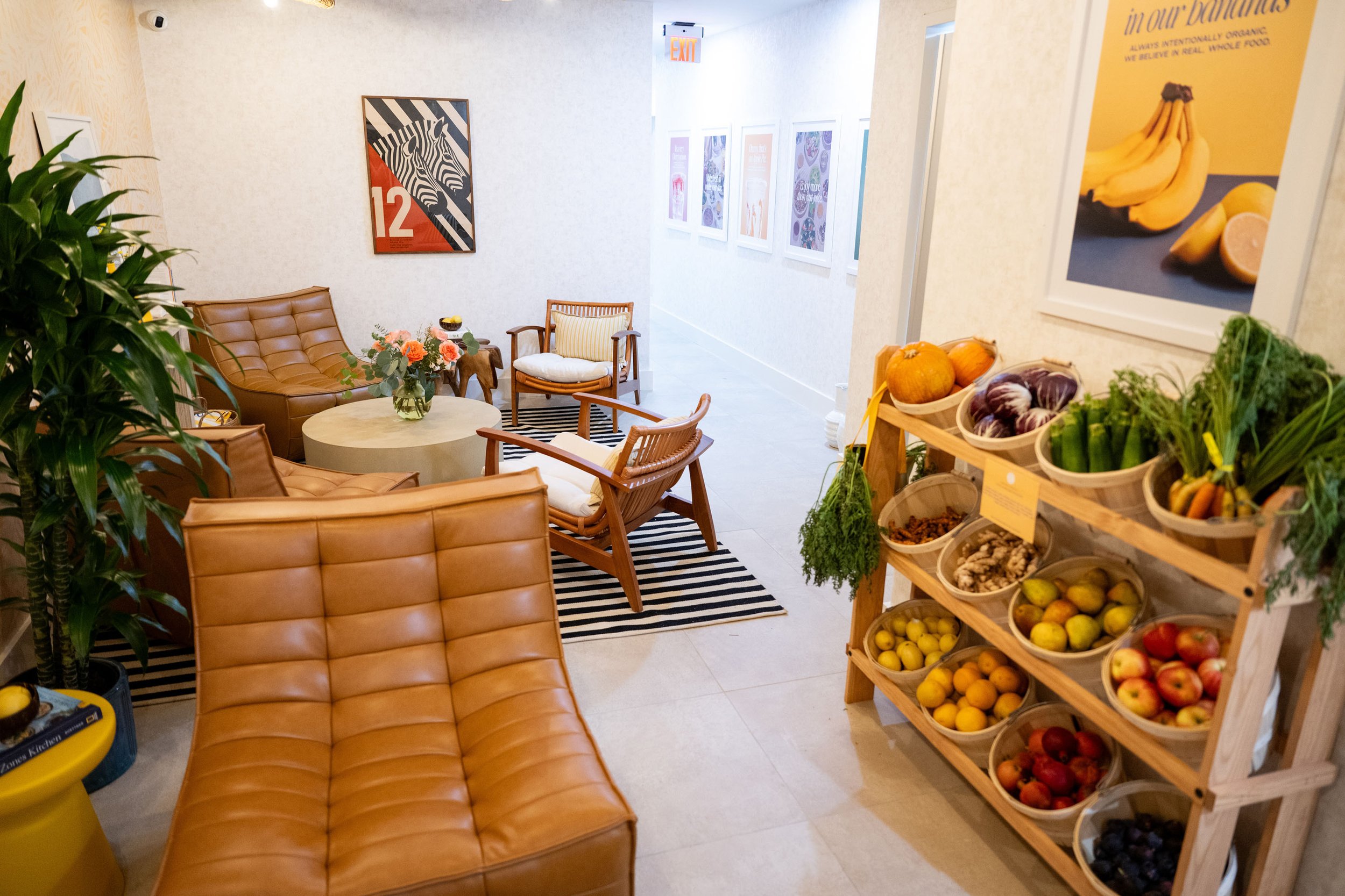
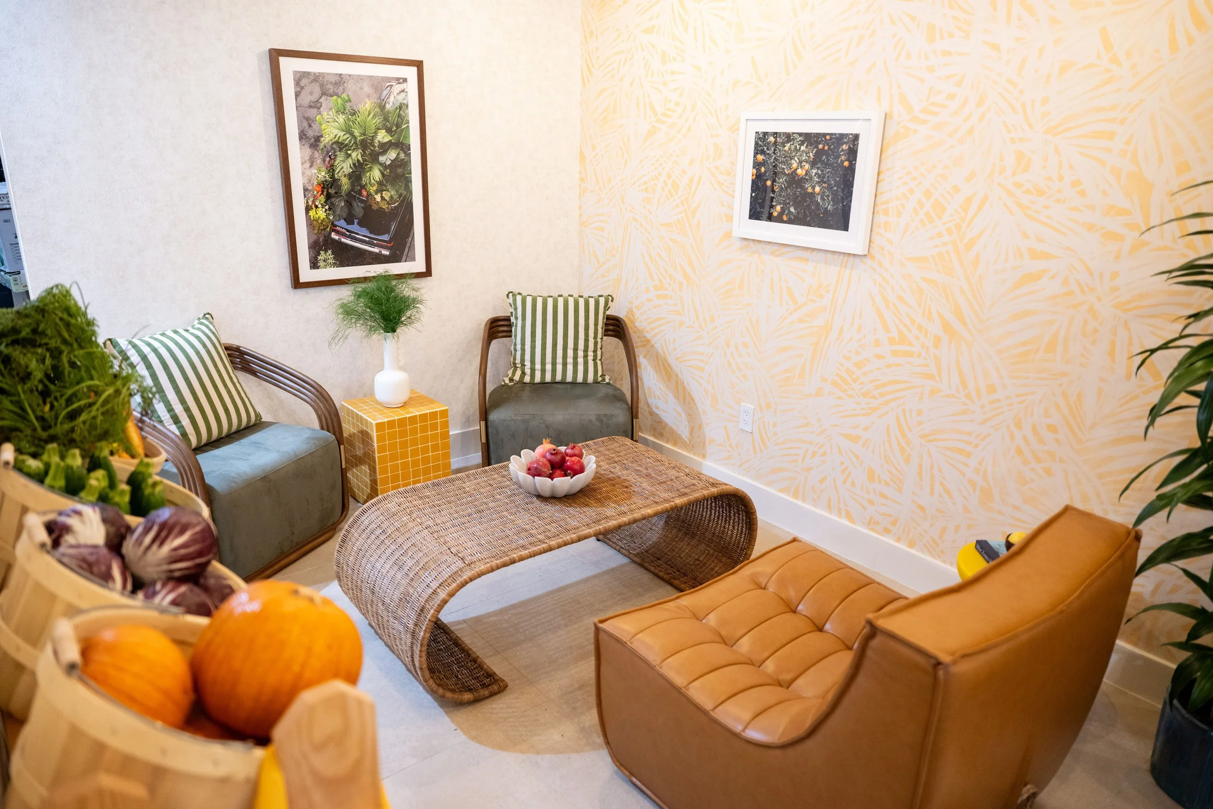
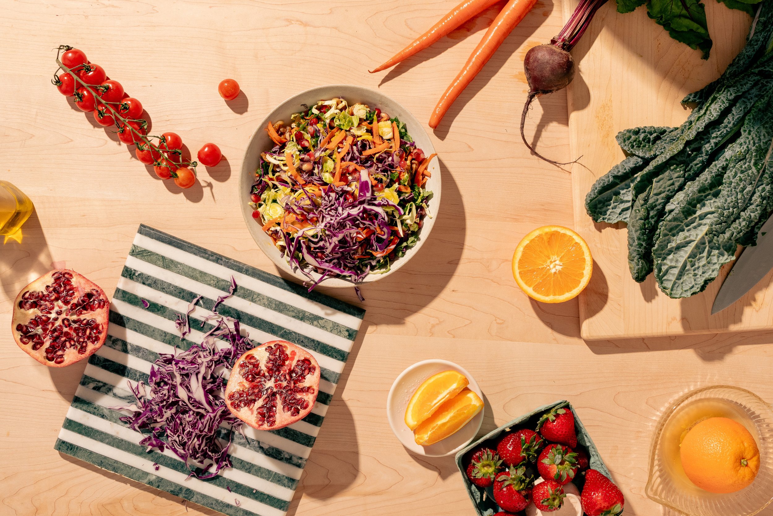
Visually, the goal was to create a system that felt bright and confident while remaining timeless. Drawing inspiration from boutique hotels, resort hospitality, and editorial food culture, we developed a flexible identity rooted in warmth and optimism.
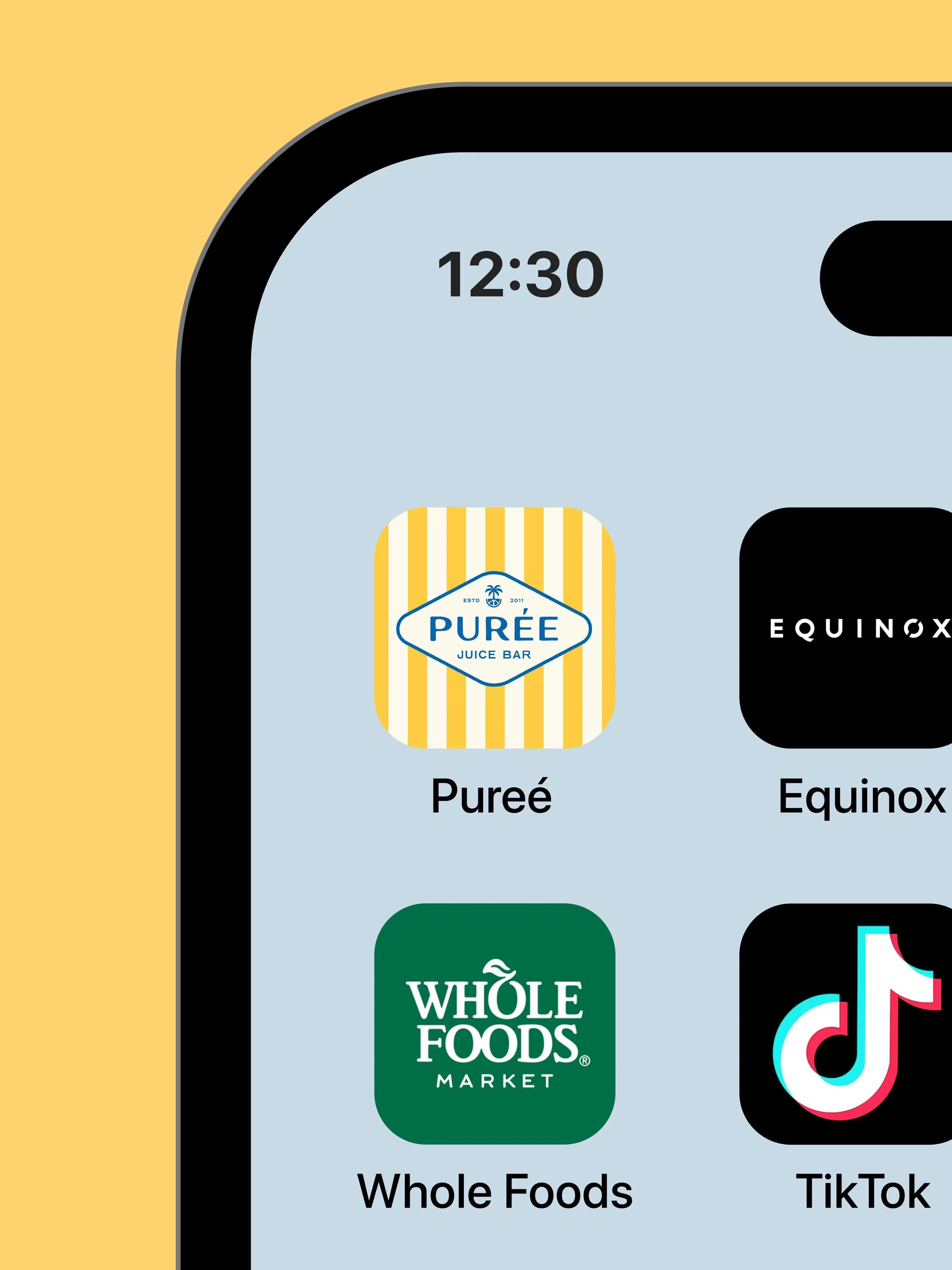
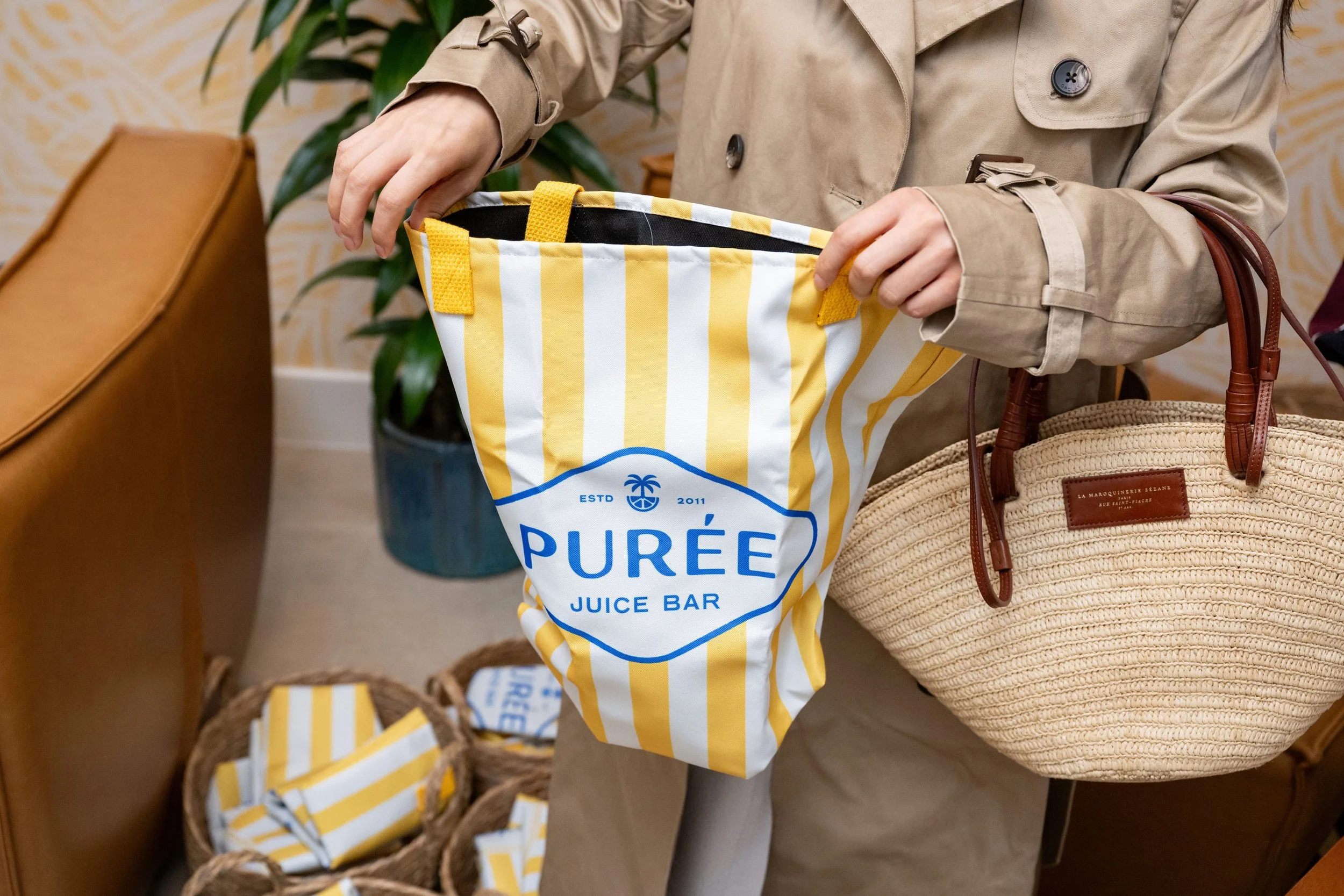
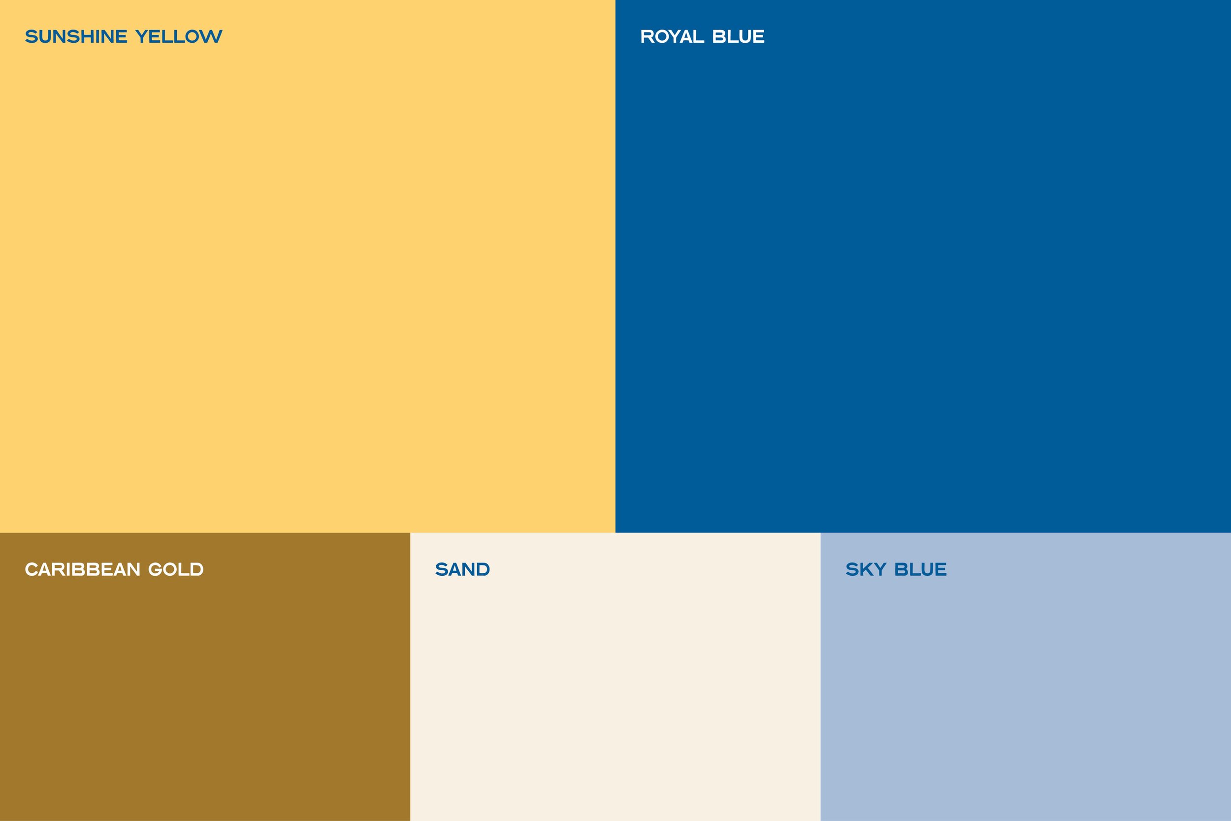
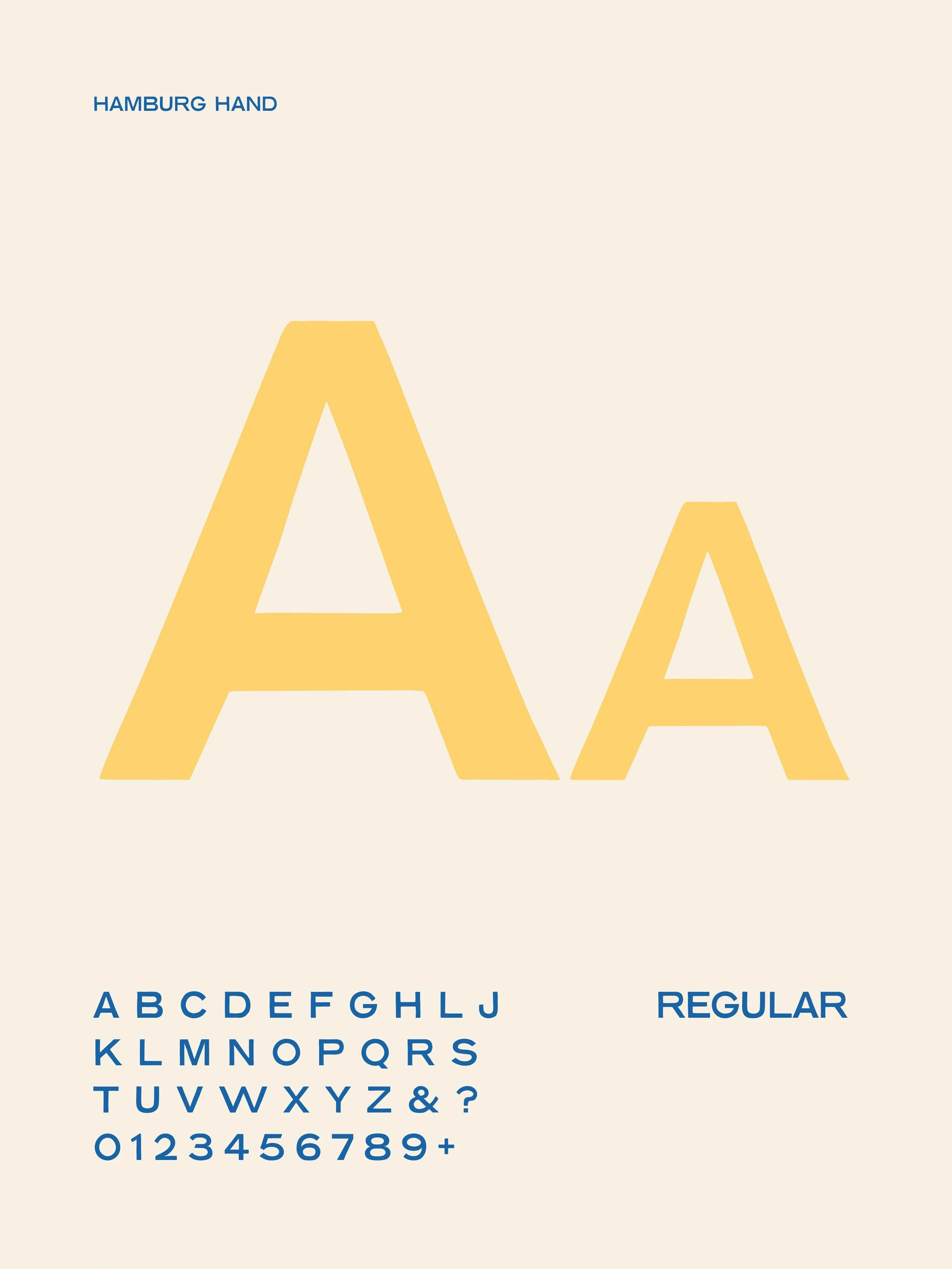
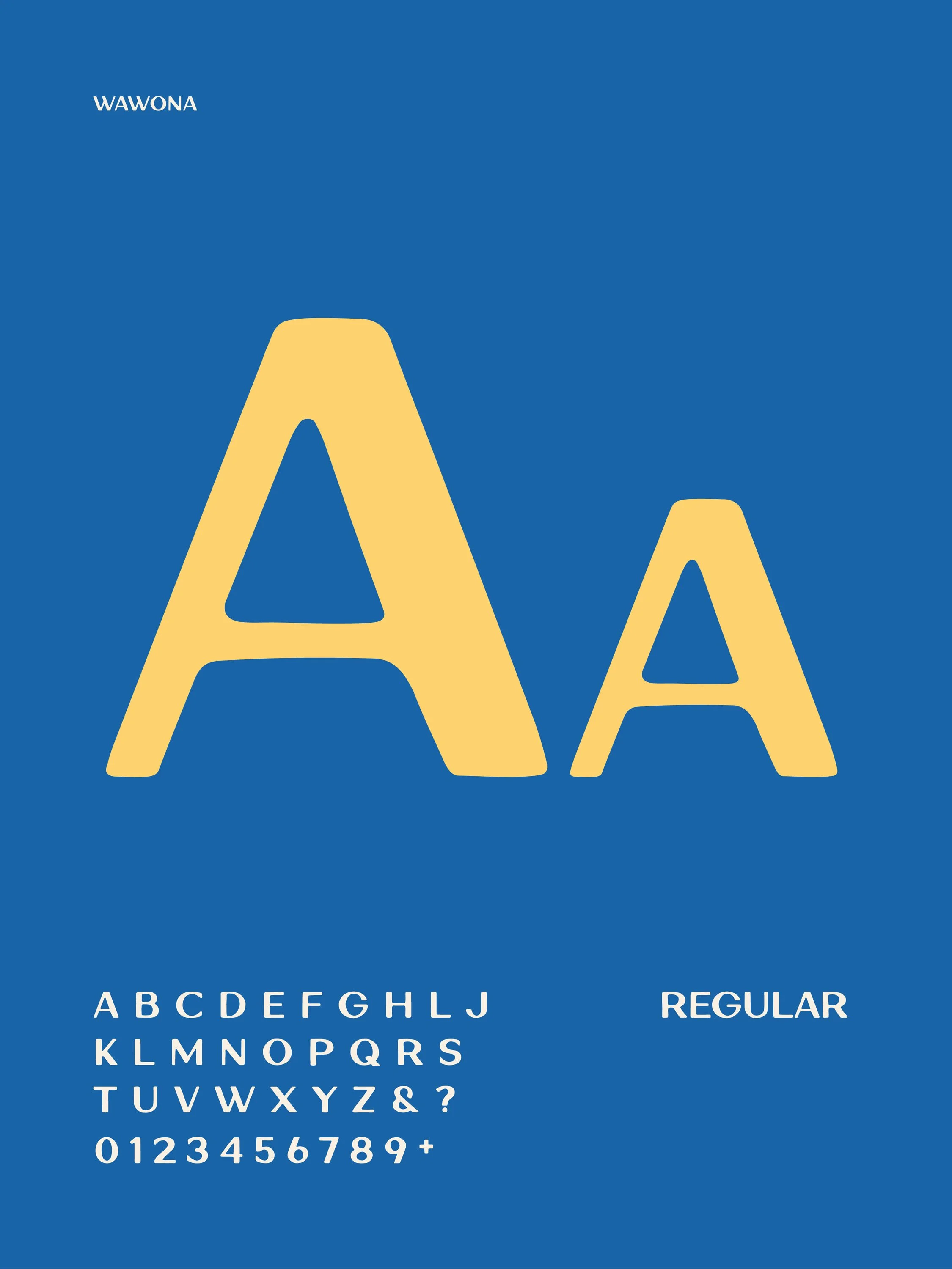
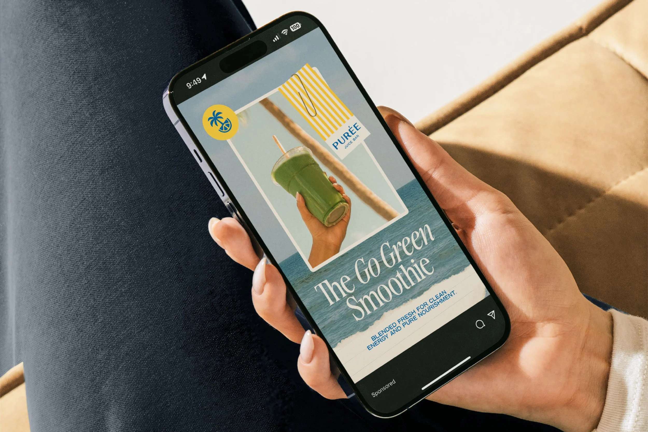
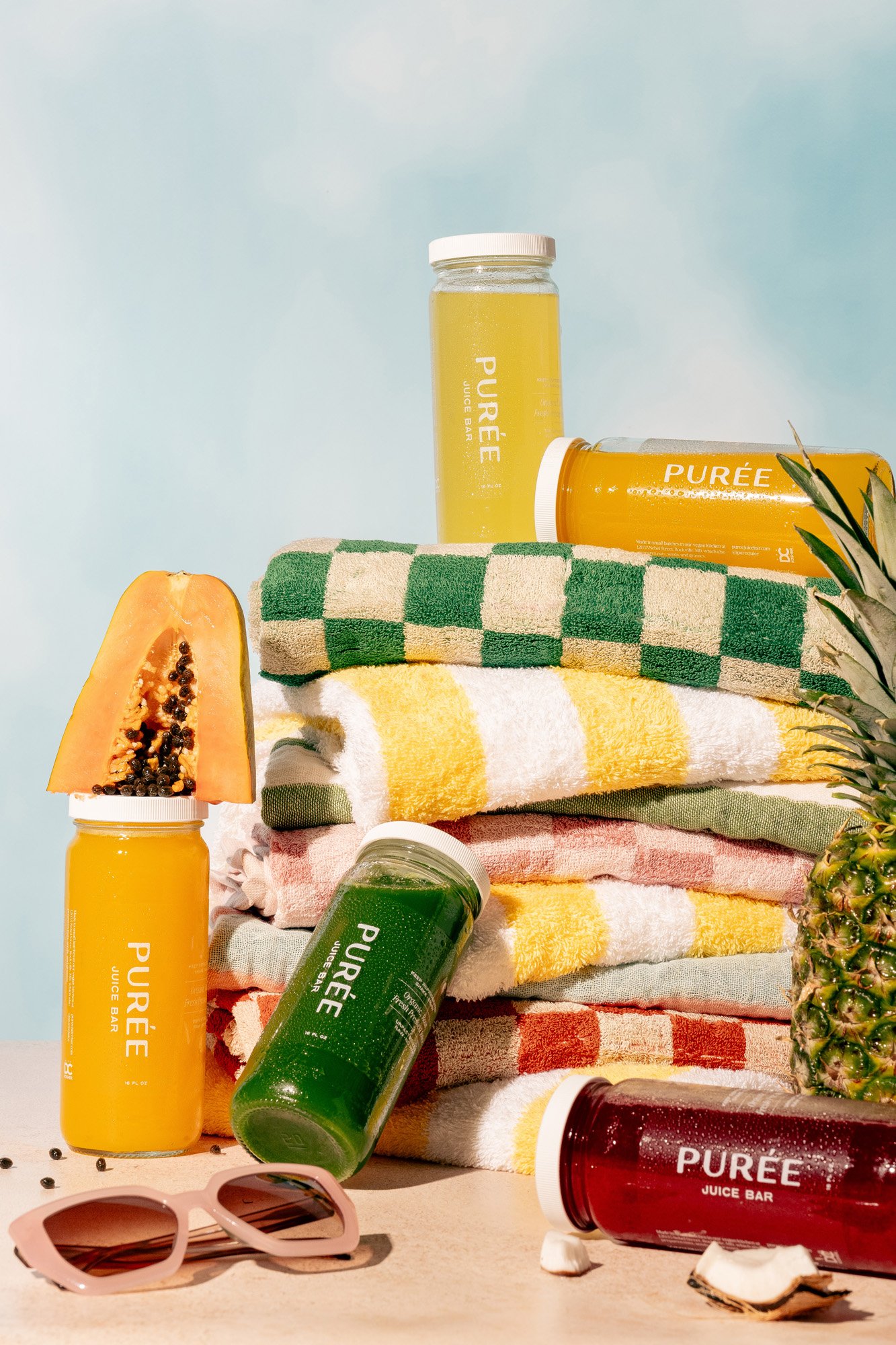
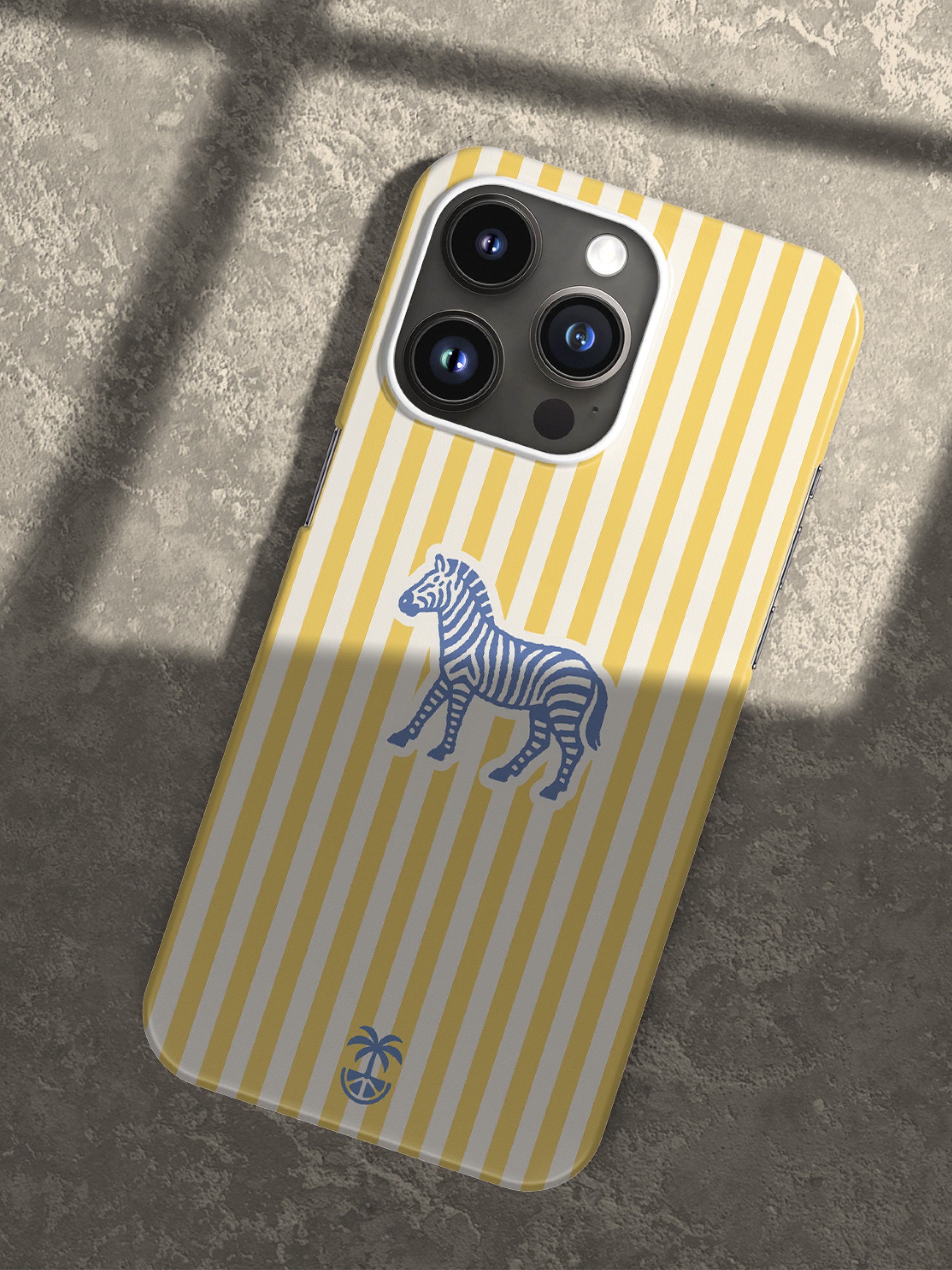
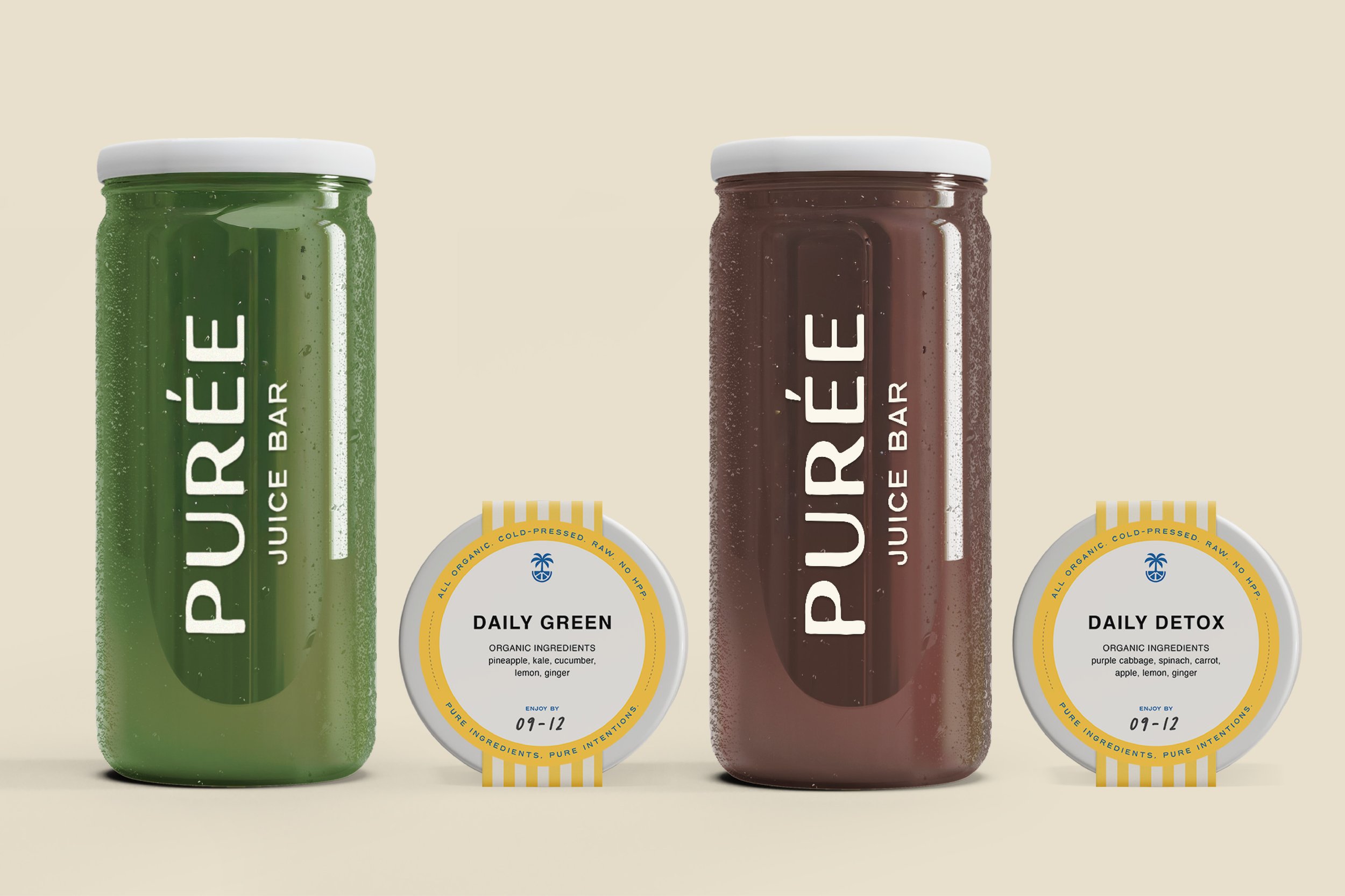
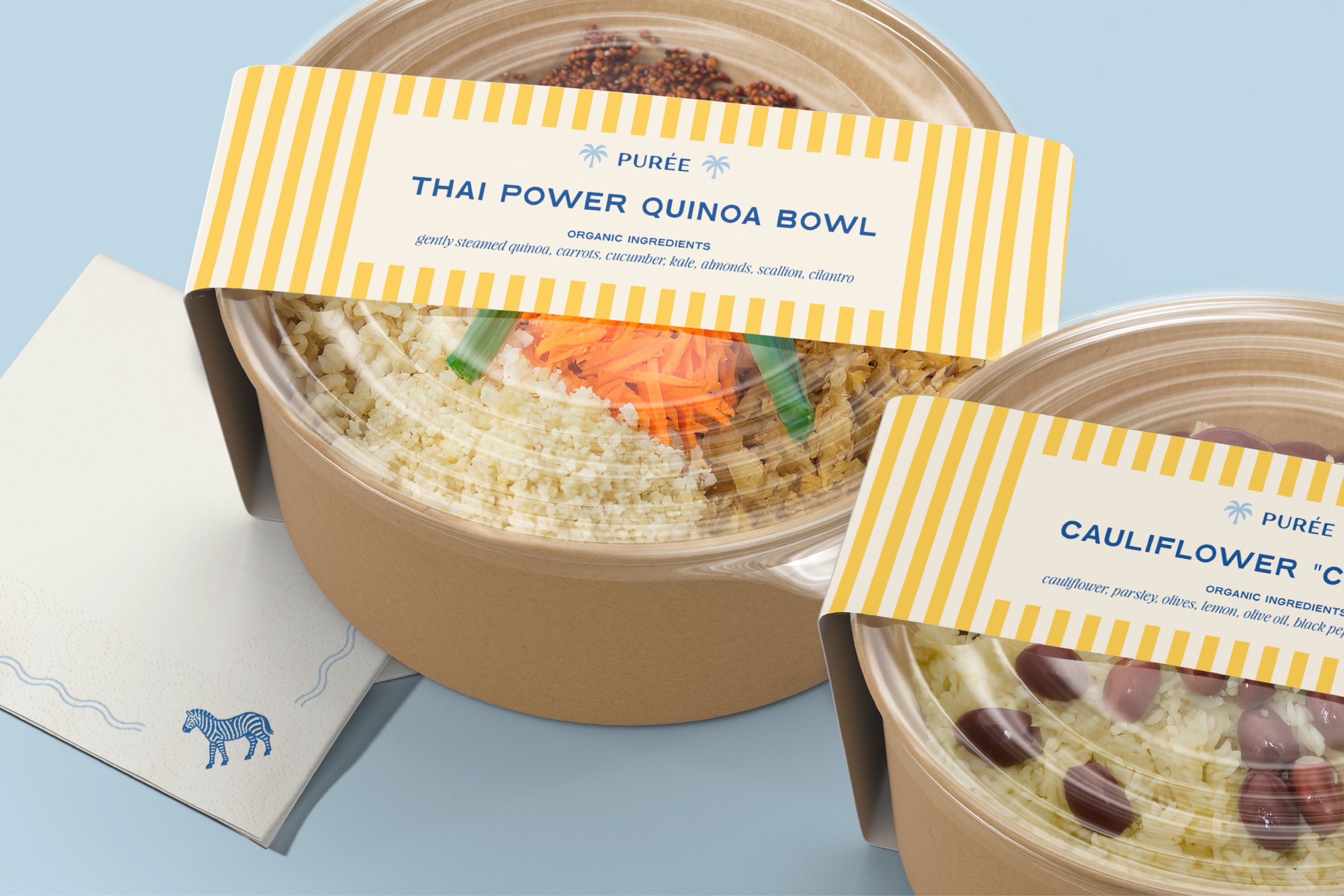
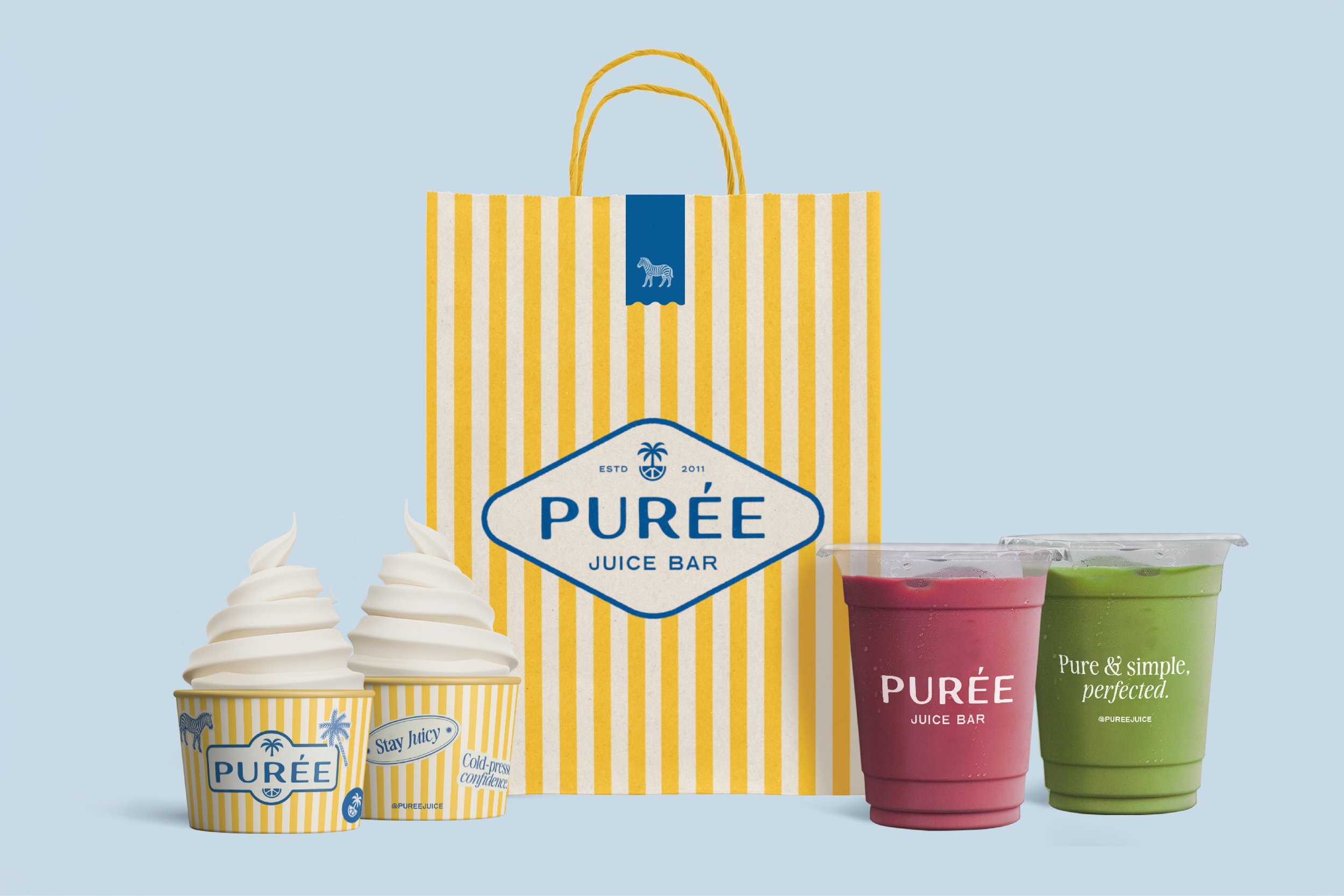
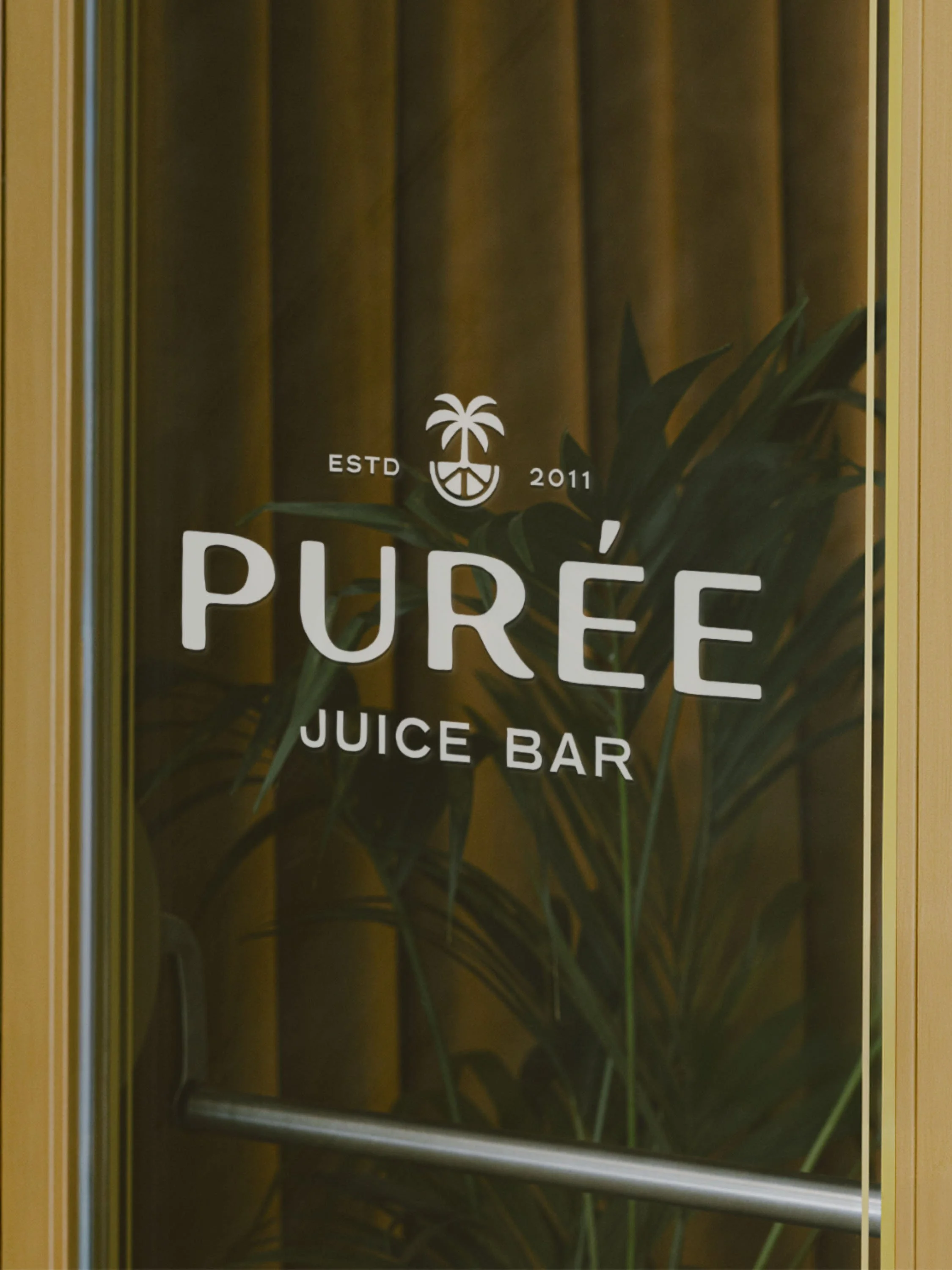
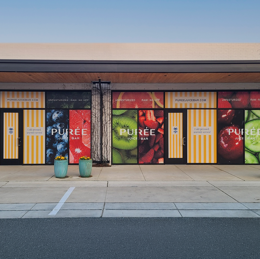
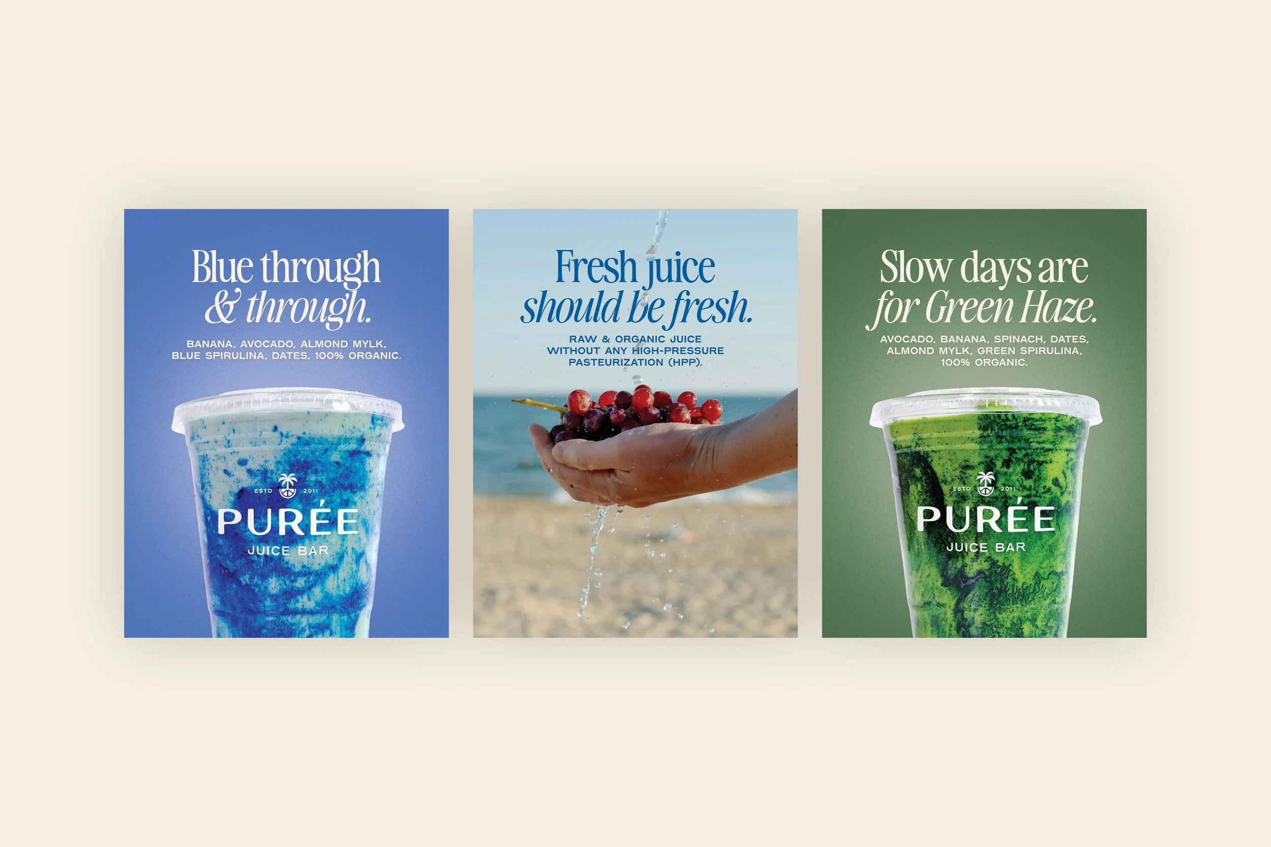
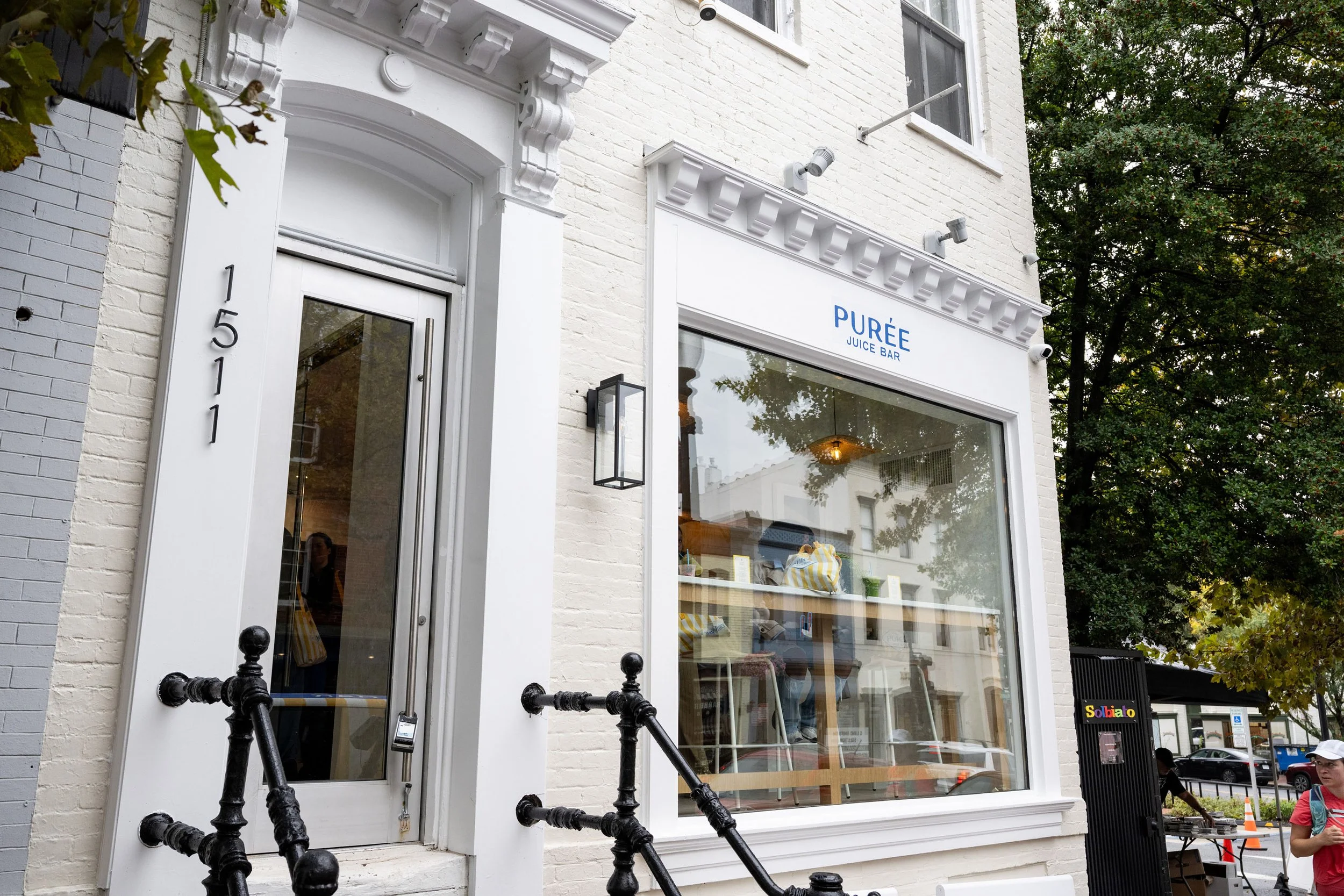
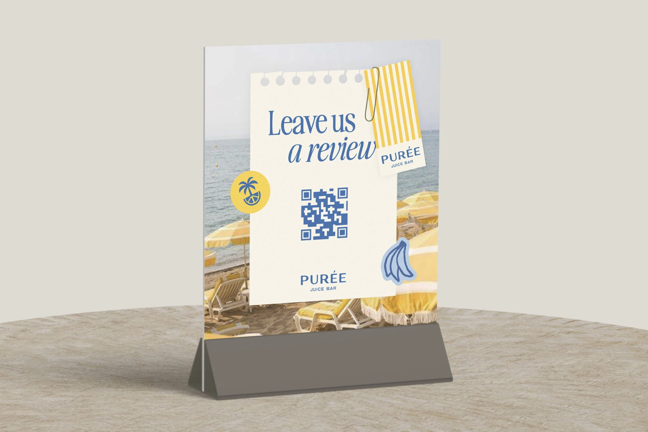
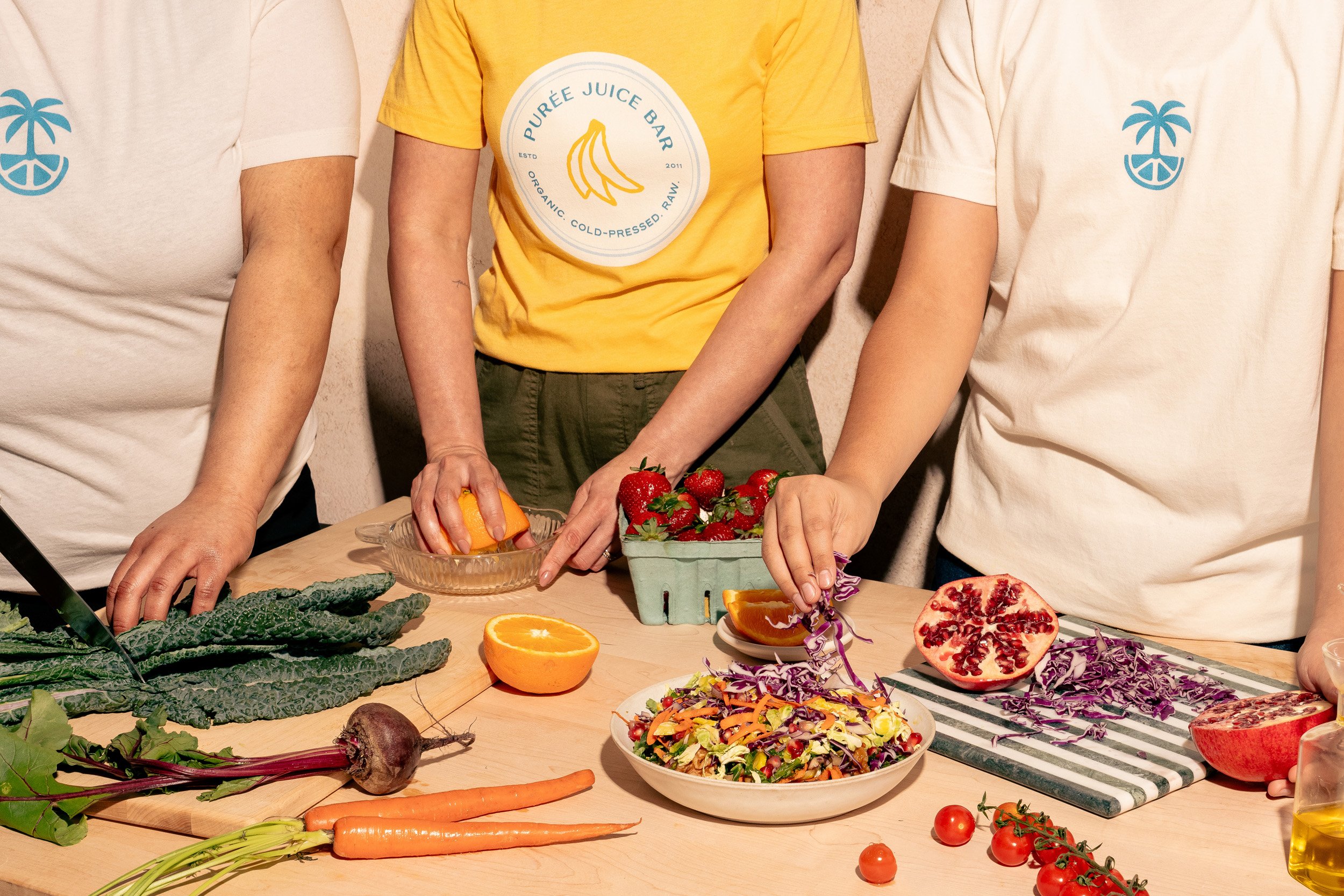
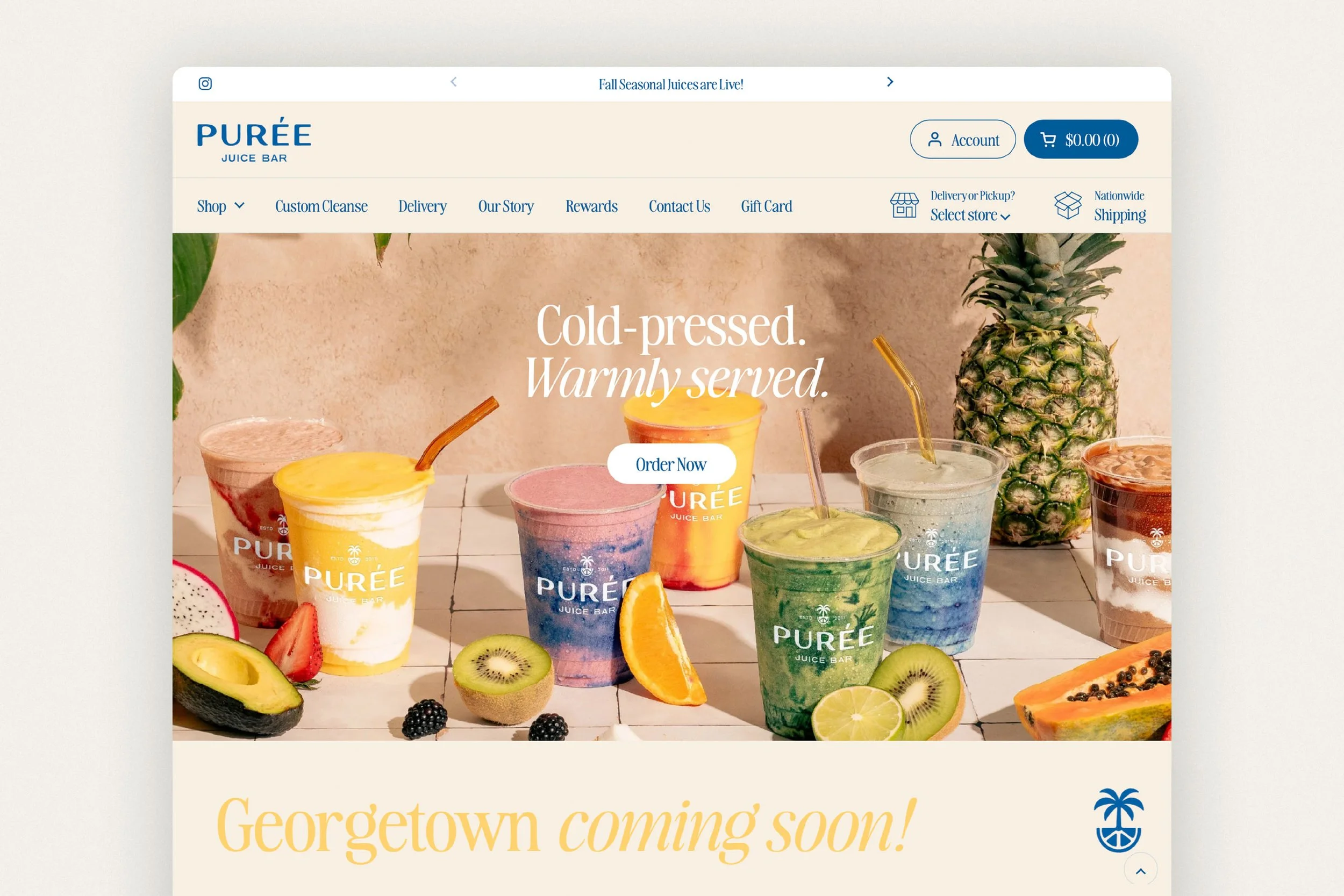
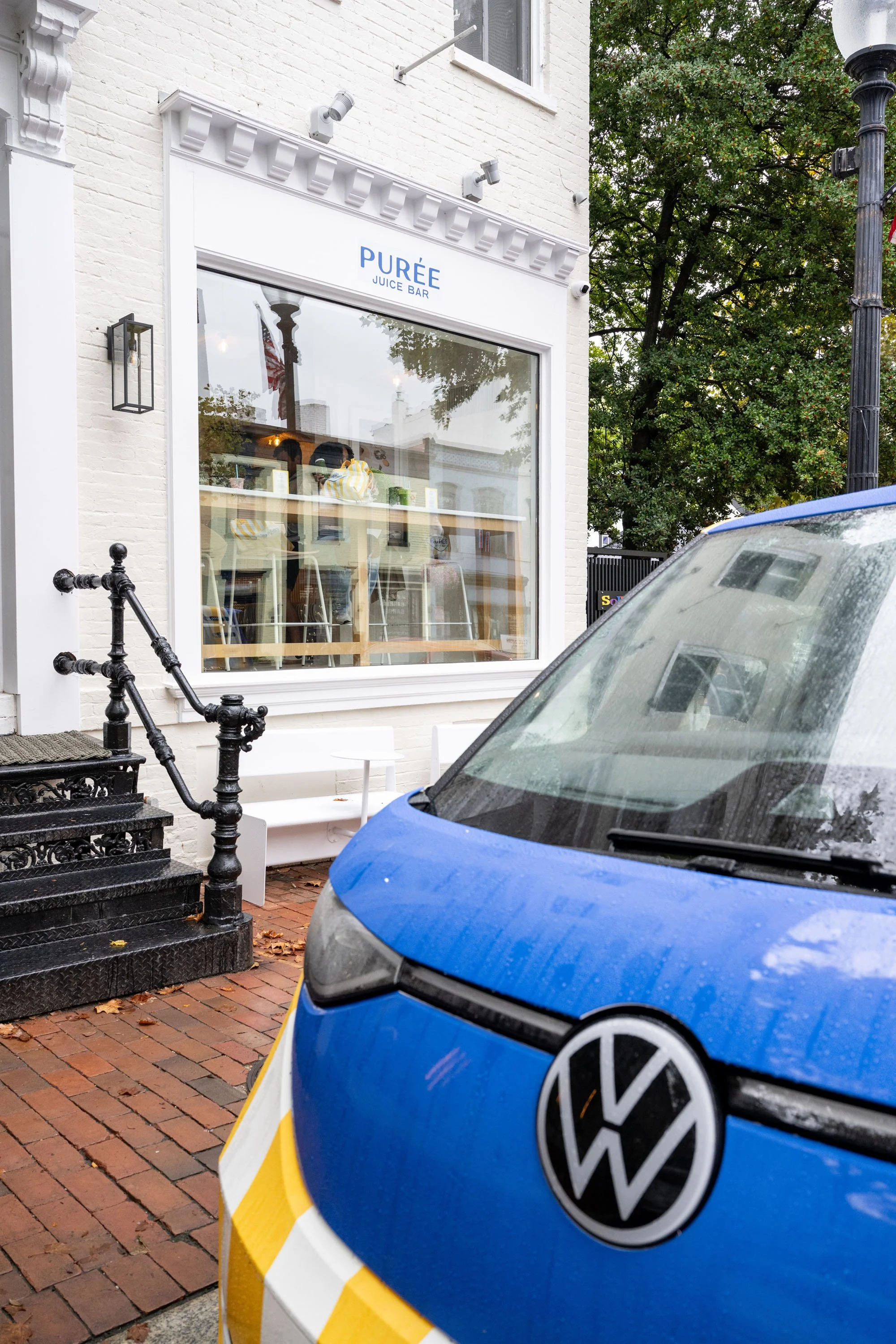
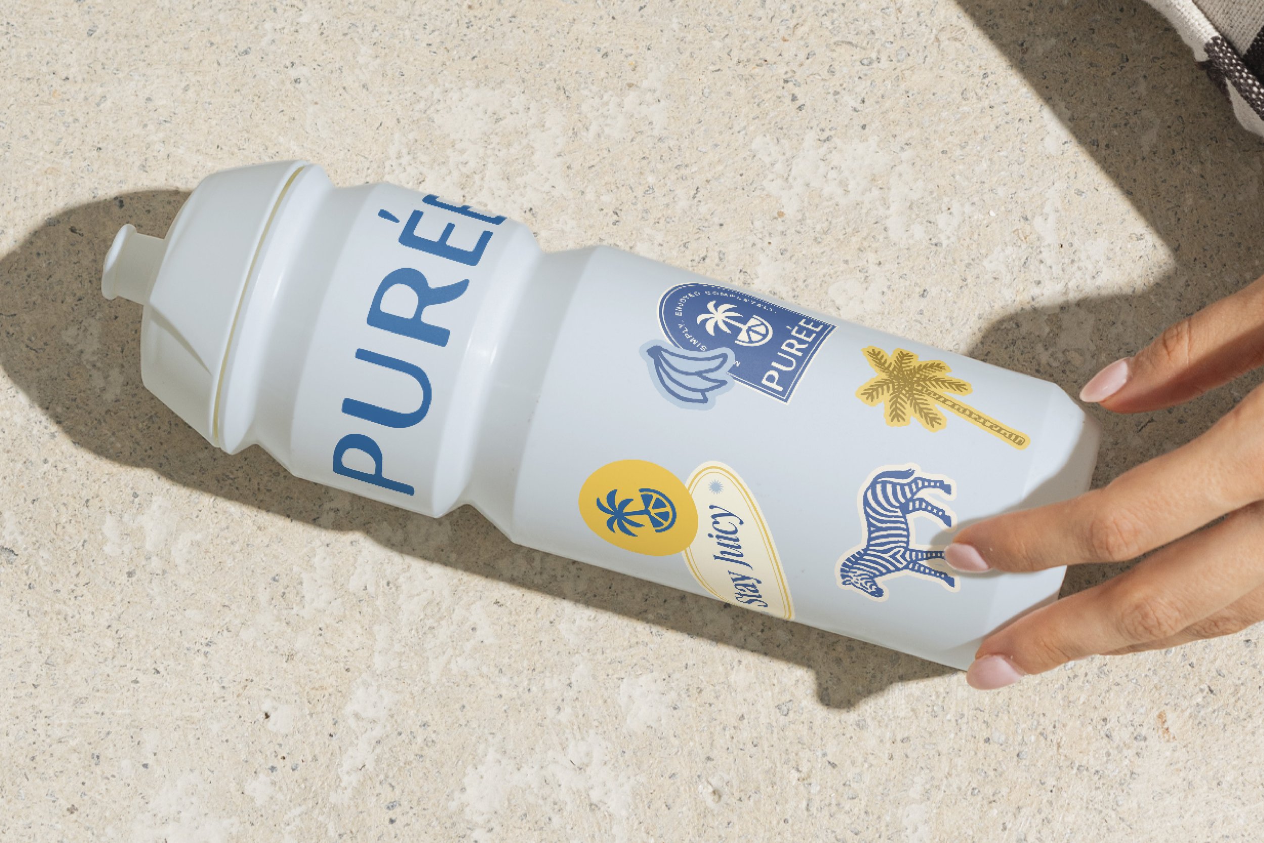
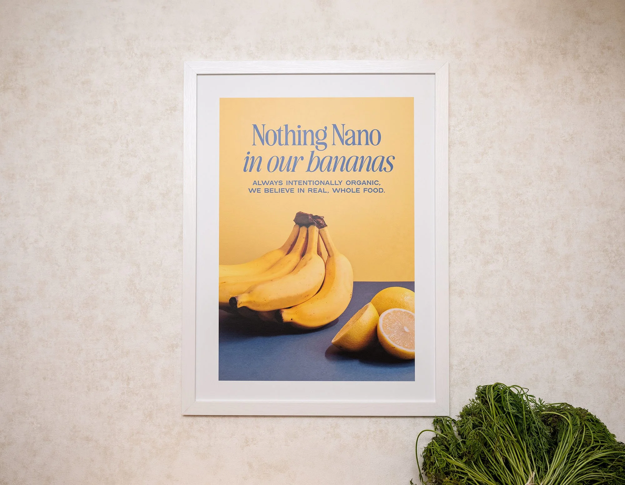
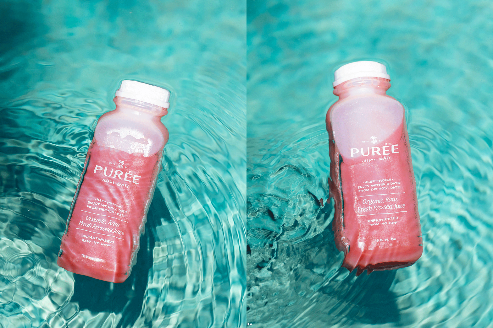
The color palette leans into sun-washed yellows, soft neutrals, and grounded accents. The typography balances clarity with personality. Pattern and motion introduce rhythm and energy without overwhelming the experience. Every element was designed to scale across environments, from cups and packaging to signage, vehicles, and digital touchpoints. The identity feels intentional, consistent, and unmistakably Purée.

“EightySeven didn't just create a beautiful brand identity. They helped us articulate the soul of our business.
They gave us a language for our values, a framework for our decisions, and a foundation that will continue to guide us as Purée grows. Looking back, the visual identity was only the output. The real work, and the real value, was discovering who we wanted to become before deciding how we wanted to look.”
-
We didn't build Purée from the ground up; we acquired a business with years of history, loyal customers, established systems, and its own soul. In many ways, that made rebranding even more challenging than starting from scratch. Before we could dream about where we wanted to go, we first had to understand what already existed; what deserved protecting, what needed reimagining, and what we wanted the next chapter of Purée to stand for.
The workshops with Maxwell and the EightySeven team at the very beginning of our relationship felt less like a branding exercise and more like therapy for our business. They asked the kinds of questions that don't have immediate answers, but ultimately shape everything that follows. They challenged us to define not just what we sell, but who we are, why we exist, how we lead, how we make decisions, and how we want people to feel every time they interact with Purée.
One of the biggest lessons I took away is something I've since found echoed in some of my favorite leadership books: people rarely remember every detail of what you do - they remember how you made them feel. That realization fundamentally changed how we think about building Purée. Our brand isn't our logo, our colors, or even our stores. It's the feeling our team creates for one another behind the scenes, and the feeling our customers carry with them long after they've left. Great brands, like great hospitality, are built intentionally from the inside out.
EightySeven didn't just create a beautiful brand identity. They helped us articulate the soul of our business. They gave us a language for our values, a framework for our decisions, and a foundation that will continue to guide us as Purée grows. Looking back, the visual identity was only the output. The real work, and the real value, was discovering who we wanted to become before deciding how we wanted to look.
Dyala Madani, Owner & CEO
Purée Juice Bar
(02) Brand Design → Verbal Identity
Dialing up wellness without the lecture.
-
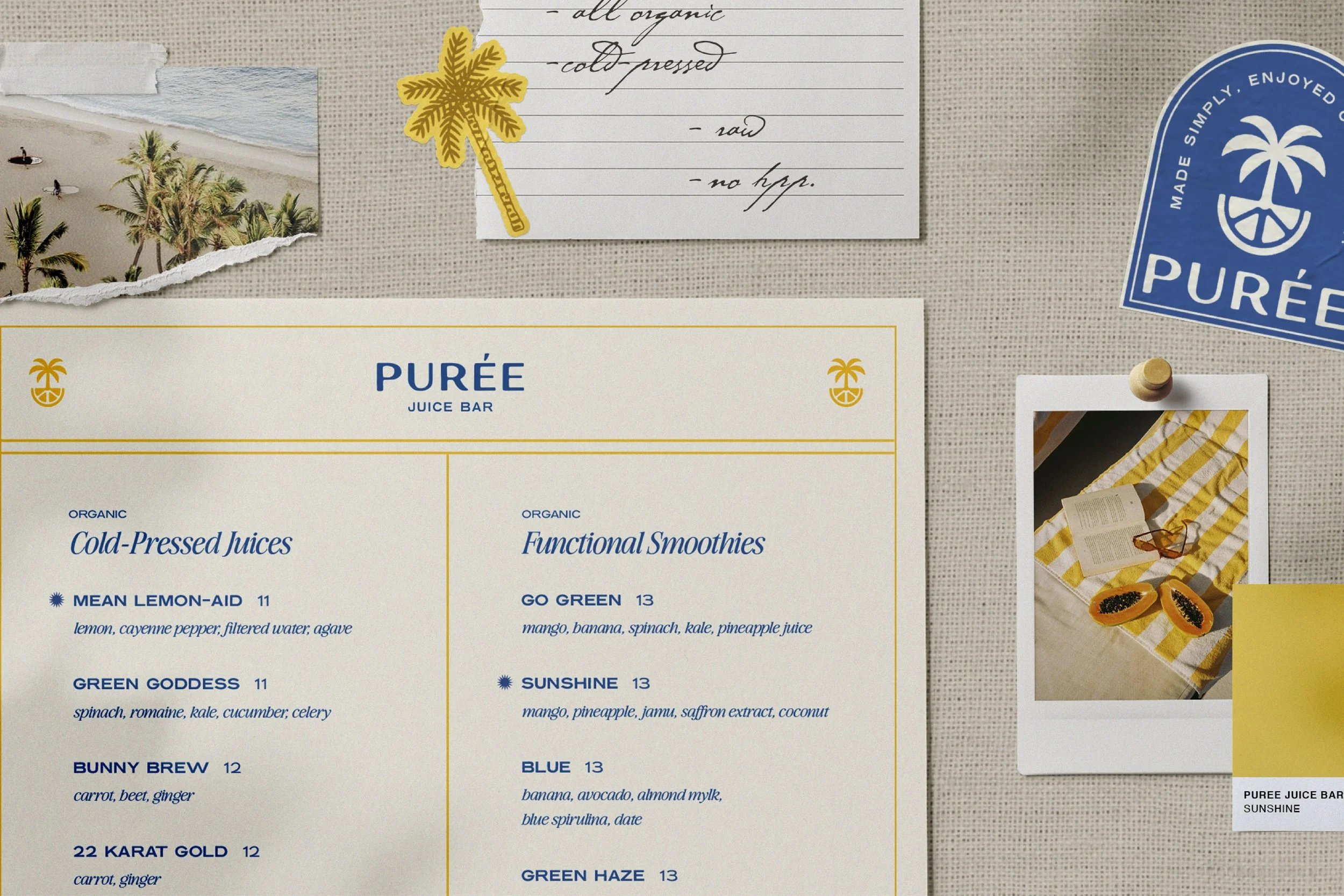
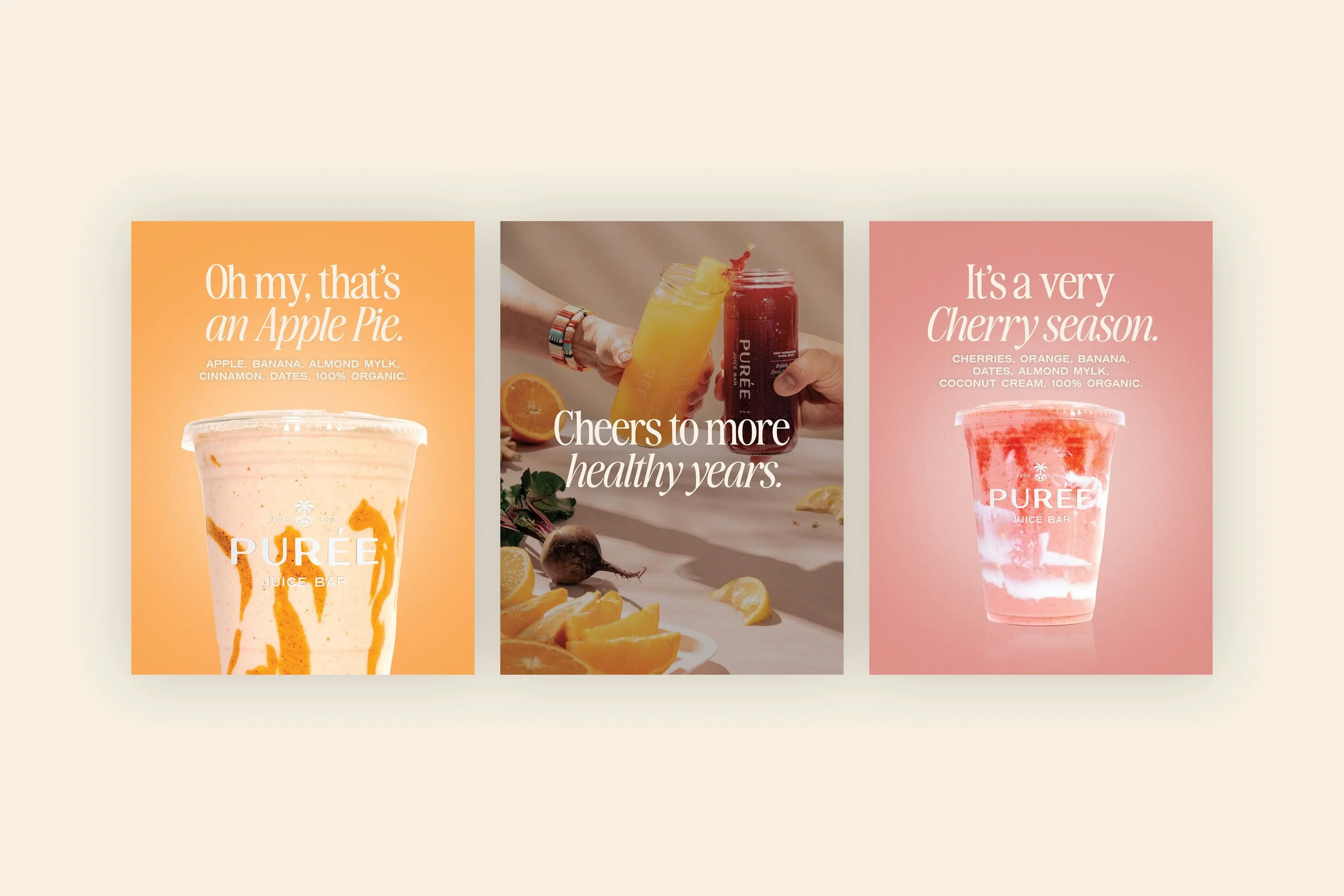
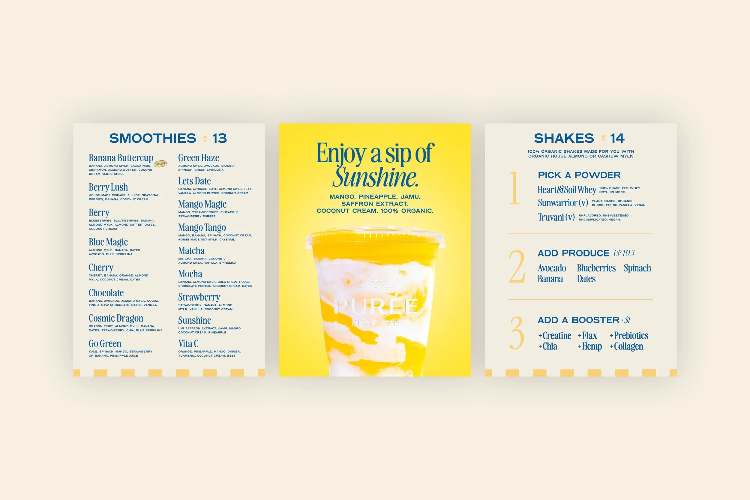
The Purée voice needed to reflect confidence without ego and warmth without fluff. We developed a verbal system that spoke plainly, optimistically, and with quiet authority. No guilt. No preaching. No over explaining.
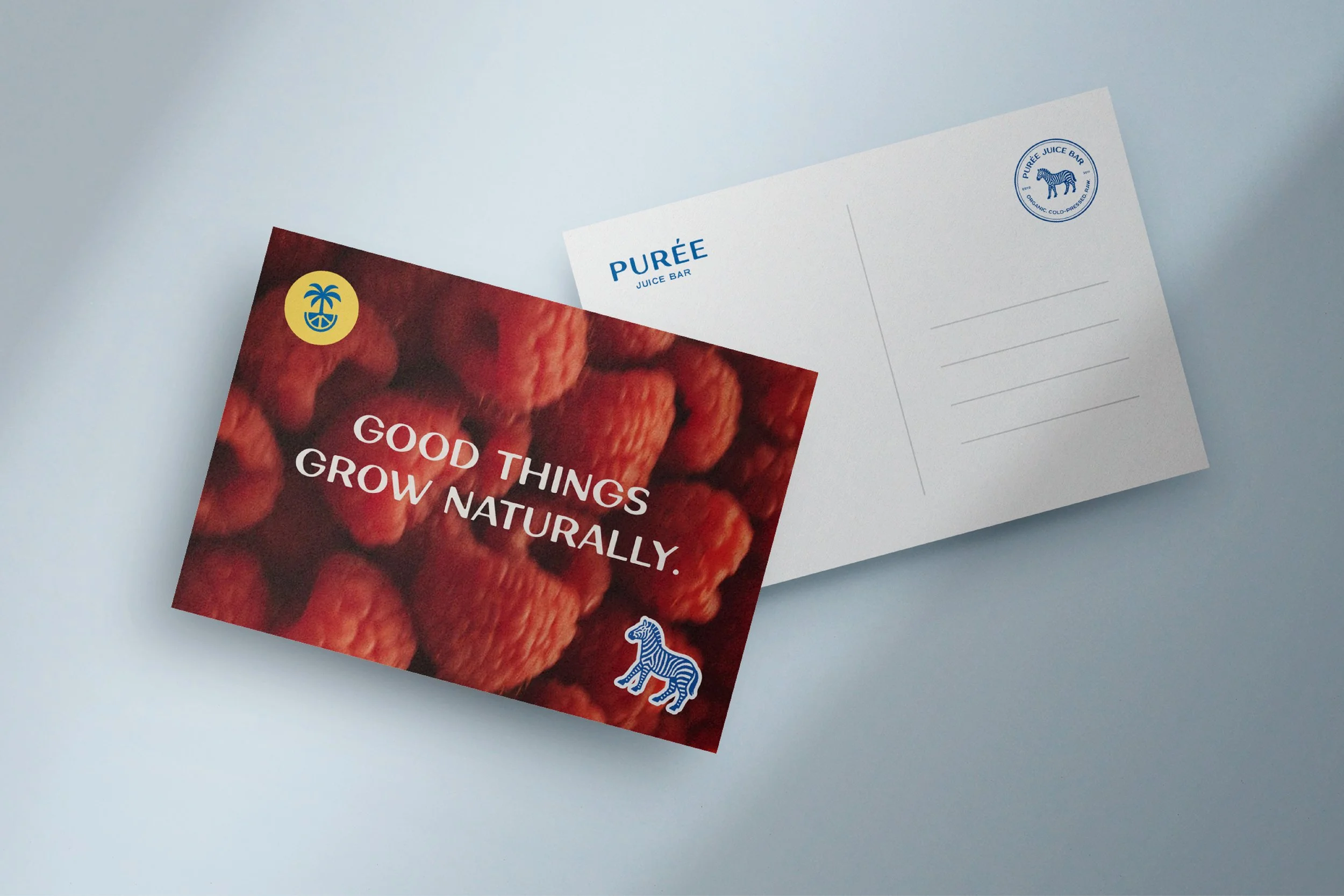
The language reinforces ease, care, and consistency. It invites customers in rather than instructing them. Whether on packaging, menus, or signage, the voice supports the idea that wellness can be beautiful, approachable, and part of everyday life.
The result is a brand that sounds as good as it feels. Clear. Uplifting. Grounded in hospitality.
(03) Brand Activation
Giving the brand a fresh squeeze, everywhere it shows up.
-
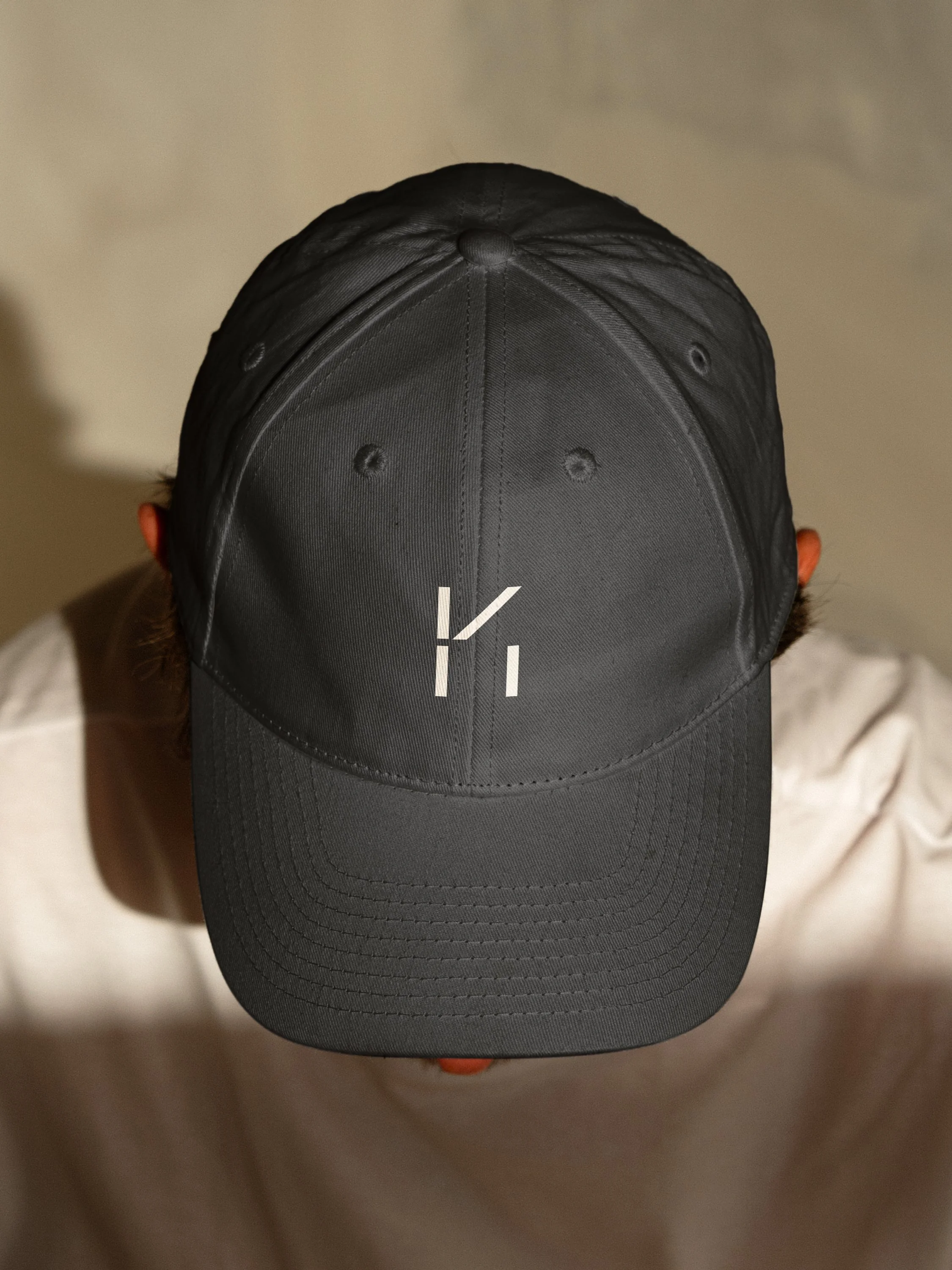
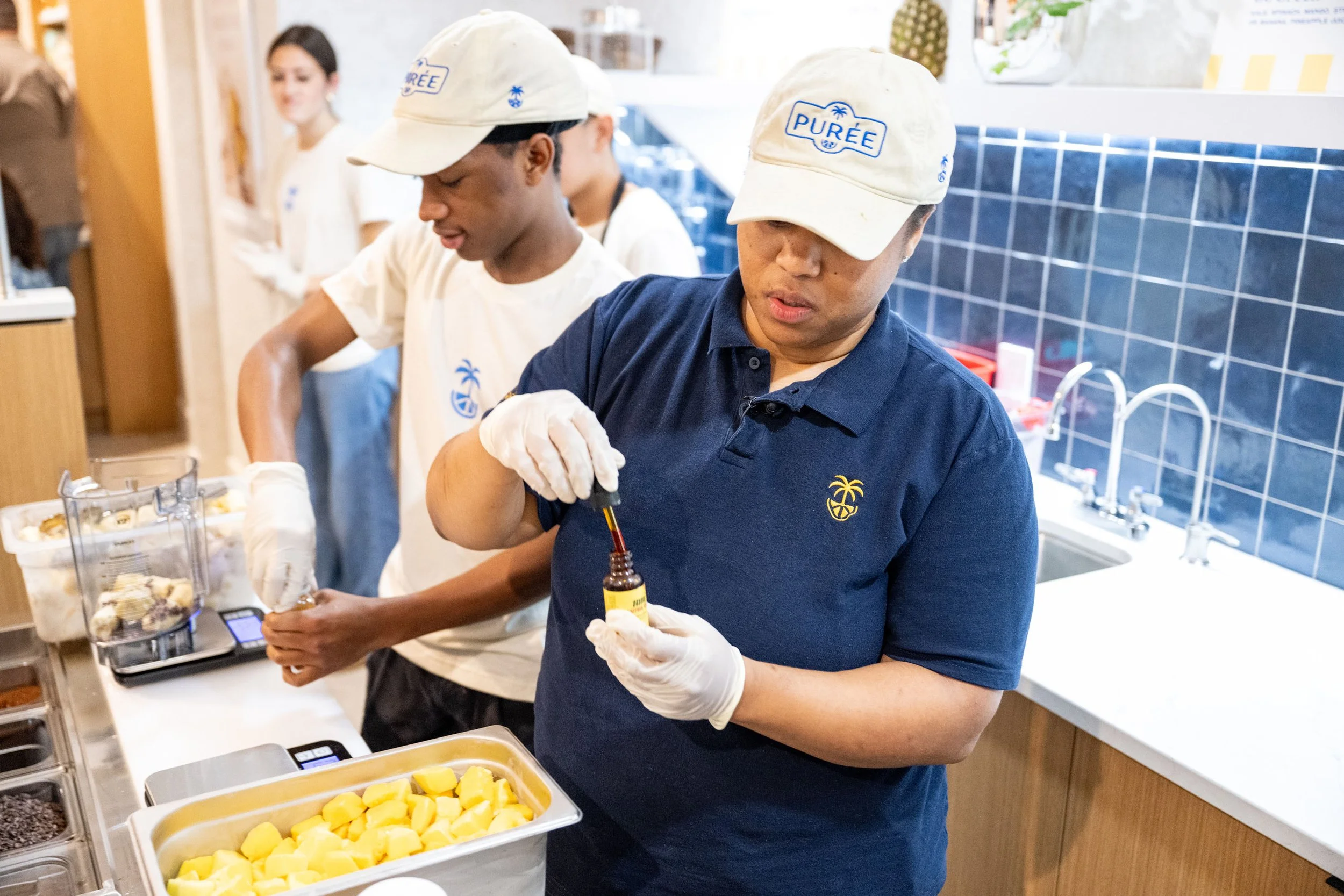
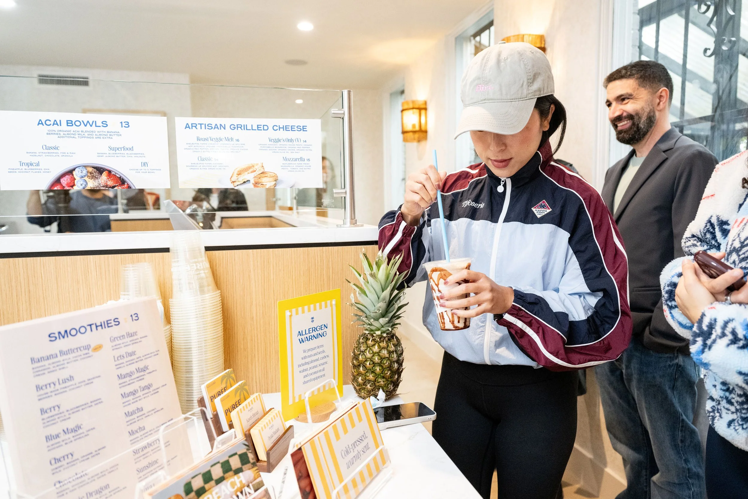
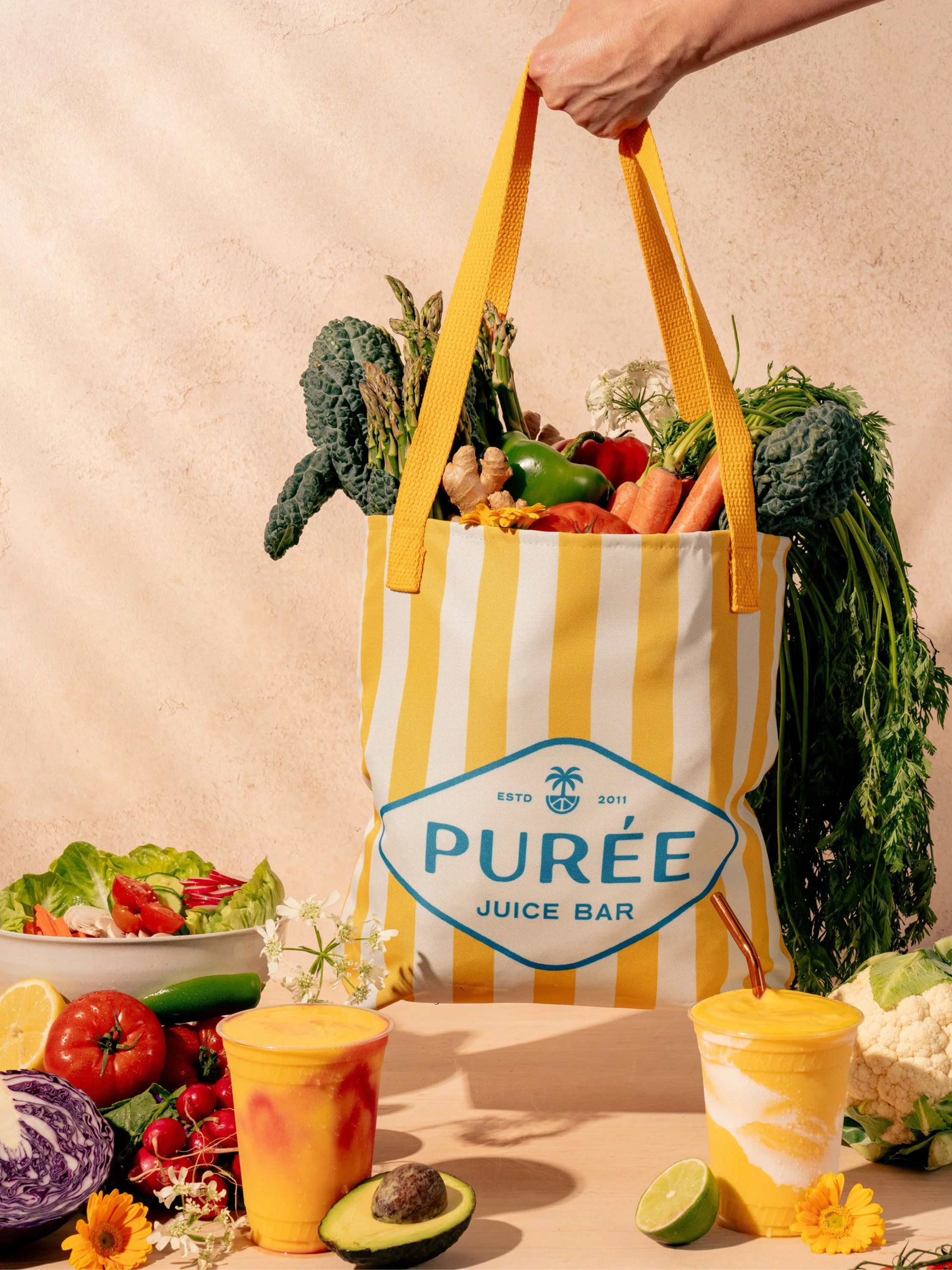
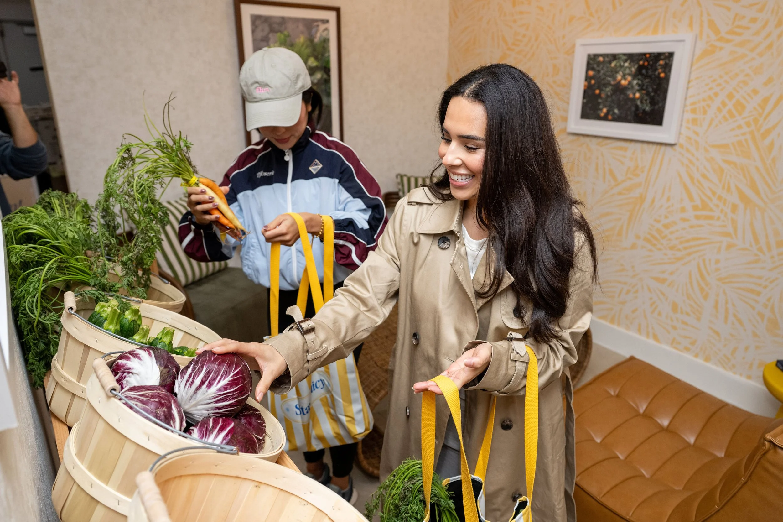
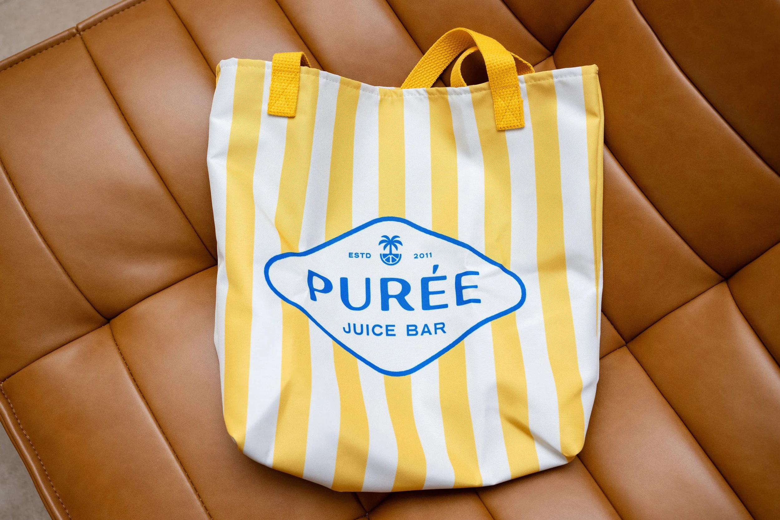
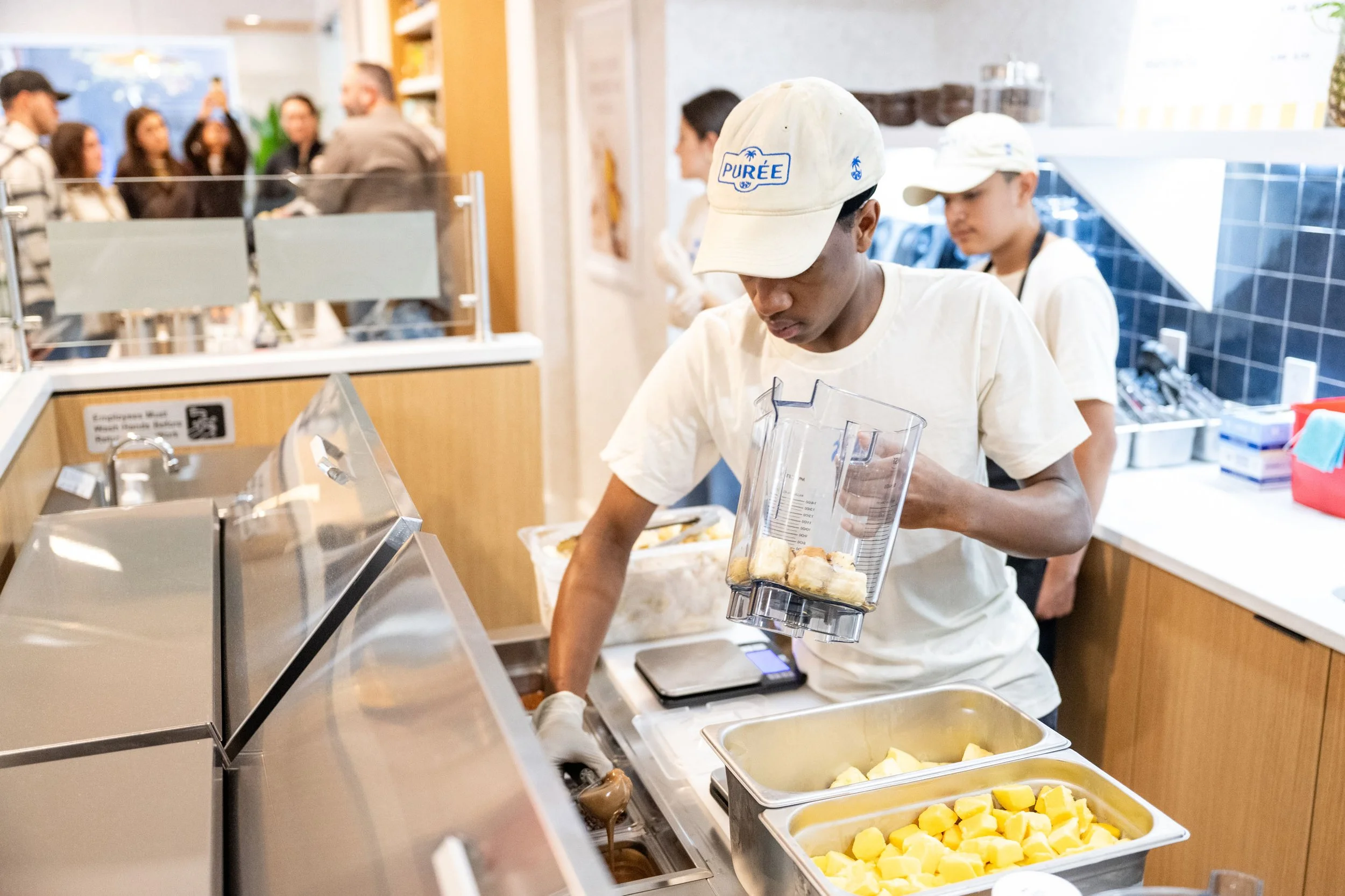
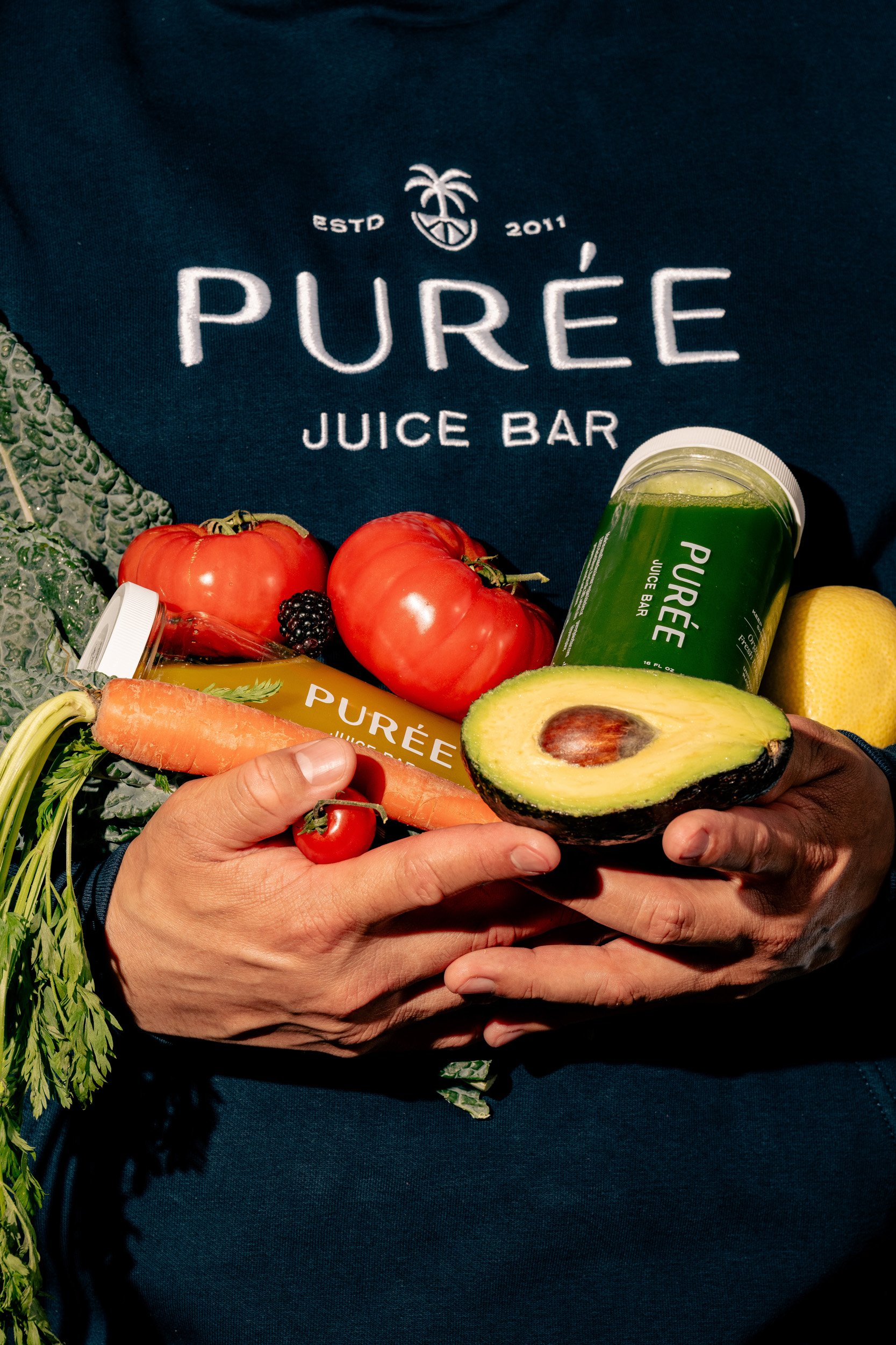
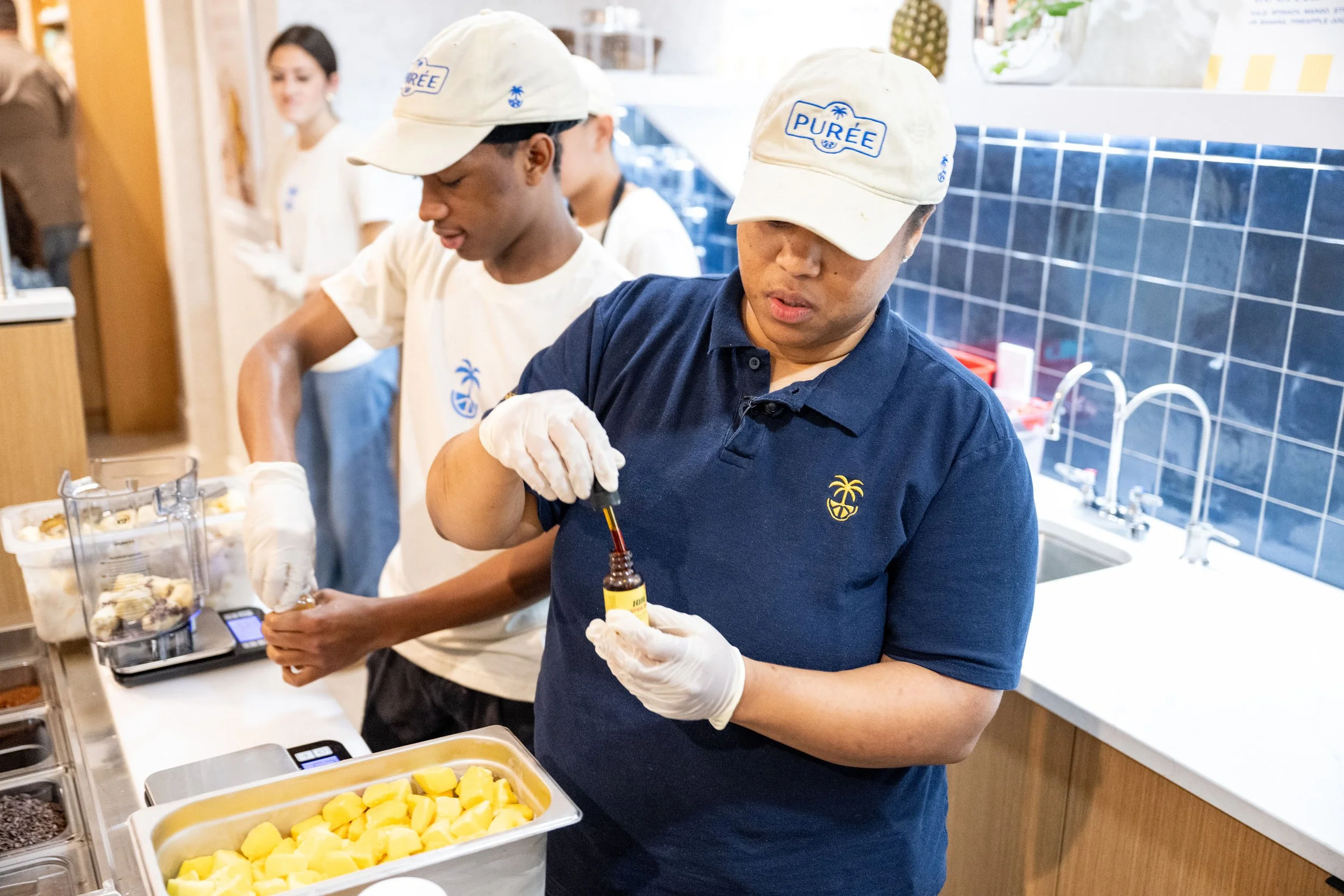
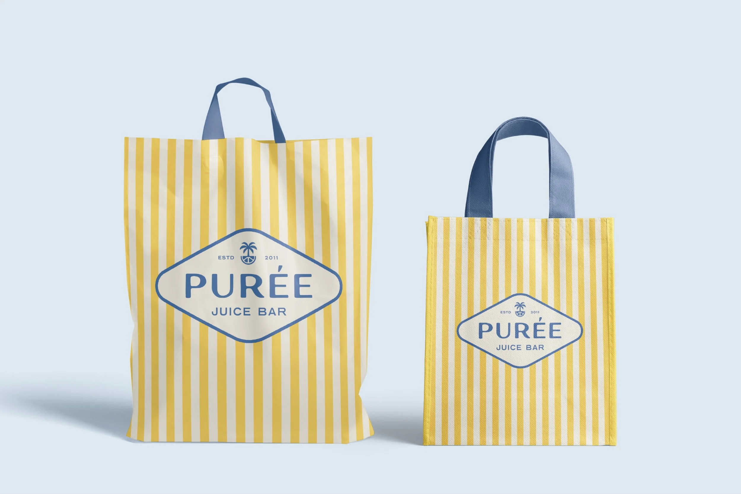
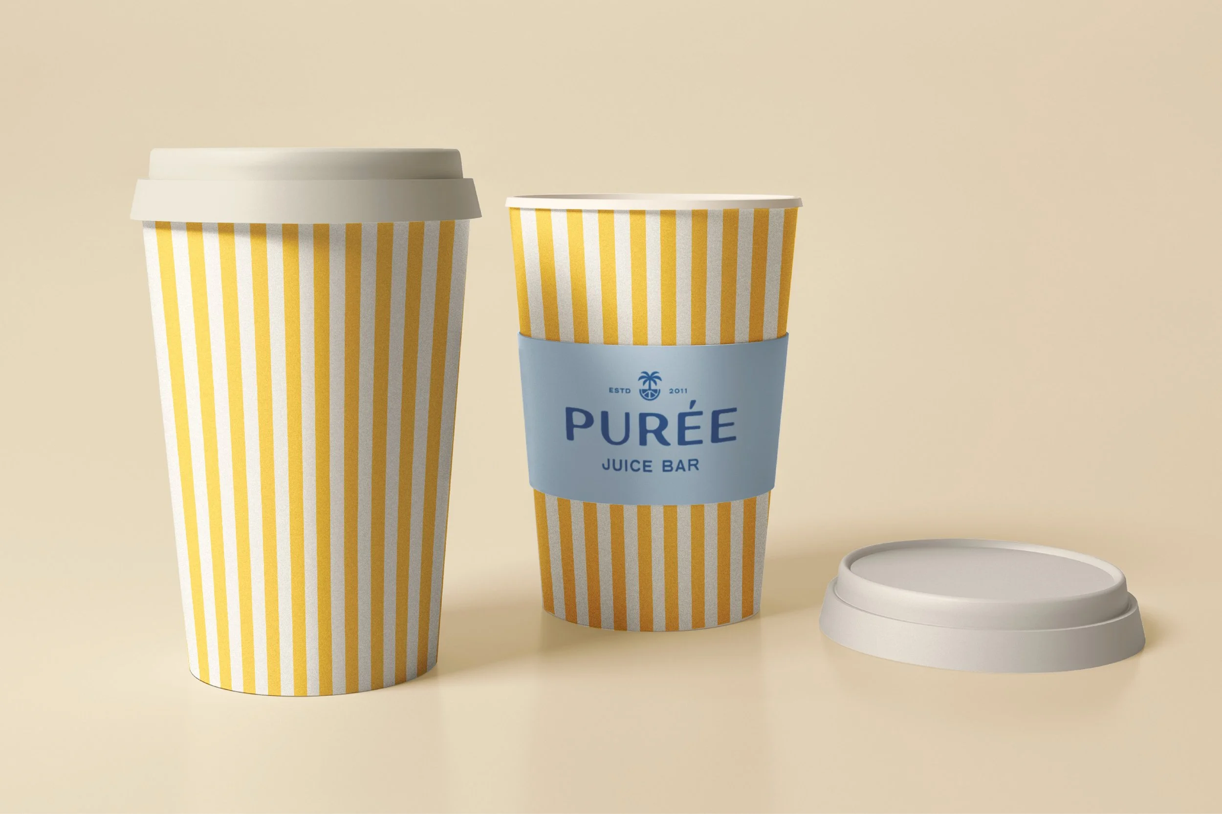
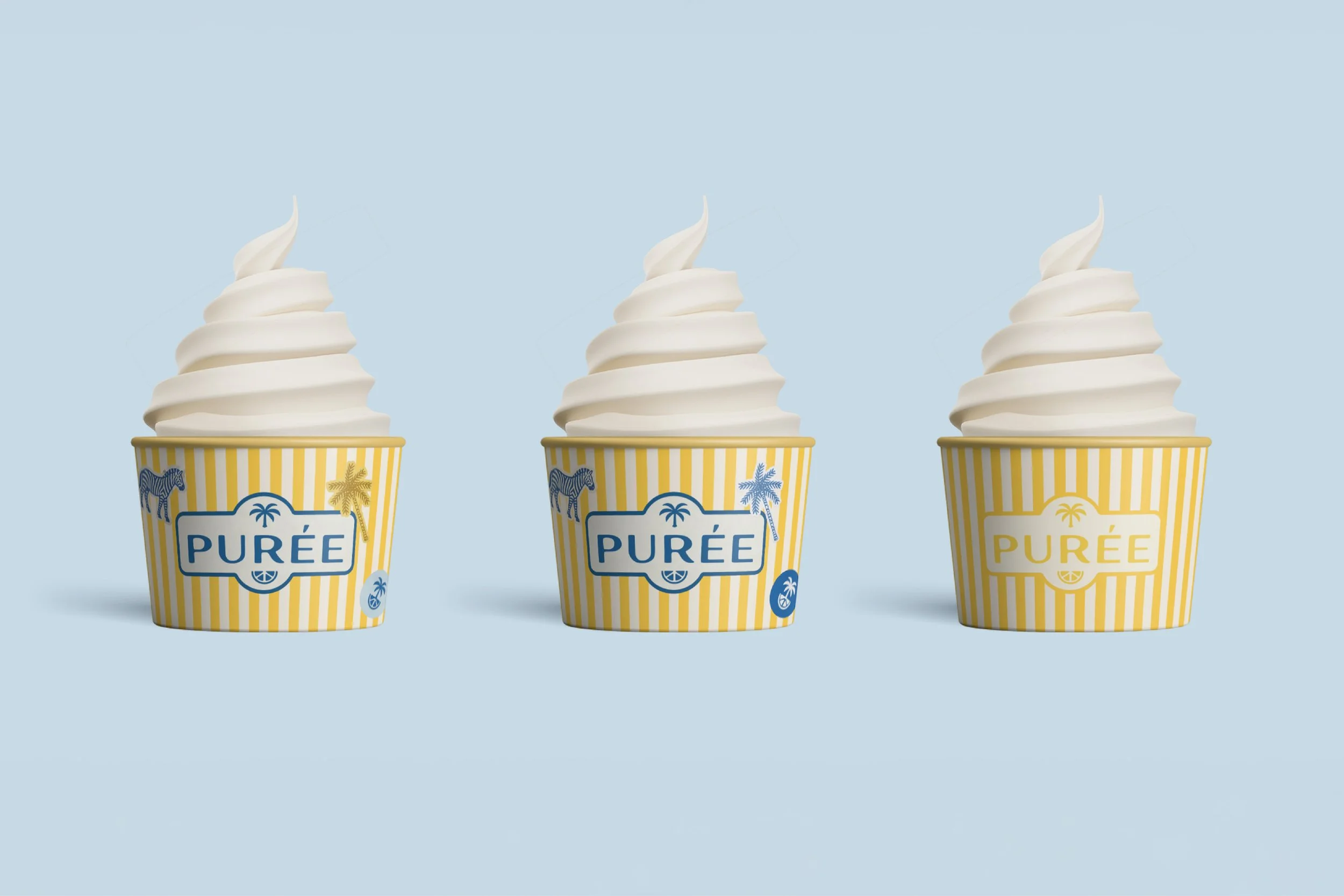
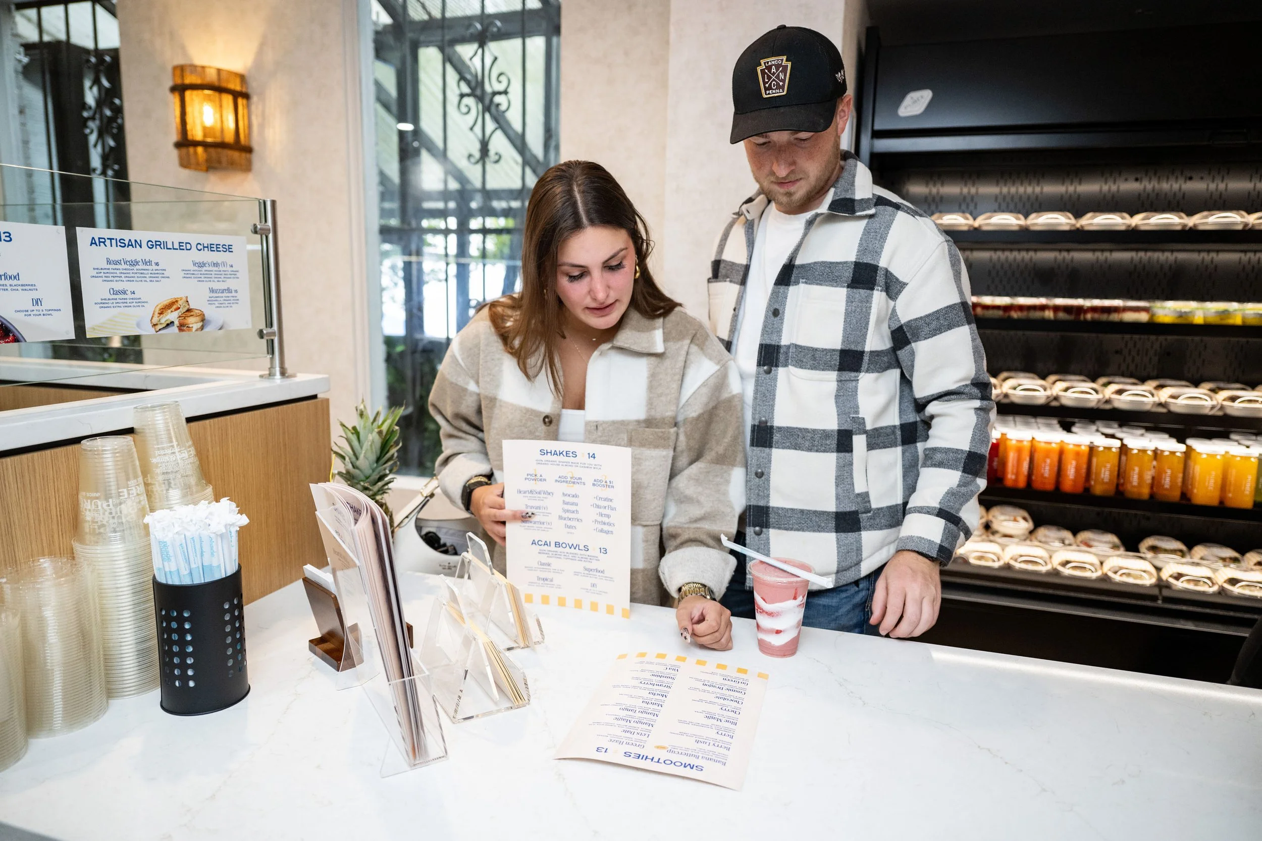
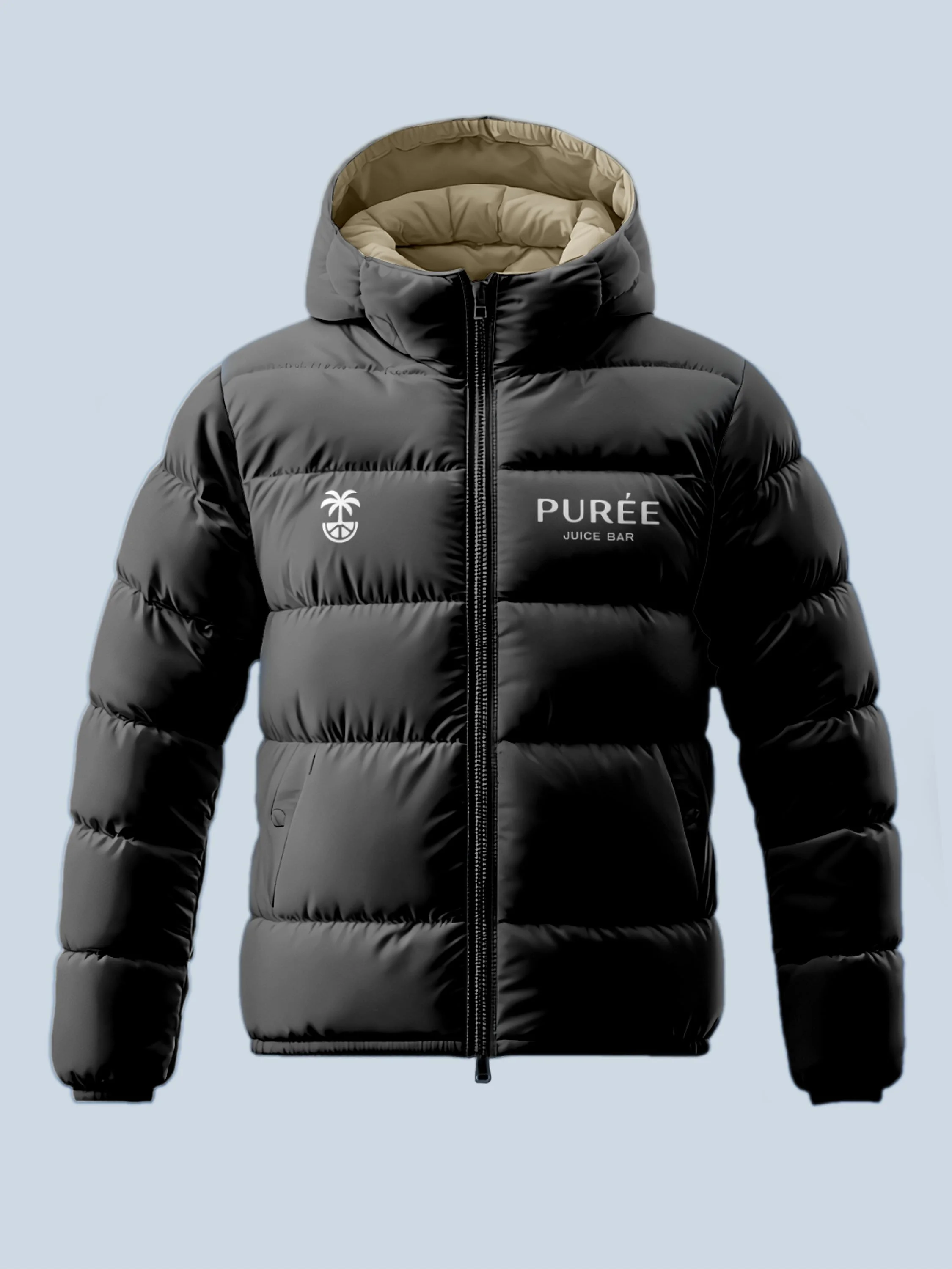
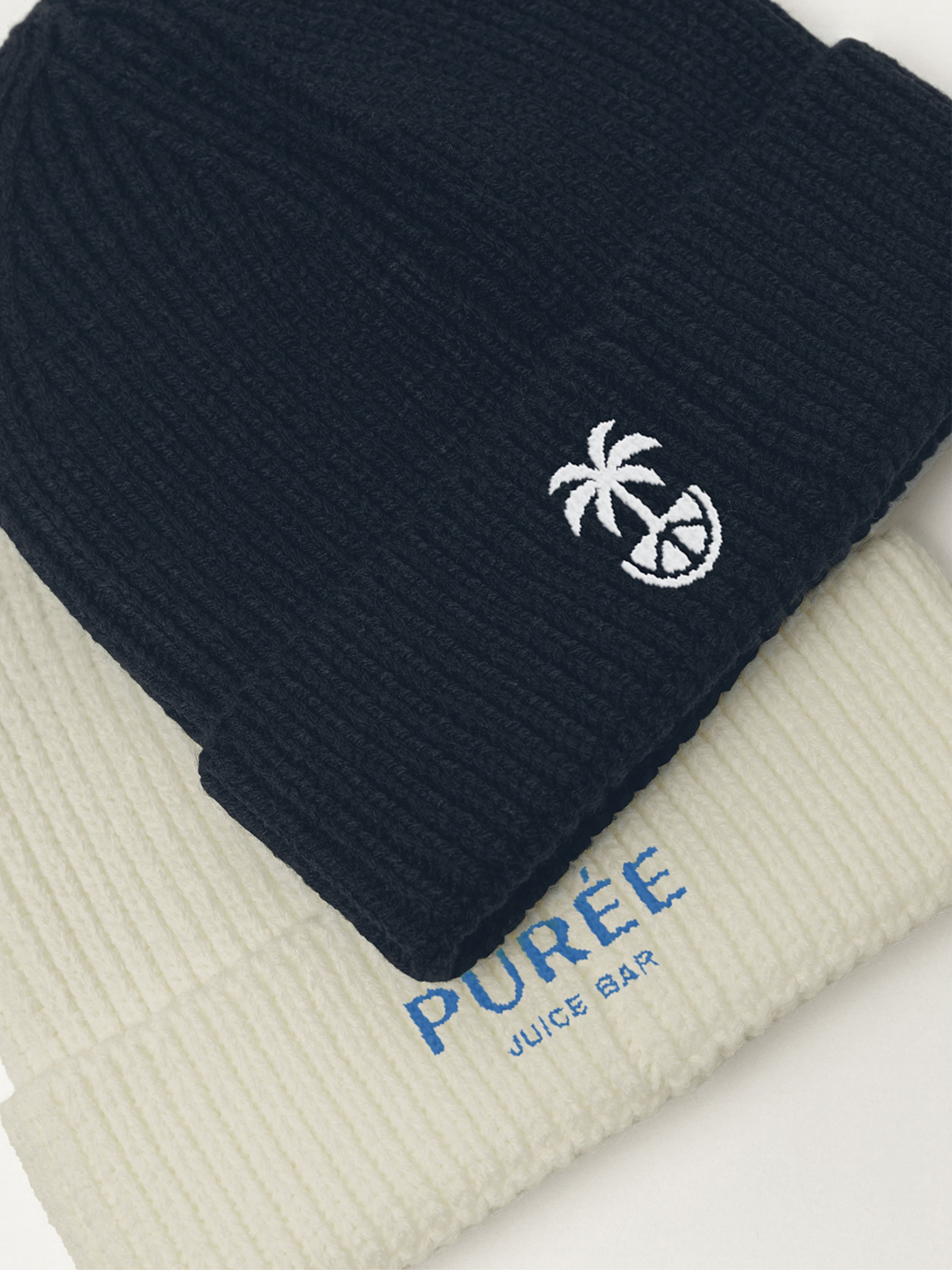
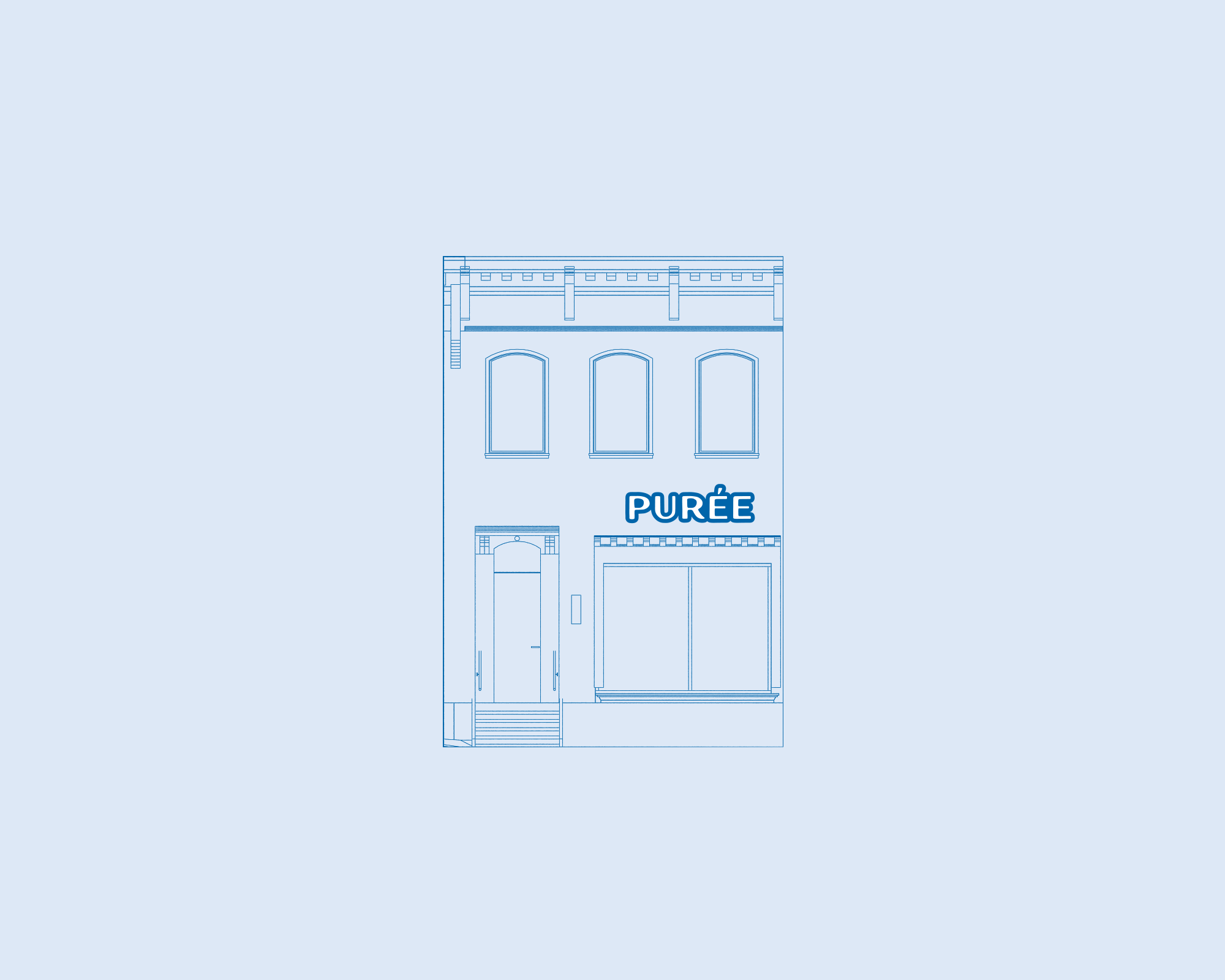
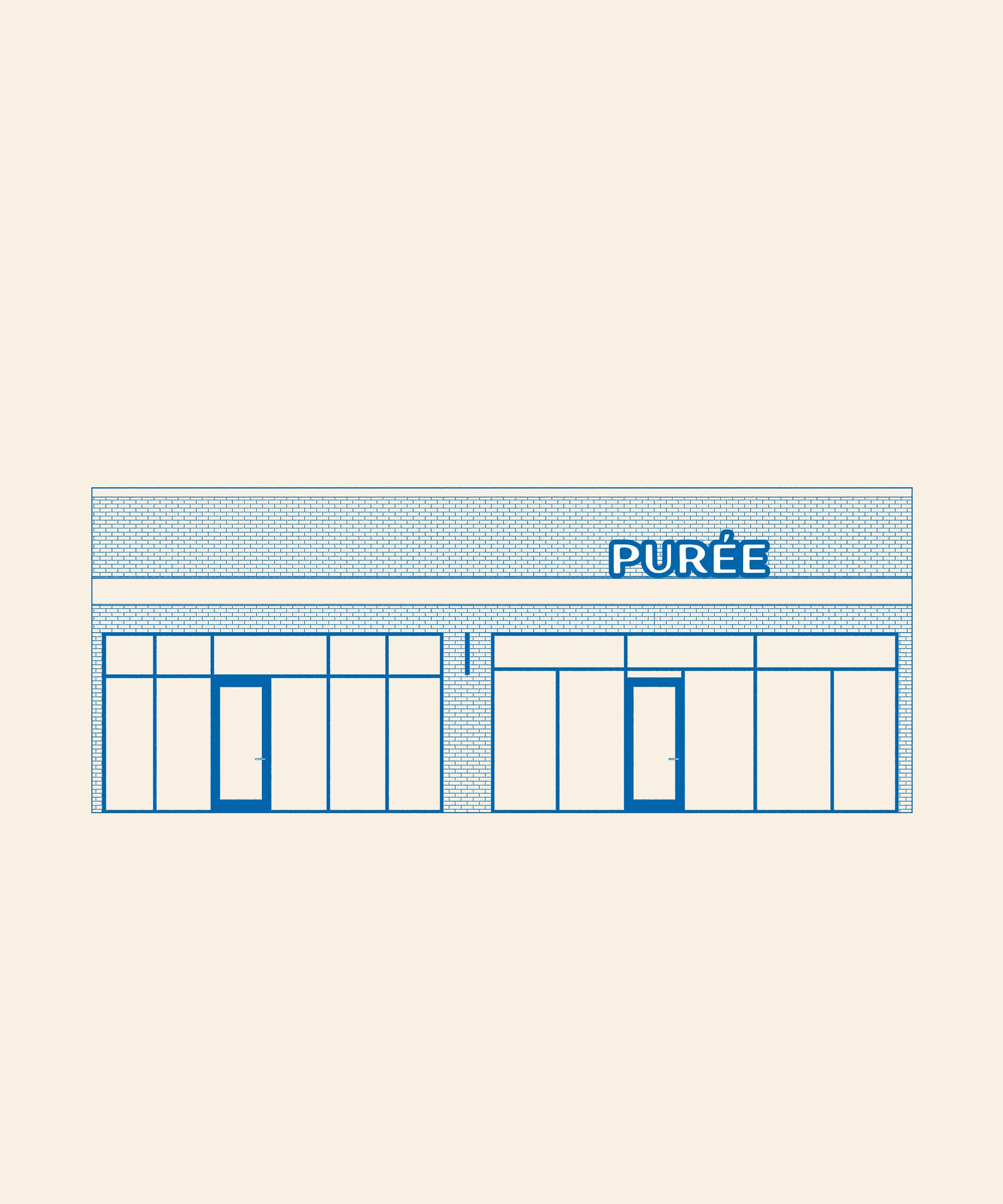
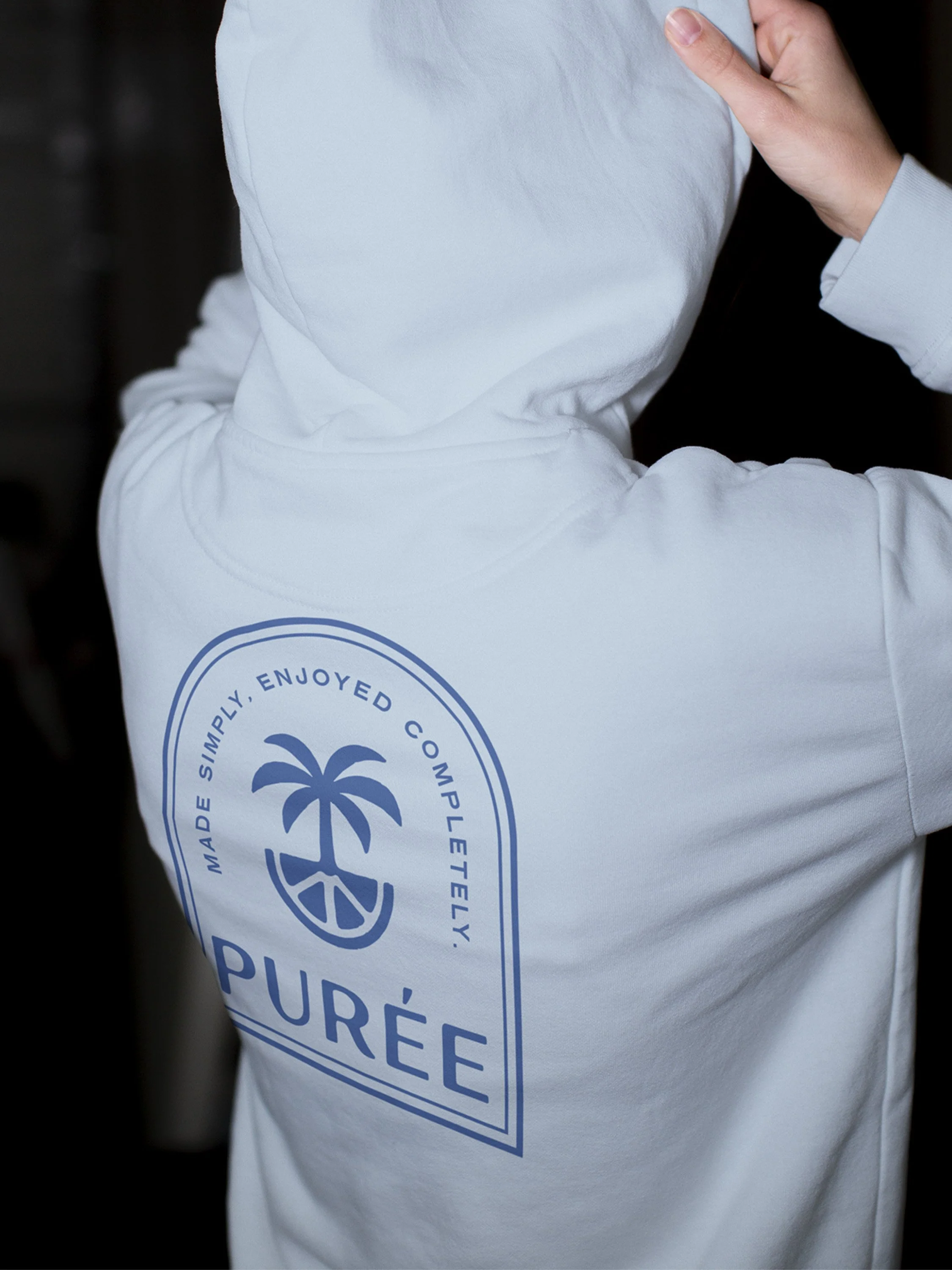
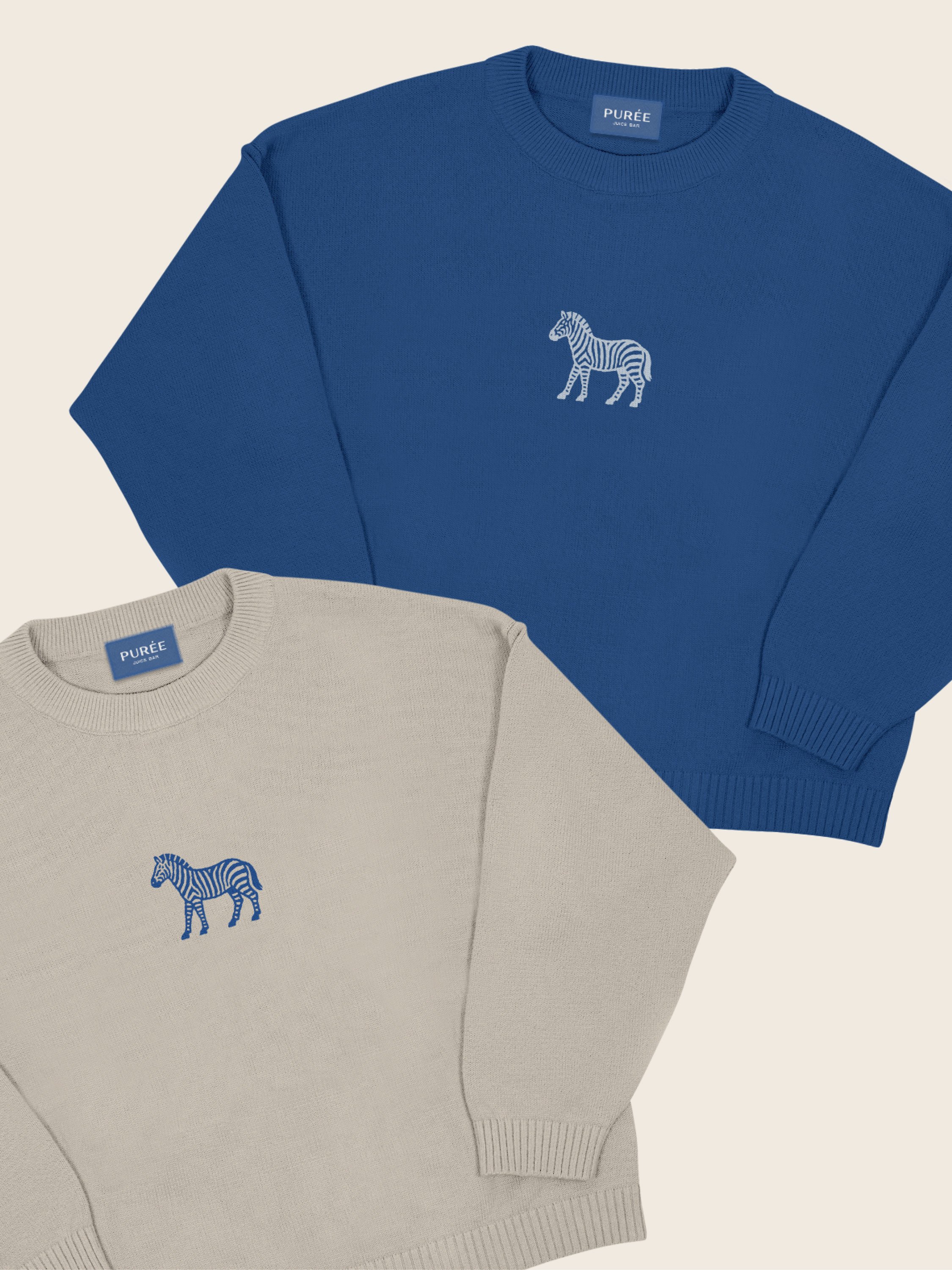
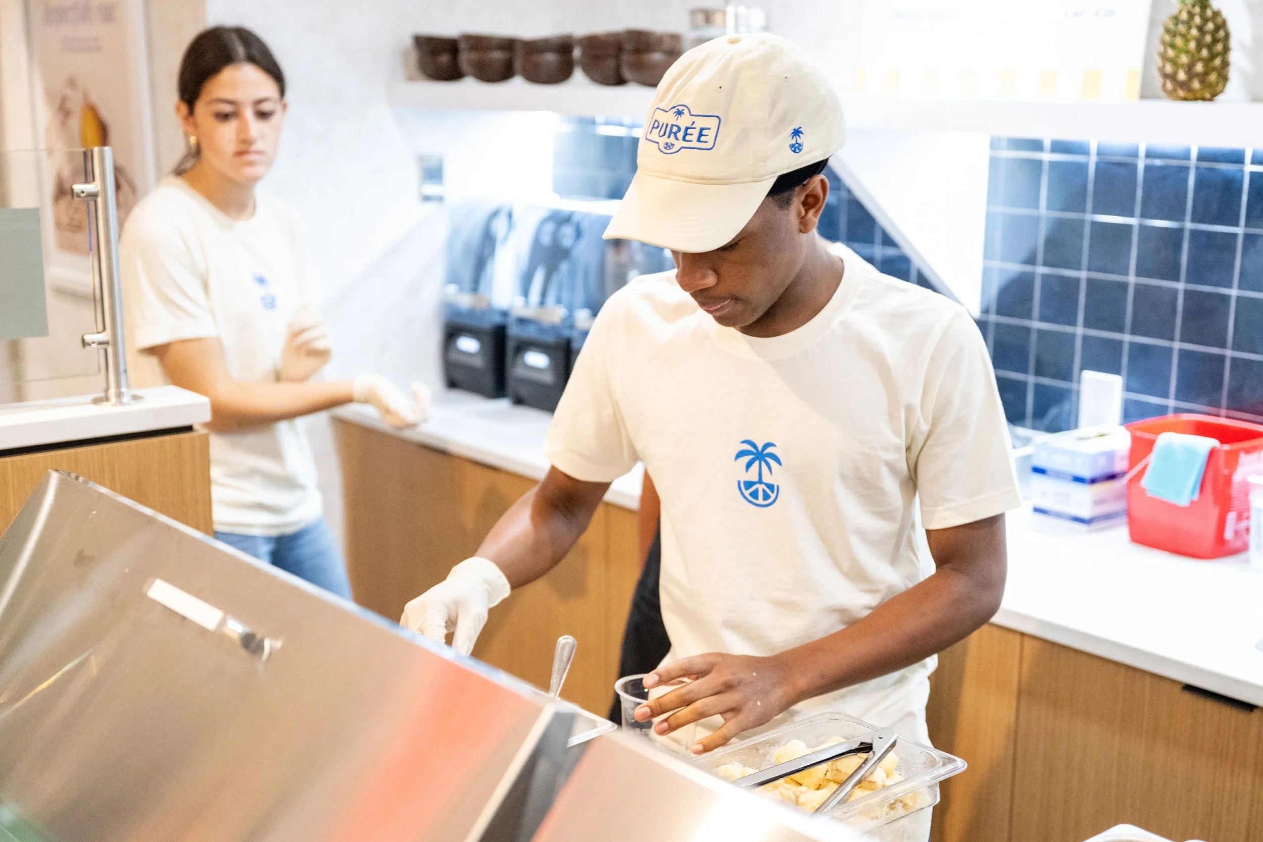
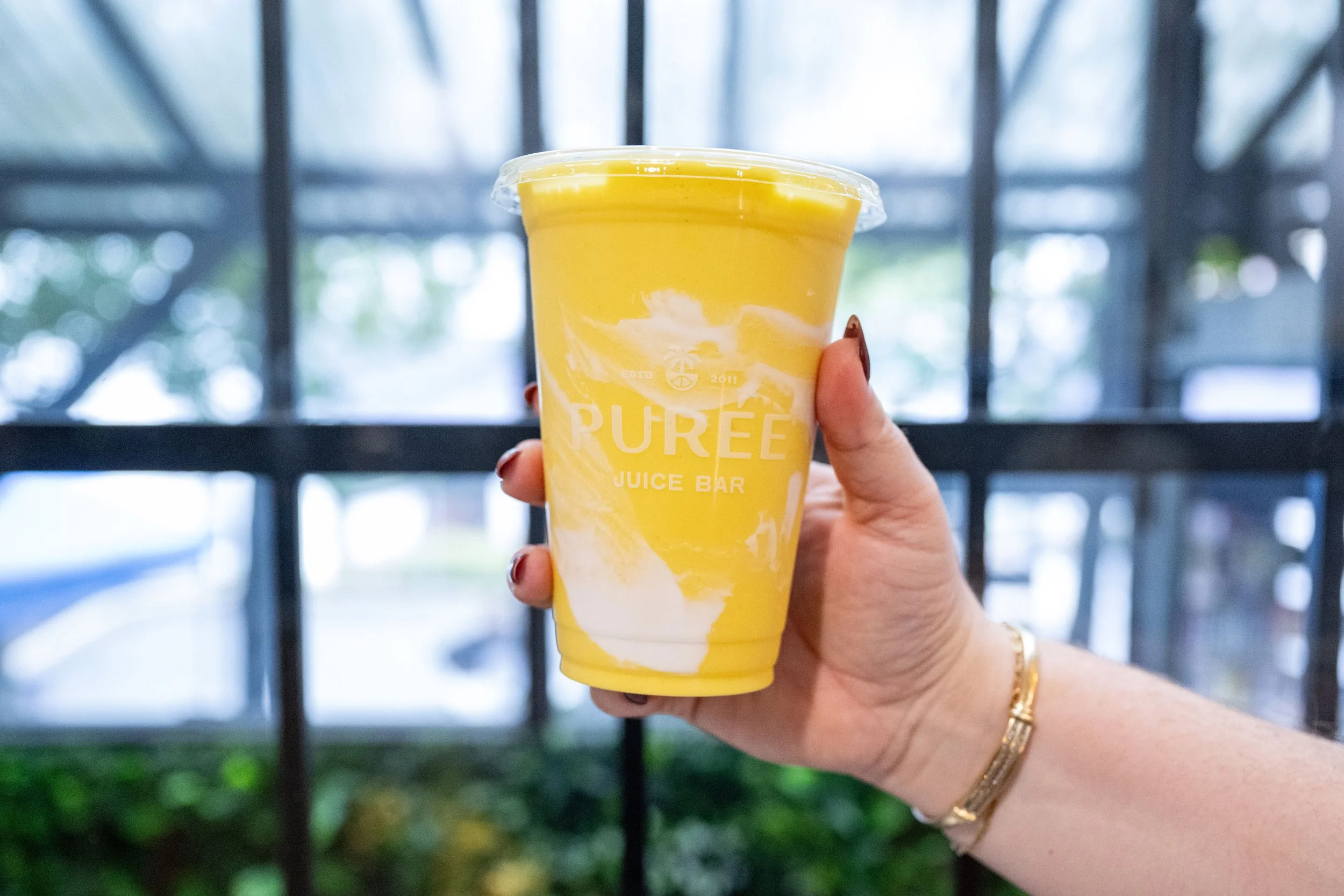
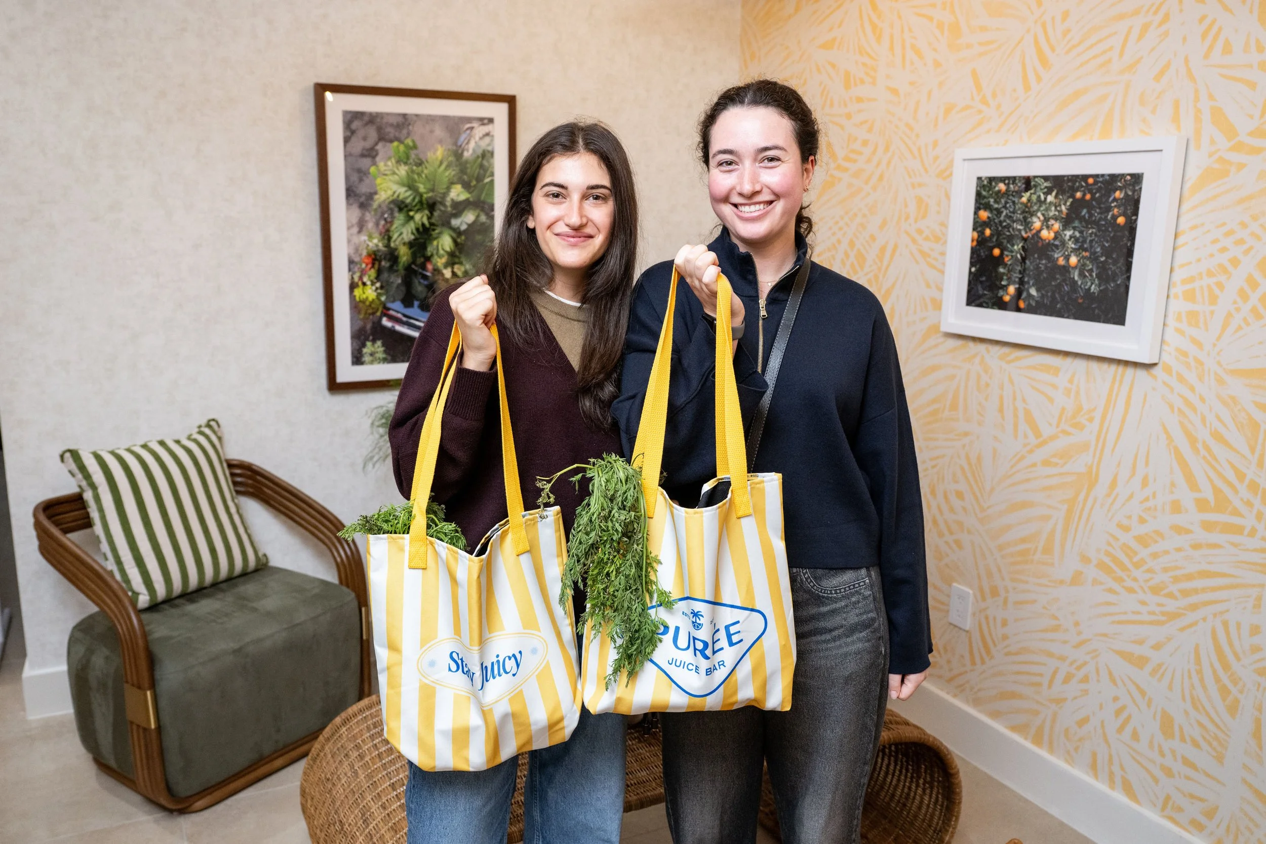
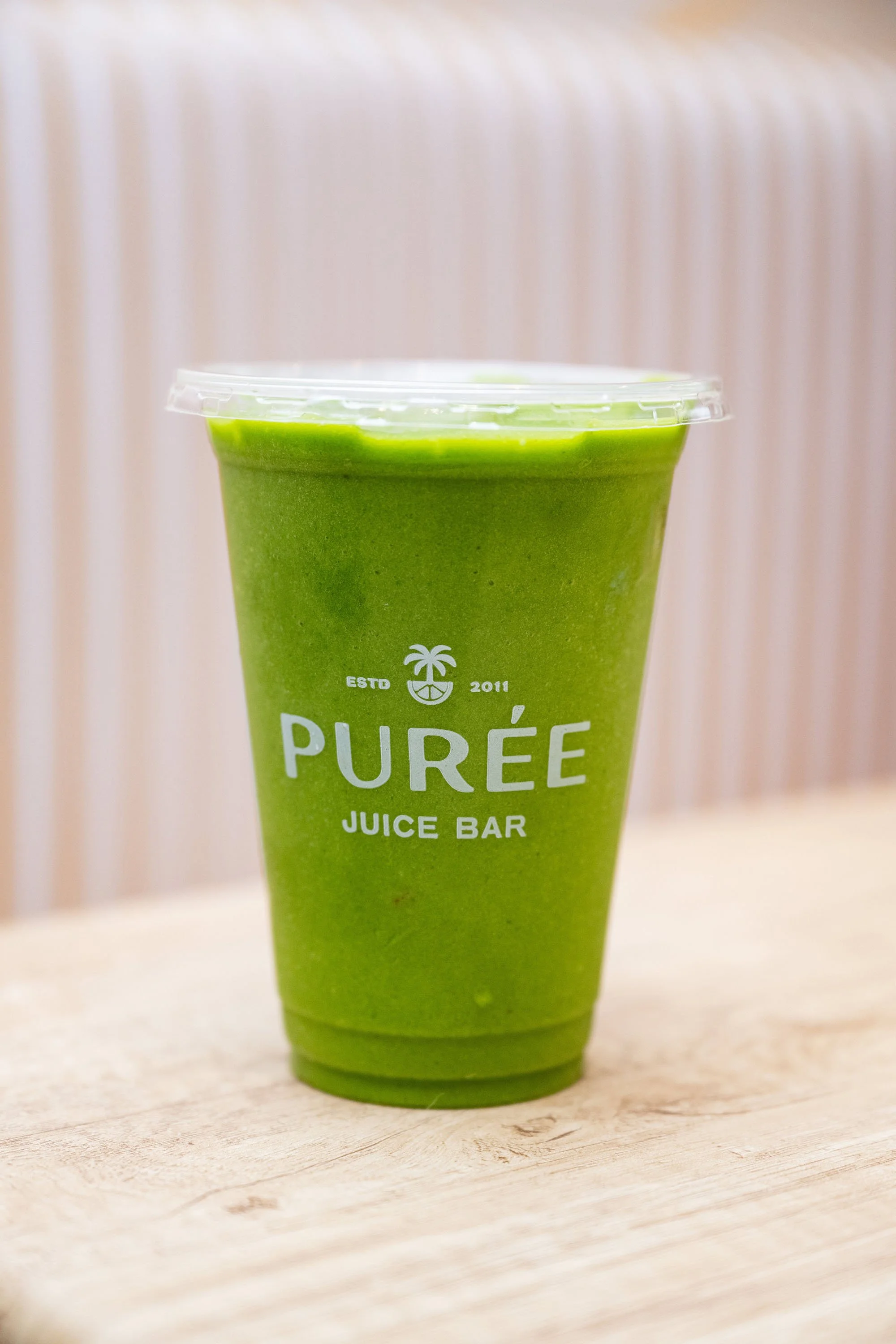
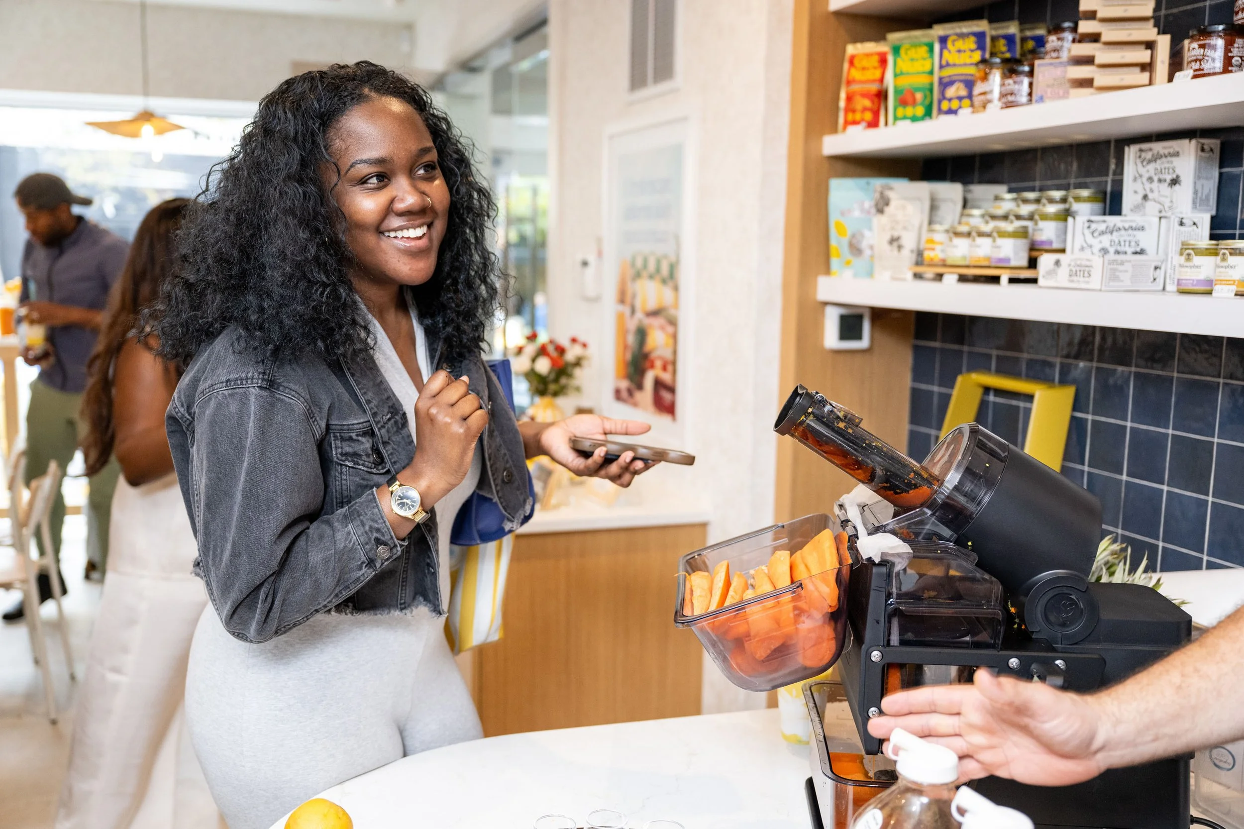
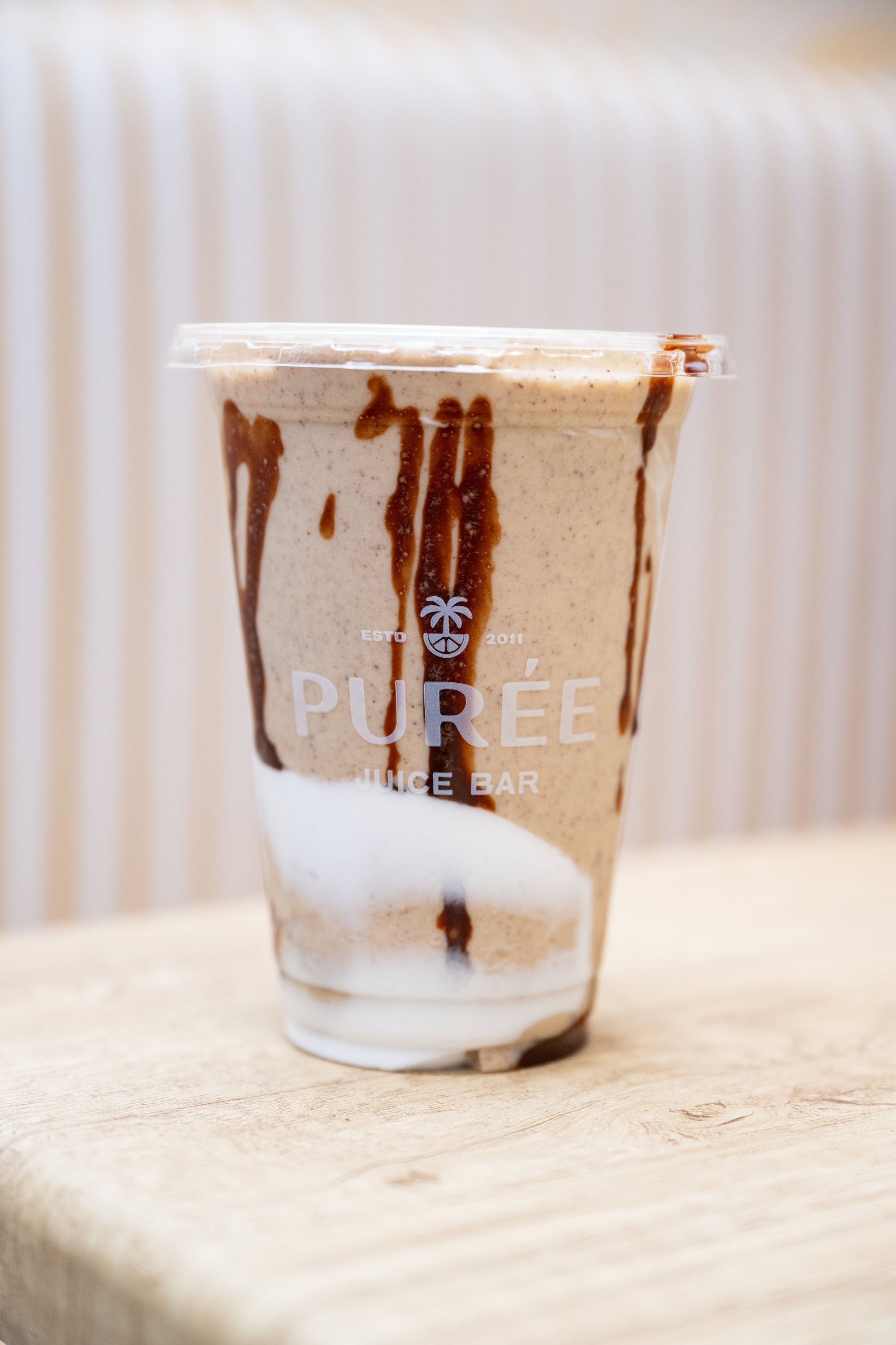
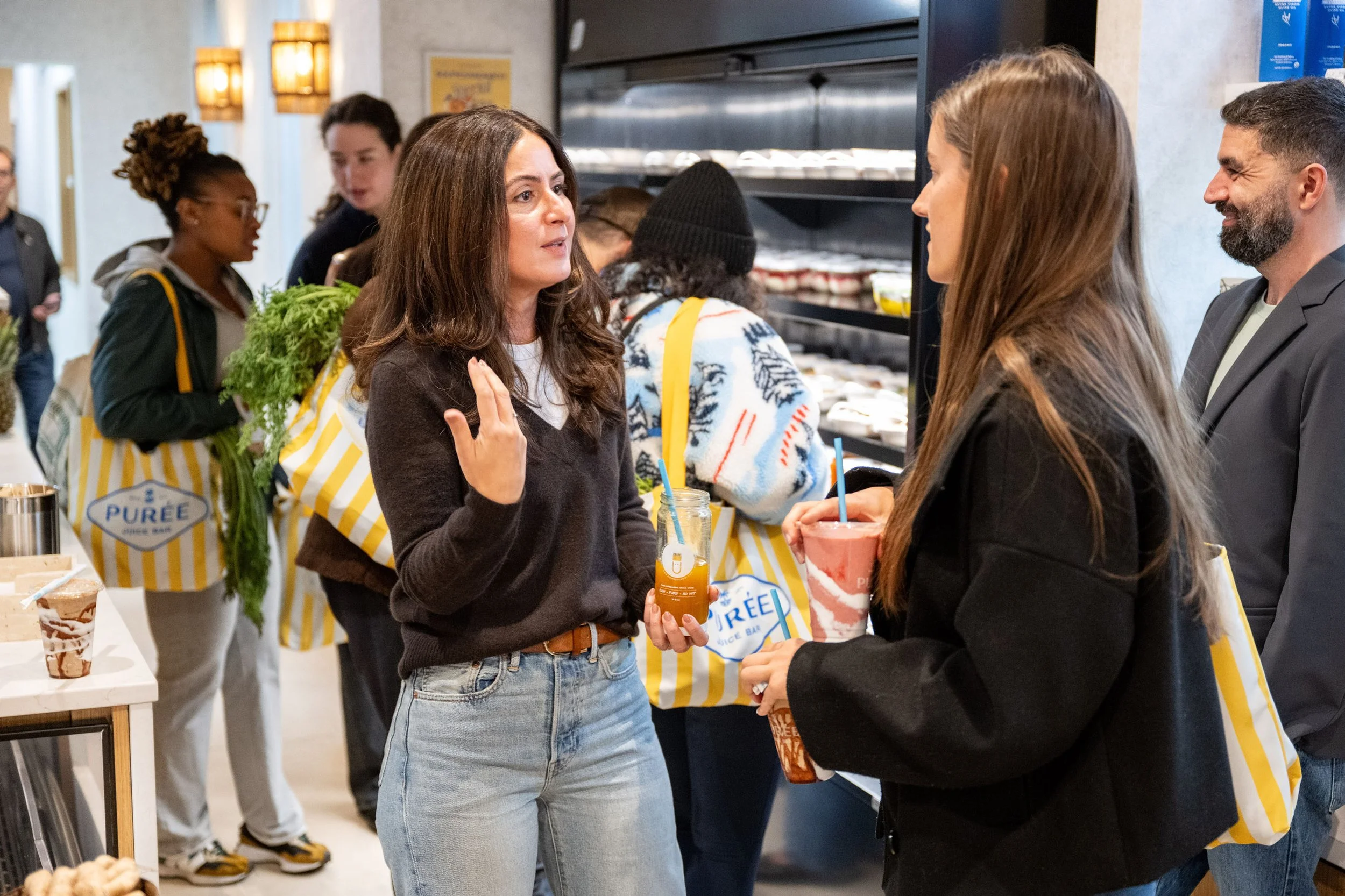
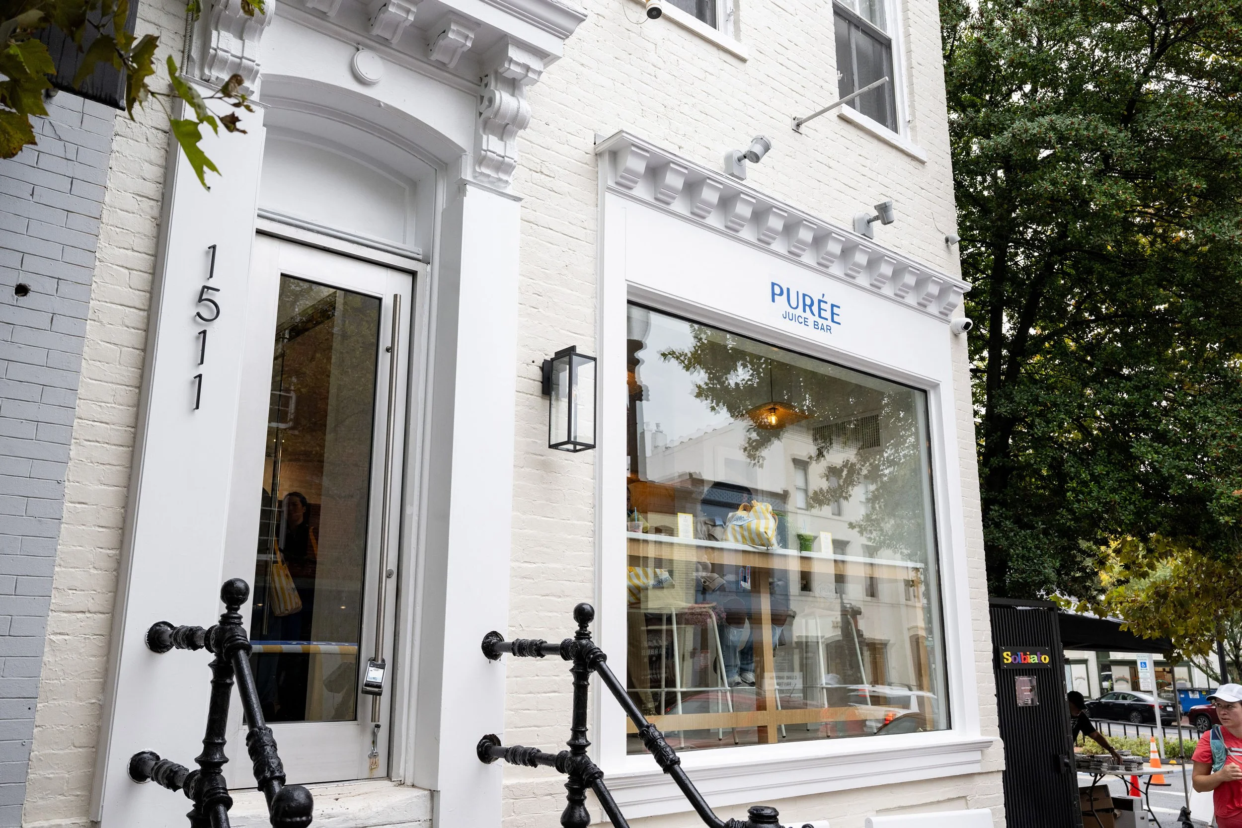
Activation focused on embedding the new identity into the physical and operational reality of the business. Packaging, cups, bags, merchandise, in-store signage, and digital ordering all became opportunities to reinforce the brand’s values.
This was not about decoration. It was about alignment. The updated system gave the team clarity and confidence, helping them make faster decisions and present a more cohesive experience at every touchpoint.
Early feedback confirmed the shift. Customers noticed the difference. The brand felt elevated, more intentional, and more reflective of the care they already associated with Purée. The result is a brand built to grow. One that protects what made Purée special in the first place while giving it the structure and confidence to expand.
Purée Juice Bar
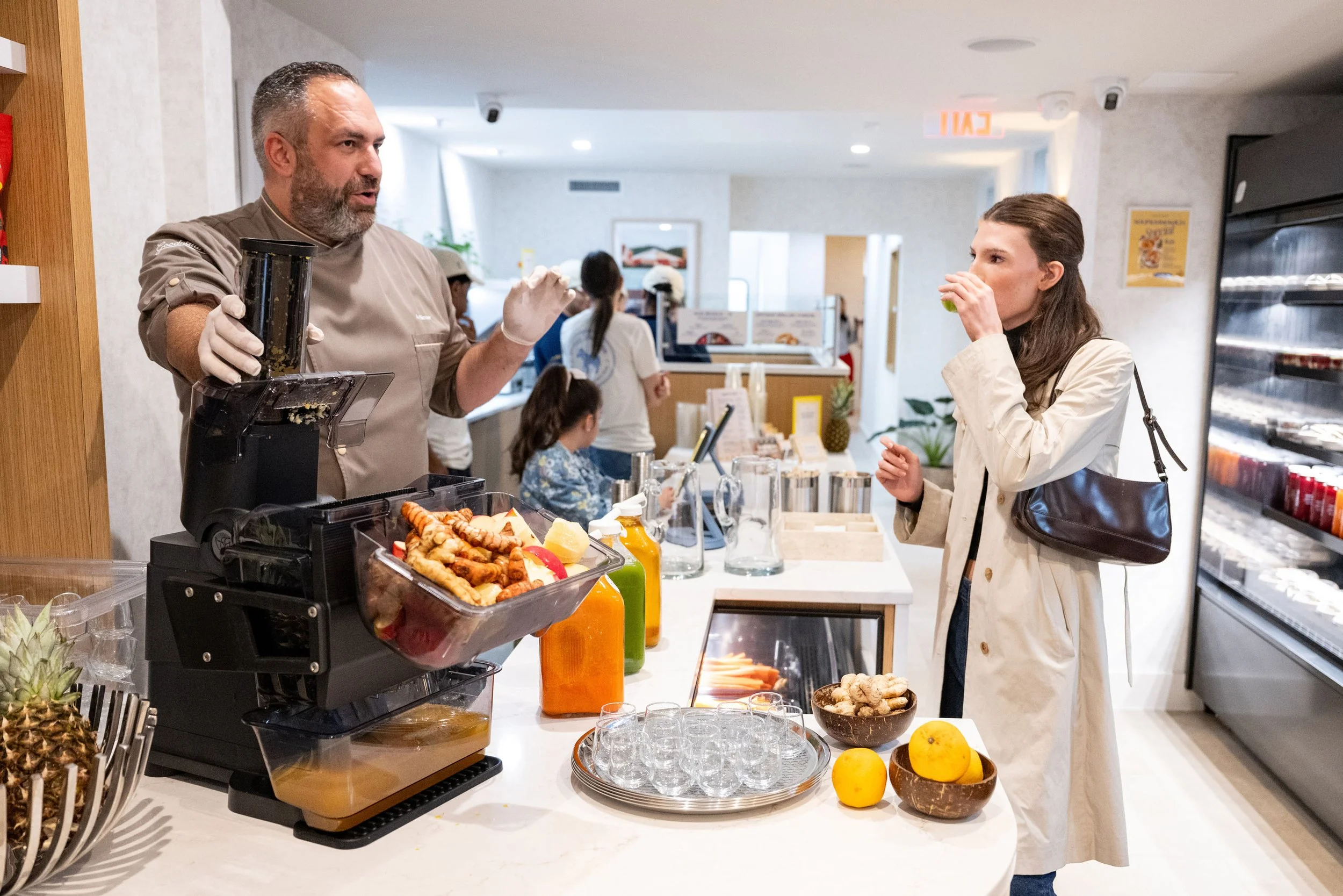
Purée had a loyal following built on raw, organic juice and a real sense of ritual. EightySeven refined the brand into a hospitality-led wellness identity built to scale, sunny and confident, without losing what made it feel personal.
Client: Purée Juice Bar, a hospitality-led wellness brand
Industry: Hospitality / Wellness / Food & Beverage
Services: Brand Strategy, Visual Identity, Verbal Identity, Brand Activation, Packaging Design, Web Design, Retail Design & Environmental
Engagement: (87)BrandLift
Year: 2026
Brand Identity & Support: Erika Park
Product Photography: Birch Thomas