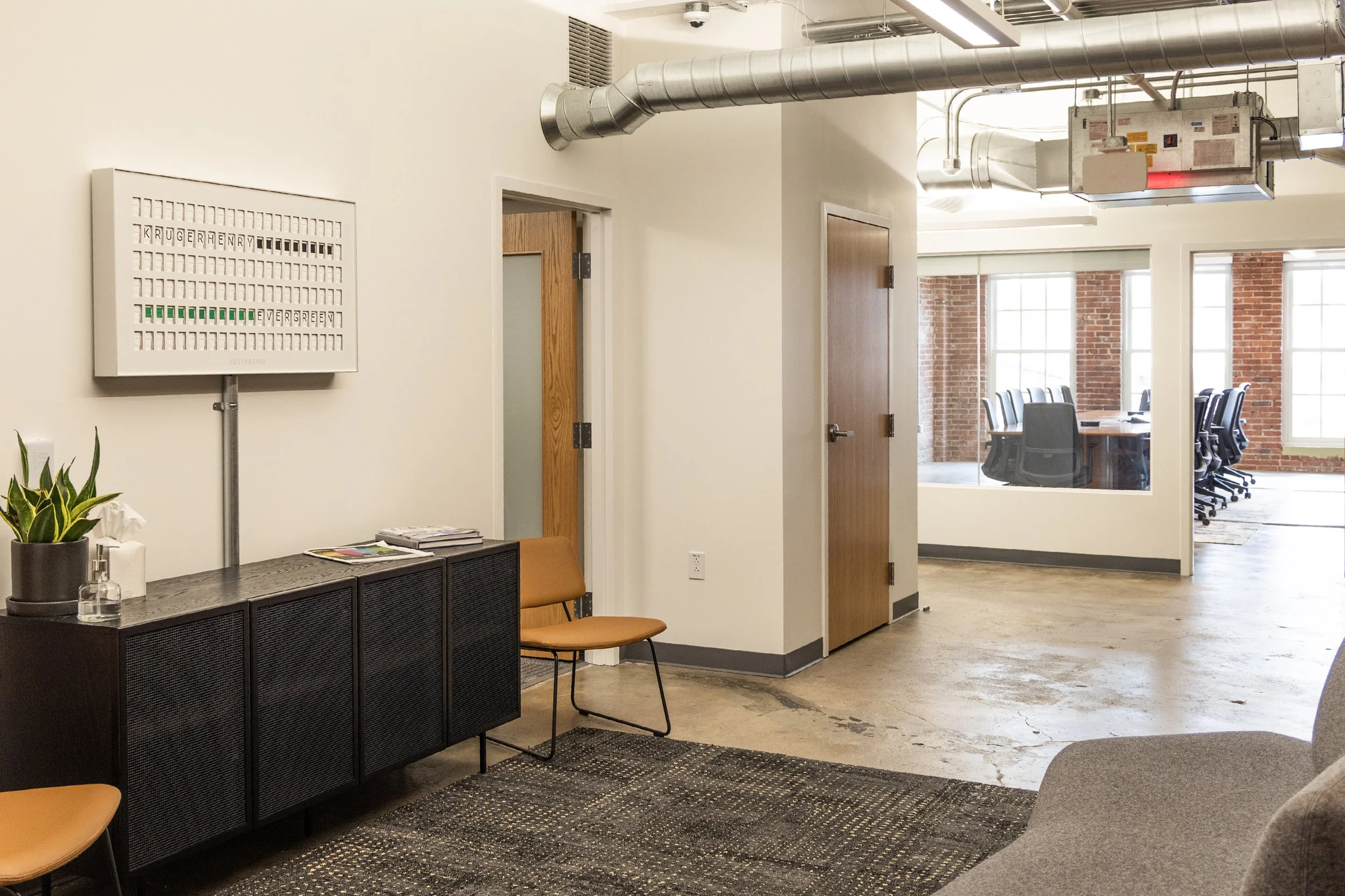
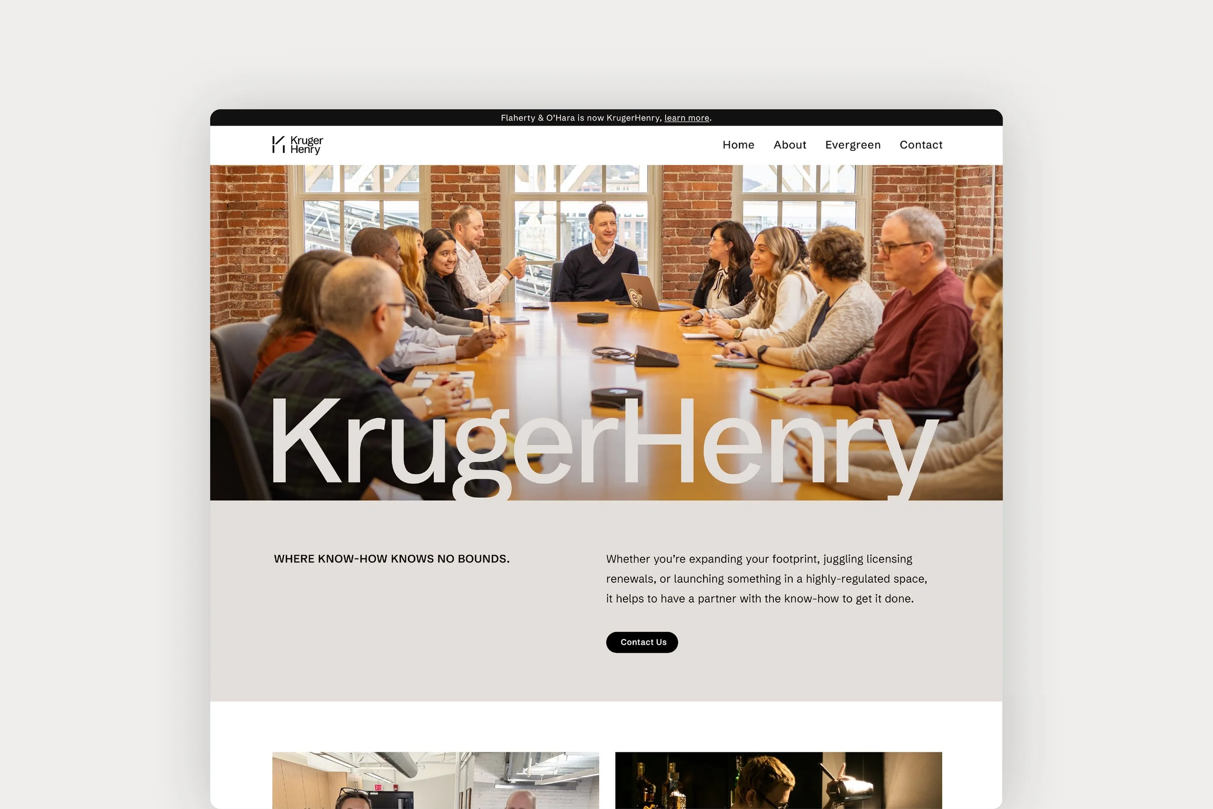
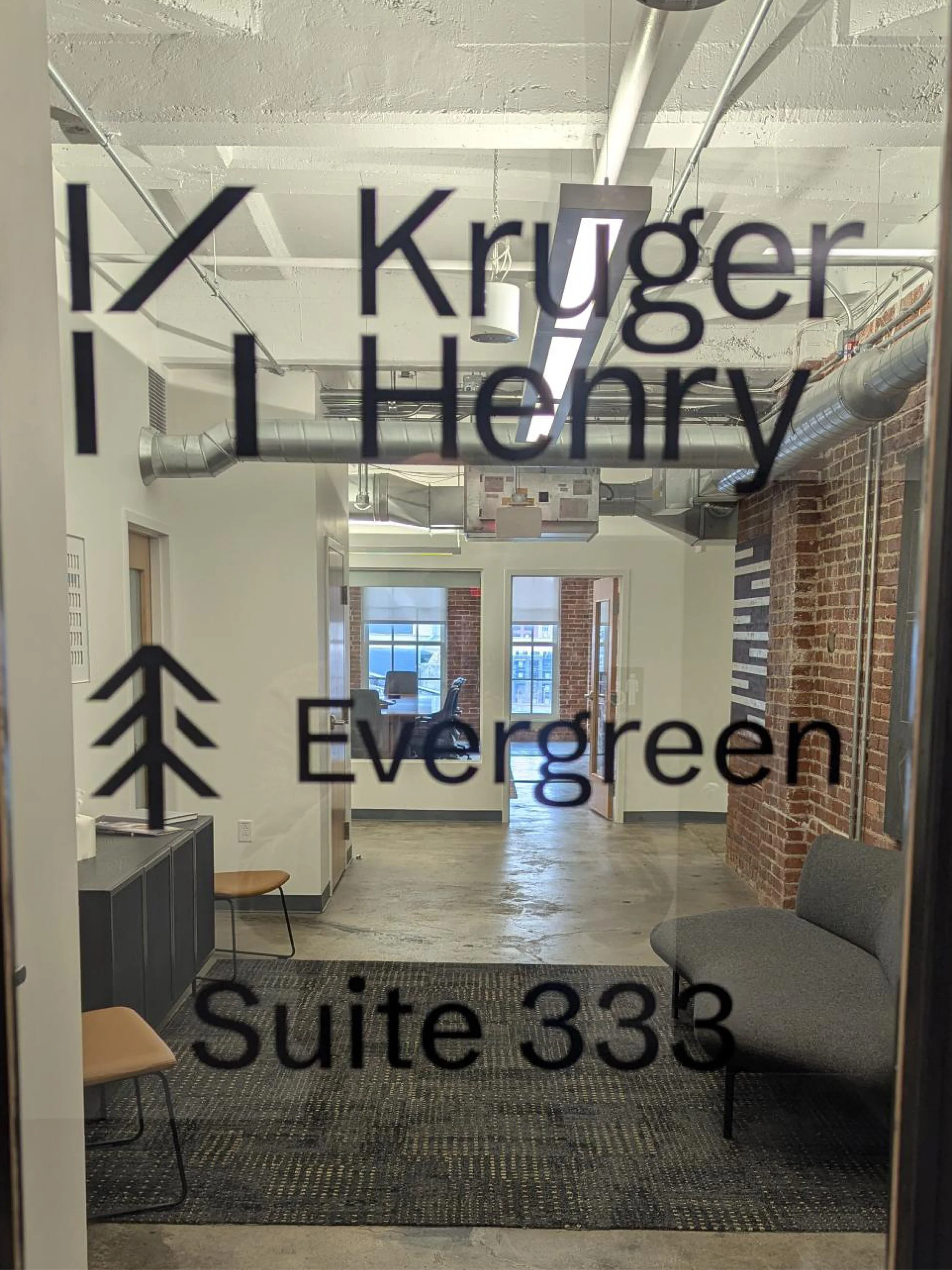
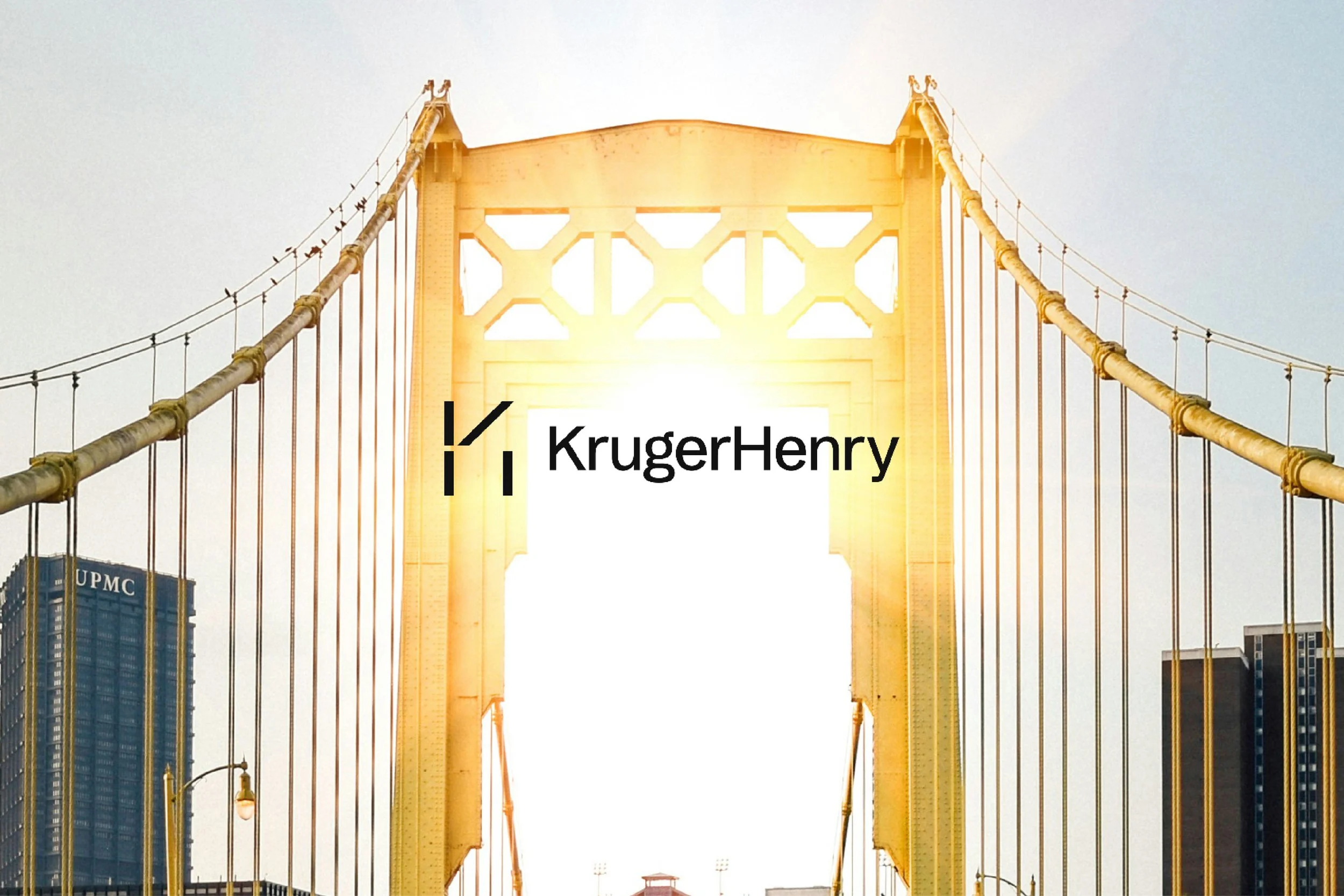
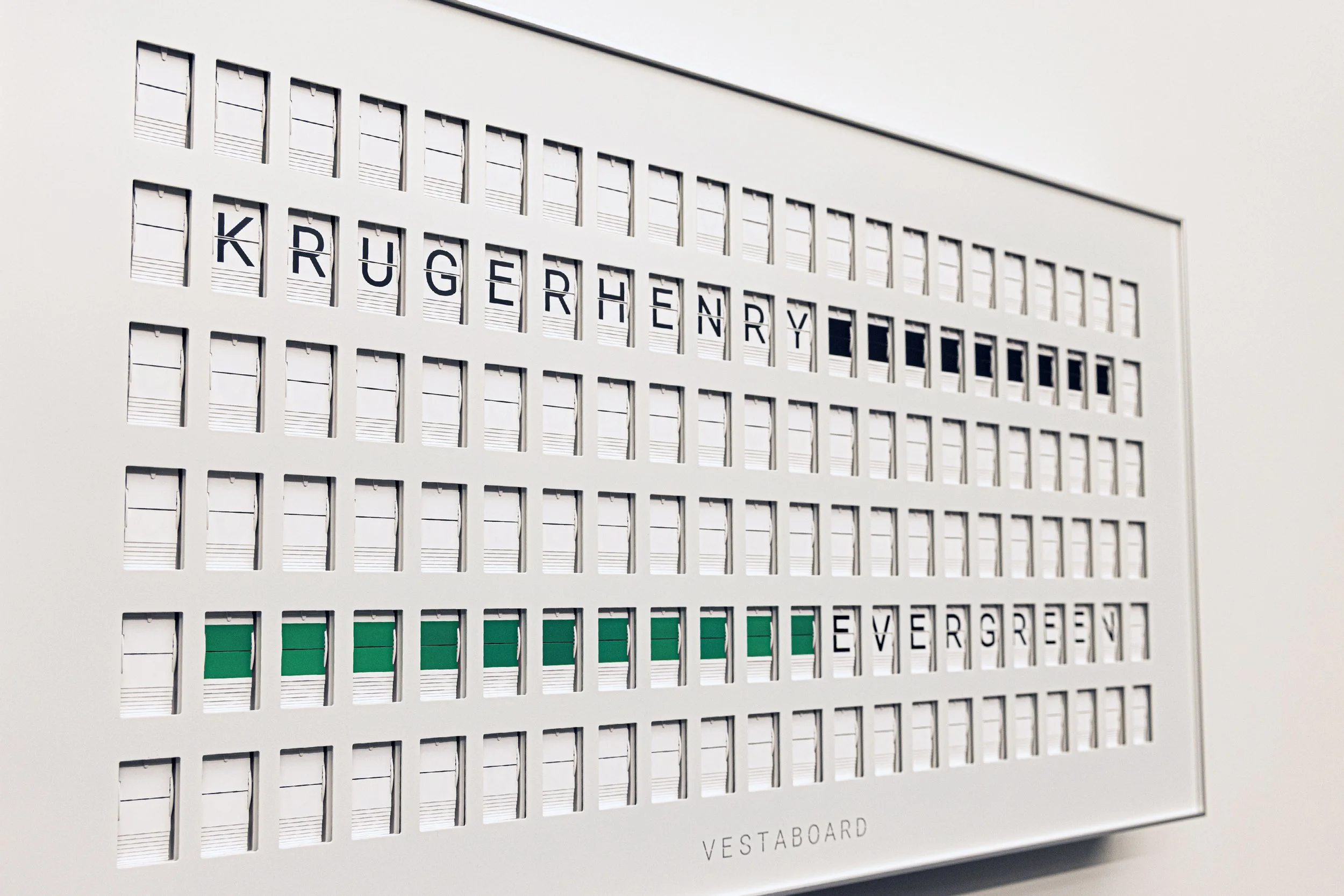
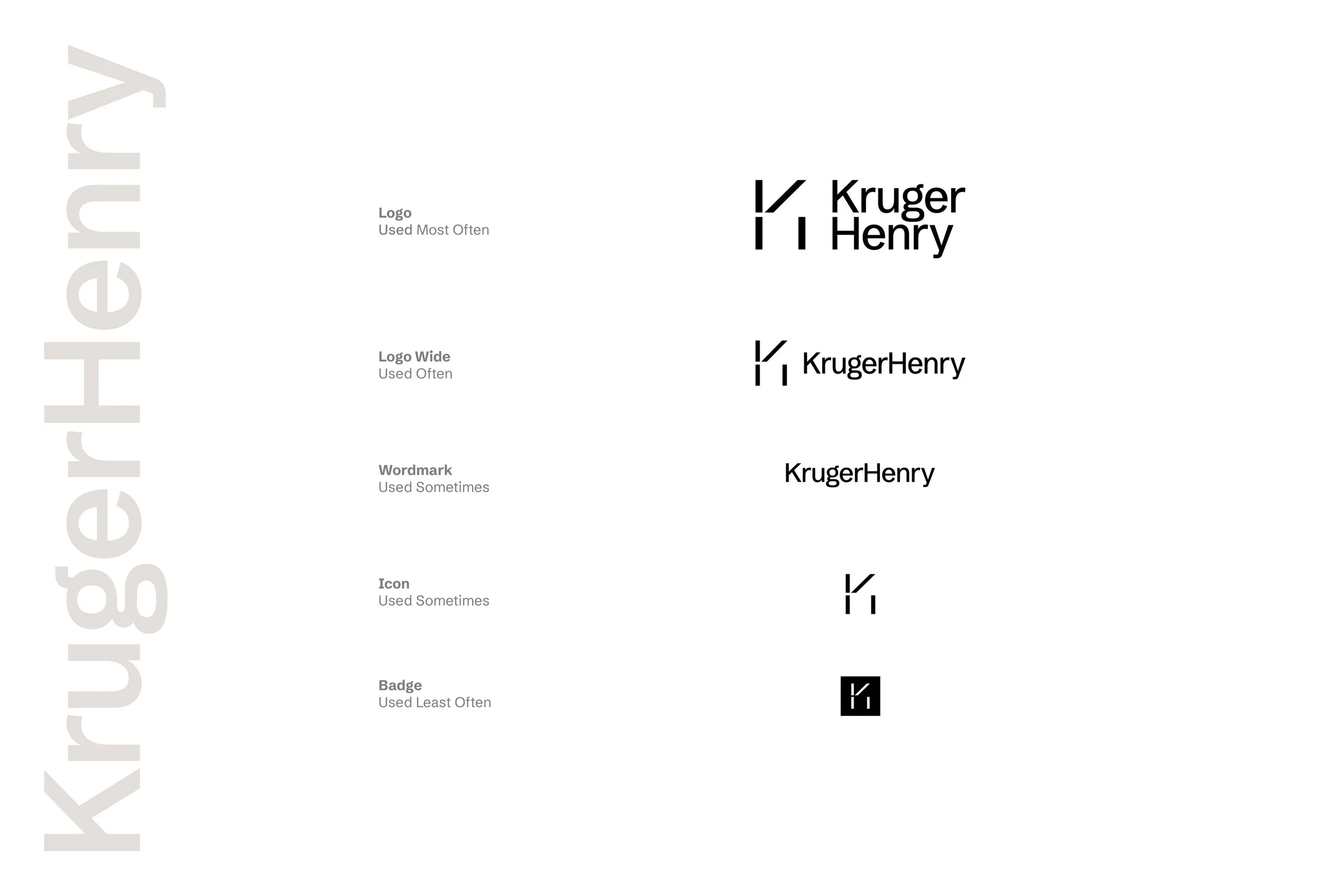
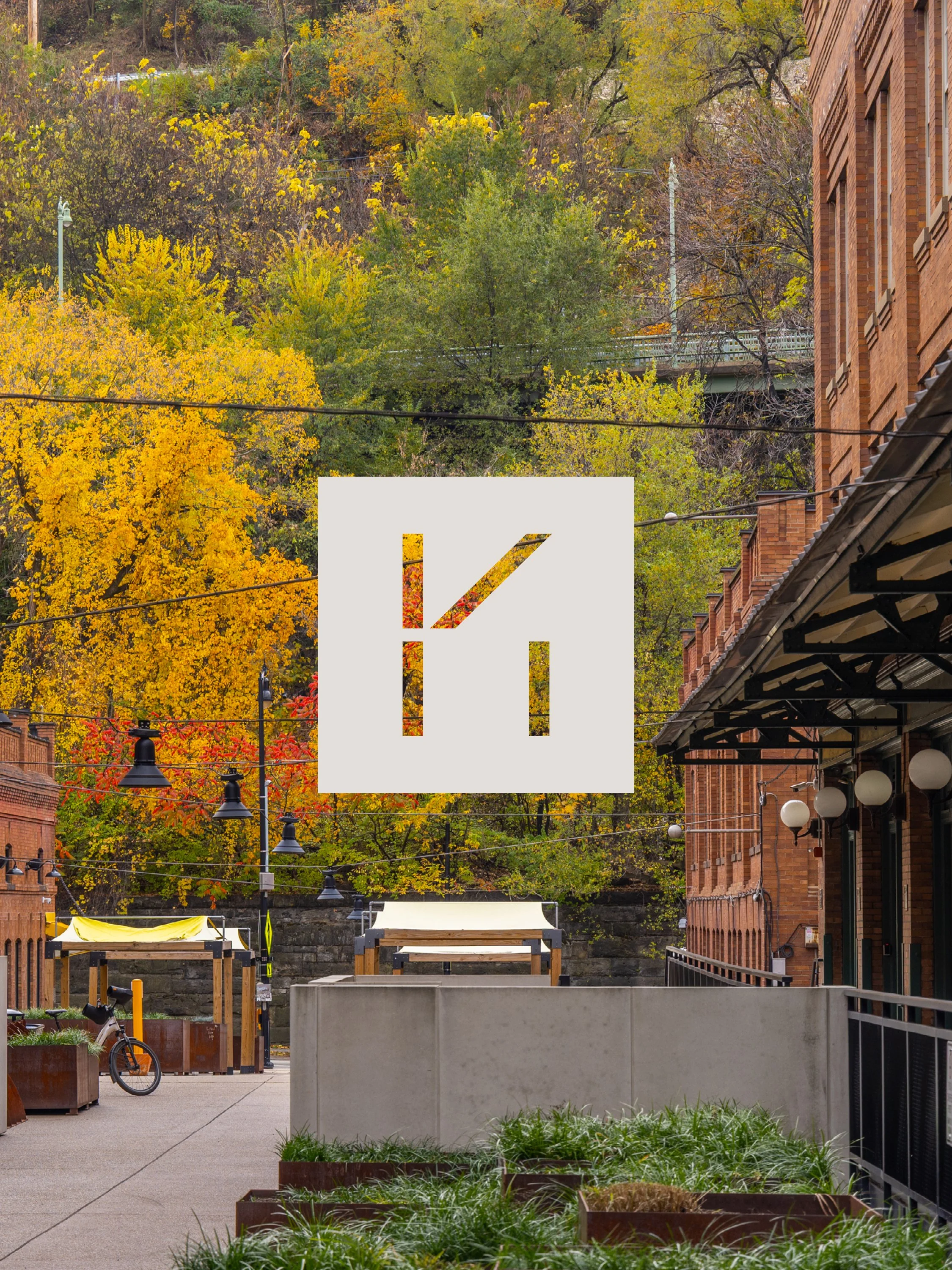
KRUGERHENRY
Flipping the look for a legacy law firm’s new vision.
-
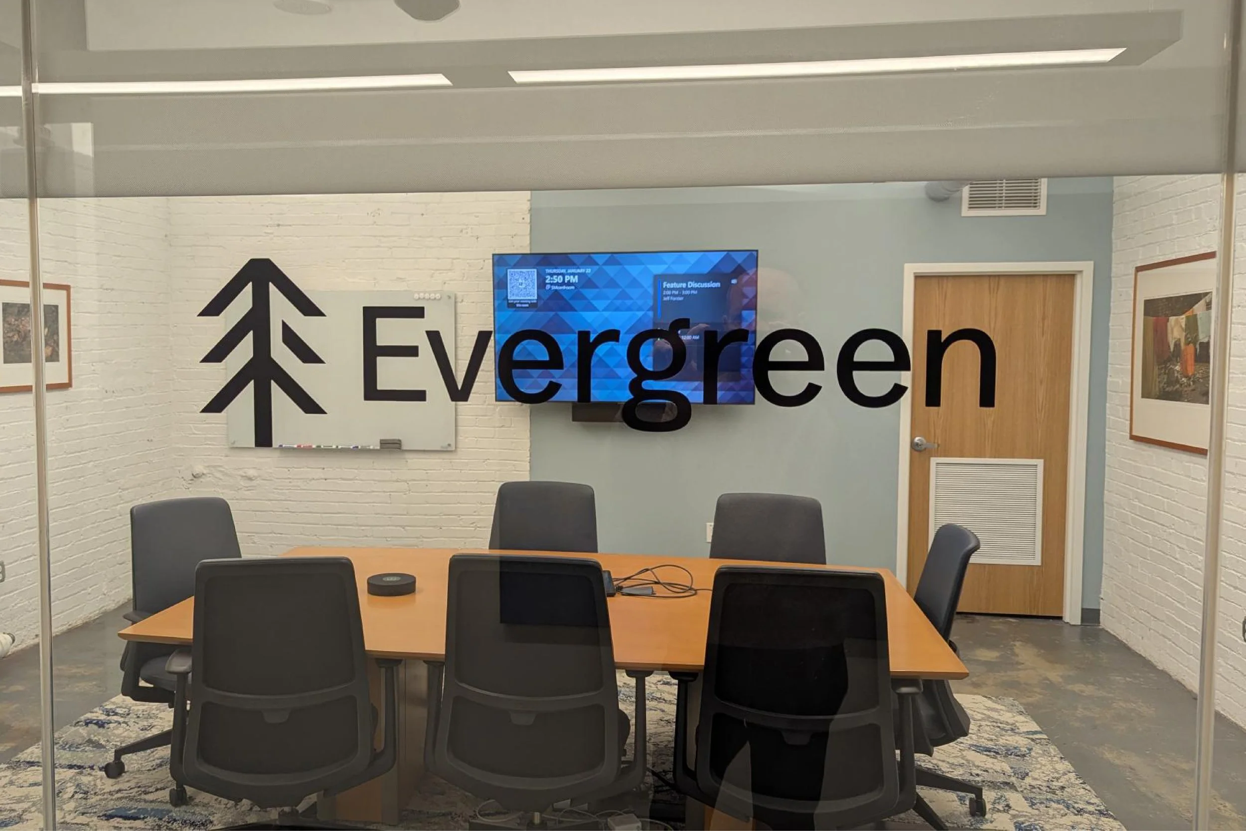
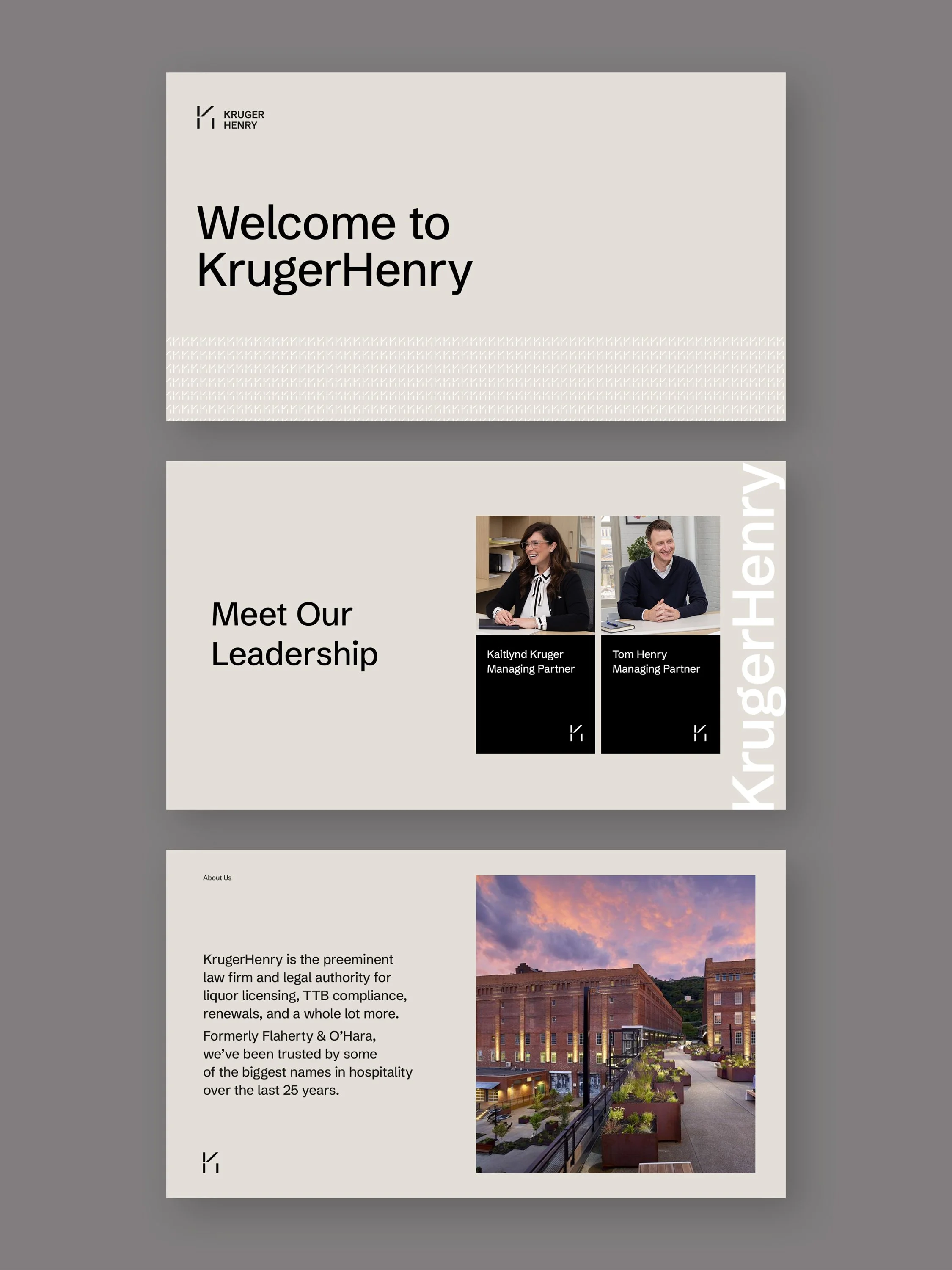
After a leadership transition and years of steady growth, Flaherty O'Hara had already evolved. A proprietary legal platform called Evergreen had quietly changed what the firm actually was, more scalable, more modern, harder to categorize. The problem wasn't capability. It was that the outside world still saw the old version.
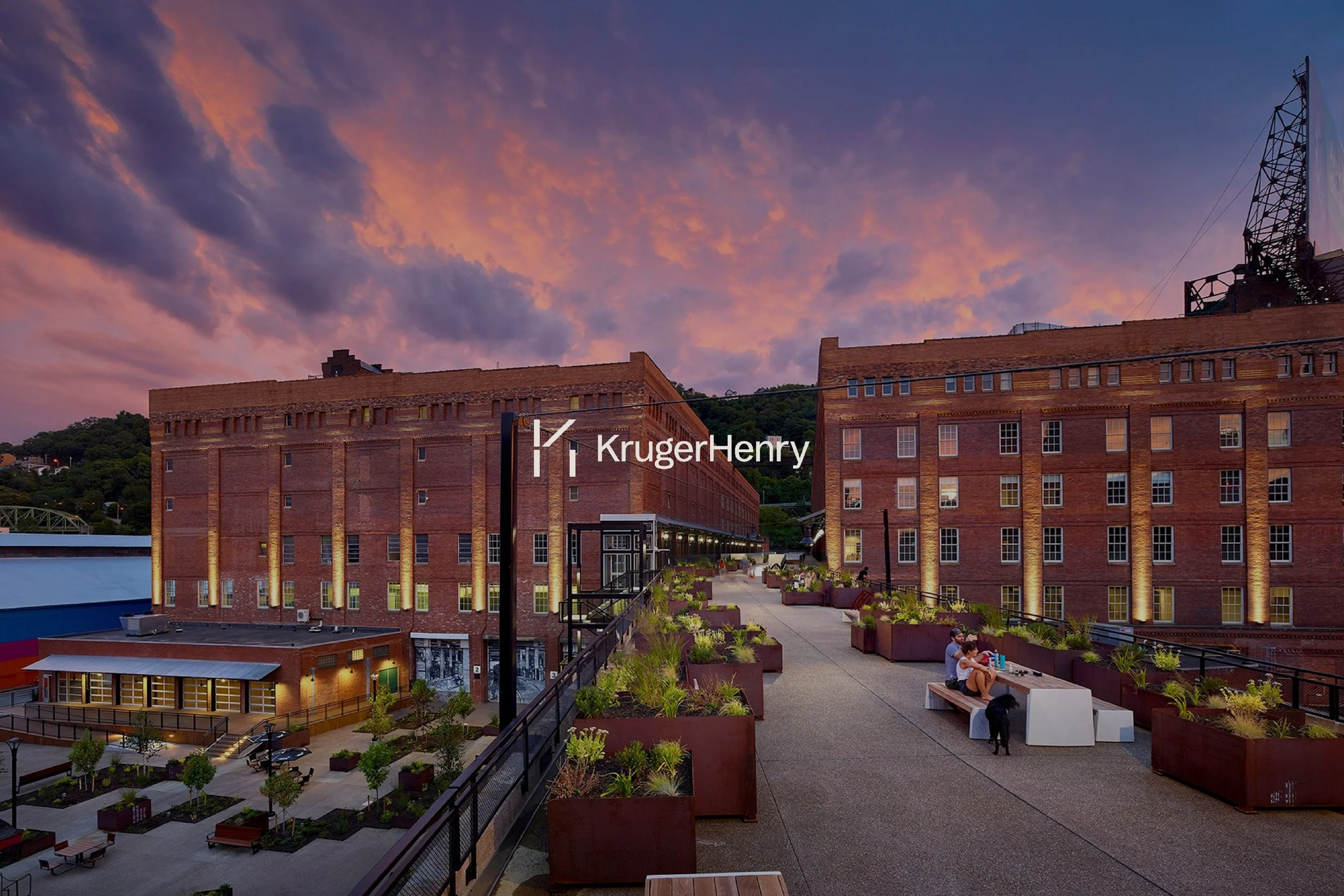
When you inherit or step into an existing business, the brand is often the last thing to move. KrugerHenry came to us to close that gap.
Our Services:
(87)BrandFusion
Brand Naming
Brand Focus
Brand Strategy
Verbal Identity
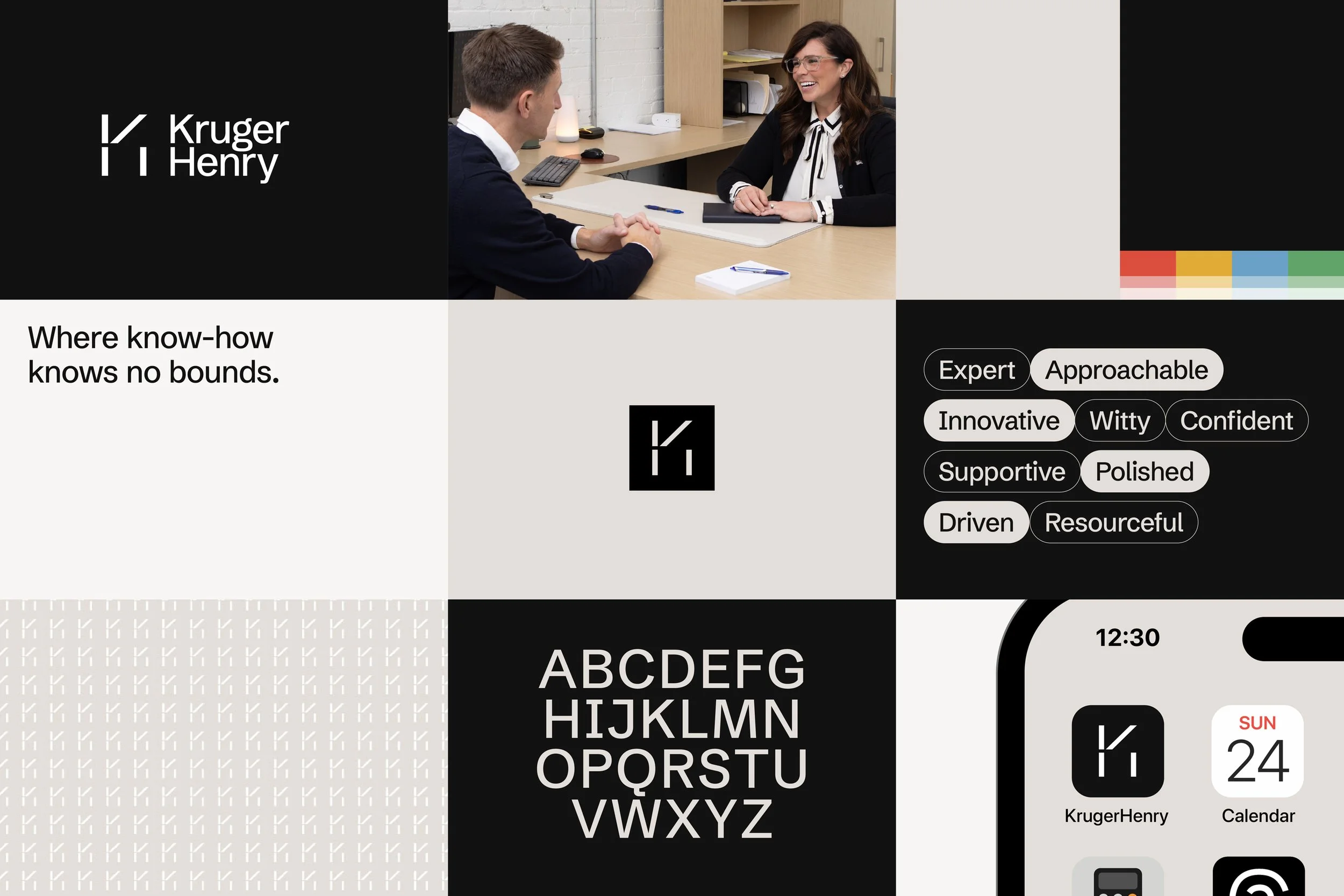
Visual Identity

(01) Brand Focus
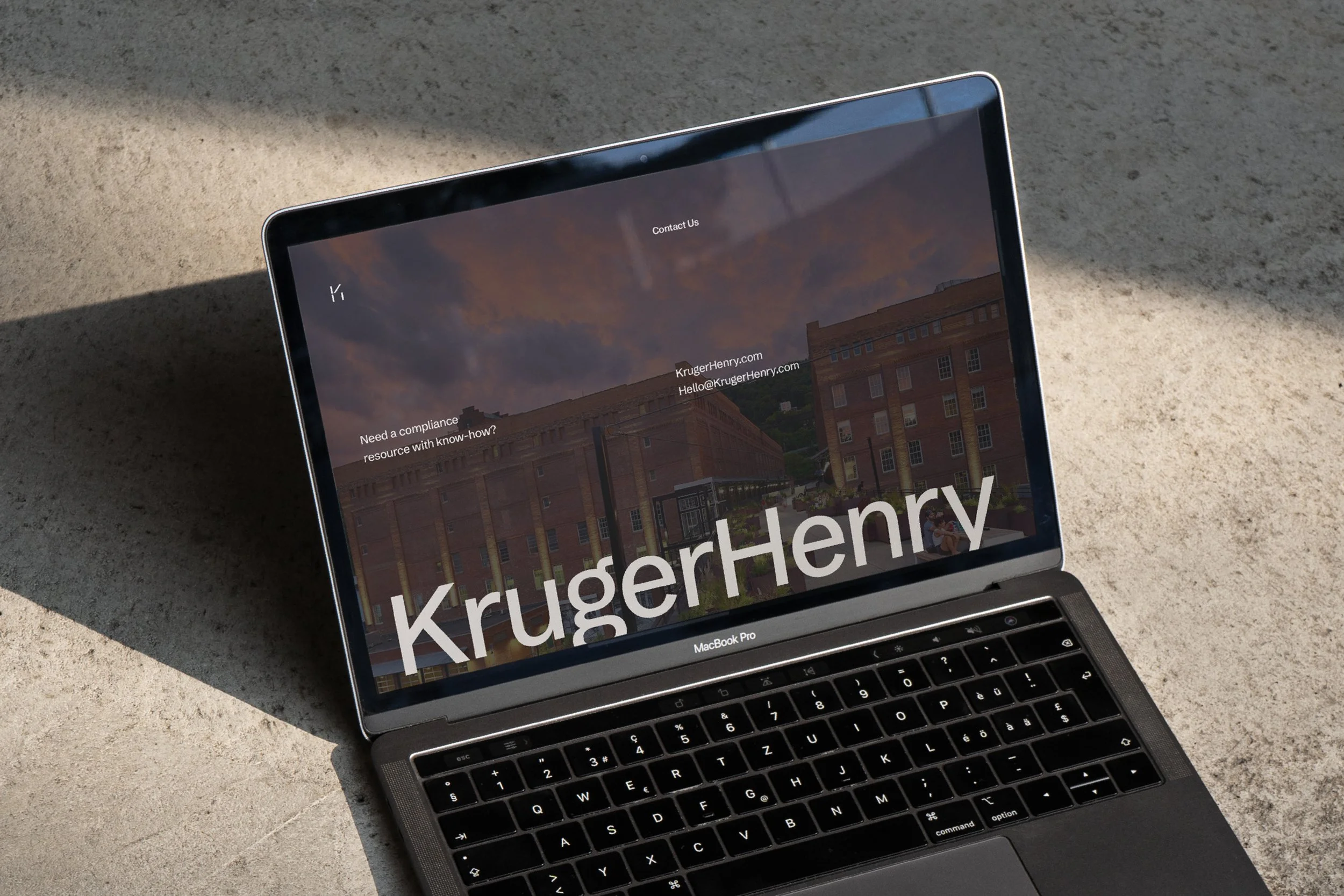
From legacy law firm to modern legal resource.
-
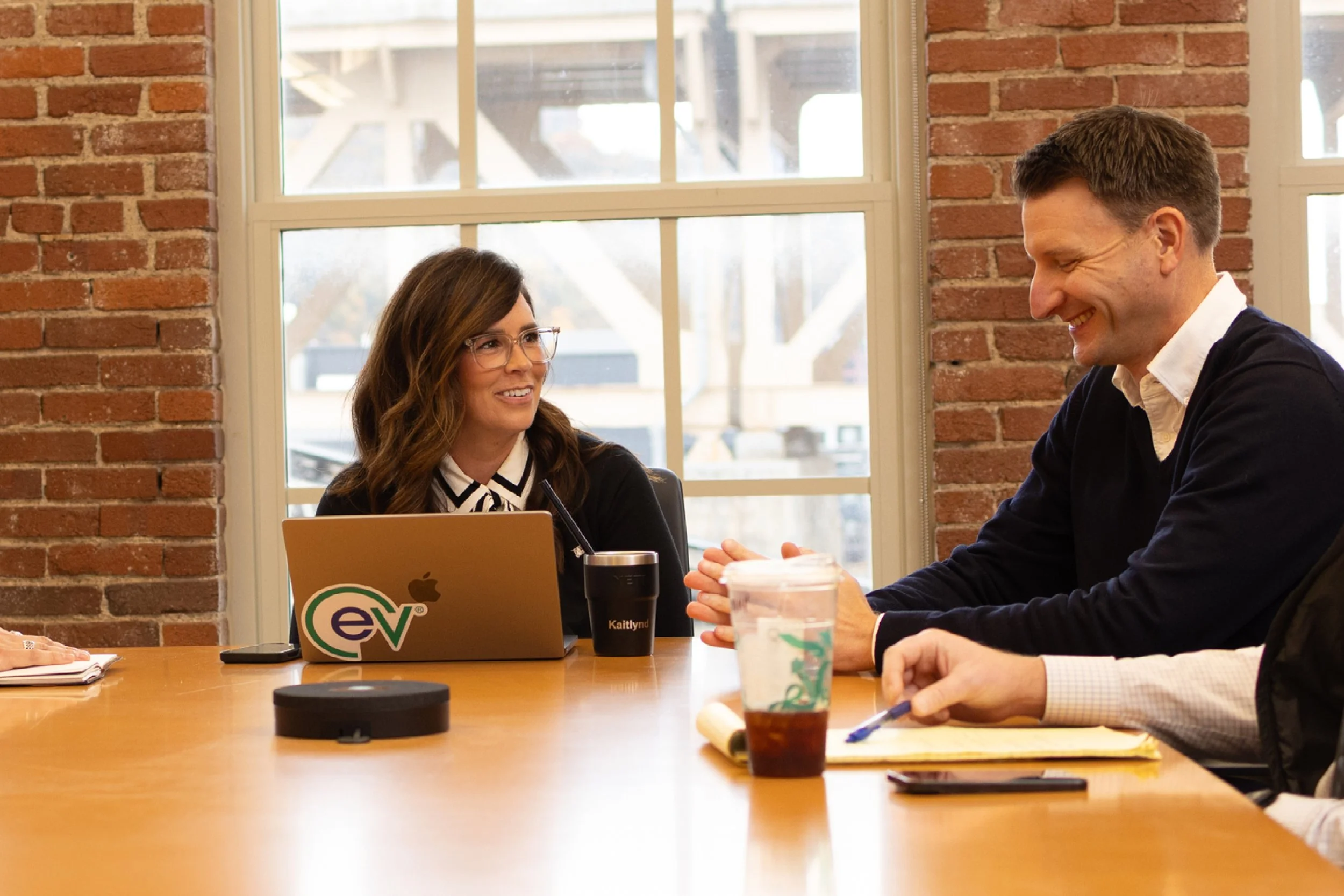
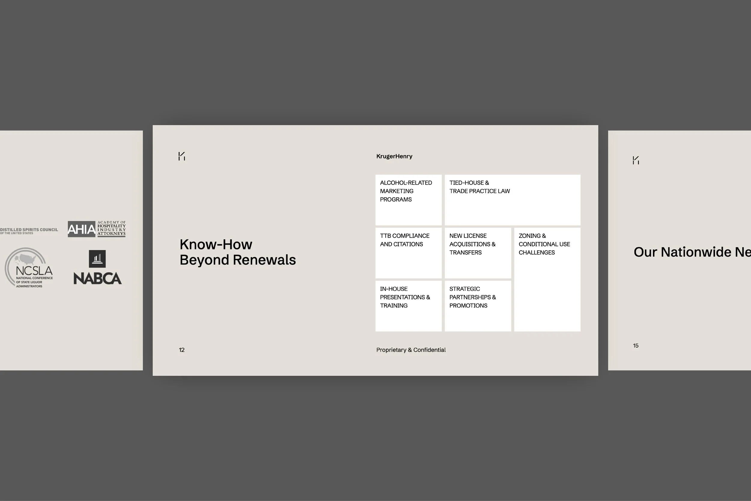
The opportunity wasn’t to reinvent the prior firm. It was to fully realize what they had already become. Through our (87)BrandFocus workshop, one tension became clear. Internally, the team knew they were evolving. Externally, they were still perceived as a traditional law firm. That gap was slowing momentum.
There were also two competing forces at play. A legacy of trust built over decades, and a forward-looking platform changing how legal work gets done. Most firms would choose one. KrugerHenry needed to own both.
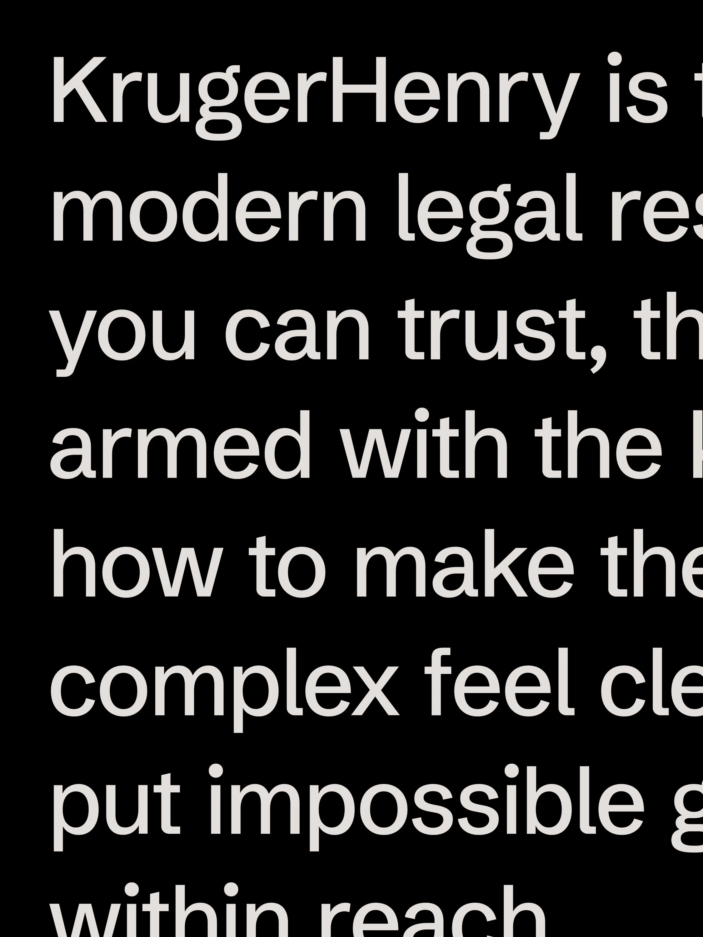
The breakthrough came from reframing their role entirely. Not a law firm. Not a software company. A modern legal resource.
That shift created alignment across leadership and gave the team a clear direction. It allowed them to move forward with confidence, knowing exactly how to talk about who they are, what they offer, and why it matters.
Brand Focus
BrandFocus Workshop
Brand Core & Audit
Vision, Mission, & Values
Audience & Personality
(87)BrandSpark
Brand Action Items

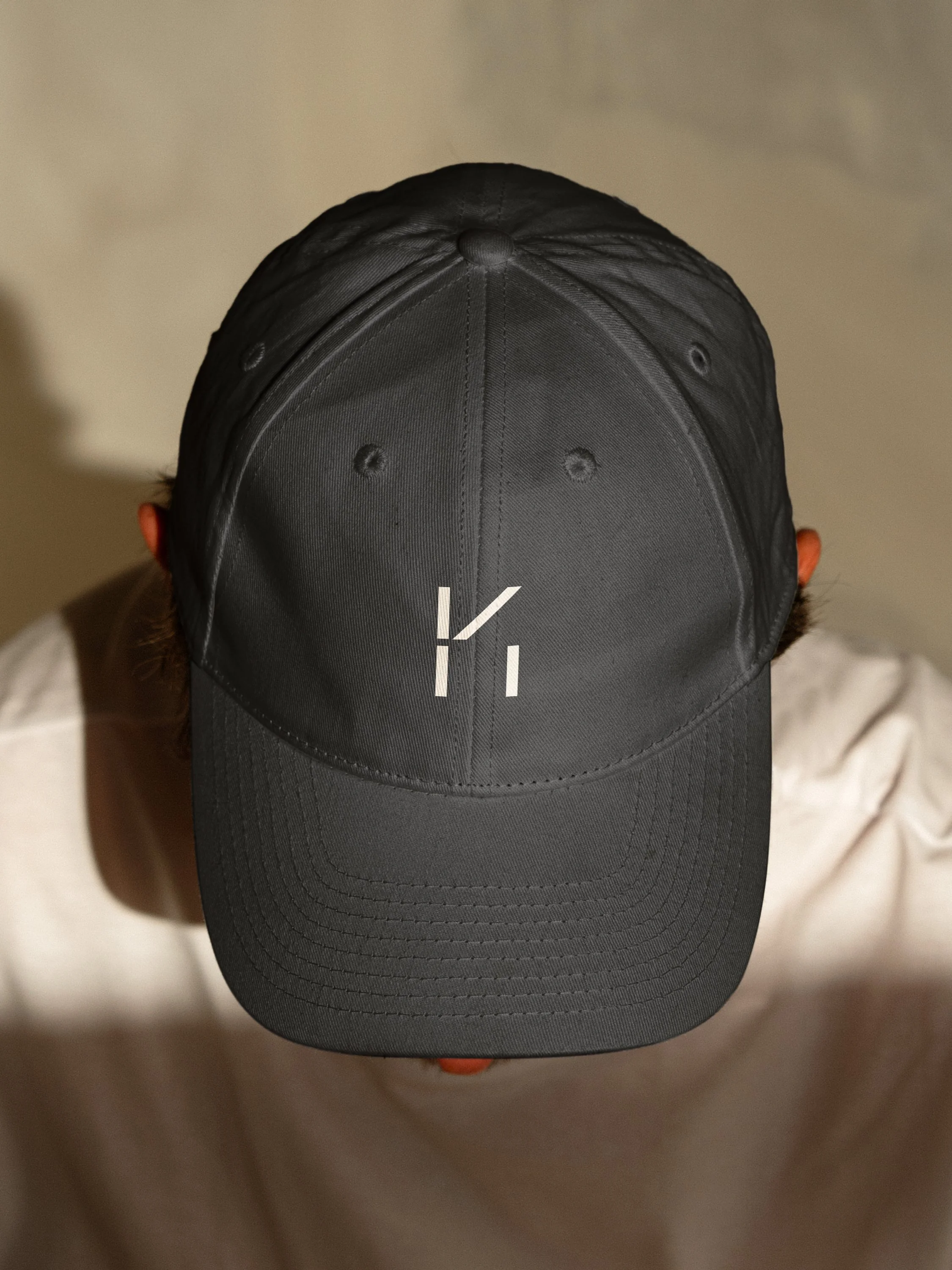
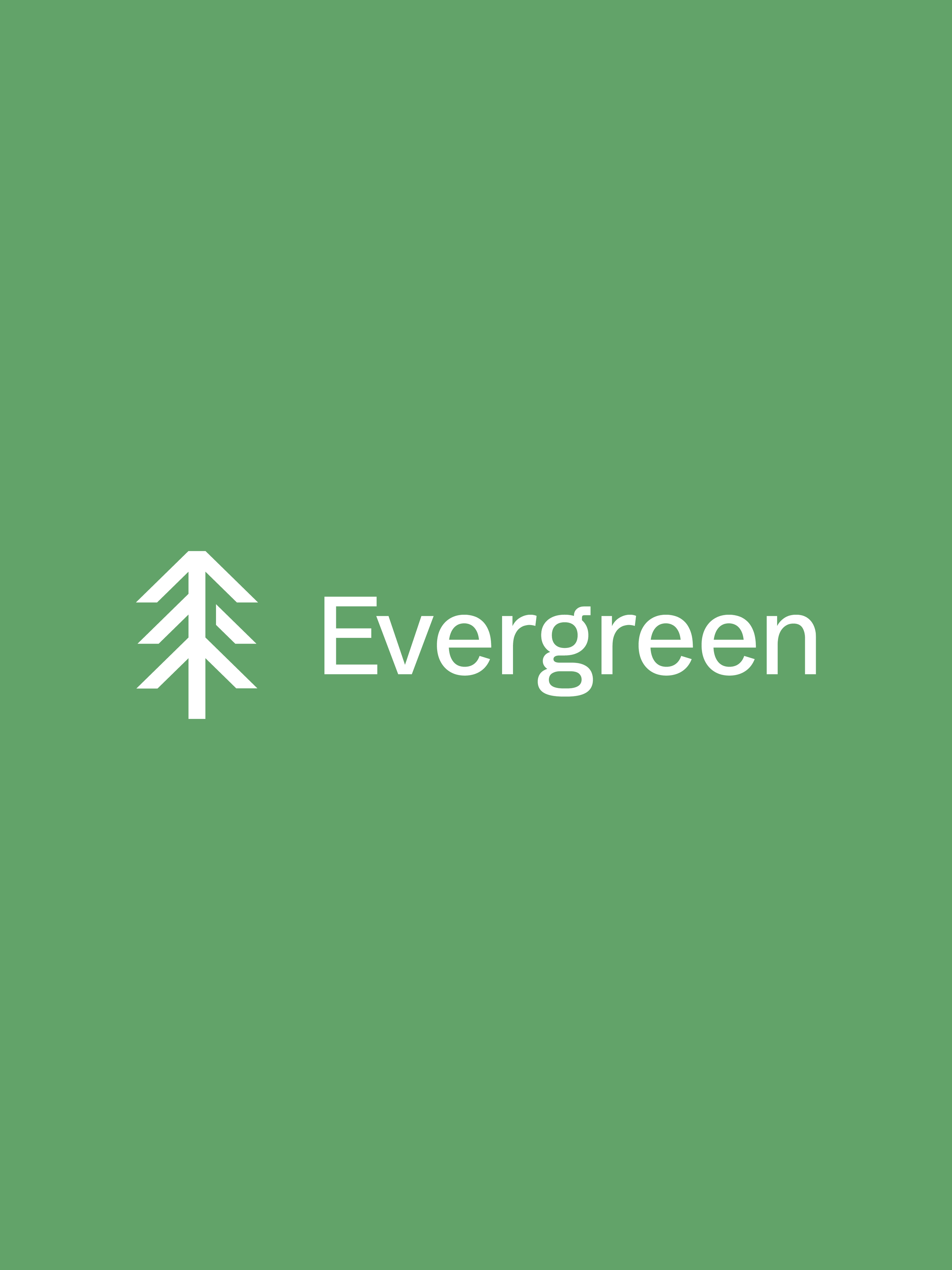
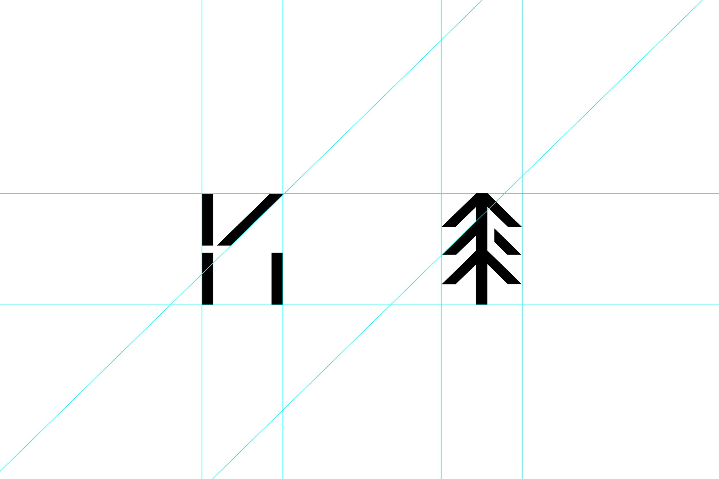
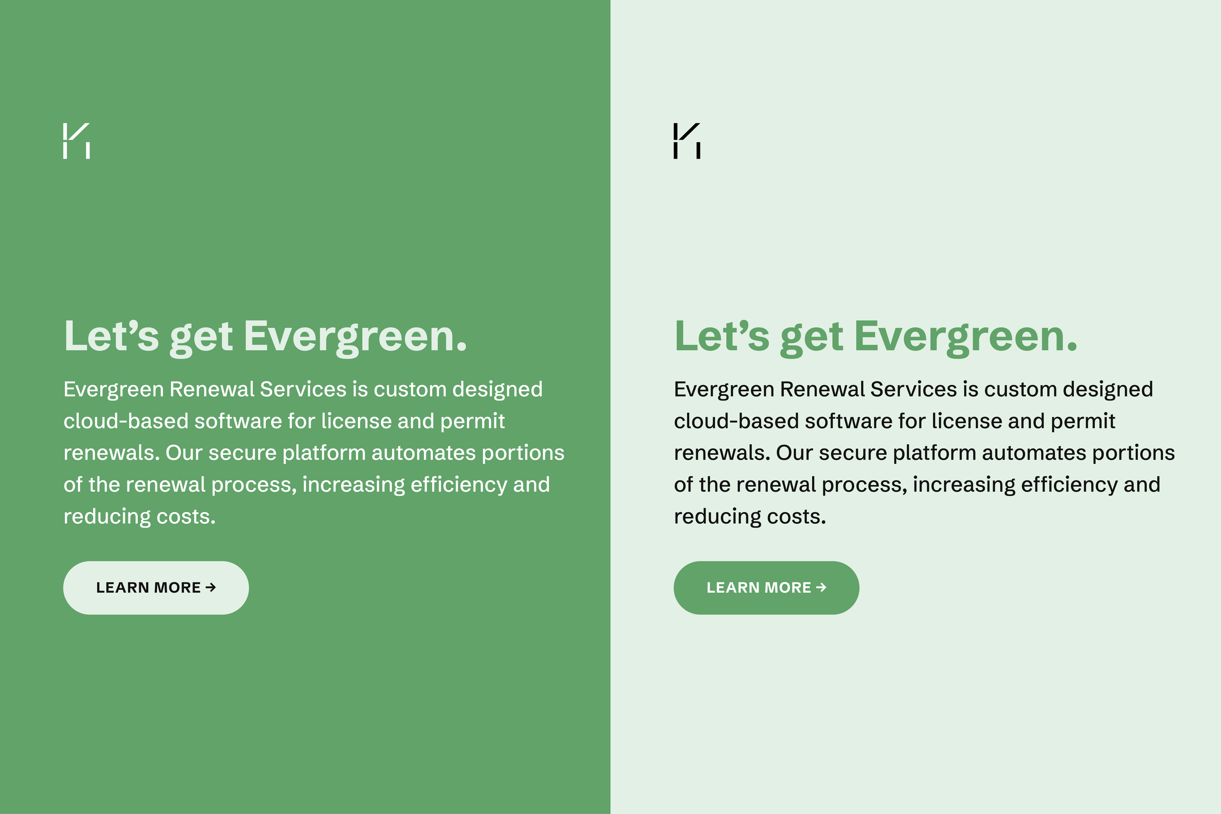
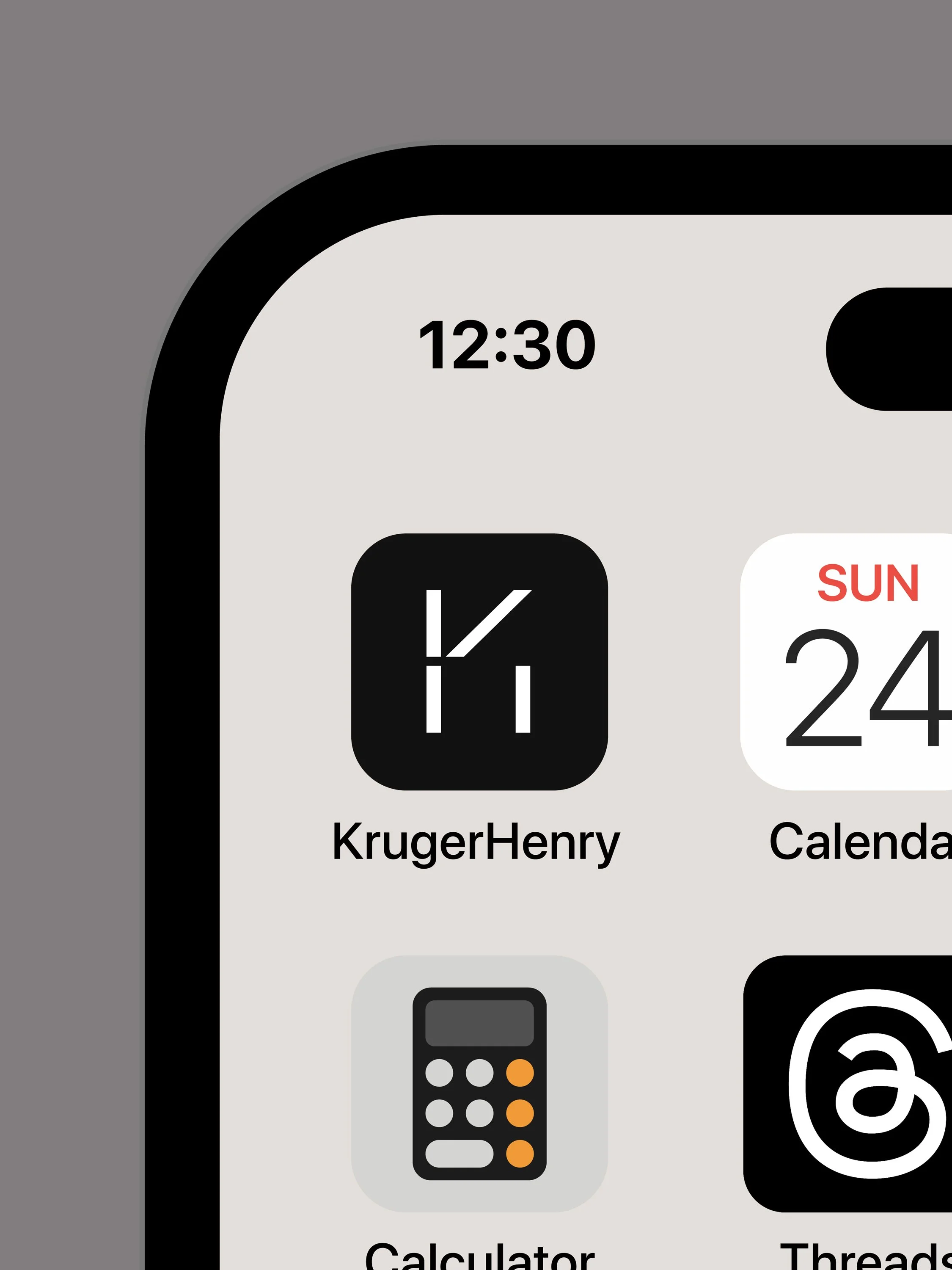
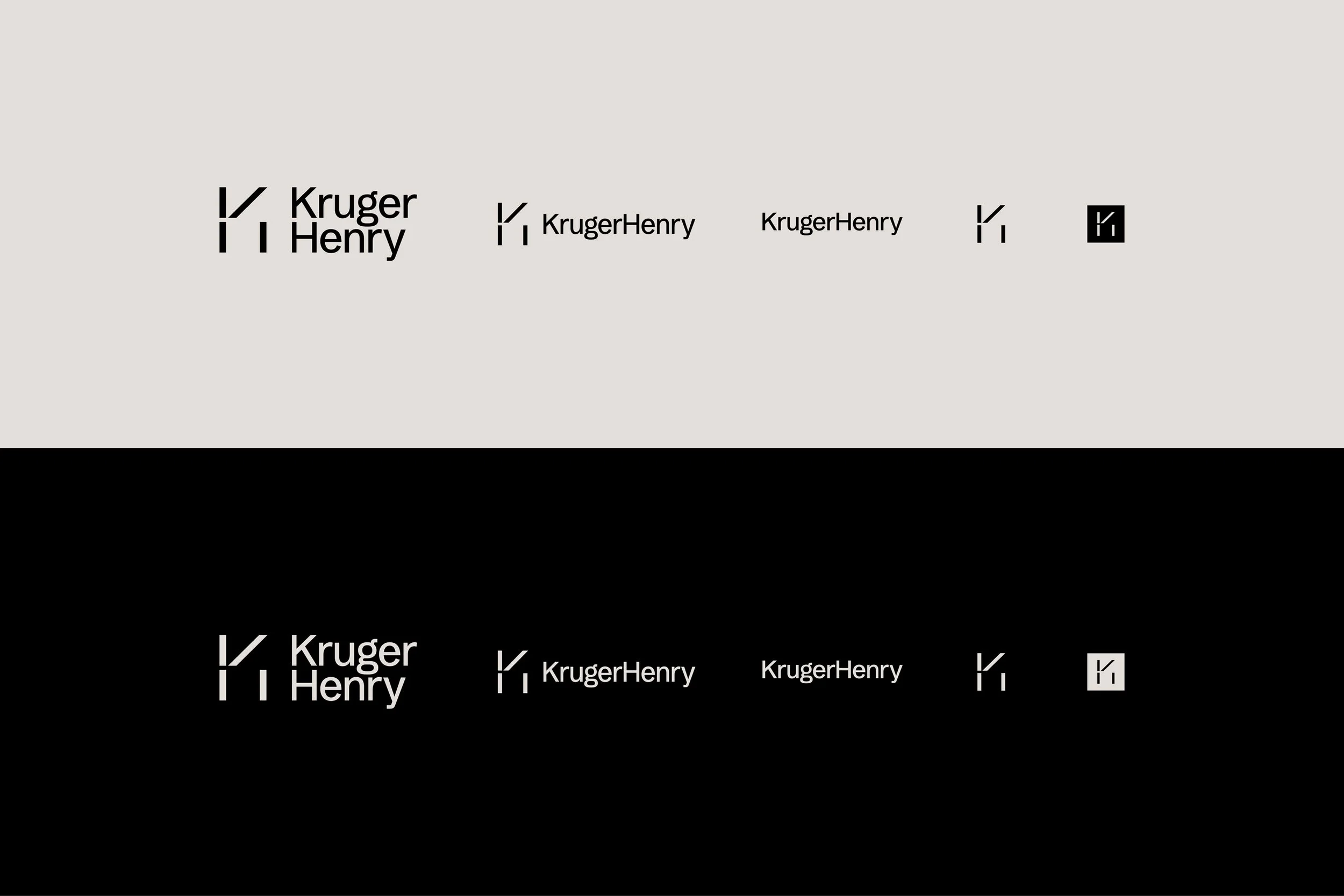
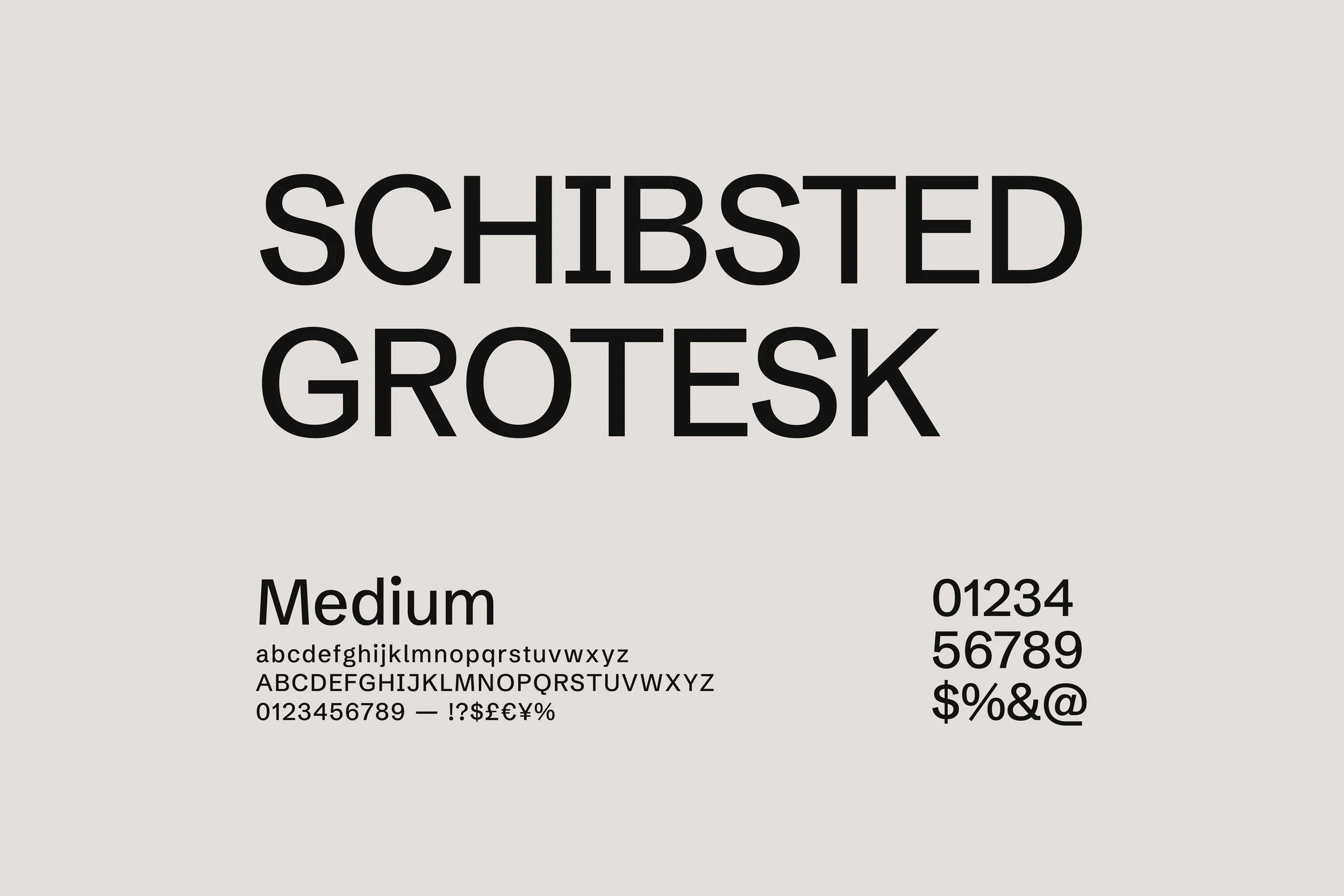
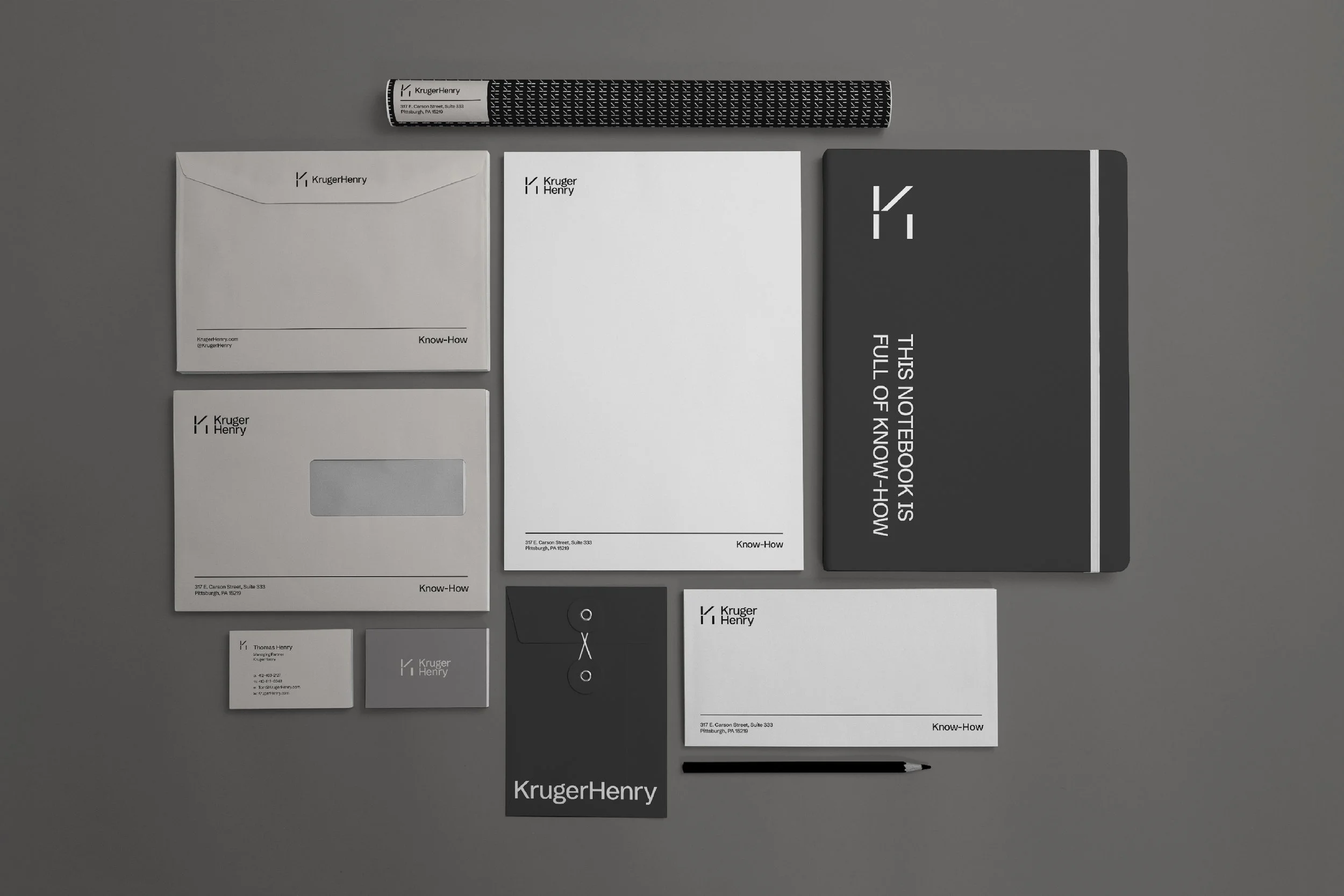
(02) Brand Visuals
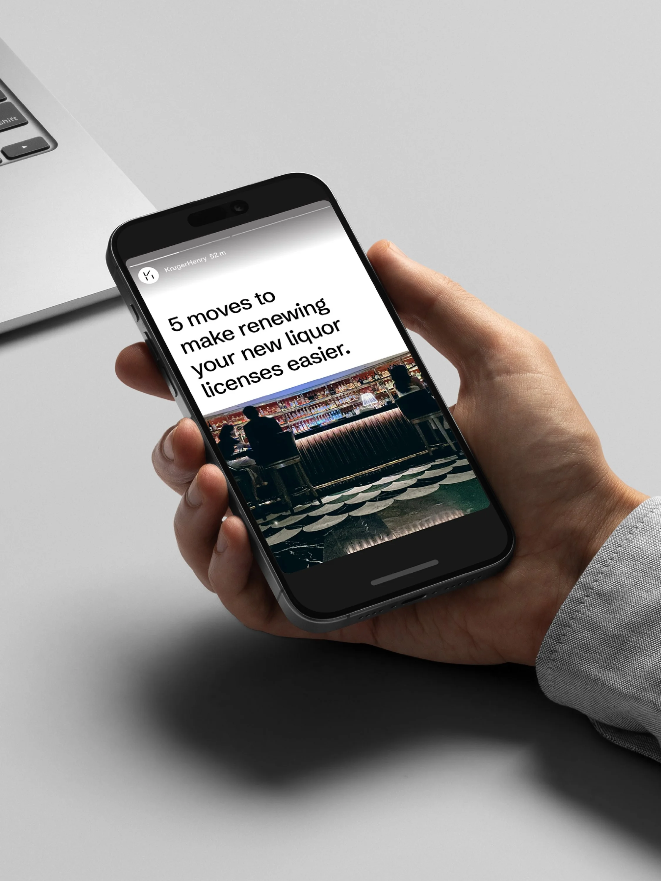
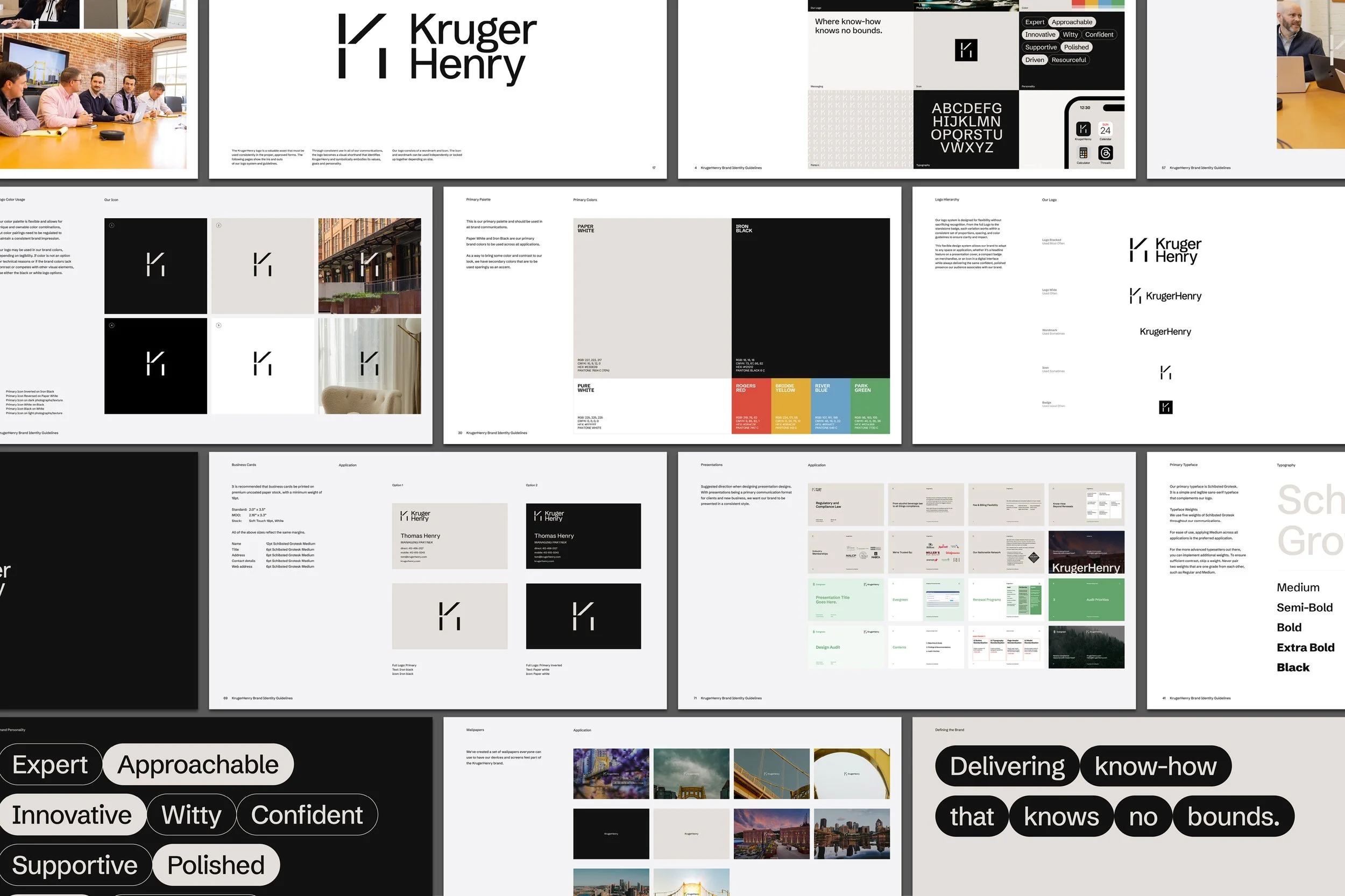
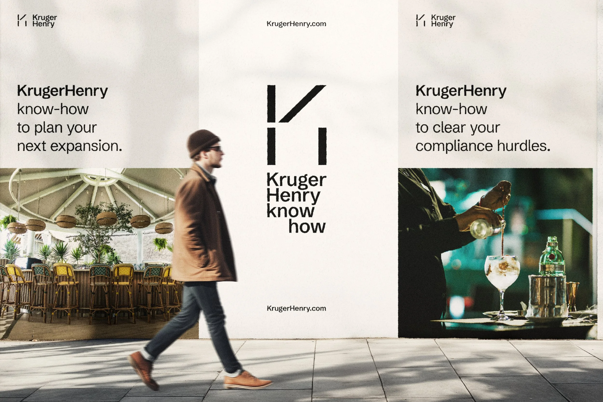
A simplified, elevated visual system inspired by communication systems.
-
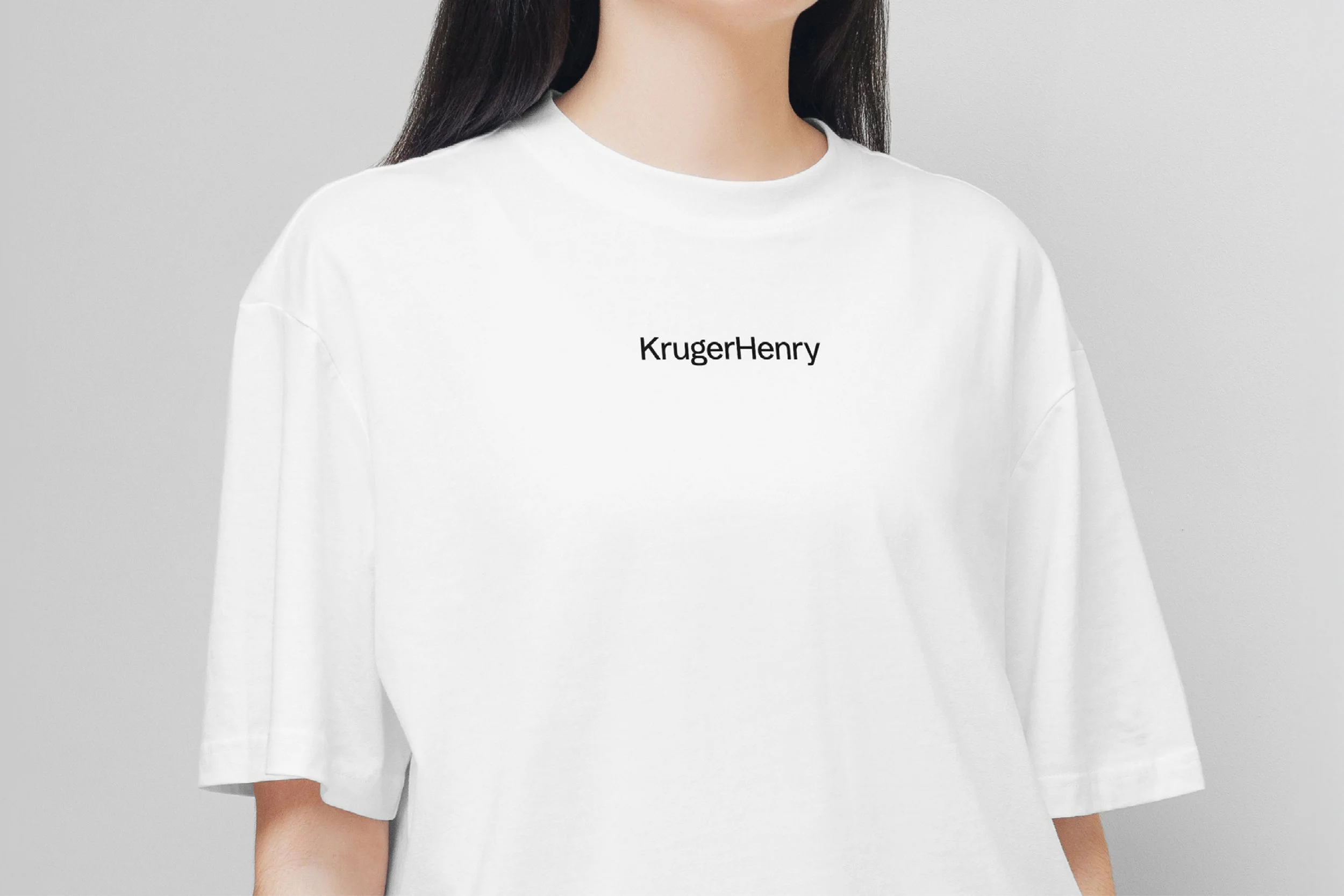
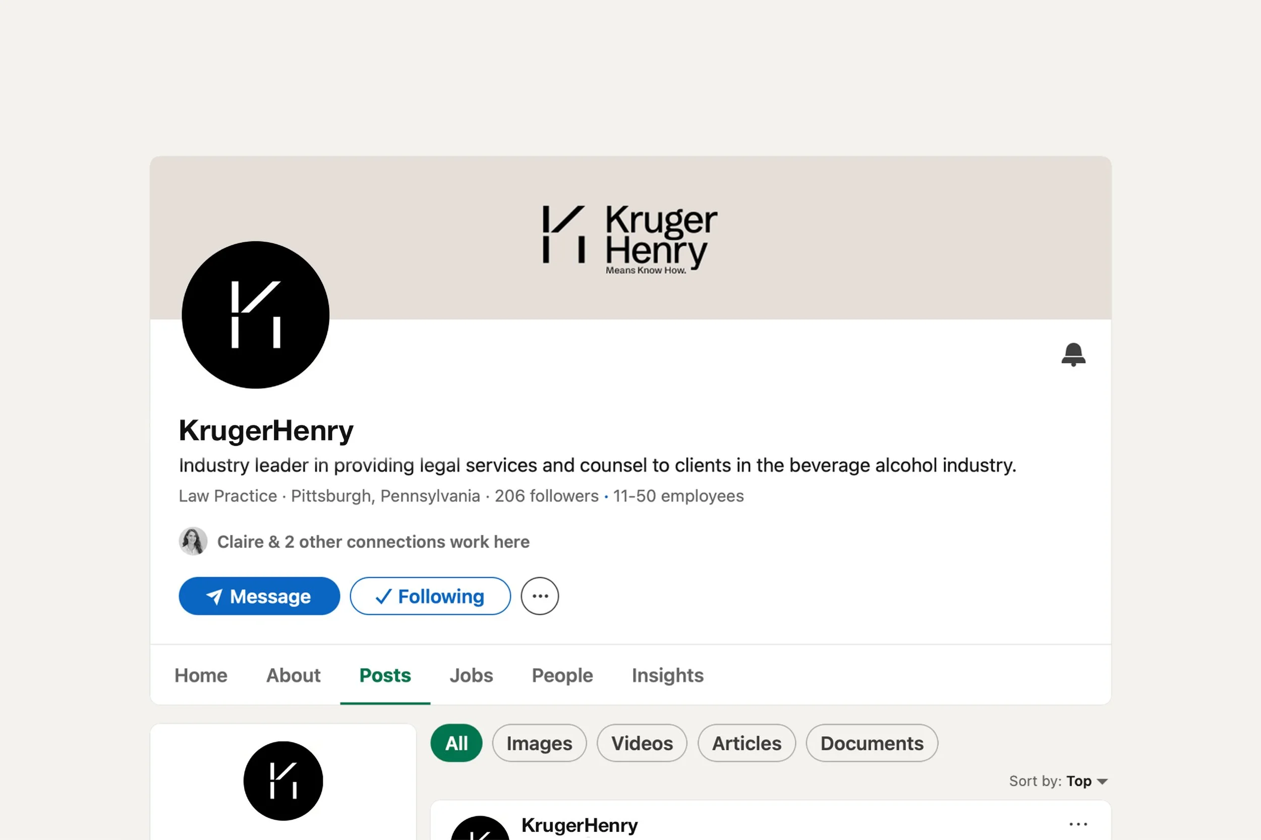
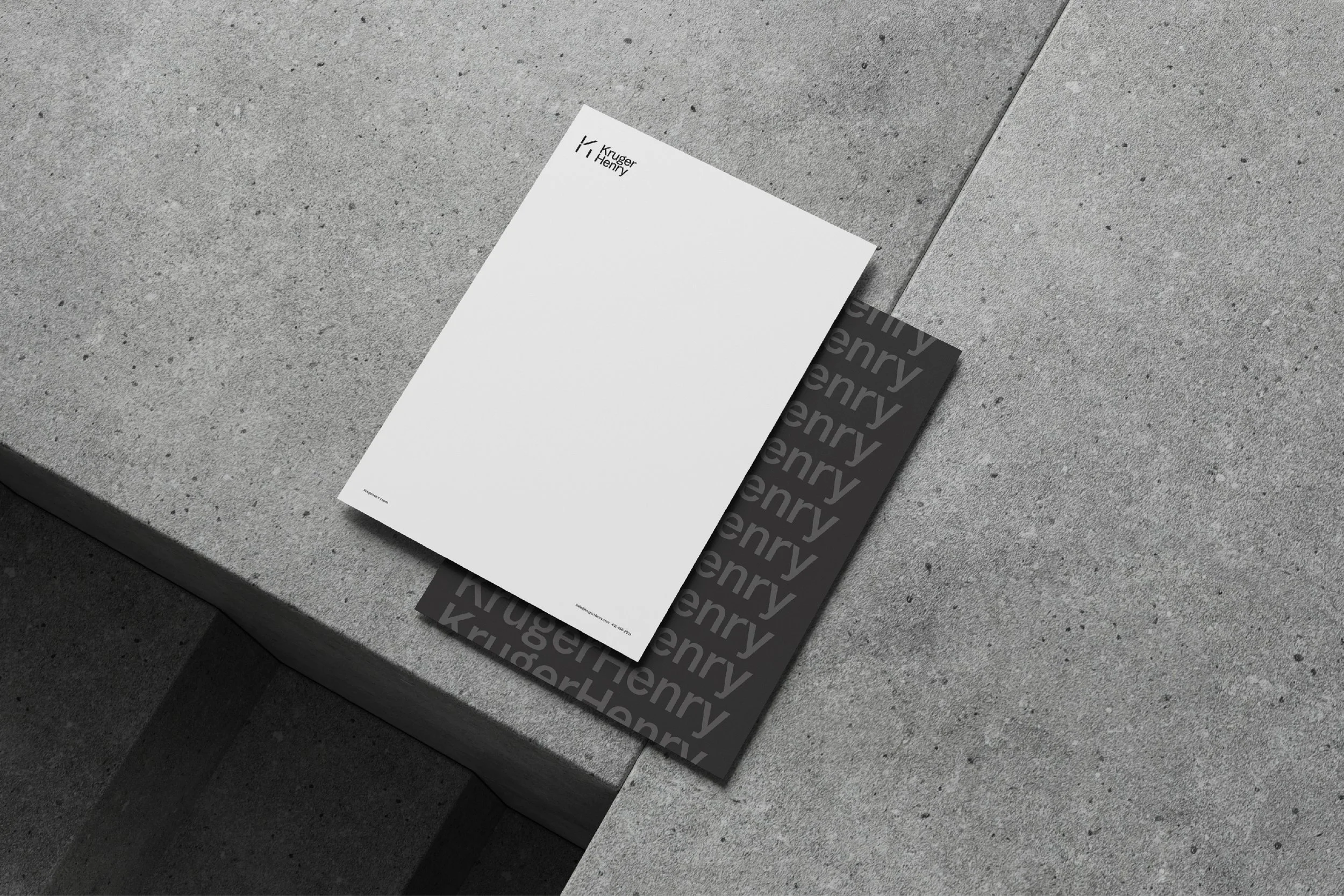
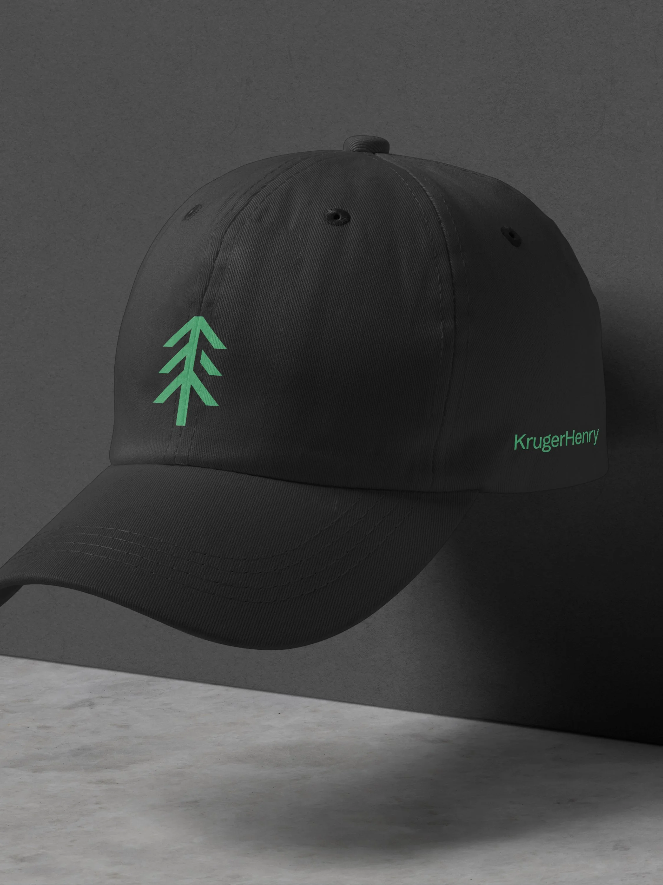
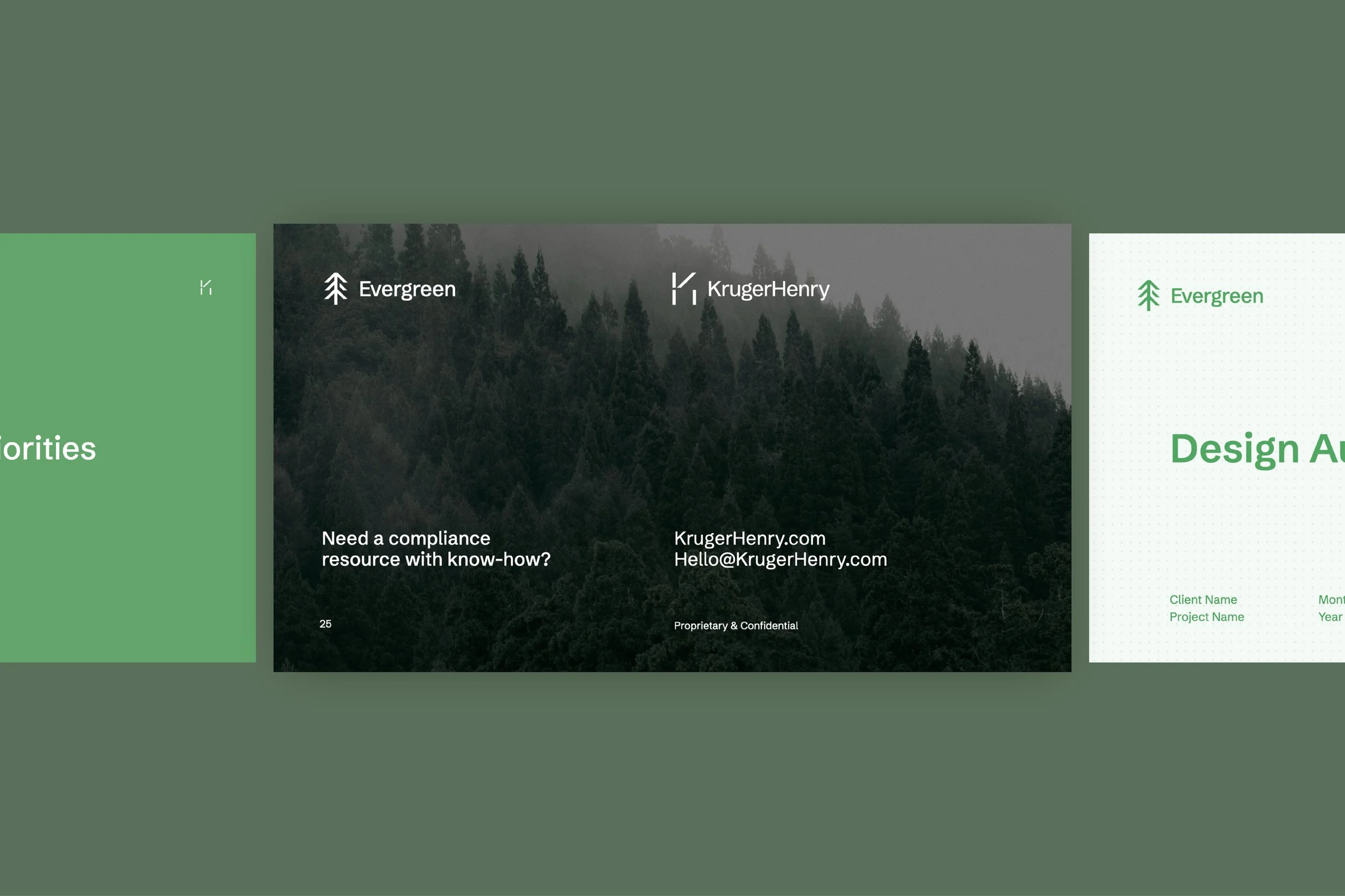
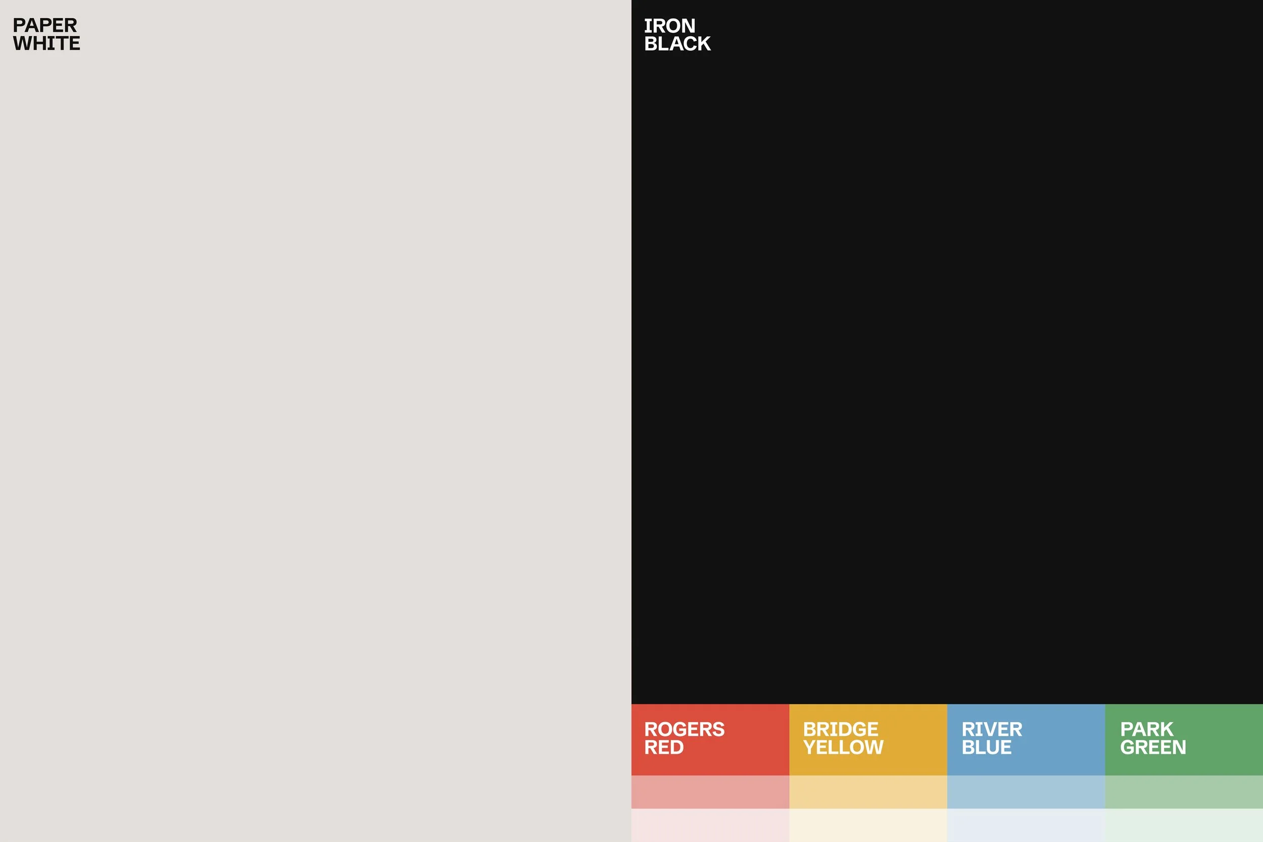
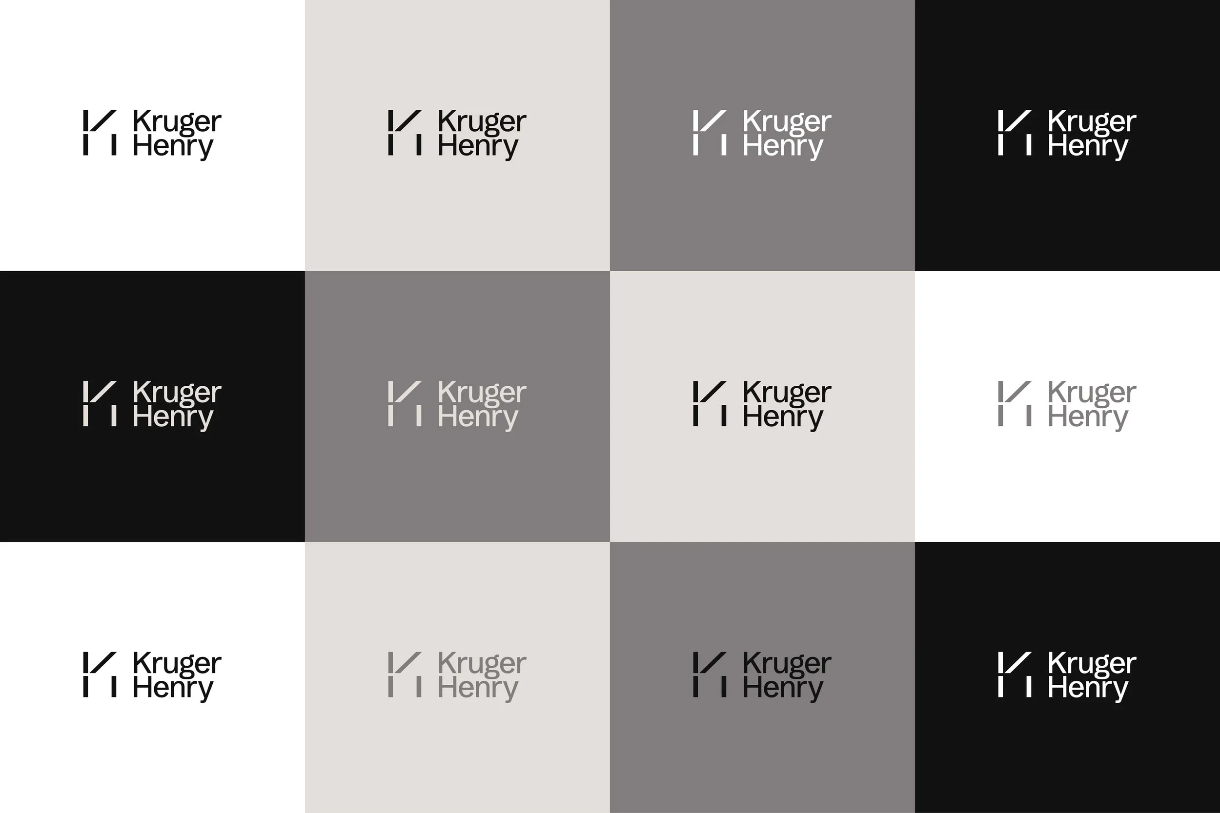
The visual system had one job: to make a complex, hybrid business feel like it always knew what it was. That meant designing for two audiences at once: clients who trusted the firm's legal legacy and those evaluating a modern technology platform. The system needed to hold both without splitting. Clean mark. Modular structure. A palette that leads with black and paper white (authority without noise) and uses accent colors sparingly, only where differentiation earns it. The result isn't just a look. It's a position made visible.
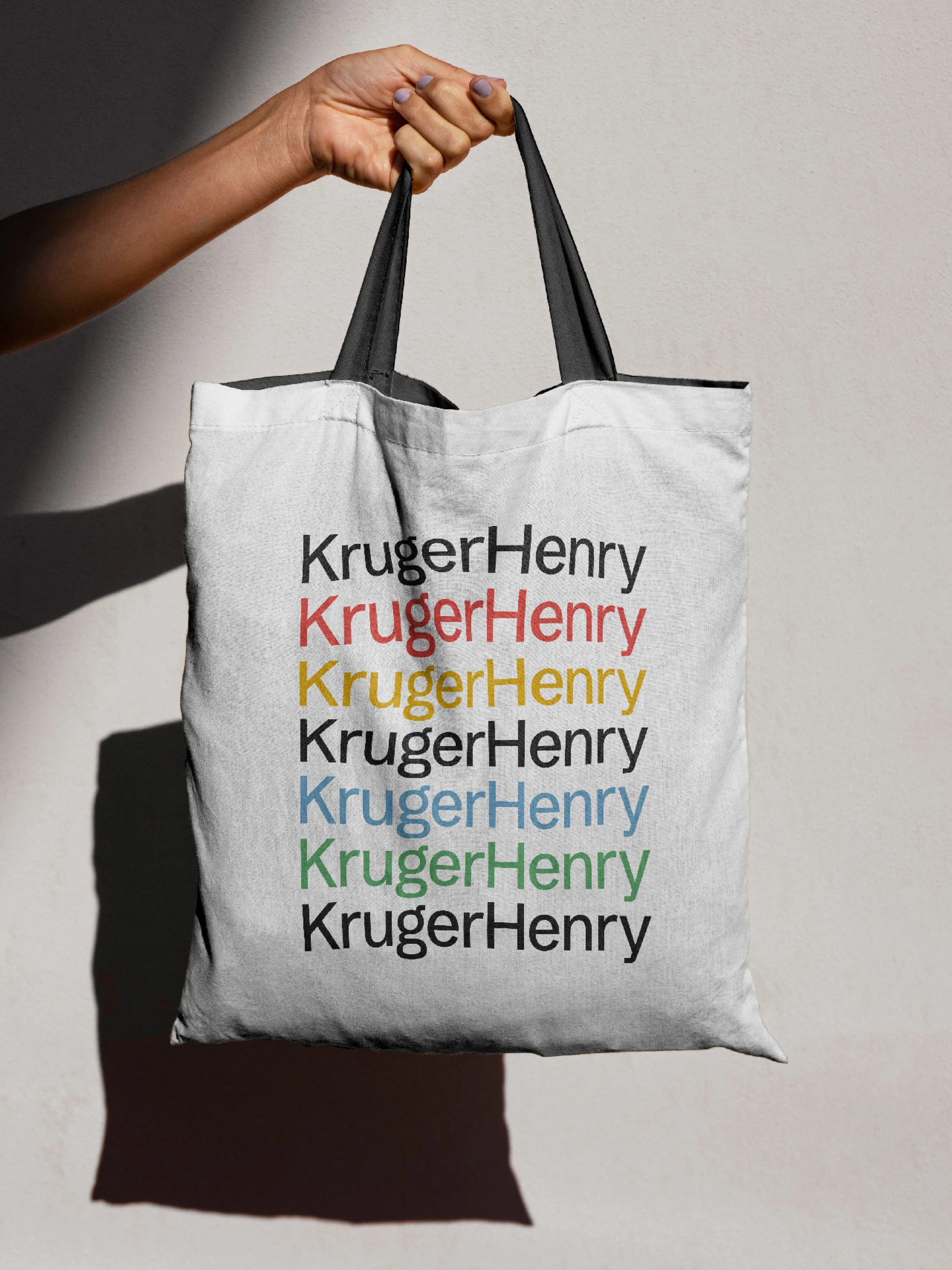
Brand Visuals:
Brand Storyboards
Visual Identity
Art Direction
Graphic Elements & Iconography
Typography
Photography Style
Brand Guidelines
“Working with EightySeven was a wonderful experience. They spent time understanding our business, which was important to us.
We are a boutique law firm in a niche area with an extremely high volume and national reach. We have a growing software company as well and wanted to make sure our rebrand captured the balance between our traditional law practice and our embrace of new technology to best serve our clients.
It was critical that the branding shift seamlessly for our legacy clients and offer something new to prospective clients, and EightySeven exceeded expectations on both points. They listened to our feedback and were able to offer a fresh perspective we found invaluable.”
Kaitlynd Kruger, Partner, KrugerHenry

“EightySeven was an excellent fit for our firm. Our company presented a bit of a rebranding challenge - a law firm in a niche practice area, coupled with a growing software company – but Max and his team understood the mission and offered thoughtful and creative solutions at every stage. We wanted to maintain elements of our firm’s heritage but showcase our growth and expanded practice, and EightySeven grasped that immediately and delivered amazing work.”
Tom Henry, Partner, KrugerHenry


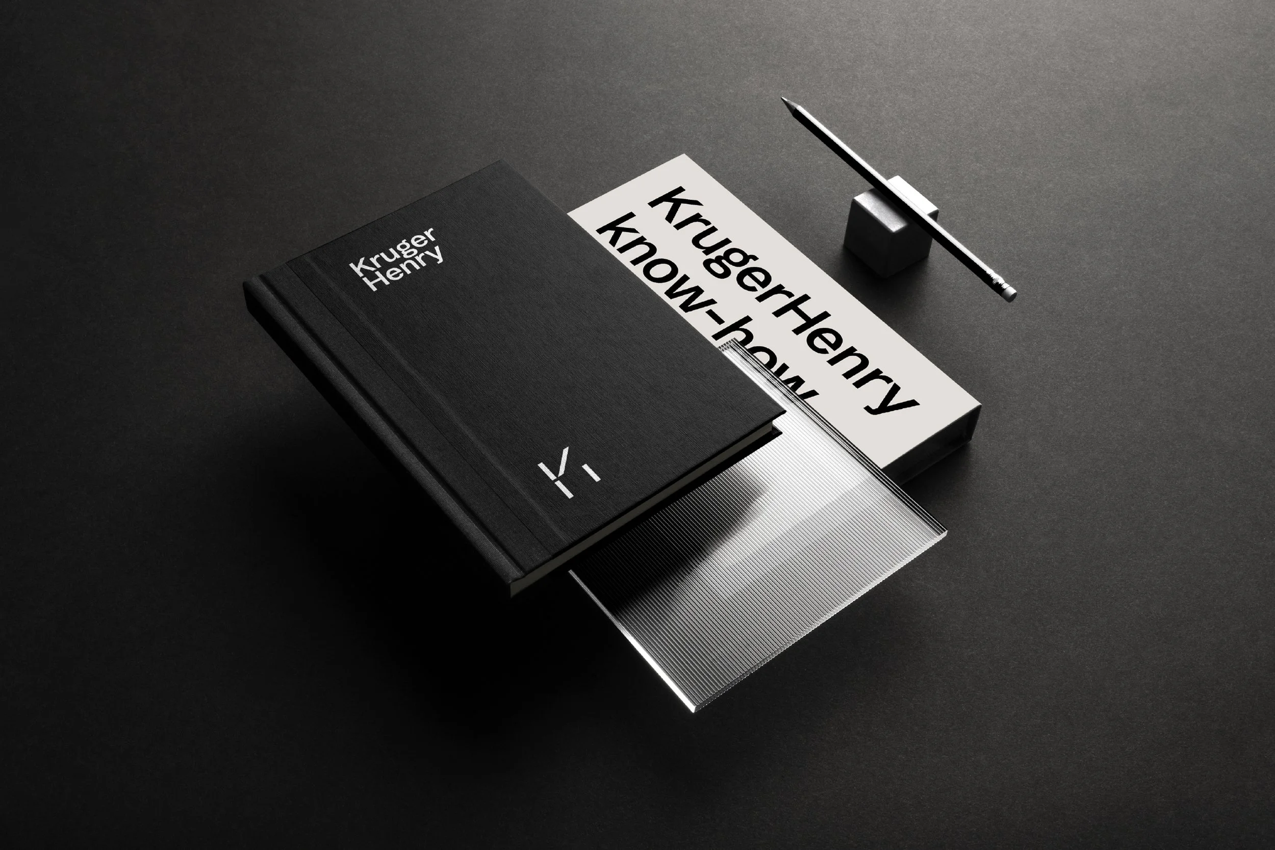
(02) Brand Voice
A voice of expertise that’s accessible and never overwhelming.
-
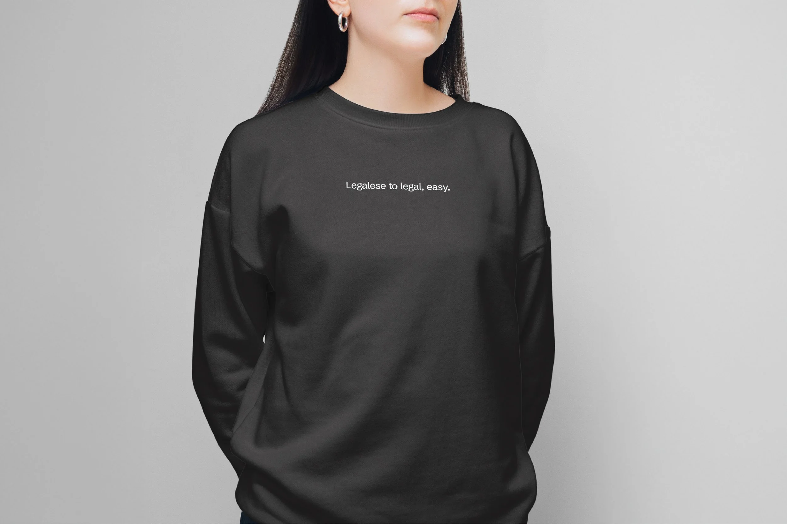
The legal category defaults to complexity as a signal of credibility. Dense language. Technical framing. The implication is that if you can't follow it, that's the point. KrugerHenry's actual strength was the opposite: the ability to make complexity navigable. So we built a voice to match. Confident without being closed off. Smart without being distant.
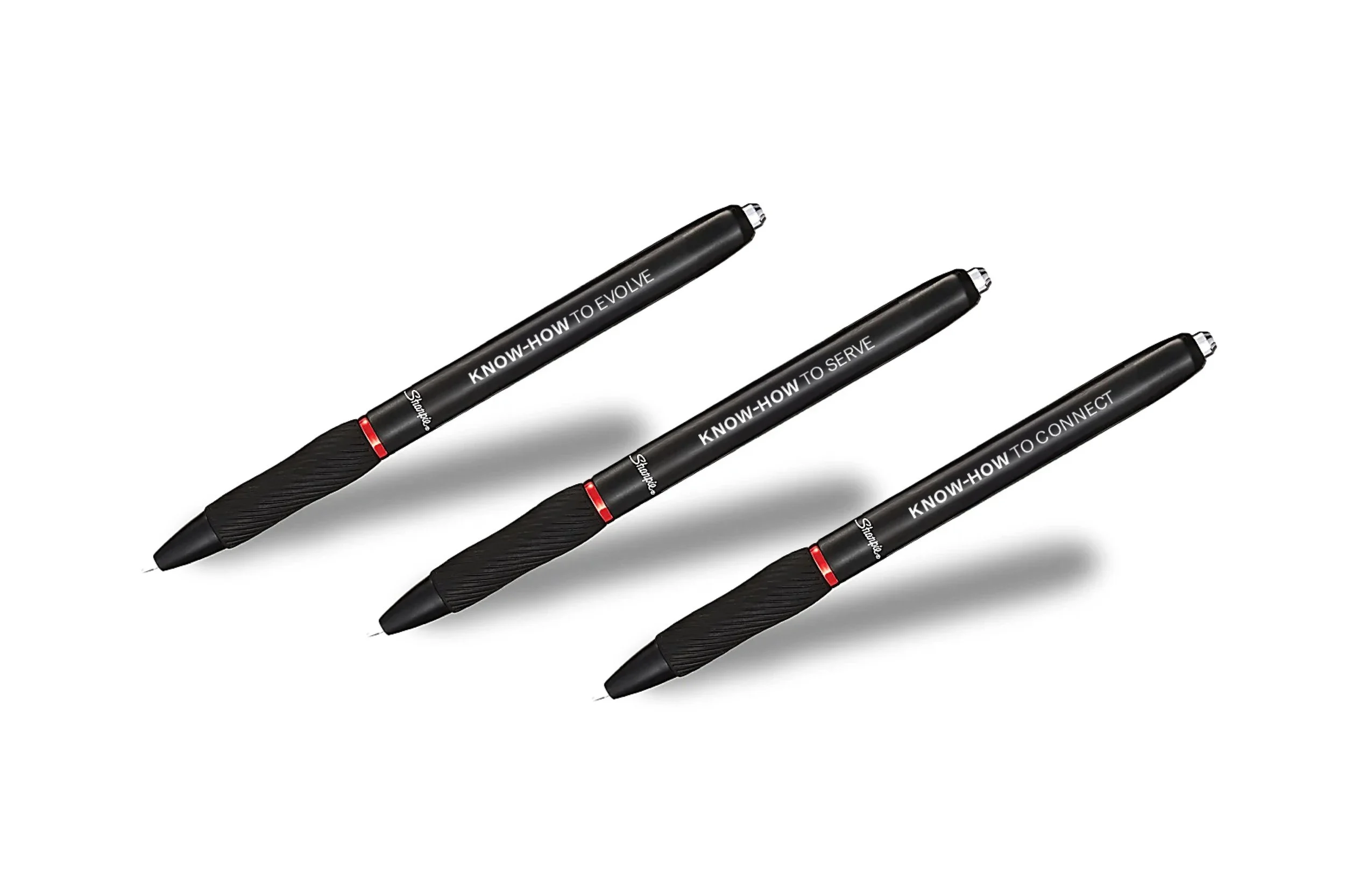
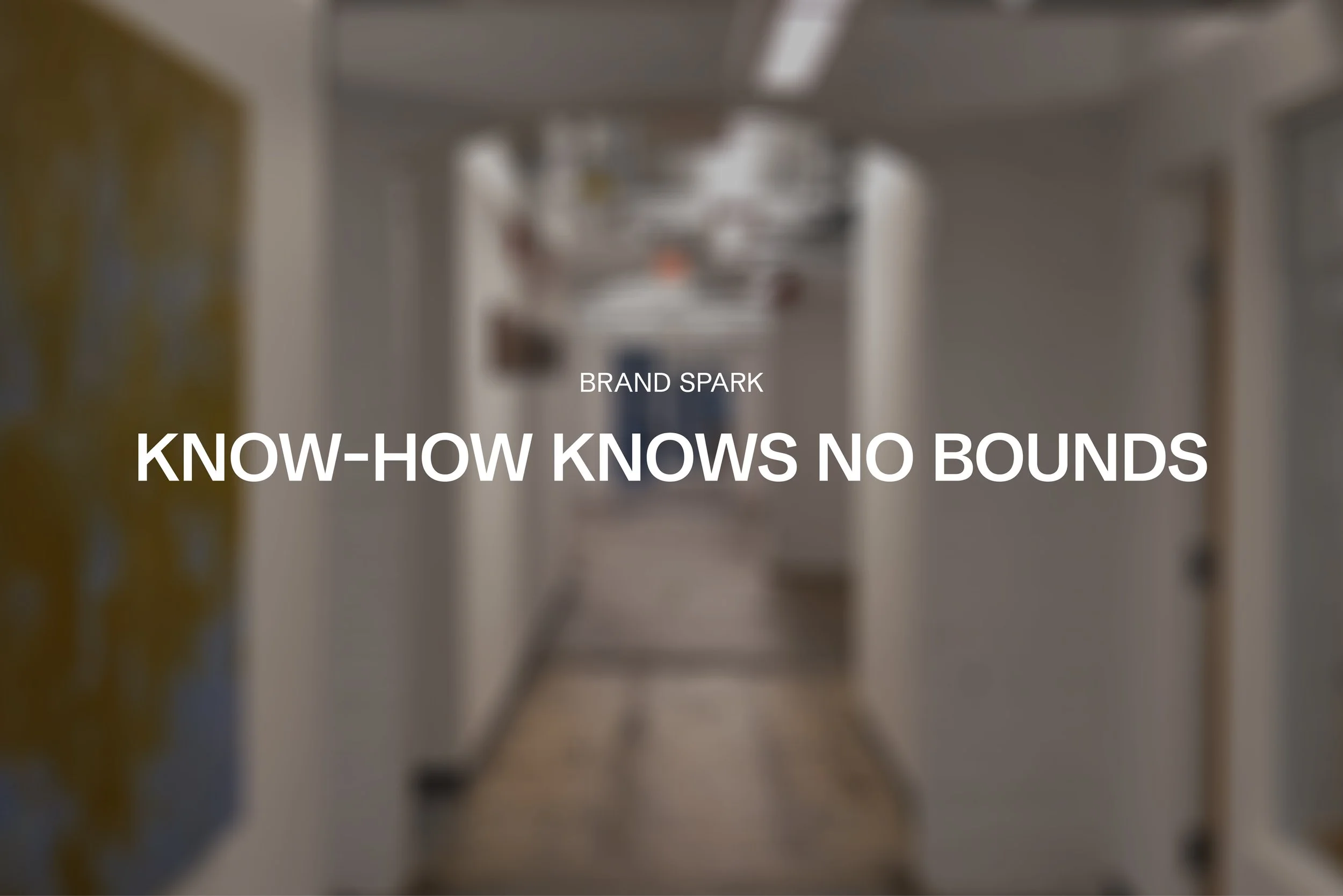
The platform for all of it: Know-how knows no bounds. Not just a tagline, but an operating principle for how the brand shows up everywhere.
Brand Voice:
Direct
Approachable
Upbeat
Helpful

(03) Brand Activation
From alignment to acceleration, launching to building business momentum.
-
The biggest shift wasn’t external. It was internal. With a clear brand foundation, the team now had a shared language for making decisions, communicating value, and moving faster as a business.
The brand became a filter.
It simplified how they present to clients. It clarified how they talk about Evergreen. It aligned teams that were previously operating from different perspectives.
Instead of debating direction, teams can now build from it. The tools and guidelines created a system that the team could easily implement rather than just reference. From presentations and proposals to digital touchpoints and product storytelling, the brand now shows up consistently and confidently.
And early signals reinforced it.
The team has seen stronger alignment, clearer conversations, and better connections with prospective clients. The brand didn’t just change how they look. It changed how they move.
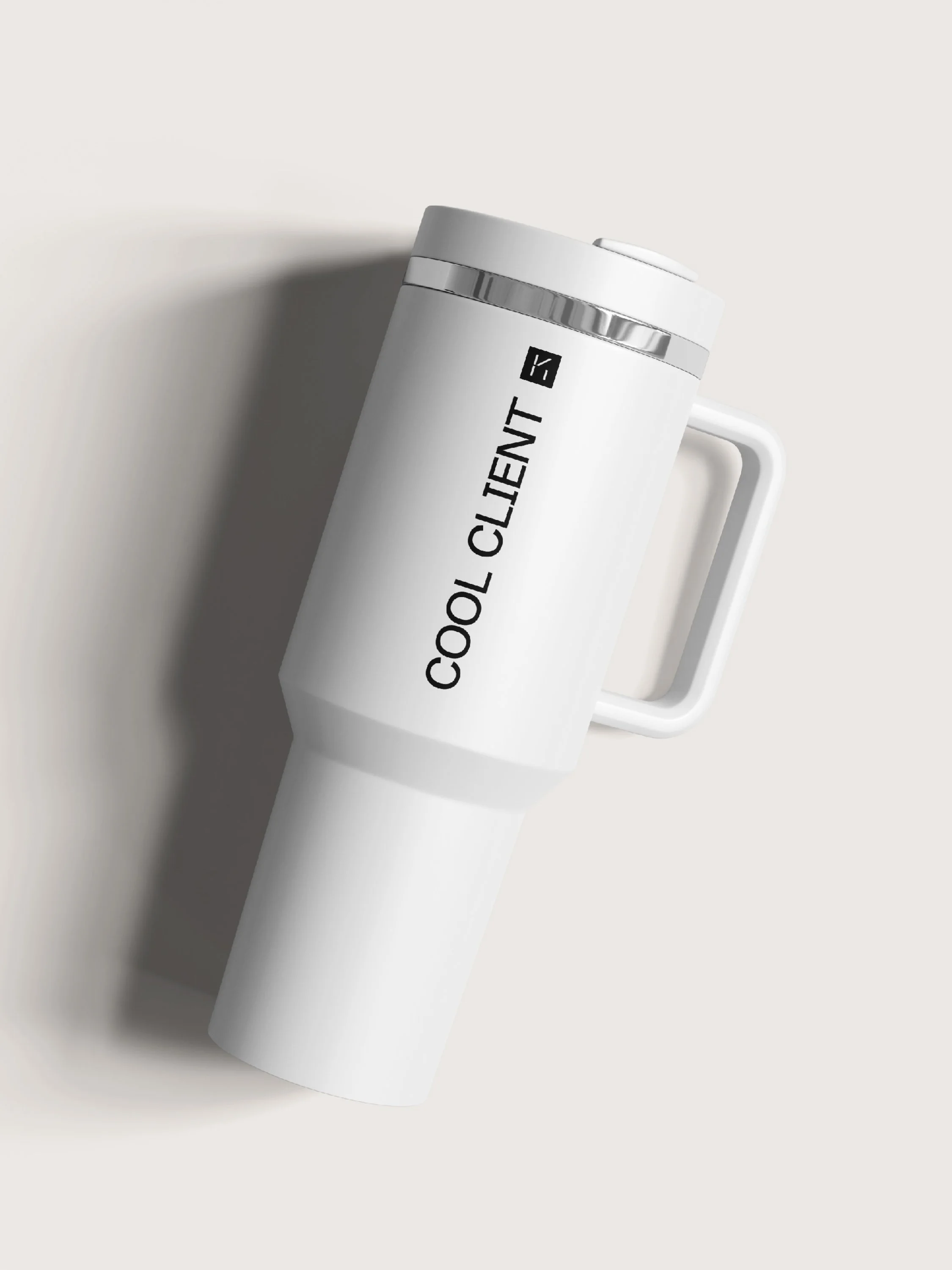
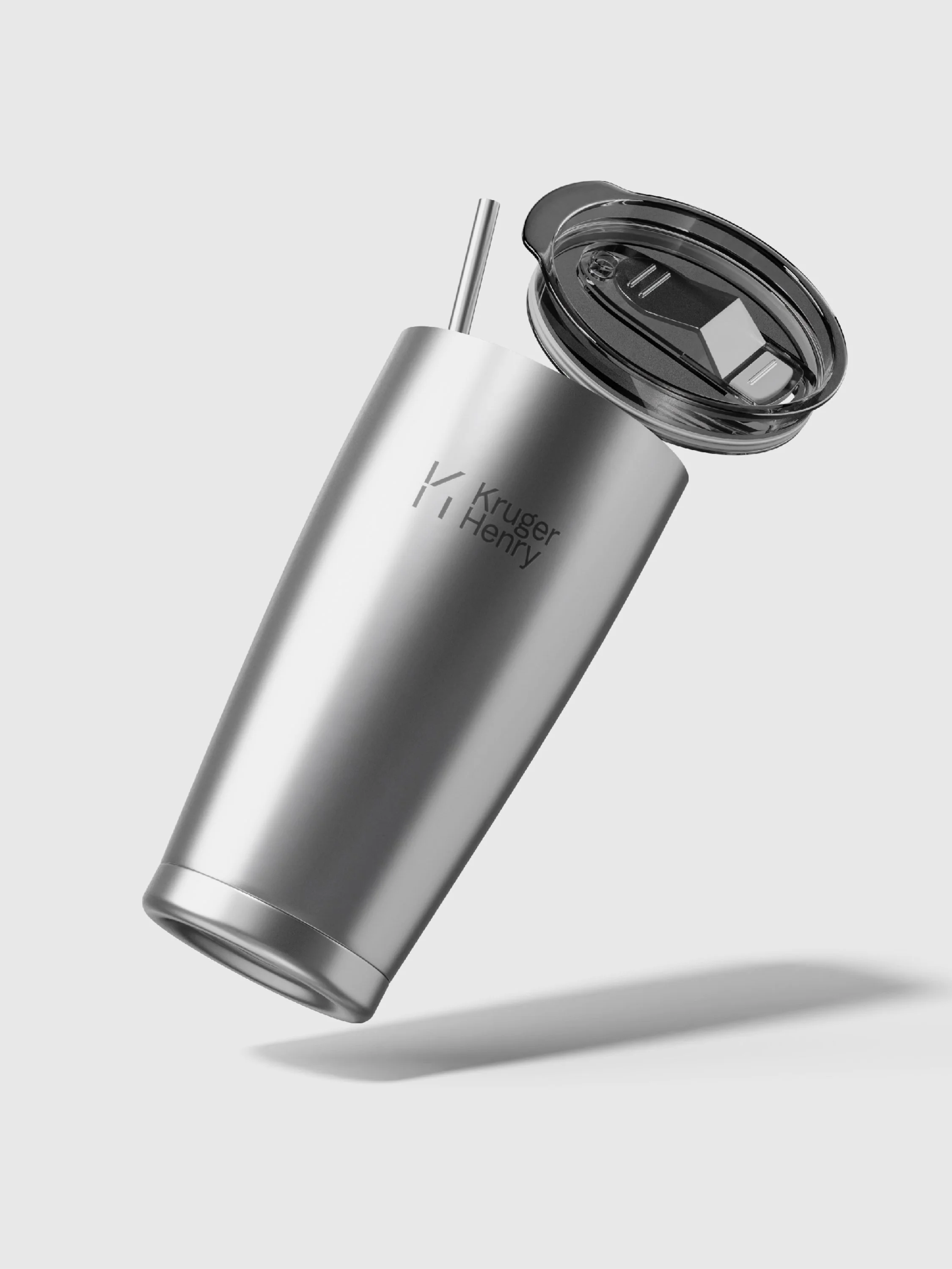
Brand Activation:
Brand Guidelines
Messaging Toolkit
Presentation Systems
Marketing & Sales Assets
Digital & Product Alignment