
PRECISION POLYMER PRODUCTS
A company built on the smallest details, and a 20-year-old brand selling them short.
(87)BrandLegacy · Strategy, verbal identity, visual identity, activation
For decades, Precision Polymer Products has made the tiny parts medical devices can't work without.
The company kept evolving. Full in-house tooling, new automation, production running around the clock. But the brand hadn't moved in 20 years, and it no longer matched the customers it served.
We ran a two-day Focus workshop with leadership and landed on one idea together. Big things happen when you get the small things right. Then we built the identity and the voice, and carried it from the packaging to the production floor.
“It felt uncomfortable to step into something new, but we trusted their process, and they delivered.”
Jason Voytilla, President
-
Most people will never see what PPP makes.
Small, highly specialized rubber components. The seals and valves inside IV systems, insulin pumps, and diagnostic tests. Parts that sit deep inside a device and just have to work. Every time.
Inside their Pennsylvania facility, PPP does something rare in this category. They build their own tooling. They prototype fast. Skilled operators work alongside automation, and the lines run 24/7.
As they invested in new equipment and started working with bigger medtech partners, leadership saw it clearly. The business had moved forward. The brand was still standing where it was two decades ago.
They weren't looking to start over. The team and their long-time partners had real attachment to what PPP already was. What they needed was a brand that matched the level of work happening inside the building... and could hold its own in the room with the next generation of global medtech companies.
So we started with leadership. Before any design, we got the room aligned on who PPP is now and where it's headed. Everything after that was built to match.


(01) Brand Focus
Reframing a skilled supplier into a strategic partner.
-
Before we explored visuals or language, we immersed ourselves in PPP’s world.
Through deep discussions, surveys, and our two-day Brand Focus workshop, one truth kept rising to the surface: PPP’s impact is enormous, even if its components are small.
Their parts sit at the center of life-saving technologies, yet their brand undersold the value and responsibility that comes with that role. We also uncovered a defining advantage. PPP is purpose-built for medtech. Complete in-house tooling. Rapid prototyping. Skilled human operators working alongside automation.
A genuinely collaborative culture.
A team that answers the phone, rolls up their sleeves, and solves problems fast. These strengths weren’t being expressed, internally or externally. The strategic opportunity became clear. PPP needed to shift from being seen as “the rubber guys” to a true critical custom component partner. We anchored the brand around a simple belief: big things happen when you get the small things right. This idea helped reshape how the world sees PPP and how the company sees itself. It brought modernity and confidence to the forefront. It gave internal teams a unified vision to rally around. And it laid the groundwork for a new chapter built on technical excellence, speed, and care.


(02) Brand Design
A high-energy identity for a high-performance team.
-
PPP’s new identity blends engineering rigor with a modern, energetic aesthetic. The verbal identity centers on a single promise: we take care of the small things so innovators can take care of the big things. The language is precise but warm, technical but human, and crafted to resonate with the engineers, designers, and procurement teams who rely on PPP every day. Every message reinforces the values that define the company: precision, agility, craft, and trust.
Visually, we built a system that captures the feeling of momentum and mastery. The creative direction is what we describe as a “skate park in a clean room,” merging the sharp clarity of medtech environments with a sporty, modern style that feels fresh, cool, and unmistakably confident. The design system draws inspiration from PPP’s world of small, round, highly essential components, using modular shapes and arrays to reflect how tiny parts come together to power much larger devices.
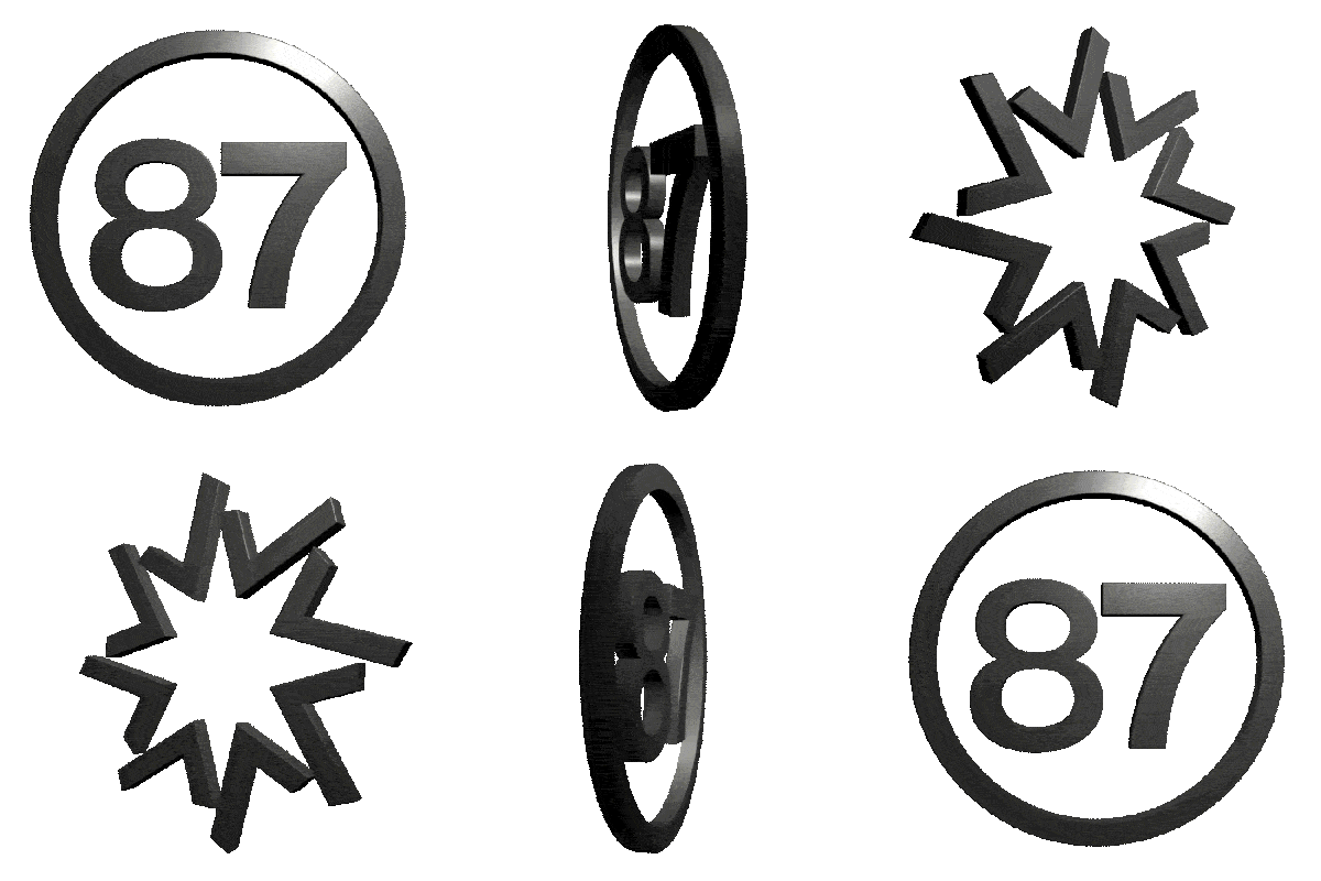
When it came to the logo, we respected what the team and their long-time partners loved, maintaining the spirit of the original mark while rebuilding it with greater precision and flexibility. The result is a cleaner, more adaptable icon that performs effortlessly across digital spaces, motion systems, packaging, and large-scale applications.
“Working with EightySeven was a great experience from start to finish. As our company evolved, we knew our 20-year-old brand no longer reflected the level of customers we serve or the image we wanted to project.
Their team brought a thoughtful, systematic process that took us from broad concepts to a refined identity we’re truly proud of. At times, it felt uncomfortable to step into something new, but we trusted their process, and they delivered.
Beyond a refreshed logo and visual identity, they helped establish our brand’s voice. We’ve already seen stronger customer recognition, greater internal pride, and genuine appreciation for the upgraded packaging and attention to detail.”
Jason Voytilla
President, Precision Polymer Products


(03) Brand Activation
Consistency from the design lab, to customer’s hands, to critical components.
-
A brand becomes real when people can touch it, wear it, navigate it, and feel it working around them. That is where activation comes in.
For PPP, we brought the new identity into every corner of their world, from the production floor to the hands of customers.
We began with packaging, transforming simple boxes and labels into an elevated experience that communicates the importance of every component inside. Early customer feedback called it “Apple-like,” a testament to how design can reshape the perceived value of even the smallest part. From there, we extended the identity throughout the facility and employee experience with updated signage, swag and gear, and environmental graphics that give visitors and employees a renewed sense of pride in the work happening every day.
Digital updates followed, with a refreshed website that balances clarity, technical detail, and modern visual energy. The new interface presents PPP’s capabilities through an intuitive, visually led experience that reflects the precision and expertise behind the scenes. We also produced internal rollout materials, on-brand apparel, and cultural tools that helped the entire organization embrace the new identity from the inside out.
The result is more than a redesign. It is a brand that aligns with PPP’s pace, power, and purpose as they step into their next 40 years.