
When it comes to packaging, be easy to find. Then, be interesting.
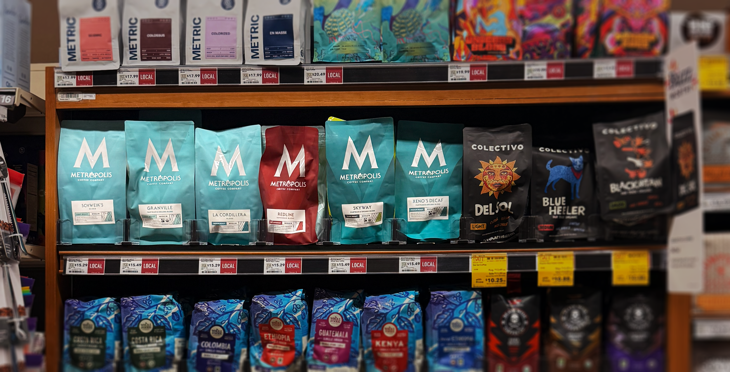
Here’s a mistake I’ve made in the past with other founders… Most think their brand needs more to work. More designs, more storytelling, more stuff. But from what I've found, the answer usually is much simpler... They need to be more recognizable.
I noticed it again last week. I was helping a founder pick a color for a new product line. We had a few directions on the table. A bright warm option, a cooler direction, and a safe choice. They could all work, and that’s where using brand strategy comes into play. It’s a way of grounding creative decisions within the business.
At some point, the founder asked a fair question, “Should one part of the line be one color and another part a second color?” More range. More options. It felt like the sophisticated move.
So I pulled up the category, and we just looked. Almost every product was white or blue. A literal wall of sameness. And the thing that would actually help was not more variety. It was picking one loud color and repeating it everywhere.
Here is what happens on a shelf or in a thumbnail… Nobody is studying your brand.
As people approach the shelf or site, they’re scanning. They are looking for the thing they bought last time. If your product is the yellow one, they find the yellow one. If it is yellow this week and purple next week, they have to think. And thinking is friction.
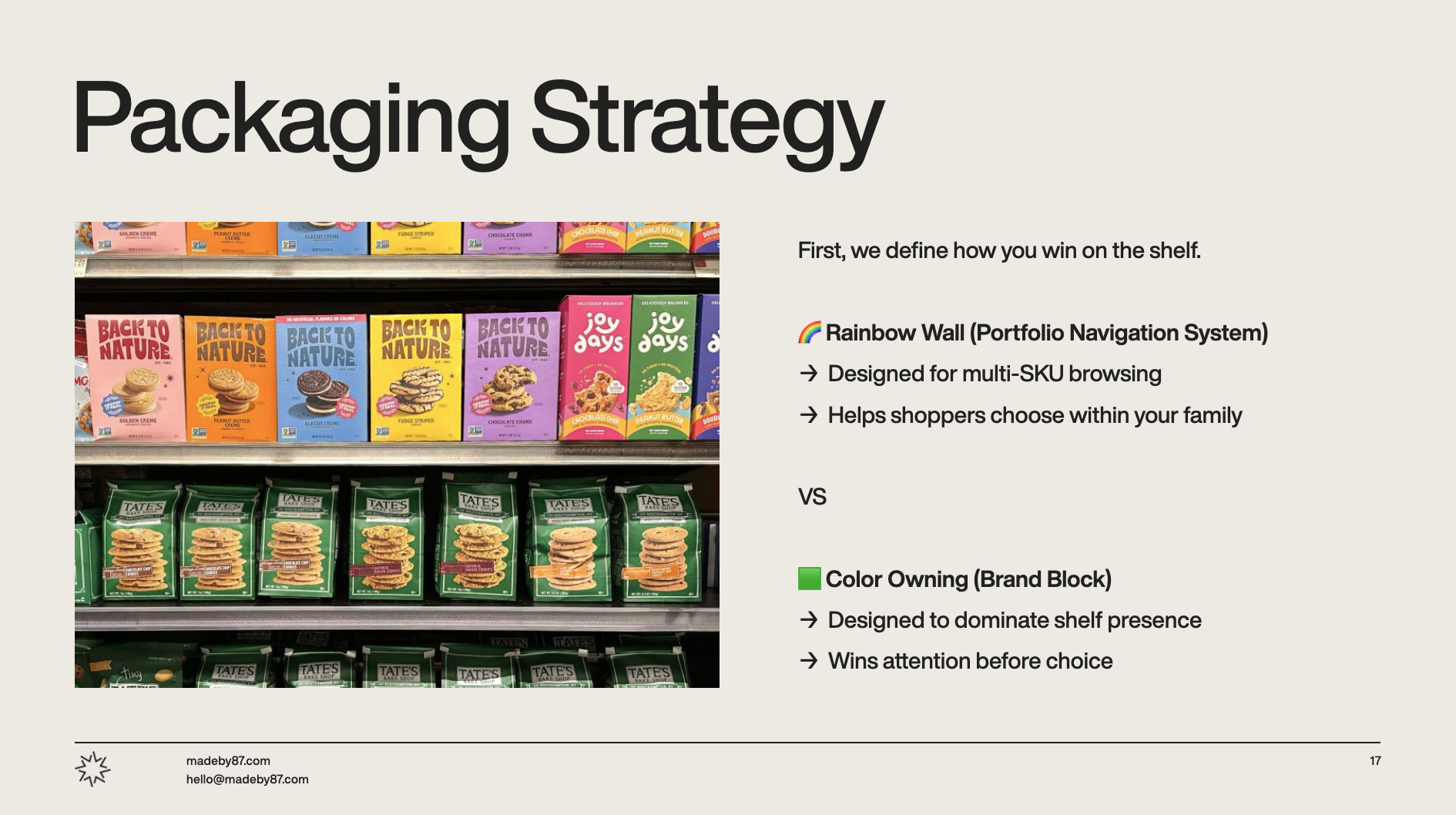
I saw the same thing during a different project we're working on with long-time partner, Metropolis Coffee Company. While we're having fun developing packaging, we're using color as a key driving decision lever during our collaboration. Our whole challenge is updating one of their product line boxes to align with the color cues found on the products (pods). While looking nice is important, packaging design needs to work functionally. That means empathizing with how people are using your product at every level... If someone discards your carton, could someone recognize the individual items? Color is meant to act as a memory cue.
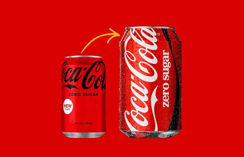
This is the part a lot of people miss. Variety feels like growth. It feels like you are giving people choice and showing your range. But early in the life of a CPG product launch, you want to build recognition so people can spot your brand. It’s why most projects we do for consumer products are refreshes. Because we want to bring the current customers into the new world gently versus a sudden update that looks completely different (I.e., Coke becoming blue would never happen and would throw us all off). Every new color, every new layout, every clever one-off, spends a little of the recognition you were building. You are quietly asking the customer to relearn you.
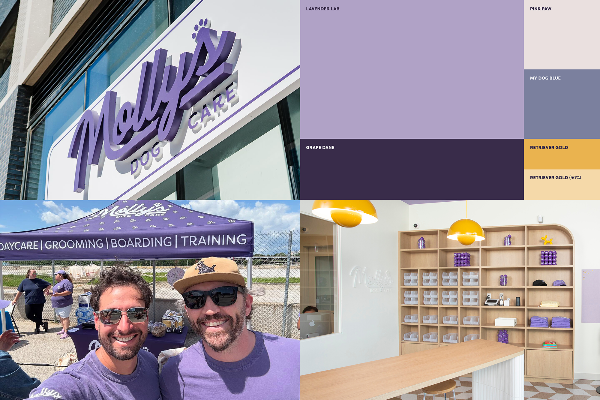
It’s the same thinking we applied to our refresh of Molly's Dog Care. Before, they had a 50/50 balanced purple-and-yellow brand palette. After, we leaned hard into violets, lilacs, and plums to own purple and associate it with Molly’s. We kept dashes of yellow to keep continuity with current buildouts, but drastically softened its presence.
Recognition is boring to build. You pick one thing, and you repeat it past the point where you are tired of it. The founder is sick of the color long before the customer has even noticed it. That is not a reason to change it. That is the whole point.
So the question is not, "How do we look more interesting?” The question is, how does someone easily find us again without having to think?
If you are early, pick the one thing you can own.
A color. A shape. A phrase. Something a stranger could describe to a friend in six words. Then repeat it everywhere and resist the urge to keep making it new.
The brands that win the shelf are not the most creative ones. They are the ones you can spot from across the aisle.
That's how you make no small brands.
– Maxwell
P.S. Still trying to decide the best direction for your business? That's exactly what a Brand Vision Call is for. We'll name what's working, what isn't, and what to do next.
No prep, no pressure. Book a time here.
