UNITED AIRLINES
A concept for the Friendly Skies.
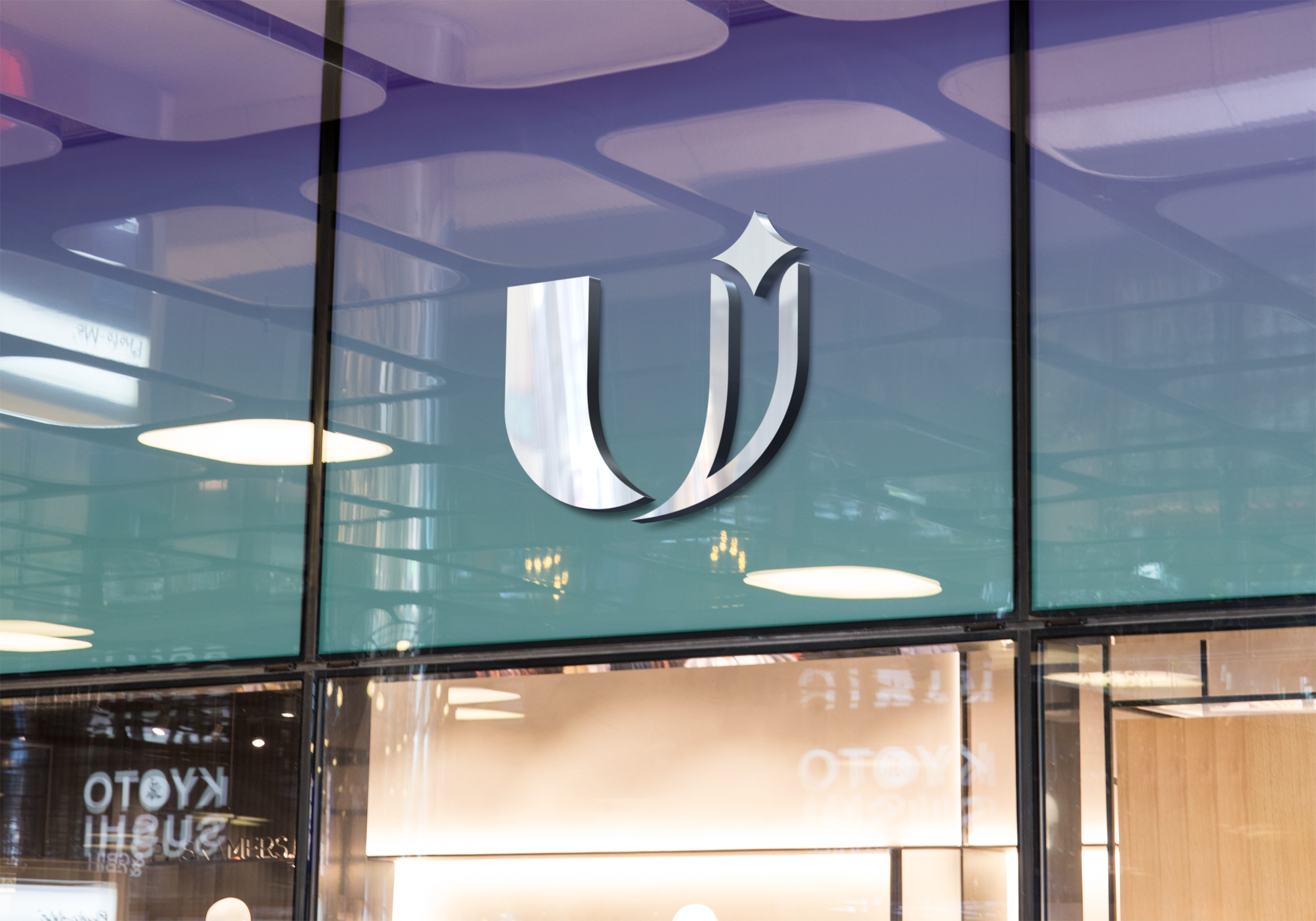
United Airlines went through an unofficial rebranding as part of TheFutur and their “Logo Redesign Series” where they select designers from around the world to redesign logos of brands of their choosing, and to present their thinking.
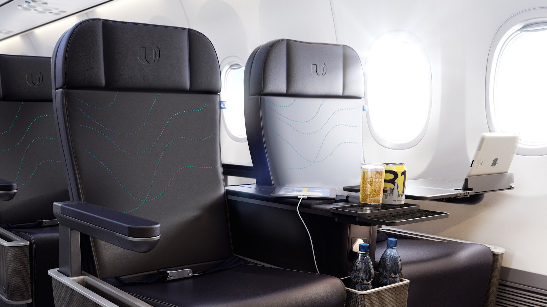
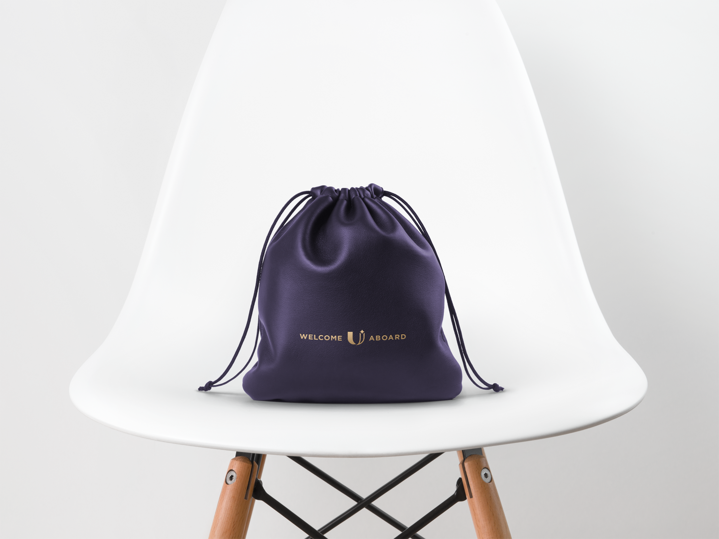
Our approach was to rethink the airline experience for travelers in a post-COVID world, leverage design as an experience, and to elevate the United brand past their current corporate identity.
*This project has no affiliation with United Airlines, it was just a fun exercise.
Our Services
Brand Strategy
Art Direction
Motion Design
Logo Design
Copywriting


United Airlines has an incredibly strong history of design. Beginning with Saul Bass in the 1970’s and the iconic “tulip” logo, to the refinement in the 1990’s by Michael Bierut and Pentagram, the current identity is a departure fueled by boardrooms rather than strategy.
Primarily fueled by the merger of United and Continental Airlines in 2013, the new visual identity of the globe and blue are the strong identity elements borrowed from Continental. The end result is an identity that feels like a corporate merger.
Watch the presentation →