
THE GREEN DOT
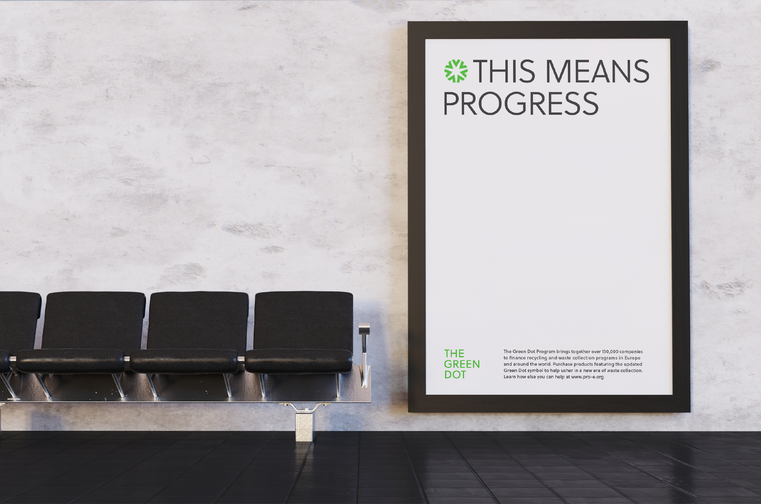
This means progress.
The Green Dot is a symbol that most believe means a product can be and should be recycled. In reality, it’s intended to communicate that a company has made a financial contribution to recycling and waste recovery in Europe, whether the company’s packaging is recyclable or not. EightySeven accepted an invitation to an international design challenge to solve this global problem, by redesigning The Green Dot.
Our Services
Brand Strategy
Messaging
Brand Identity
Typography
Brand Visuals
Motion Design
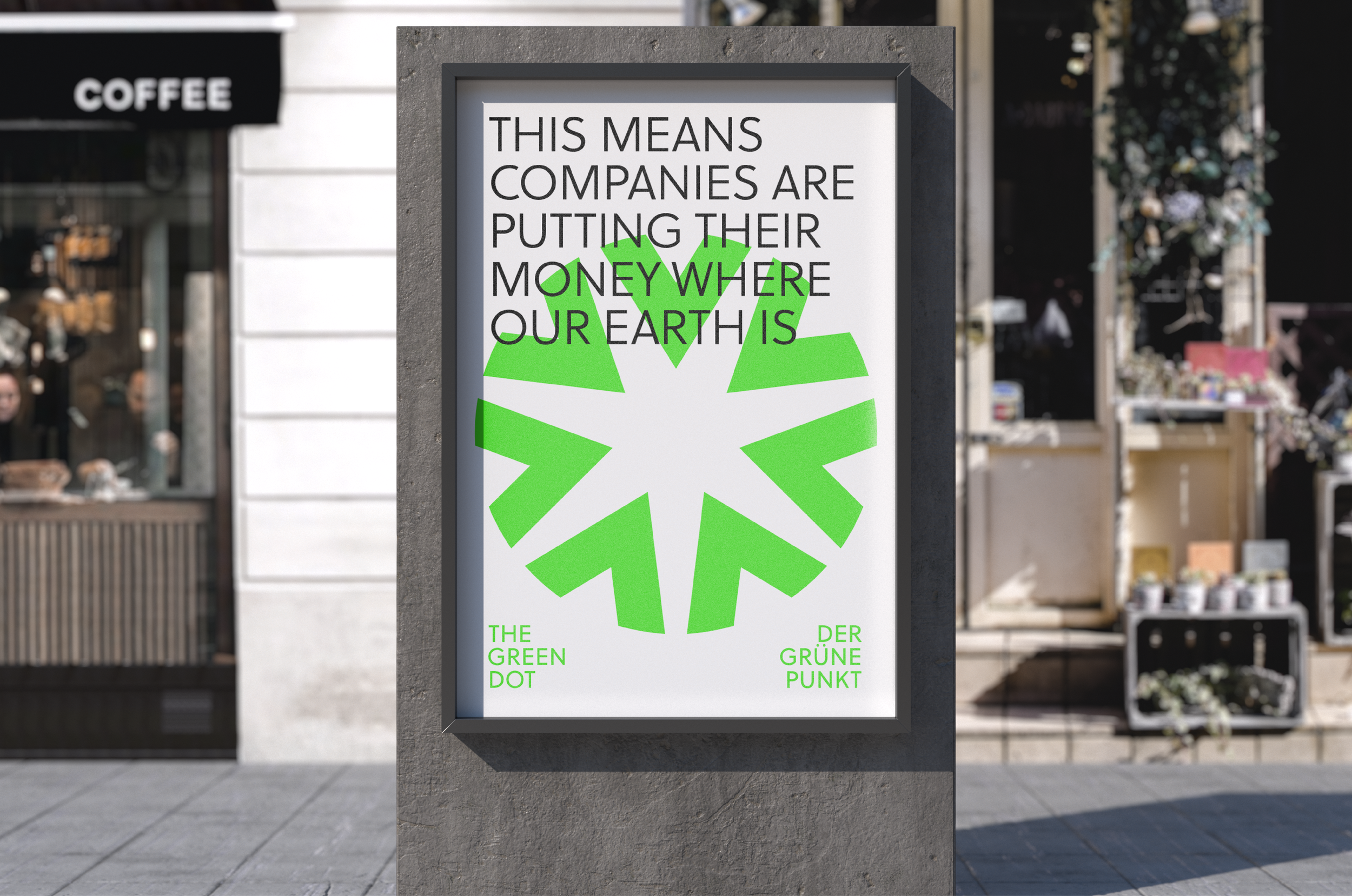
The challenge of this assignment was to reimagine The Green Dot without any arrows or cycle so it would not be confused with the chasing arrows of the recycling triangle, or any indication that the logo relates to the product being recyclable. The hope was this redesign would reduce recycling contamination worldwide by representing a company’s financial contributions to recycling and waste recovery, without misleading well-intentioned consumers who might try to recycle an item that cannot actually be recycled.
This project was an international open design brief by Two°Creative and The Brand Identity

If you see these on a package, one of them means it can be recycled. The other means that company has made a financial contribution to recycling and waste recovery. Not confusing at all.

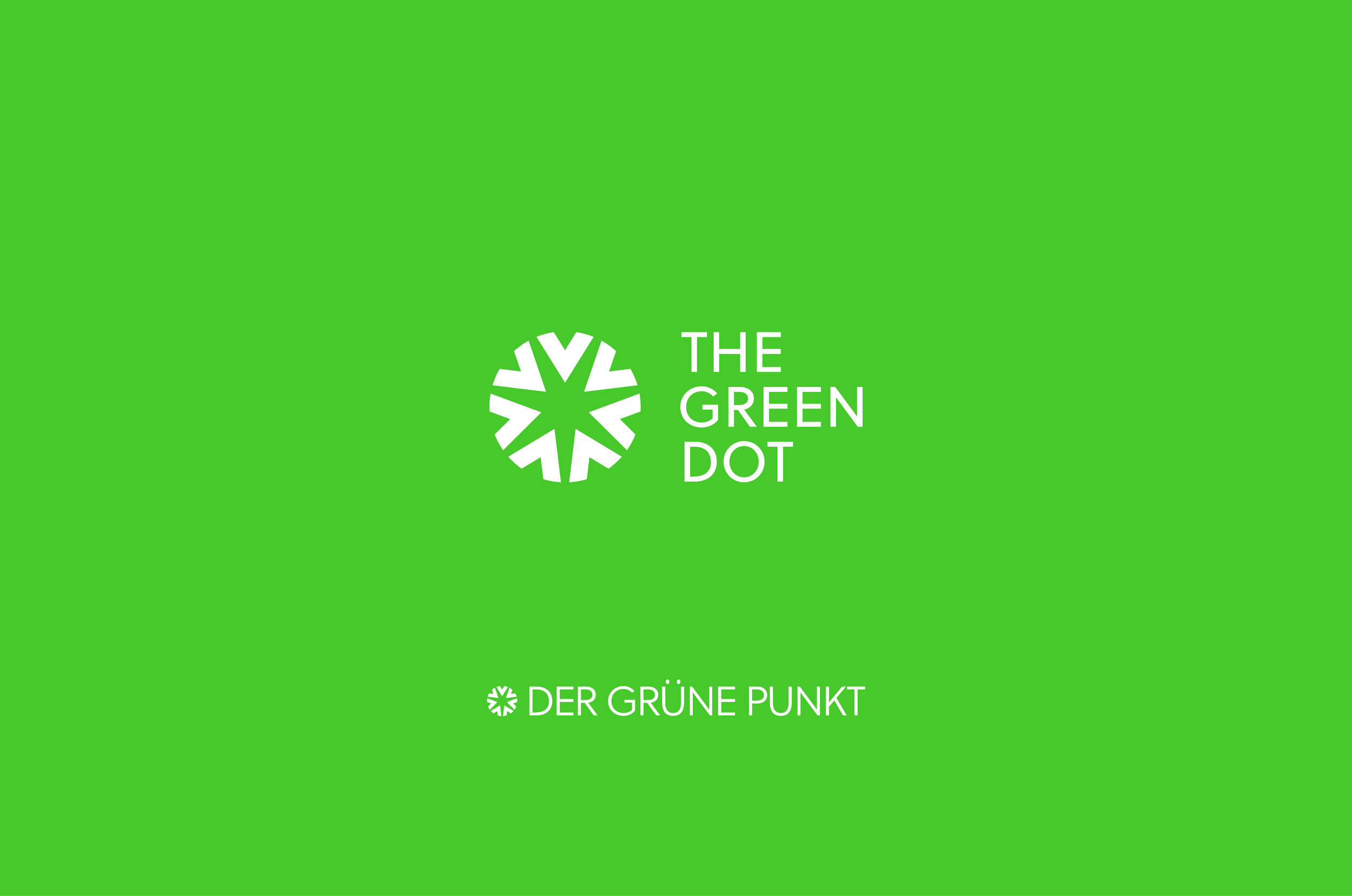
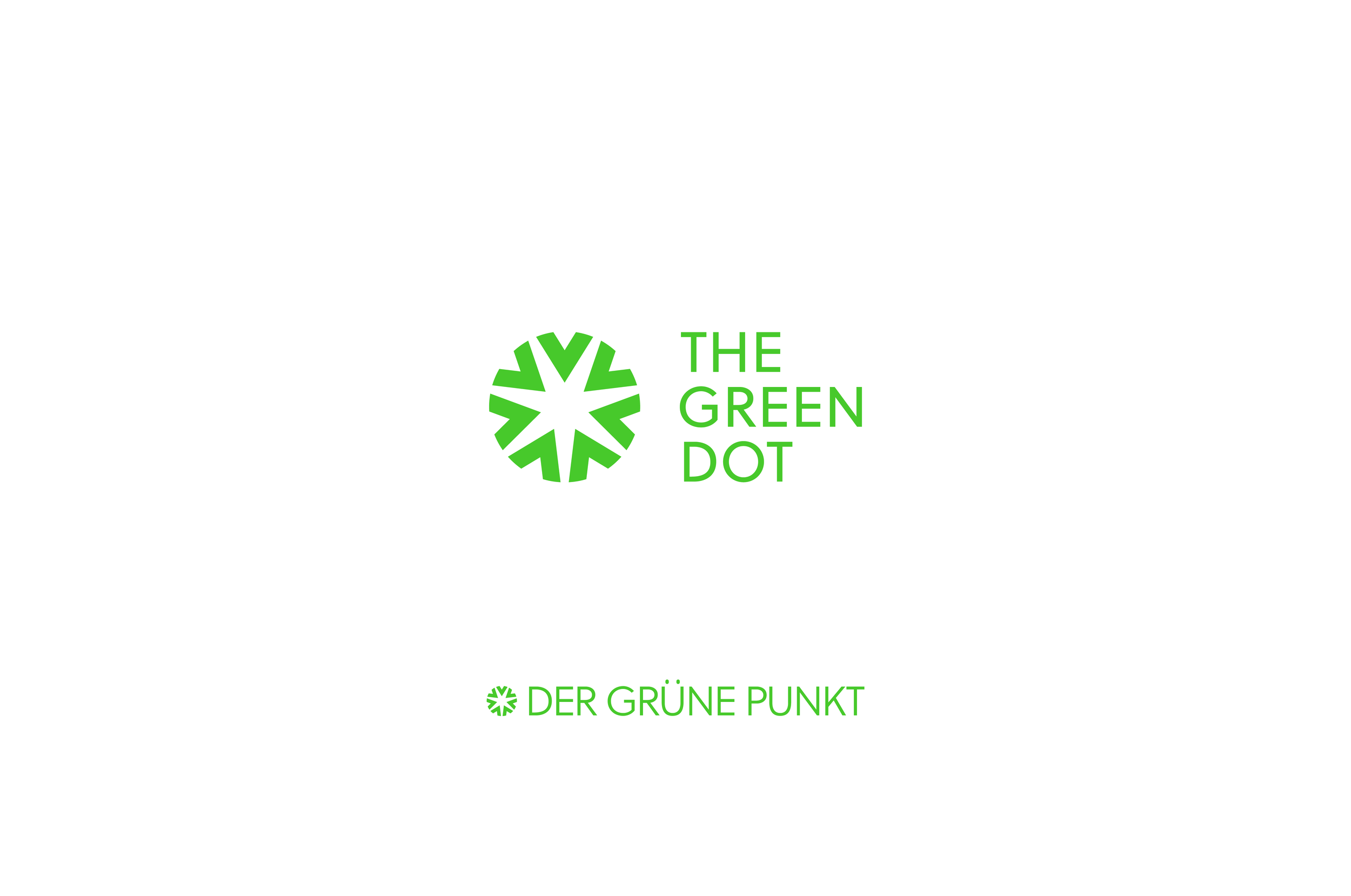
One of the greatest branding challenges is always striking a balance between the novel and the familiar. We needed to develop a symbol that was distinct from the chasing arrows, but could still work alongside them on packaging. We knew, considering that the name of the symbol is “The Green Dot” that our new symbol should still work with that name, and we wanted to develop a symbol that could be altered and manipulated for various uses within the brand work. The result was the Seven-Delta Green Dot.
Brand Visuals
Brand Storyboards
Visual Identity
Graphic Elements & Illustration
Typography
Art Direction
Brand Guidelines
Photography
-
As we do with every logo we develop, we wanted to infuse the updated Green Dot with a deep story and meaning. The Seven Deltas, Greek symbols of change, represent the seven continents of our planet since waste recovery is something everyone on the planet must contribute to. They also stand for the seven days of the week, since saving the planet is an around the clock job.
The deltas are distinct from arrows, but serve a similar purpose. They point inward, coming together to communicate the global collaboration The Green Dot program is known for. Their ends are also curved, allowing The Green Dot to maintain its original circular shape. What’s more, the negative space they create in the center forms a star of recognition for the companies that support it.
The Seven-Delta Green Dot was also designed to be highly versatile as a brand mark. The mark can be broken apart to graphically illustrate natural elements (trees, mountains, water, etc.) and renewable energy sources. It can draw attention to key communication points and calls to action. When animated in the digital space, it can be further manipulated to serve as a transition card, illustrate key statistics, and visualize communication points in a way that’s distinctly ownable by The Green Dot brand.
Sustainability is something that’s near and dear to our hearts at EightySeven and we know the future of the world depends on it. As visual communicators and brand designers, we were proud to do our part.


“Great brand marks tell a story. The problem with the Green Dot was that it was telling the wrong one. We wanted to design a symbol that conveyed the idea of collaboration and could be used to recognize the companies that made a contribution to responsible waste collection.”
— Rick Hickey, Brand Director


The Green Dot - Tote
The Green Dot - Brand Guide

The Green Dot - Apple Box


