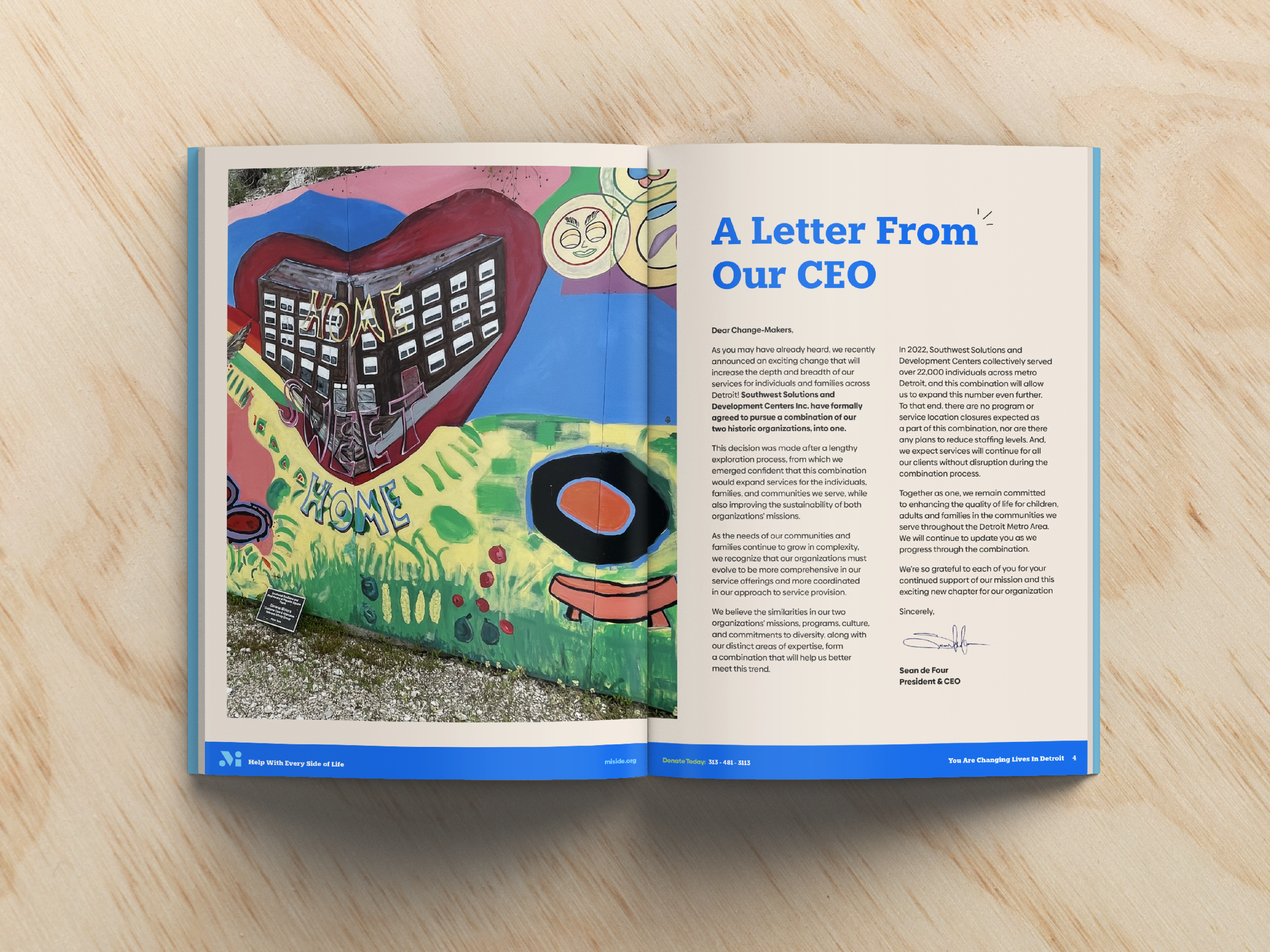
In 2023, Southwest Solutions and Development Centers merged to form a philanthropic network dedicated to helping Michiganders of all ages and backgrounds with every side of life – from housing and finances to healthcare and childhood services.
They partnered with EightySeven to bring their organizations together under a new, unified brand identity that honored their stories, appealed to clients and donors, and set the stage for a bright future.
Our Services
(87)BrandFocus
Strategy
Naming
Verbal Identity
Visual Identity
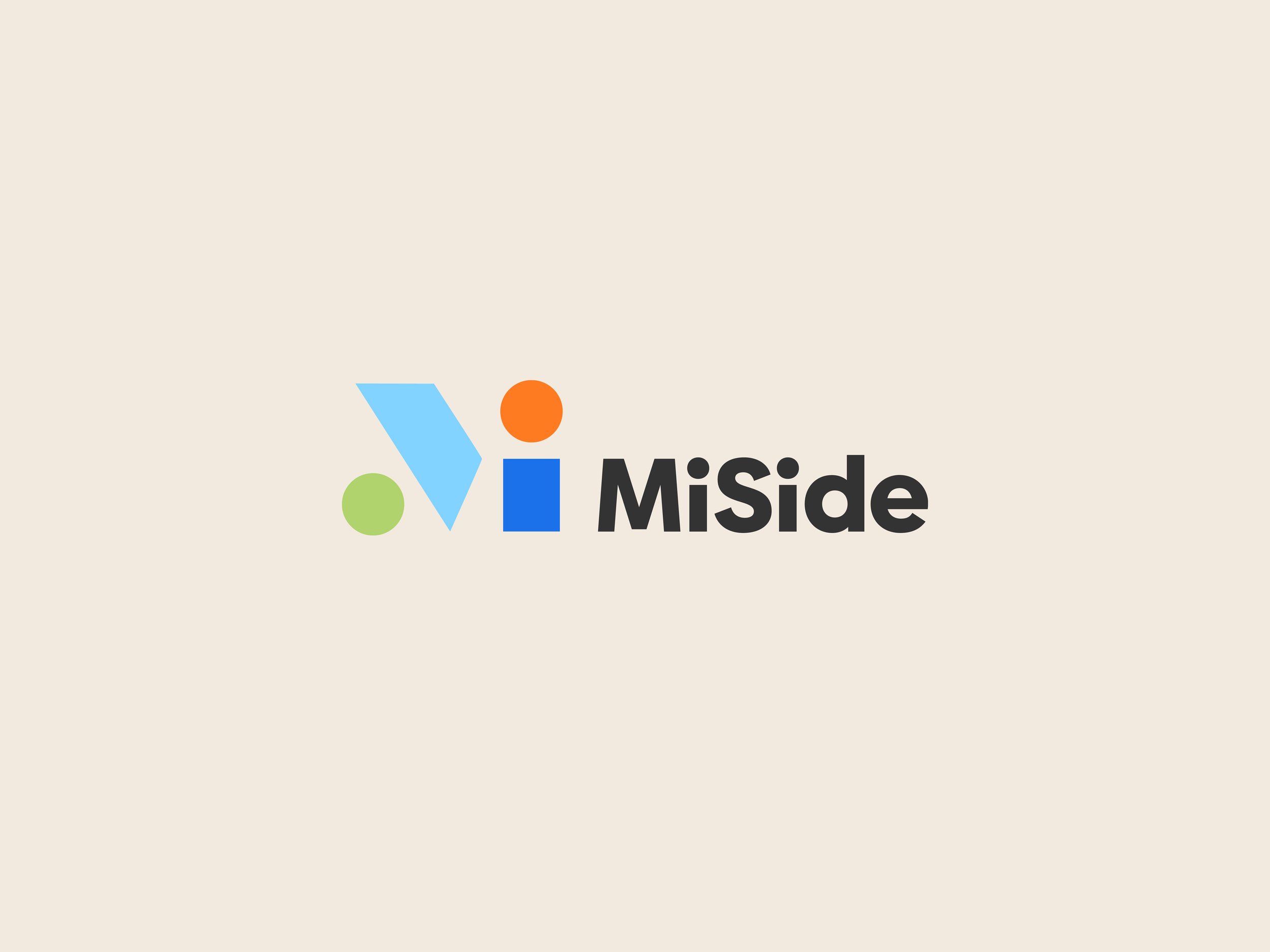
MISIDE
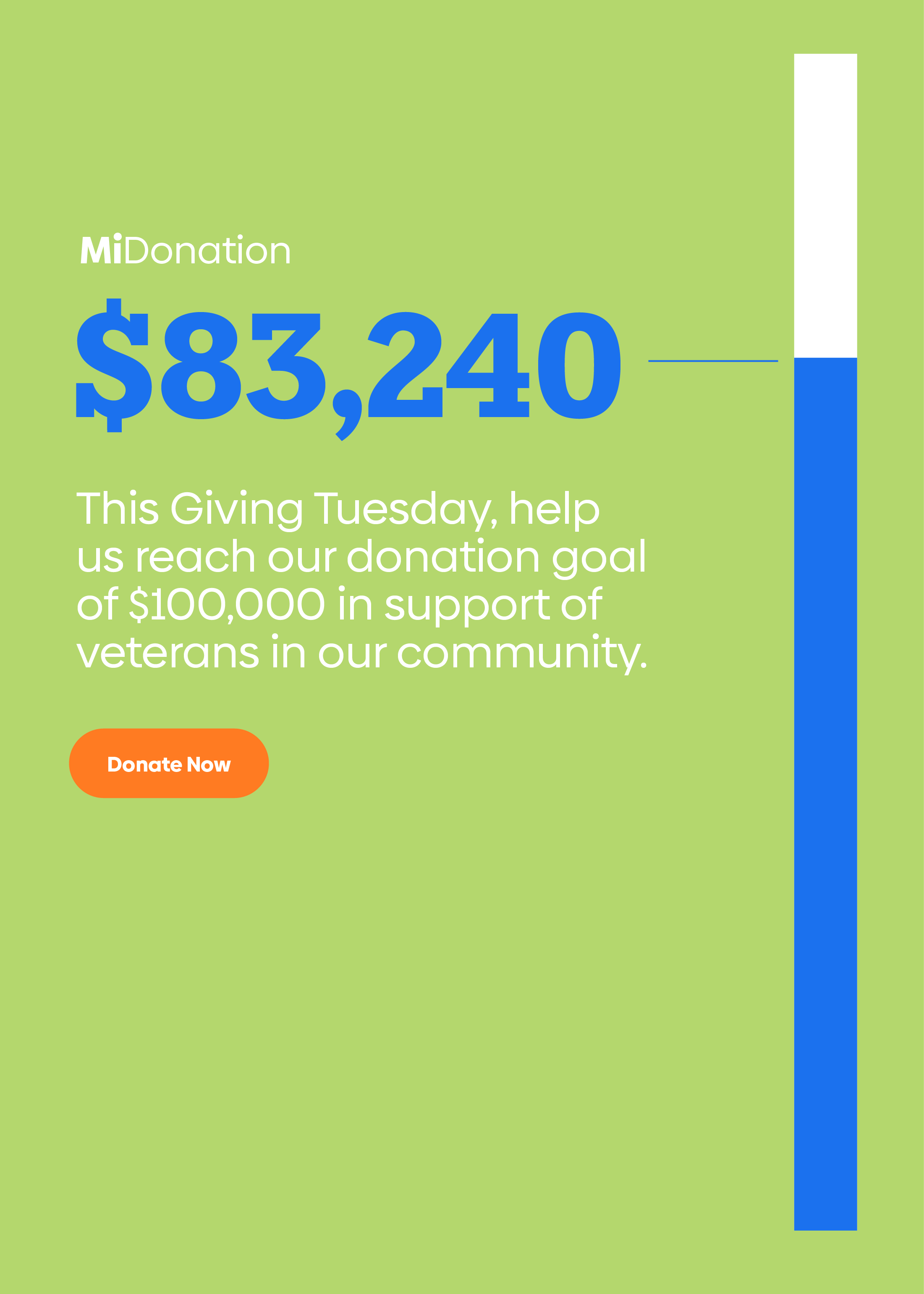
MiSide a new nonprofit network dedicated to helping families and individuals of all ages and backgrounds with every side of life.

Southwest Solutions (Previous Logo)
Development Centers (Previous Logo)


Bringing difference makers together.
Before the merger, Southwest Solutions and Development Centers were both dedicated to helping people, they just went about it in different ways. This made them a great match for each other, but the scope of their collective services also made it more challenging to share their story in a simple, succinct way.
EightySeven collaborated with members of both organizations to focus their vision for the future and design a new, modern brand identity to get them there. It was an opportunity to use every tool in the branding toolbox, from strategy and naming to voice and visuals.

MiSide featured on Fox News Detroit

A brand blueprint to spark success.
First, we built a strong strategic foundation for the brand to grow from. EightySeven distributed surveys to collect perspectives and gather insights from clients, donors, and employees before bringing more than a dozen members of the Southwest Solutions and Development Centers teams together for a two-day 87BrandFocus workshop.
After two days of exercises and open discussions, the teams aligned on a core strategic foundation that would inform the rest of the brand design process and set the stage for an even more impactful brand experience.
Brand Focus
87BrandFocus Workshop
Brand Core & Audit
Vision & Values
Audience & Personality
Brand Focus
Essential Brand Statements
Brand Action Items
Brand Spark


One name for a multi-sided service.
After working with the client team to develop a naming brief that established clear expectations, EightySeven developed hundreds of names, conducting an initial vetting to confirm name availability and viability before narrowing the list down to the best of the best.
The clear winner was “MiSide,” (pronounced “My Side”). Initially inspired by the abbreviation MI (for Michigan) to drive regional relevance, MiSide projects confidence, warmth, positivity and personal ownership. It also alludes to the compassionate care and support the organization offers across its services.
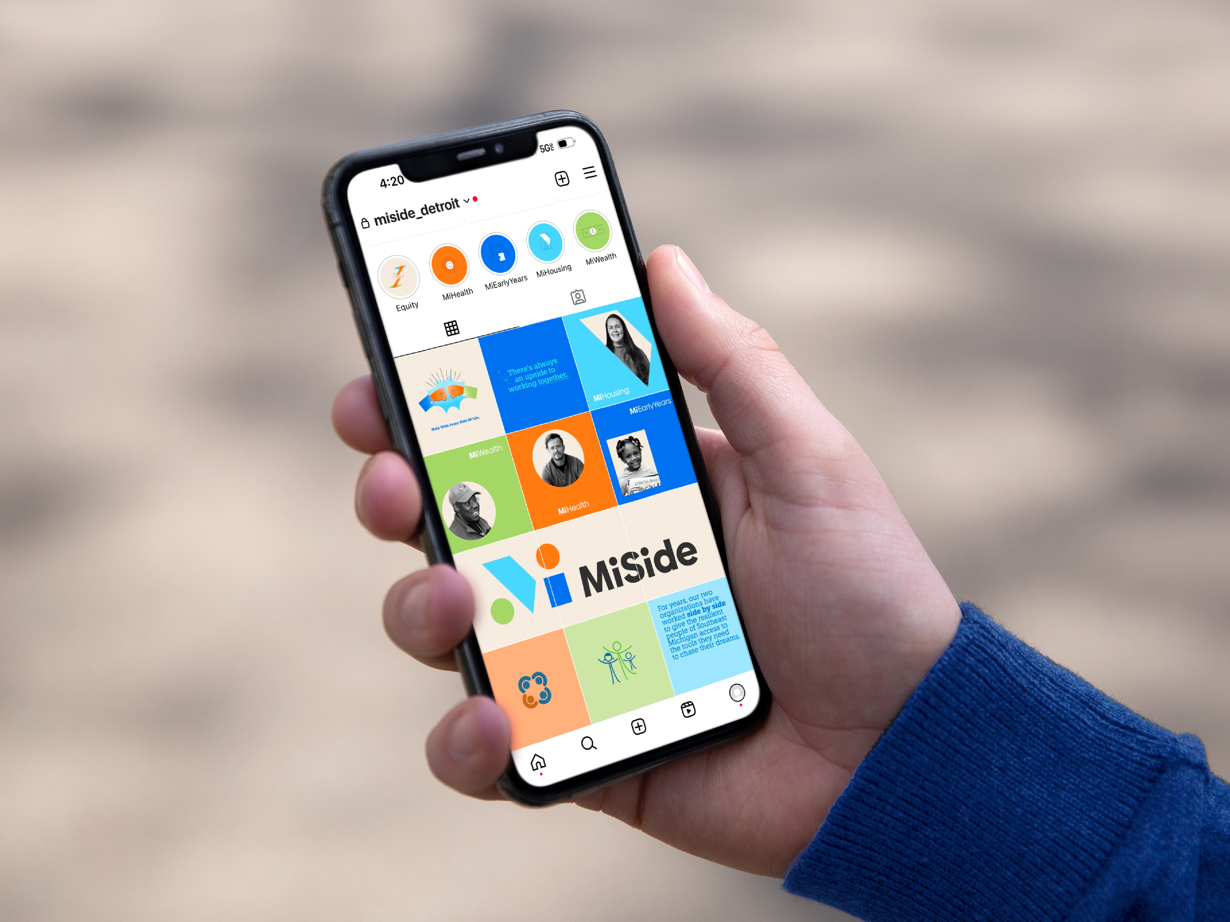
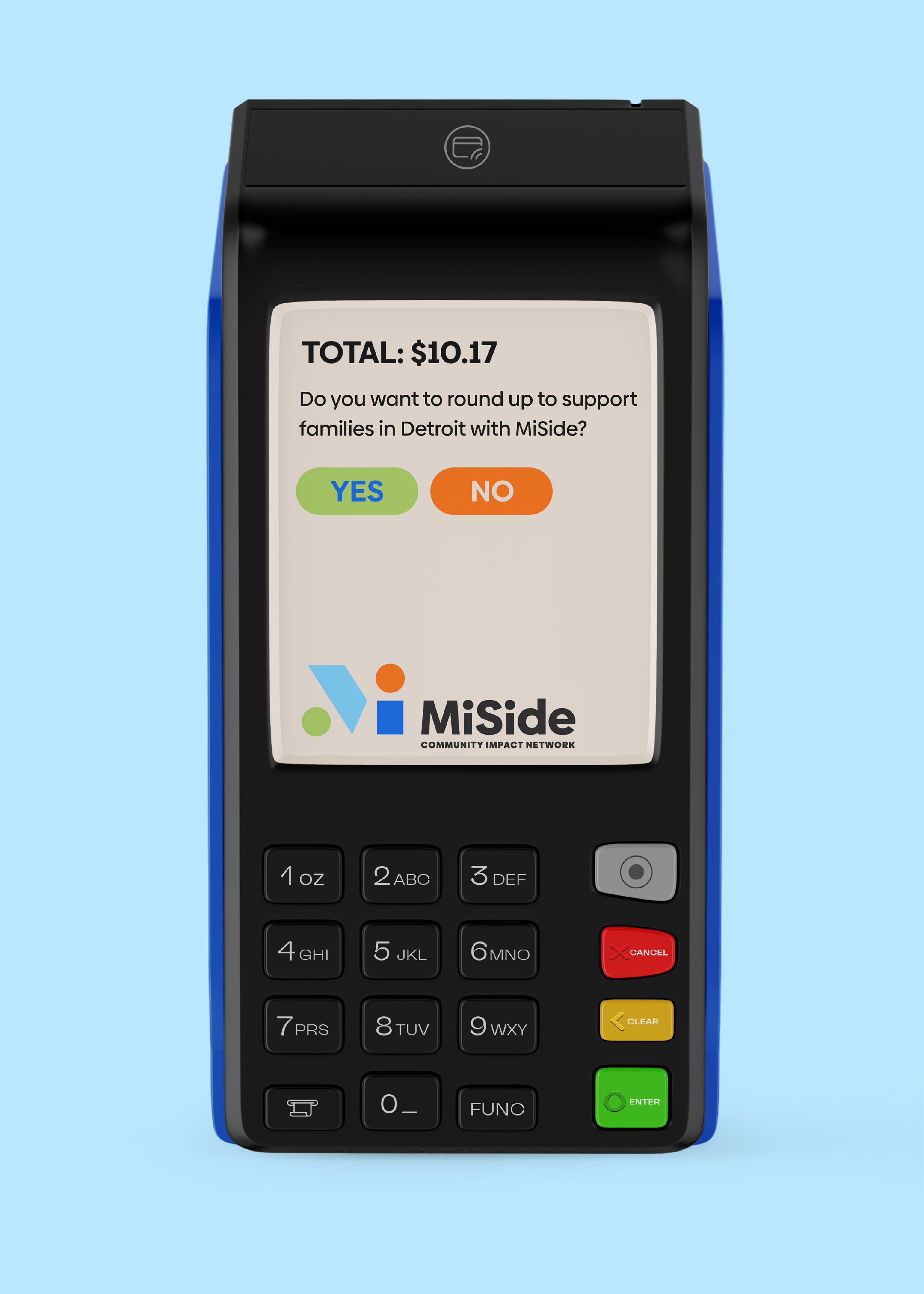
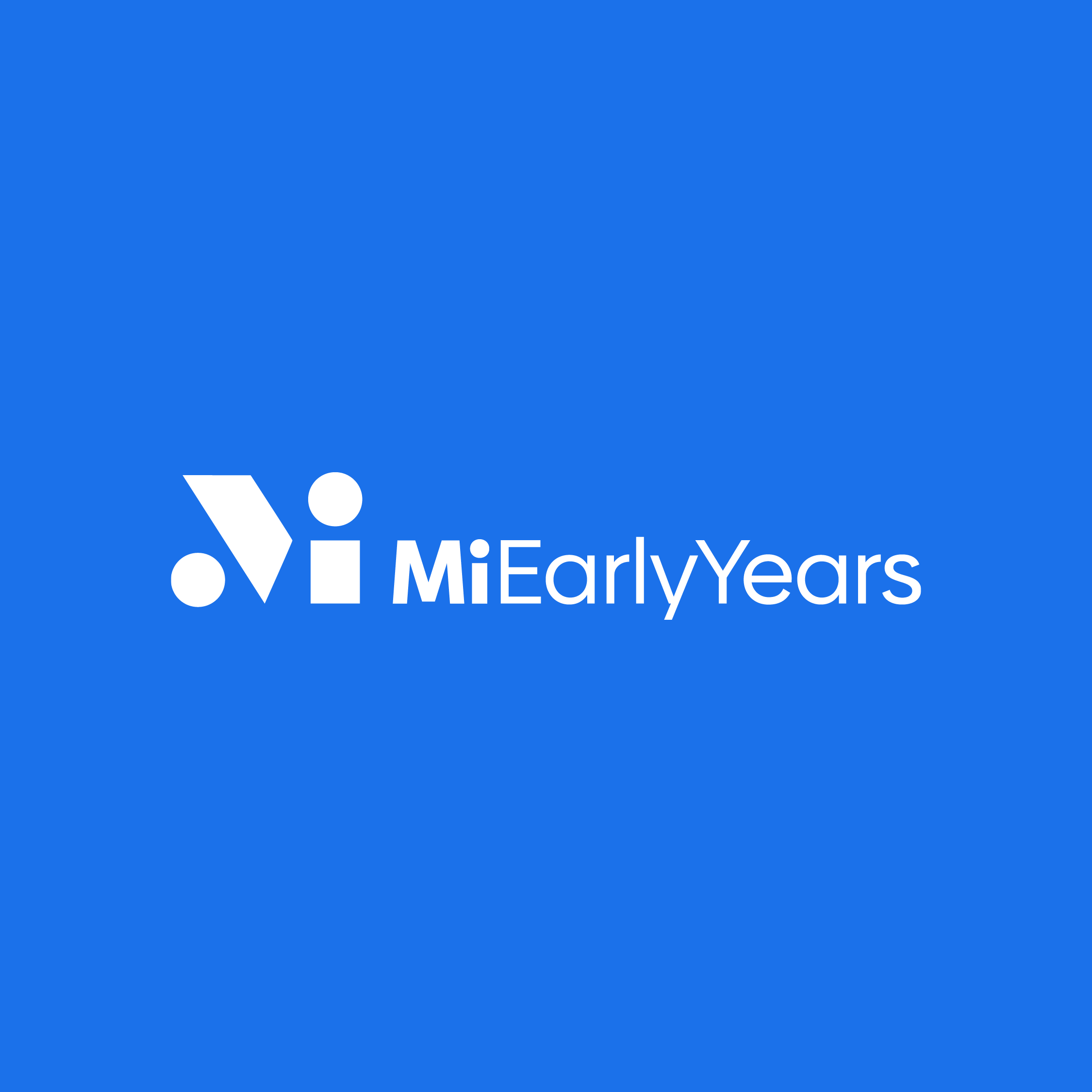
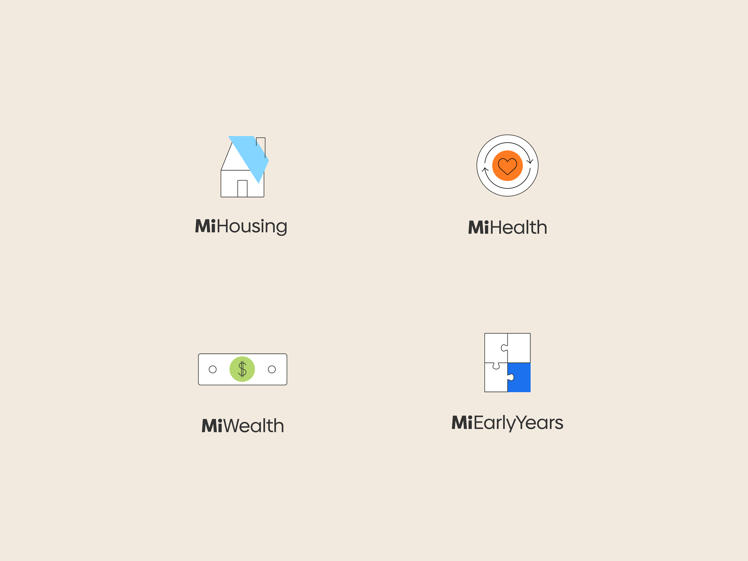
Crucially, “MiSide” created an opportunity to brand the four pillars (or “sides”) of the network’s services – MiWealth, MiHealth, MiHousing, and MiEarlyYears – and inspired simple, ownable headline constructs that could be deployed across communications. The name was designed to be more suggestive and abstract to stand out against regional competitors, so we paired it with a descriptive strapline “Community Impact Network” to provide context and clarify the brand’s purpose.
Brand Name
Brand Name
Brand Storytelling & Language
Naming Workshop
Trademark Alignment & POV
Story and Name Origins
Naming Systems

“Hiring EightySeven was one of the best decisions I have made in my entire career. When faced with merging two legacy nonprofits in Detroit, I knew we only had one chance to get this right.”
-
The first time we met with EightySeven - I was hooked. They were incredibly professional but down to earth at the same time. They guided our large team of executives from both legacy organizations throughout a very organized and thorough process…
They truly captured our mission and vision and took it somewhere I couldn’t have dreamed of. They were by our side throughout the merger and brand reveal and were always there when something came up.
As someone who works with building at brand at the orgs I work for, I was thrilled to work and learn from some of the best out there. Today, we have a new name and brand that somehow maintains the legacy of both organizations. We didn’t have to get rid of what we loved so much, instead they found a way to build onto it with a fresh and modern approach.
Lastly, working at a nonprofit, it is critical to have brand recognition in community especially with clients and donors. They kept our vision in mind for both audiences to help ensure sustainability moving forward. 10/10 recommend.”
Laura LeBlanc, Executive Director of Philanthropy and External Affairs, MiSide
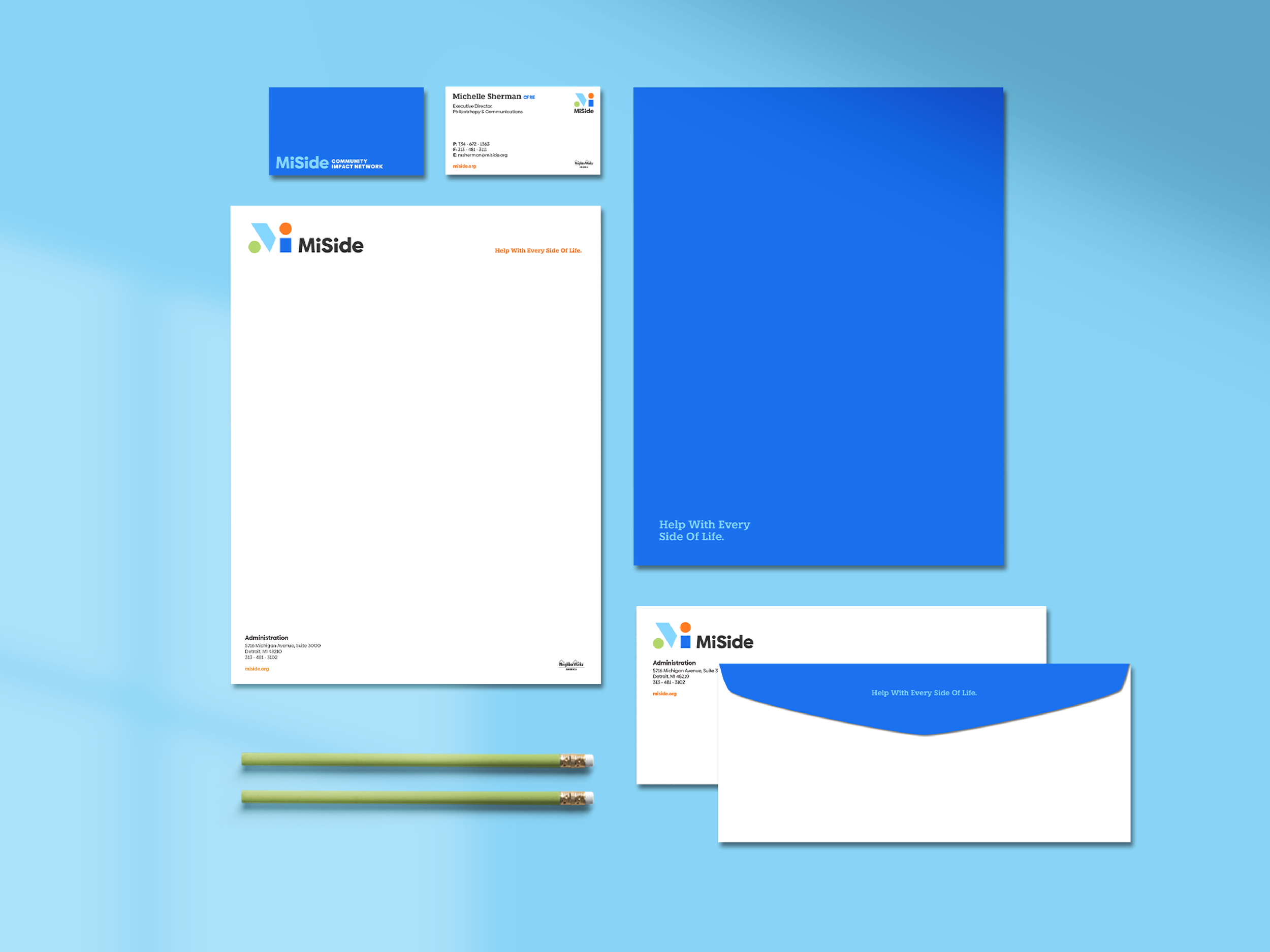
Visuals to celebrate the past and usher in a bright future.
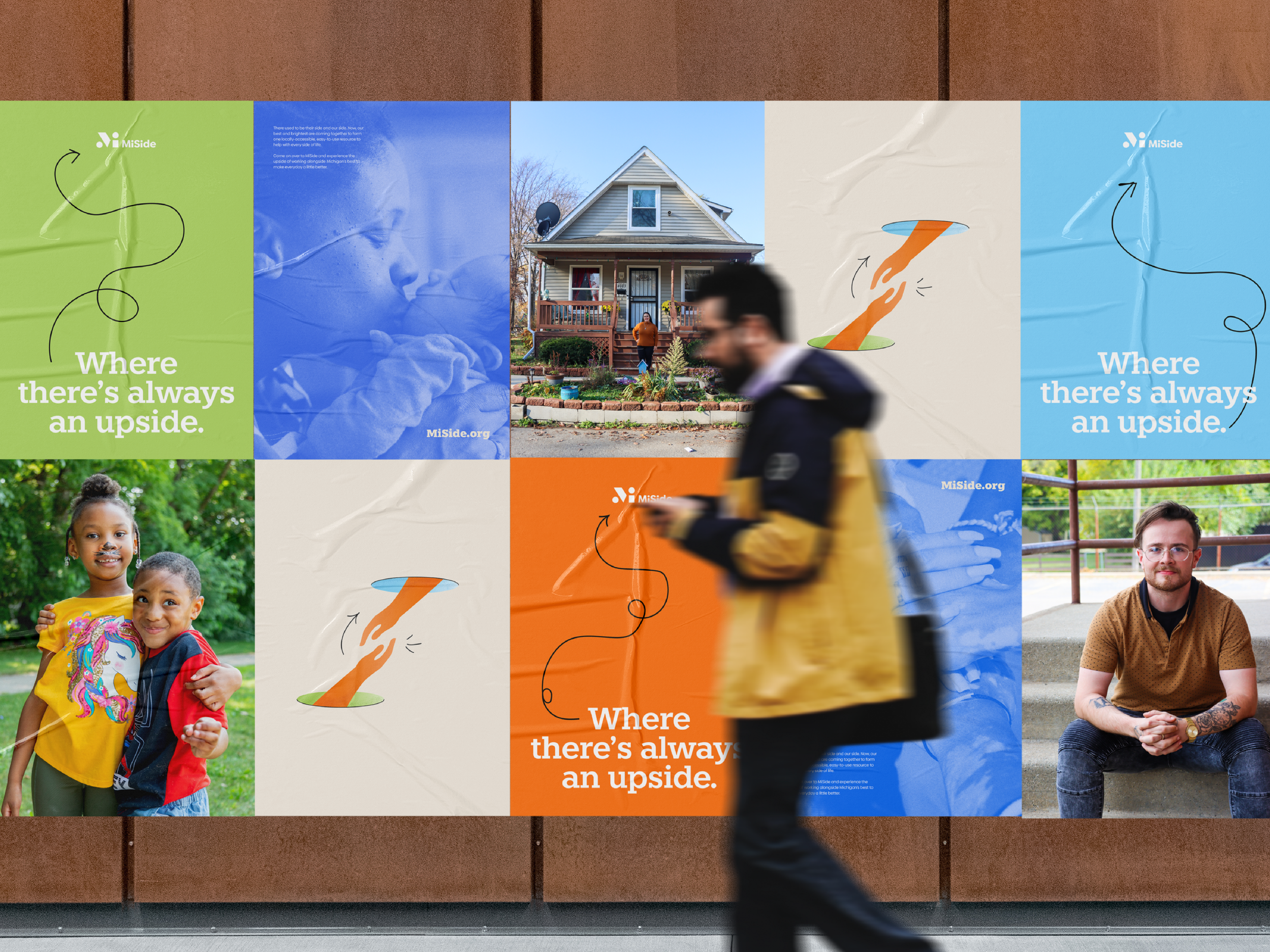
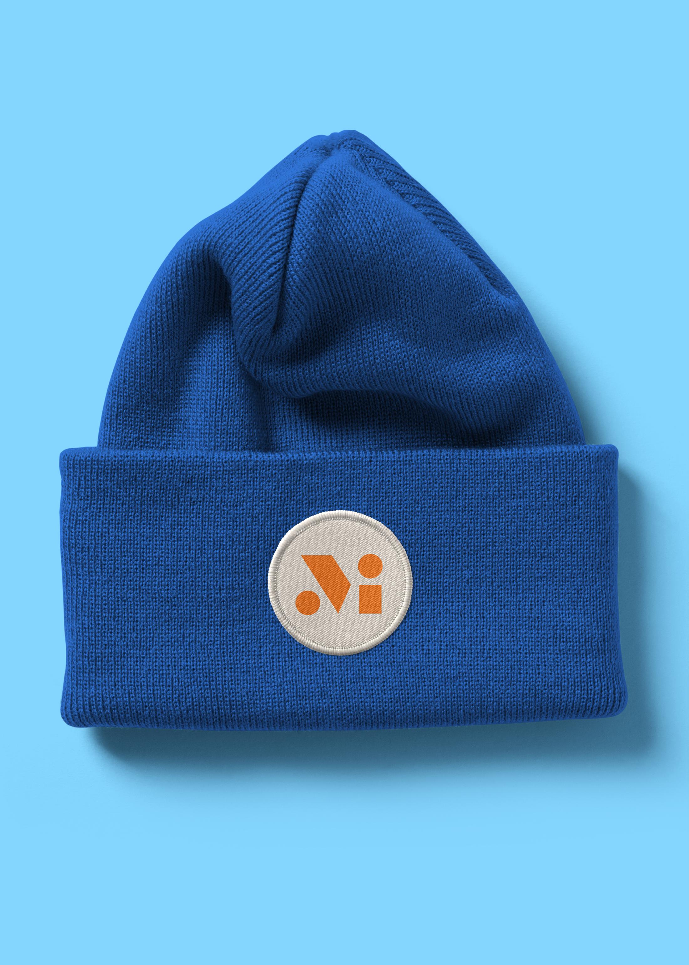
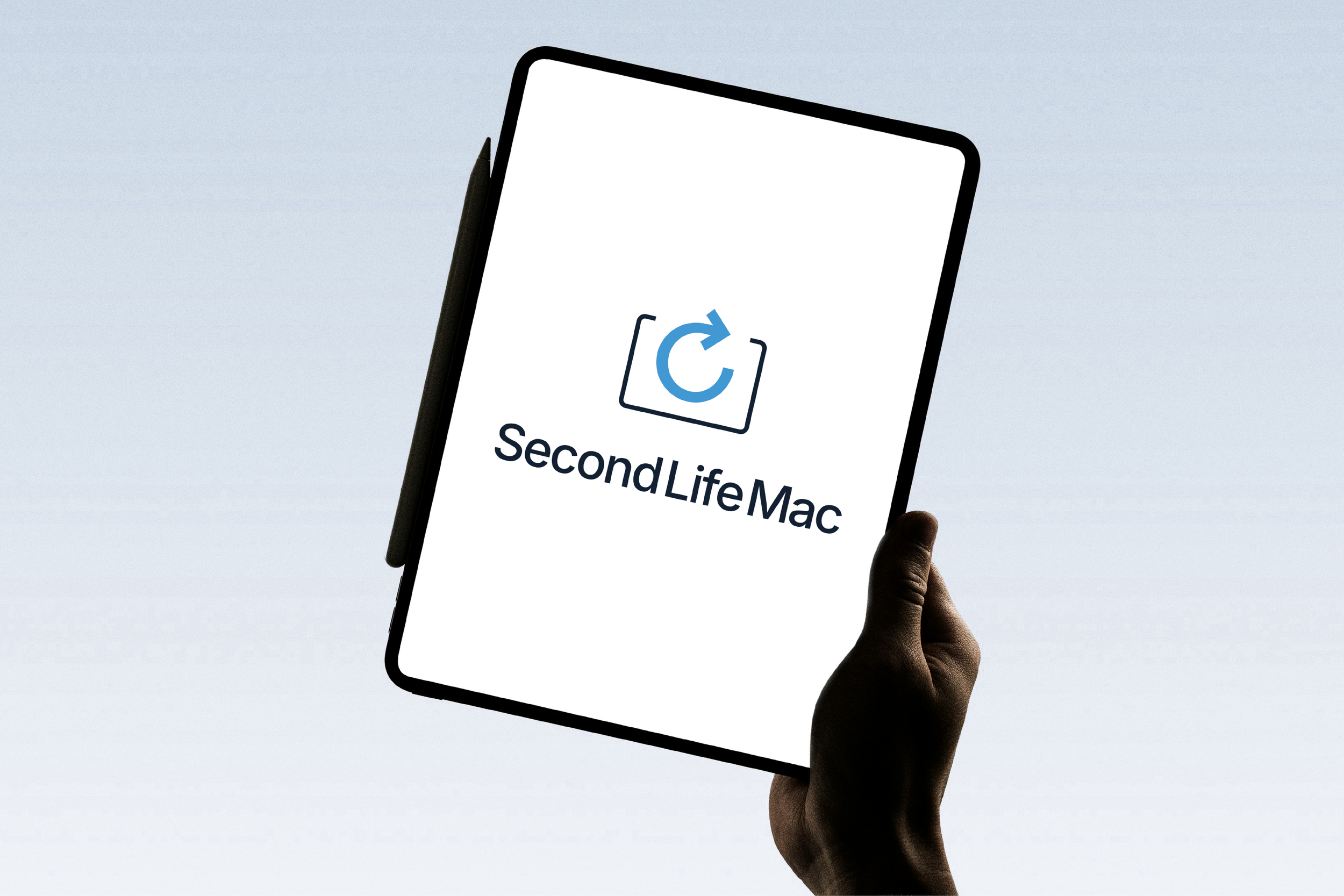
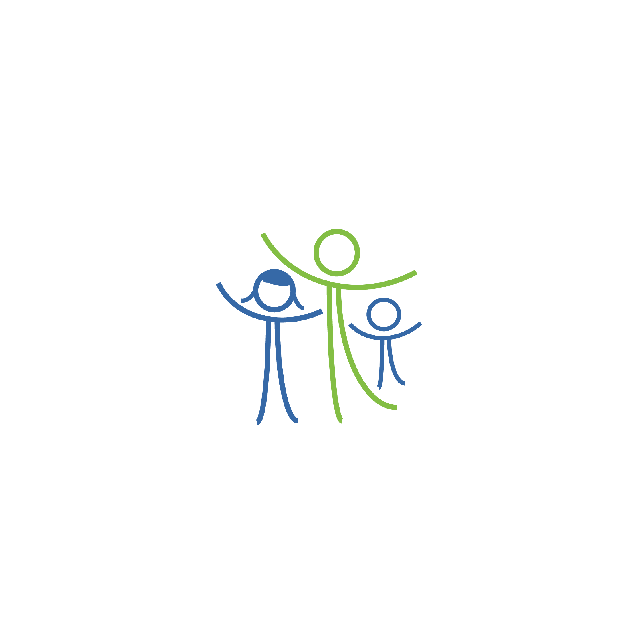
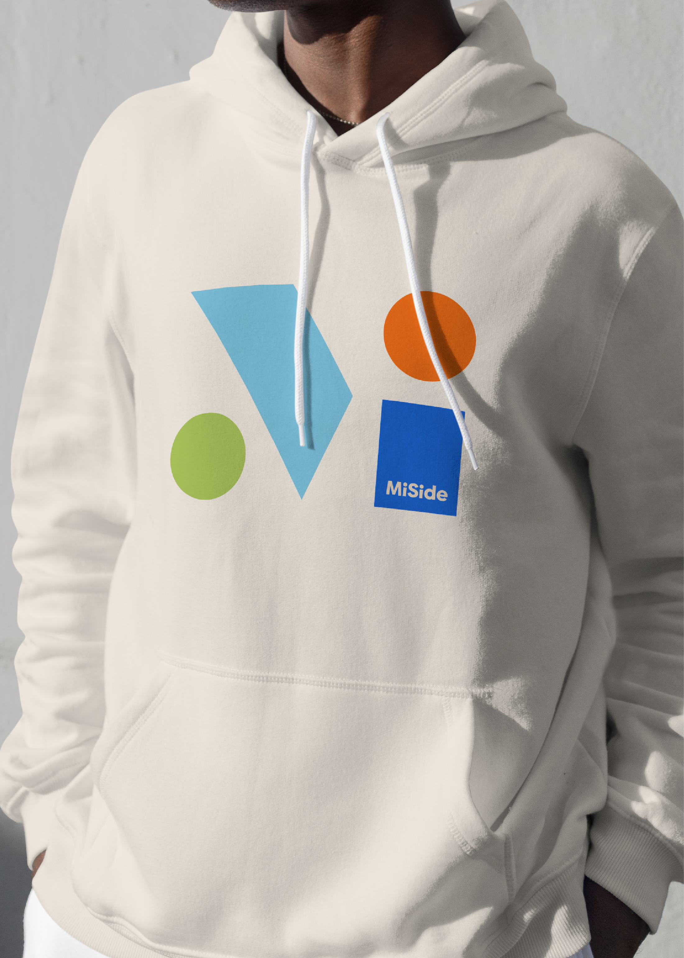
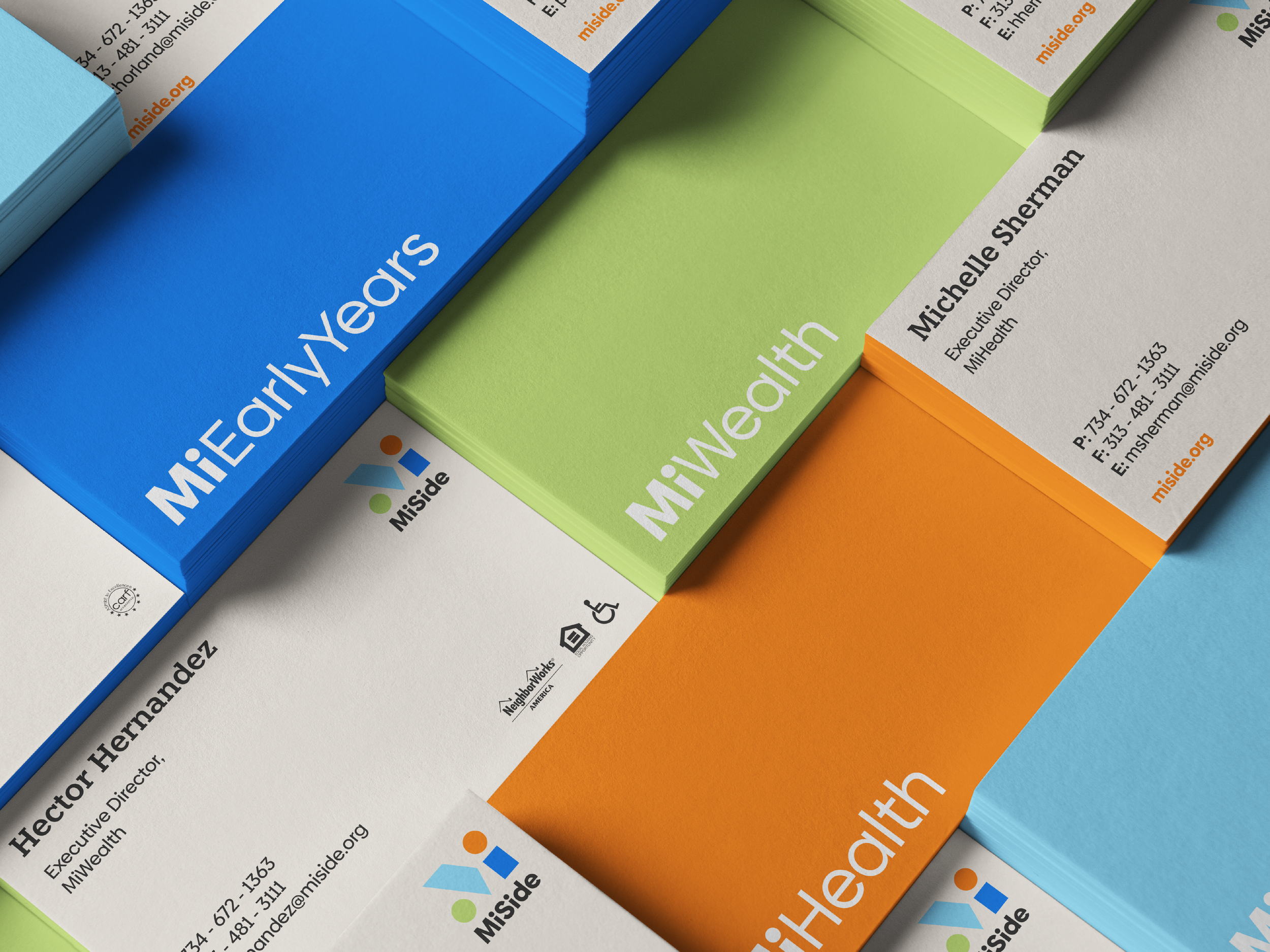
The MiSide visual identity celebrates community icons coming together to make a difference. It pays homage to the past while looking forward to a shared future. The logo is composed of shapes merging to form a holistic mark, with each shape representing one of the four brand programs. This unique combination forms an abstract monogram that’s fresh, clean and instantly recognizable.
The brand’s palette includes a modernized take on the colors of the merged organizations. It was important to include moments that honored the past of each organization.
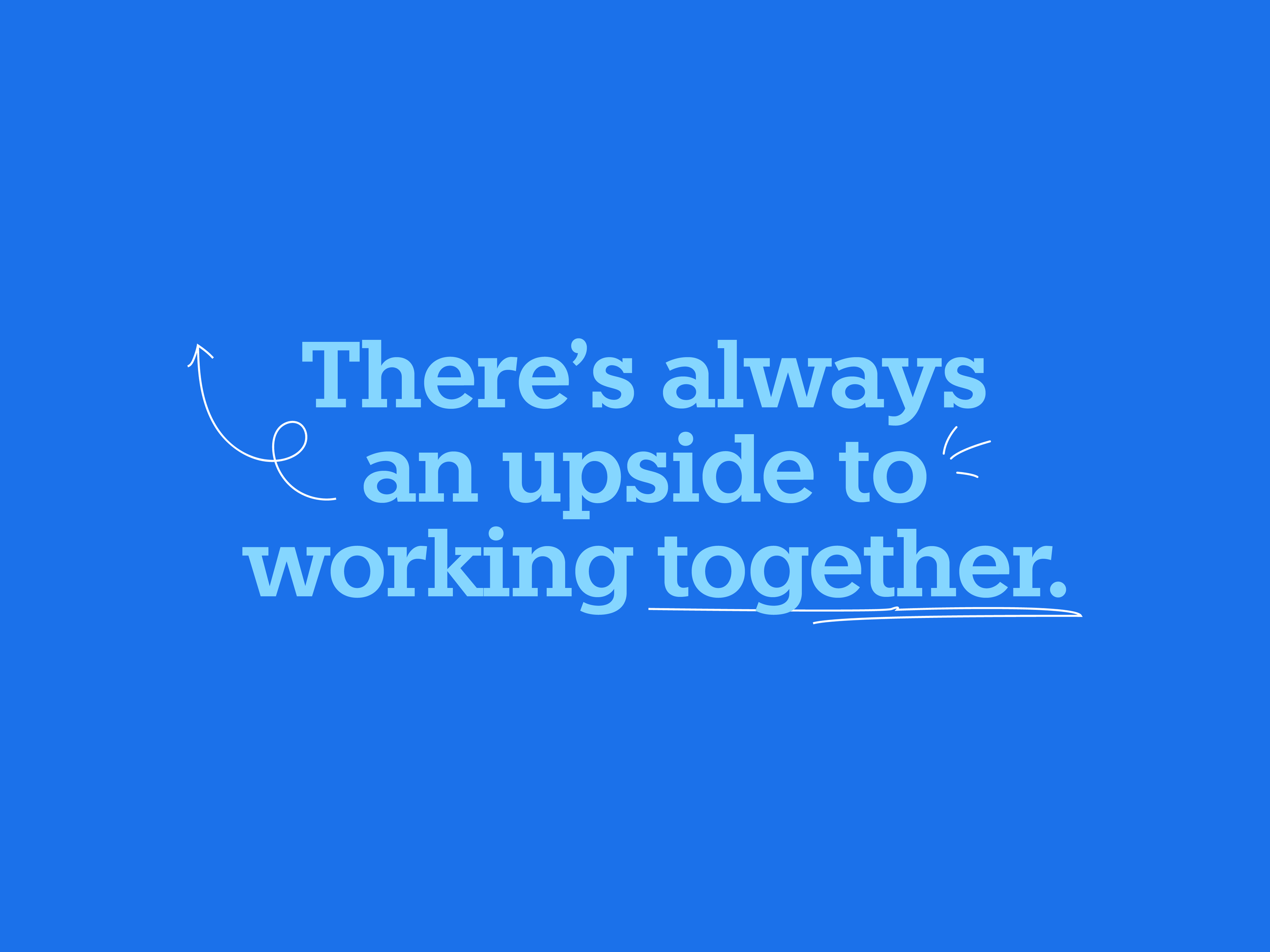
From a graphic perspective, illustrative arrows and linework add an imperfect human touch and contrast the clean lines of the brand’s identity system. To convey the idea of optimism and the “upside”, the MiSide arrows always point upwards.
People are at the core of this organization, so playing up humanity in the photography was critical. Custom brand photography features the real clients, employees and board members of MiSide. Eye-contact, teamwork and optimism are intentionally used to capture client’s stories and showcase the impact of the brand’s values at work.
Brand Visuals
Logo Systems
Typography
Color Palette
Photography Treatments
Icon Design
Design Systems
Visual Guidelines


Creating a voice for every side of the story.
The clients emphasized the importance of, “meeting people where they are,” throughout the process. With this in mind, EightySeven placed an emphasis on simplicity, both in terms of story structure and tone, designing the voice to be approachable, conversational, relatable, and easily understood, regardless of the complexity of its content (finances, healthcare, etc.).
We brought the voice to life with key brand language and a simple headline construct. The construct was designed to be flexible across topics and easily deployed across channels to convey the depth of MiSide’s services. It pairs services and outcomes directly to the name, driving the name recognition that’s so critical throughout year one.
Brand Voice
Brand Story
Brand Tagline
Headline Constructs
Brand Voice Pillars
Key Brand Language
Brand Voice Guidelines