
Super Blanding: How the Big Game’s look went blah.

This weekend is Super Bowl LVII (one of the last remaining public uses of Roman numerals), aka Super Bowl 57. Every aspect of the game has grown from its modest beginnings into the massive draw it is today. That includes the branding for the event itself.
Looking back on the history of Super Bowl logo design, three phases start to jump out:
The Beginning.
The Bold.
The Boring.
The Beginning
1967-1992
While there are a few outliers (looking at you, Super Bowl IX), most of the first few years are red, white, blue, and relatively basic from a design perspective. They don't ever necessarily feel of their time (the late '60s until early' 90s) but certainly, take their cues from beer labels.
Hmm, there might be a connection there.


The Bold
1993-2010
My favorite time of design is when it comes to the NFL and Super Bowl years. While closely tied to memories of growing up and throwing big parties in the basement, these years successfully bring a story and feeling of delight into the dialogue around the game. From Super Bowl XXX (30) until XXXIX (39), a run of designs pay tribute to the host city. Good or bad, they do something interesting before the last gasp of the mid-2000's.

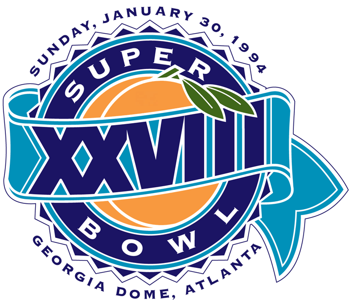


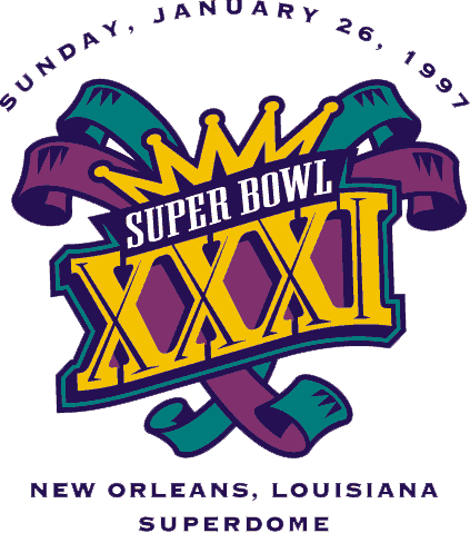

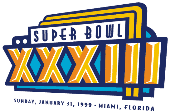

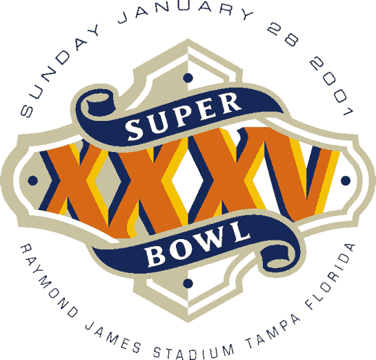


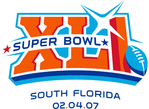


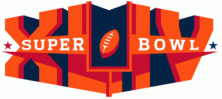
What I love about all these designs is that they each feel like a bright pop culture milestone when viewed as a whole. The best example is that the XXXVI logo changed to reflect the patriotic vibe of the country after September 11, 2001. While some of these designs might be stronger than others, especially at the beginning of this period, there is a definite sense of tying the Super Bowl to a location theme.

The Boring
2010-Today
Once we hit the 2010's we can see the NFL made a very distinct creative decision to change the branding and approach to their Super Bowl designs.
Gone are the artistic flourishes and personality that varies year-to-year. Now, we have a consistent (some would say “corporate”) look. It seems the NFL wanted more of a matching, branded approach to the biggest day in American sports. Even hiring the renowned branding agency Landor to update their look, here’s what they have to say:
“Historically, the National Football League (NFL) commissioned a new logo for the Super Bowl every year; the design’s theme was inspired by the host city. But starting with Super Bowl XLV in 2011, the logo no longer changed from year to year…A sports event of this stature needed a consistent, iconic identity—a symbol that fans could immediately recognize, much like the Olympic rings. The Vince Lombardi trophy, bestowed on league champions each year, was the ideal inspiration for a lasting symbol. Working with the NFL’s in-house designers, we created a logo befitting the trophy’s prominence.”


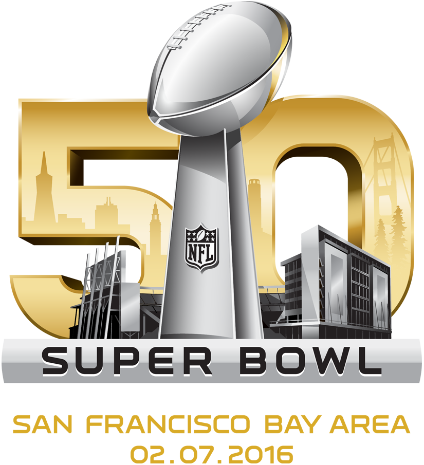


While there might be reverence for the trophy, I feel like it's the NFL speaking to itself. There is far more fun and community around creating a theme and personality that connects the game to the host city. In and of itself, it is a huge deal for any city to play host to the Super Bowl. The least the NFL could do is show some love with their army of marketing behind the event each year.
While consistency has certain advantages, the thrill and excitement of the event disappear with their latest corporate look.
Being unique stands out and ties the event to a time and place. "Sports are such a mirror for the American psyche," said Todd Radom, who designed the logo for Super Bowl 38.
While I may not be loco for the logo, and there is no chance of my Chicago Bears showing up in a Super Bowl anytime soon,* I just hope both teams have fun... and cover the spread.
*2025 Update: Retracting that last statement because the Bears are back #goodbetterbest.
Want to talk about logos for your business? Contact us.